Copyright
©The Author(s) 2022.
World J Clin Cases. May 26, 2022; 10(15): 4737-4760
Published online May 26, 2022. doi: 10.12998/wjcc.v10.i15.4737
Published online May 26, 2022. doi: 10.12998/wjcc.v10.i15.4737
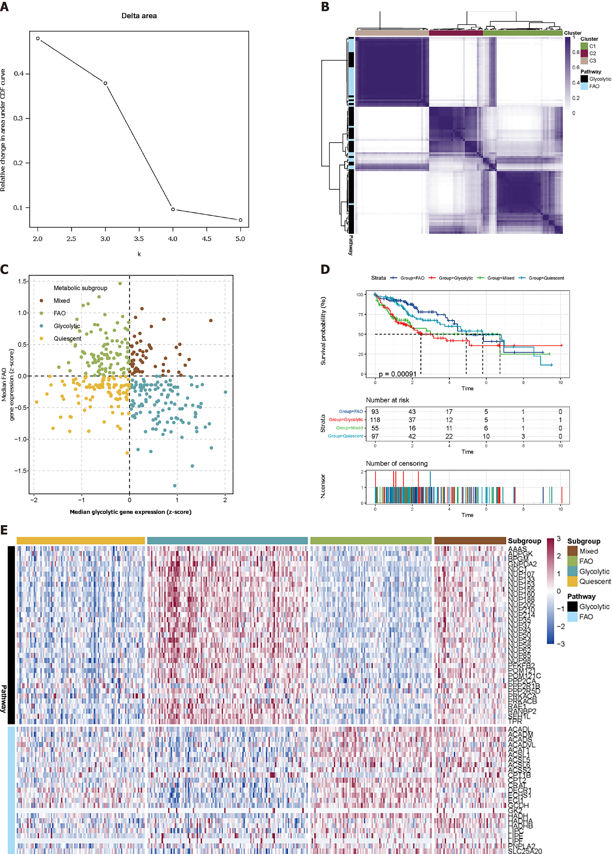
Figure 1 Classification of liver hepatocellular carcinoma tumours depending on the median expression of fatty acid oxidation and glycolytic genes.
A: Delta area shows that the cluster works best when K = 3; B: Heatmap shows three consensus clustering results. Genes in C1 and C3 are identified as robustly co-expressed; C: Scatter plots show the median expression of metabolic genes in each sample and group them into four subtypes; D: Kaplan-Meier survival analysis of patients in metabolic subtypes. Log-rank test P values are shown; E: Heatmap depicts the expression of co-expressed metabolic genes across each subgroup.
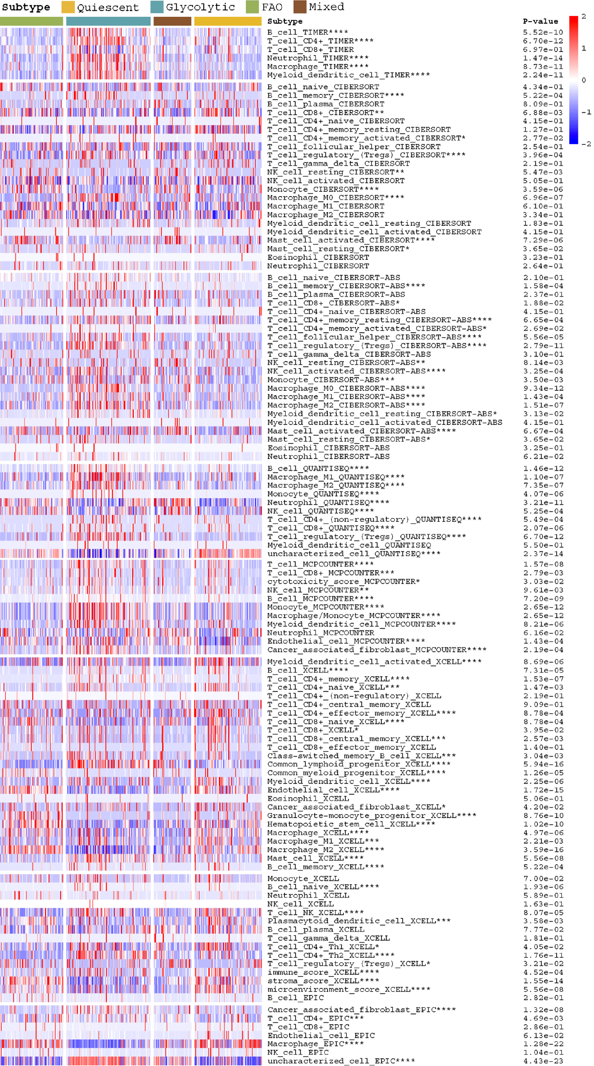
Figure 2 Heatmap depicts the difference in immune infiltration between metabolic subgroups.
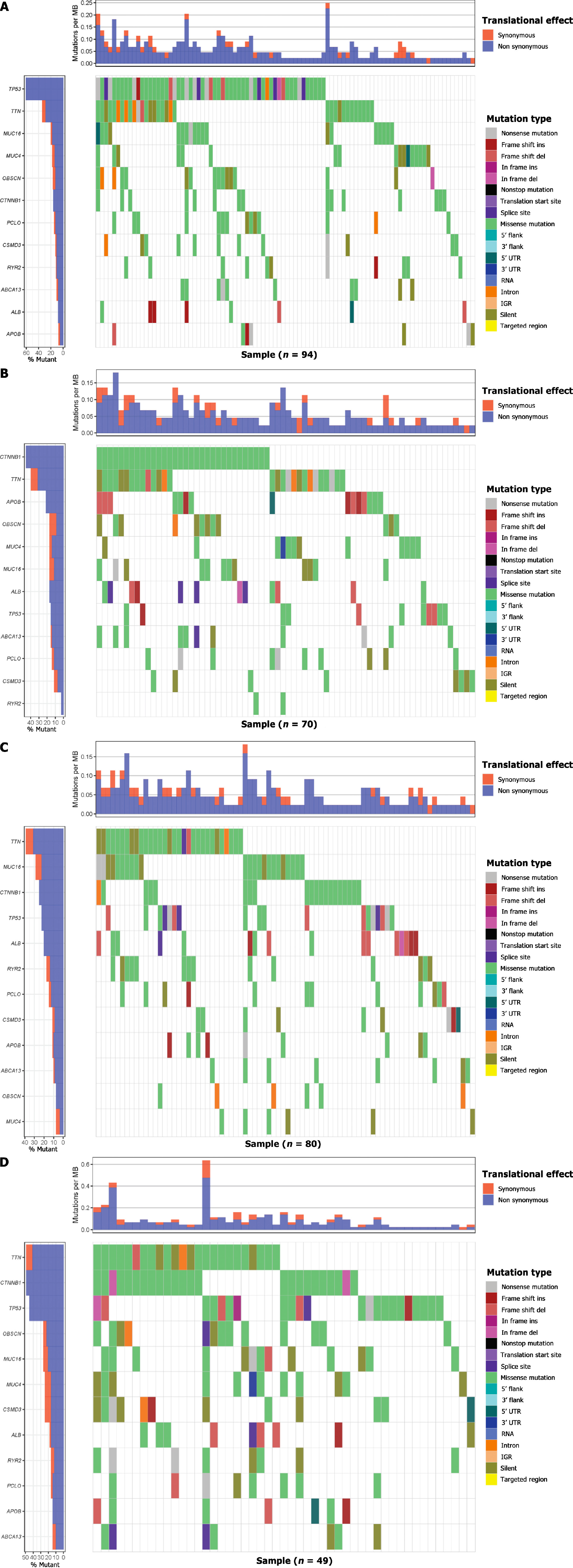
Figure 3 Gene mutations of each metabolic group are illustrated by waterfall maps.
Different colours mean different mutation types.
Figure 4 Scatter stats depict the correlation of co-expressed metabolic genes with mutant genes.
Figure 5 Copy number variation characteristics between metabolic subgroups.
A-H: Genomic Identification of Significant Targets in Cancer analysis shows the whole-genome distribution of copy number alterations; A-D: Genomic Identification of Significant Targets in Cancer (GISTIC) Q-values for amplifications in metabolic subgroups: Glycolytic, fatty acid oxidation, mixed, and quiescent group; E-H: GISTIC Q values for deletions in metabolic subgroups are plotted across the genome. The green line represents the significance threshold (Q value = 0.25); I and J: Composite copy number profiles for four clusters with gains in red and losses in blue.
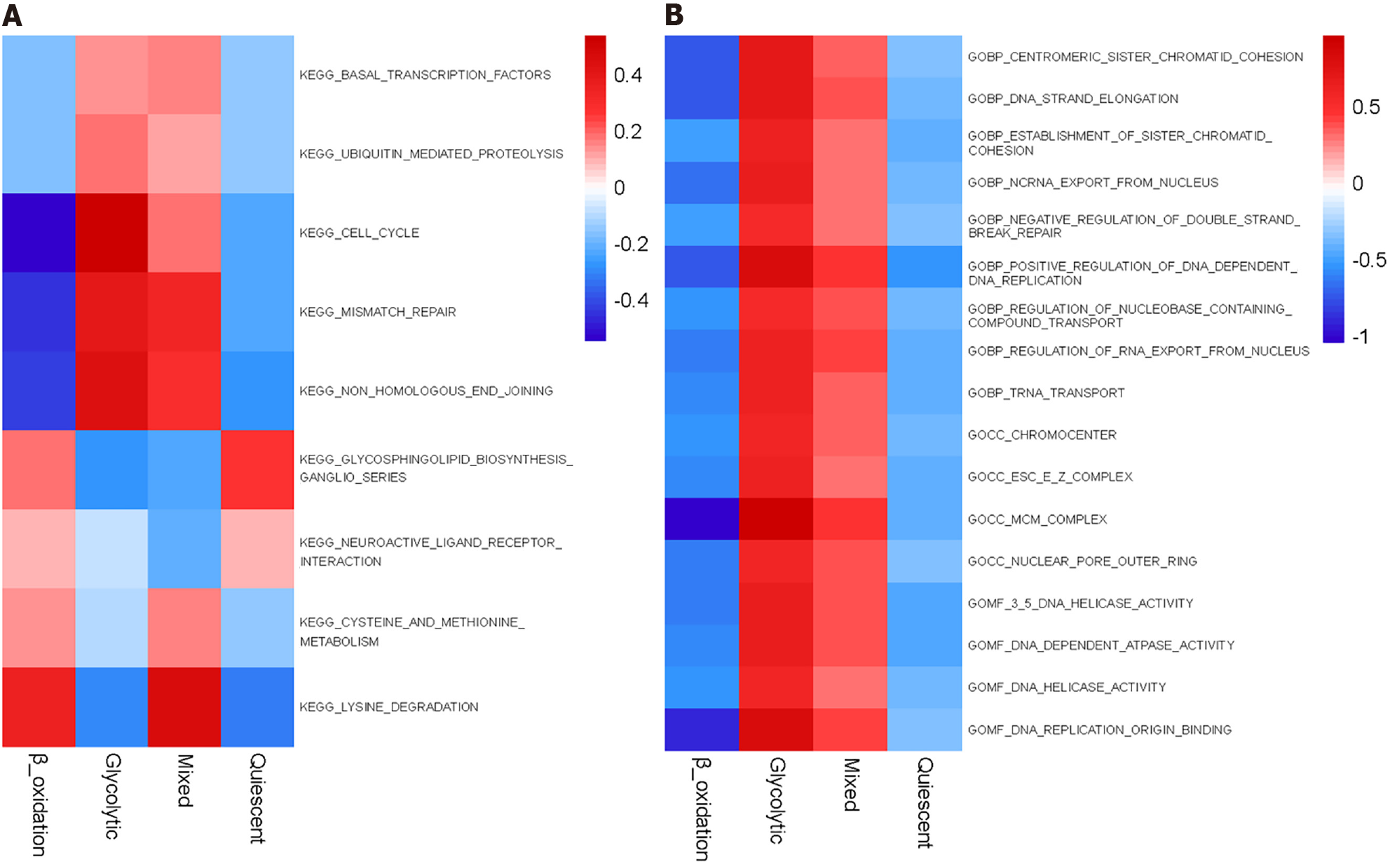
Figure 6 Gene set enrichment analysis reveals distinct enriched gene sets between subtypes.
In the heatmap, rows are defined by the selected 60 gene sets and columns by consensus scores for each subtype.
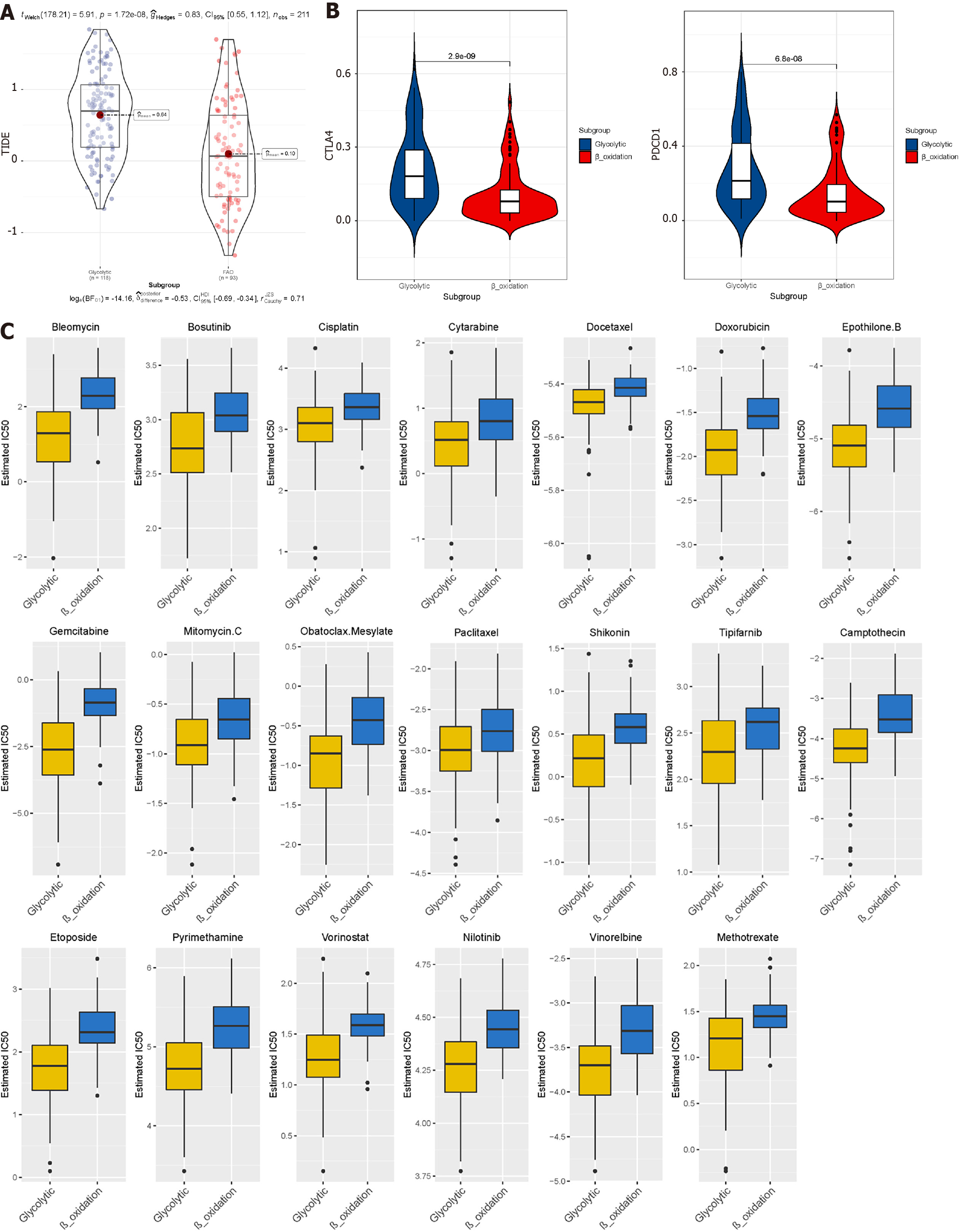
Figure 7 Prediction of the efficacy of immune checkpoint blockade therapy and chemotherapy drugs in different metabolic subgroups.
A: Distribution of Tumour Immune Dysfunction and Exclusion scores in glycolytic subtype of liver hepatocellular carcinoma vs fatty acid oxidation subtype of liver hepatocellular carcinoma; B: Box plot shows samples with response if immune checkpoint blockade therapy; C: Half-maximum inhibitory concentration of clinical anti-cancer drugs forecasted by Genomics of Drug Sensitivity in Cancer.
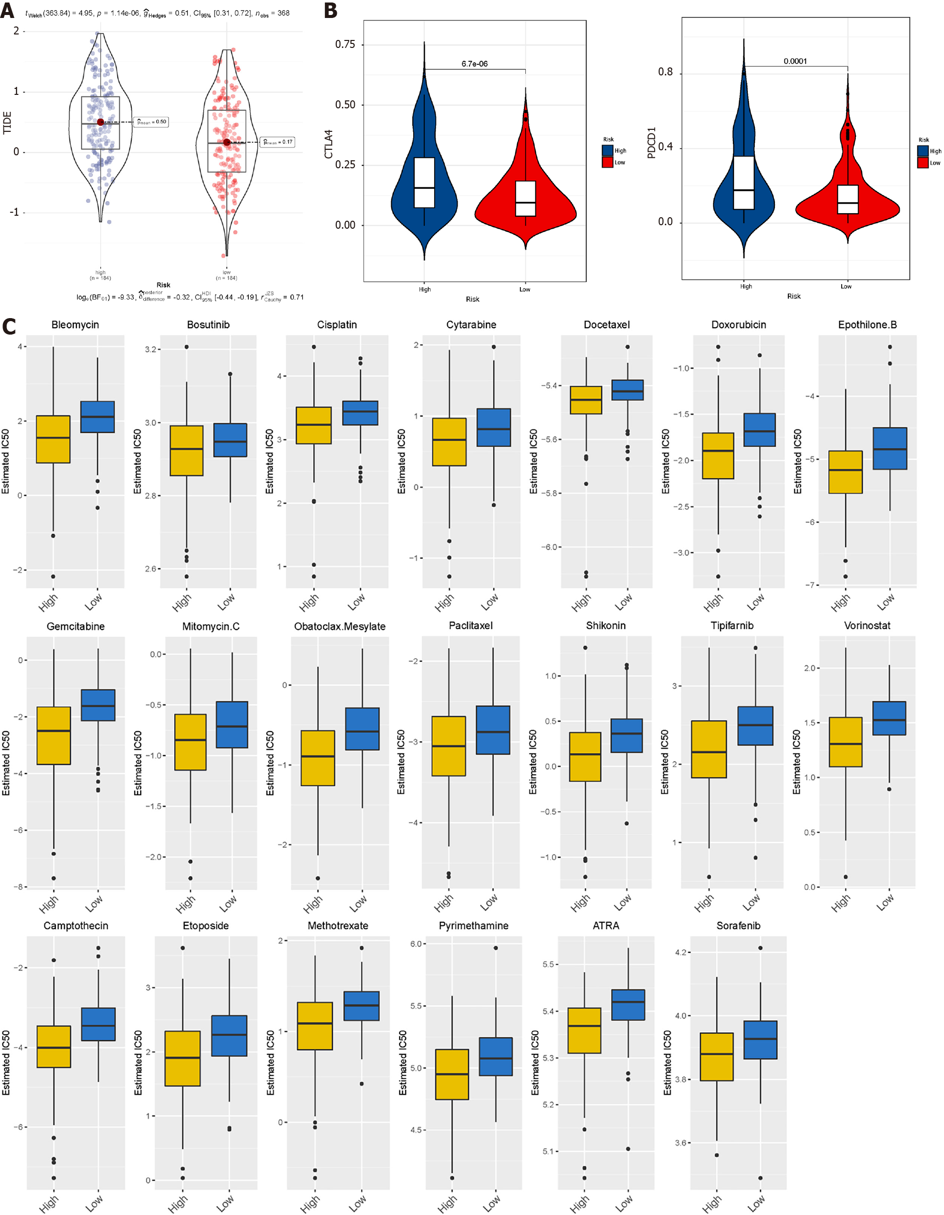
Figure 8 Prediction of the efficacy of immune checkpoint blockade therapy and chemotherapy drugs in The Cancer Genome Atlas datasets.
A: Distribution of Tumour Immune Dysfunction and Exclusion scores in high-risk subtype of liver hepatocellular carcinoma vs low-risk subtype of liver hepatocellular carcinoma; B: Box plot shows samples with response to immune checkpoint blockade therapy; C: Half-maximum inhibitory concentration of clinical anti-cancer drugs forecasted by Genomics of Drug Sensitivity in Cancer.
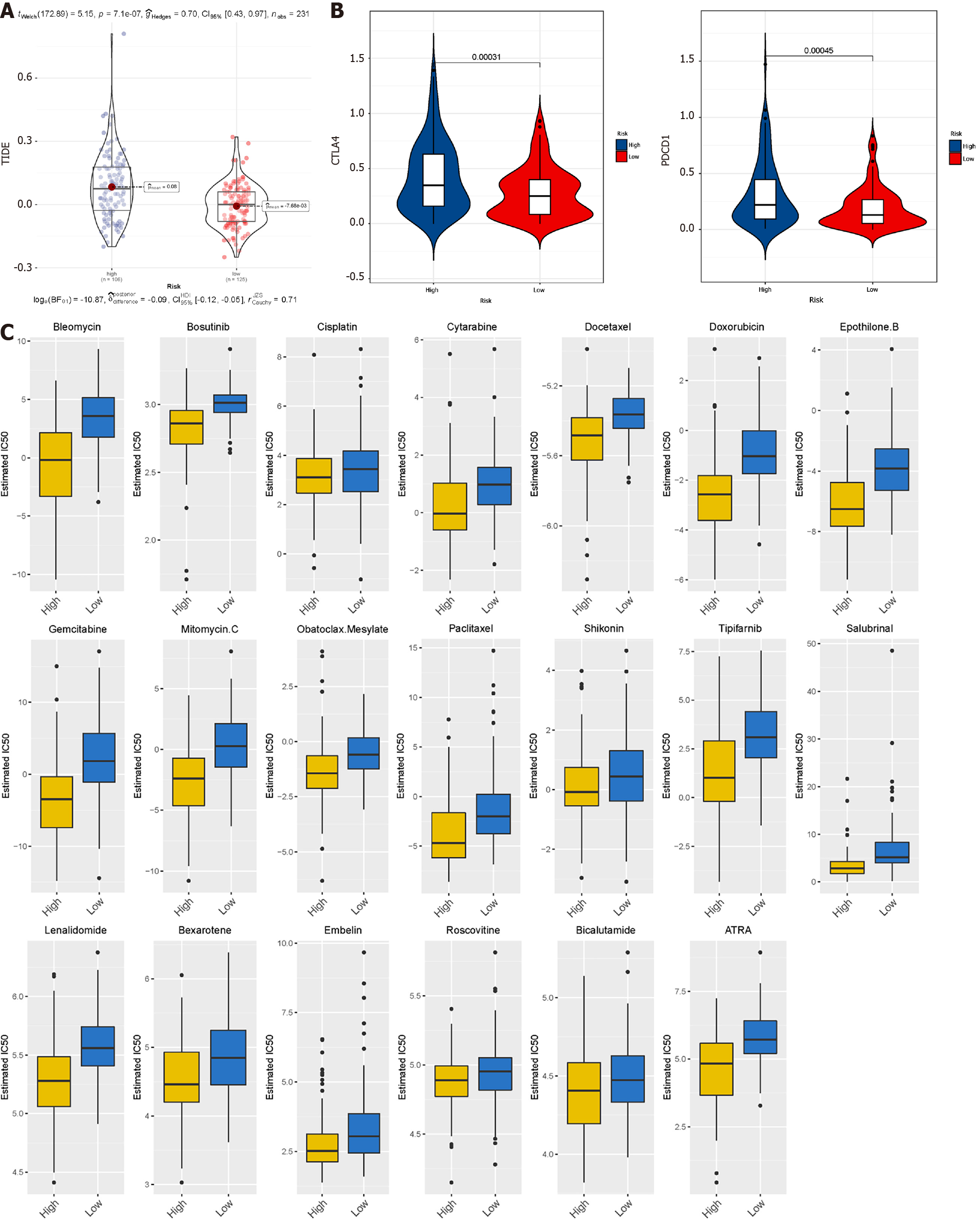
Figure 9 Prediction of the efficacy of immune checkpoint blockade therapy and chemotherapy drugs in International Cancer Genome Consortium datasets.
A: Distribution of Tumour Immune Dysfunction and Exclusion scores in high-risk subtype of LIRI-JP vs low-risk subtype of LIRI-JP; B: Box plot shows samples with response if immune checkpoint blockade therapy; C: Half-maximum inhibitory concentration of clinical anti-cancer drugs forecasted by Genomics of Drug Sensitivity in Cancer.
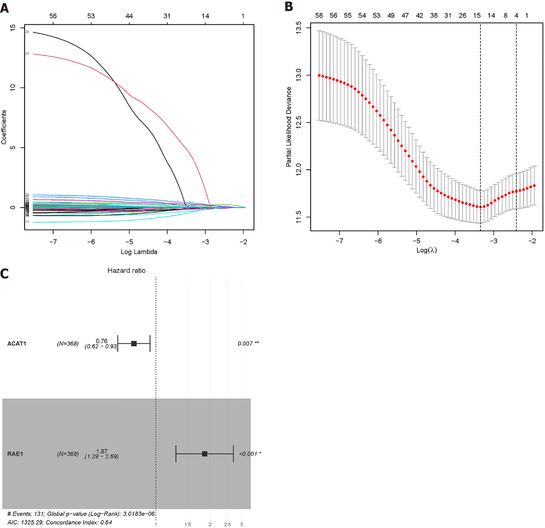
Figure 10 Lasso Cox regression was used to reduce the dimensionality.
A and B: When λ = 0.0354467, four modelling genes were obtained; C: Combined with multivariate Cox regression analysis, two final modelling genes, ACAT1 and RAE1, were obtained (P < 0.05).
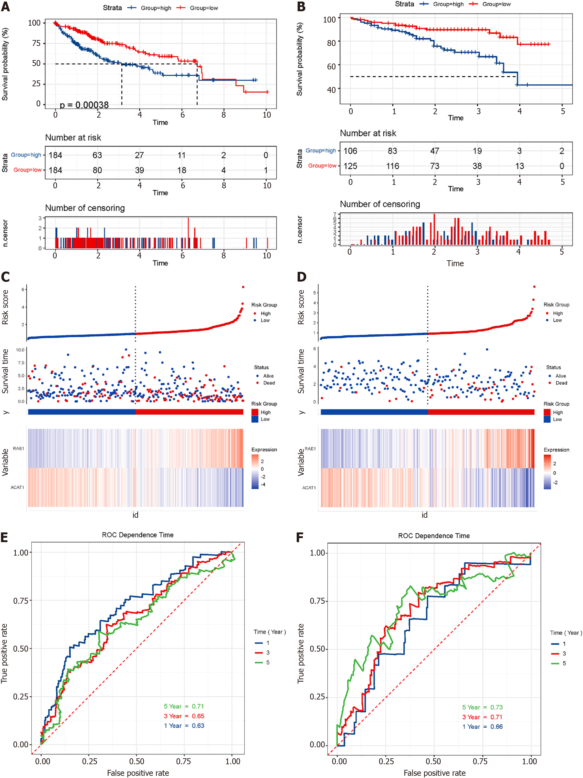
Figure 11 Survival analysis and model evaluation of The Cancer Genome Atlas and International Cancer Genome Consortium datasets.
A and B: Kaplan-Meier survival analysis of patients in The Cancer Genome Atlas and International Cancer Genome Consortium datasets. Log-rank test P values are shown; C and D: Risk plot of two datasets; E and F: Time dependence receiver operating characteristic curves show 1-year, 3-year, and 5-year area under the curve of the module.
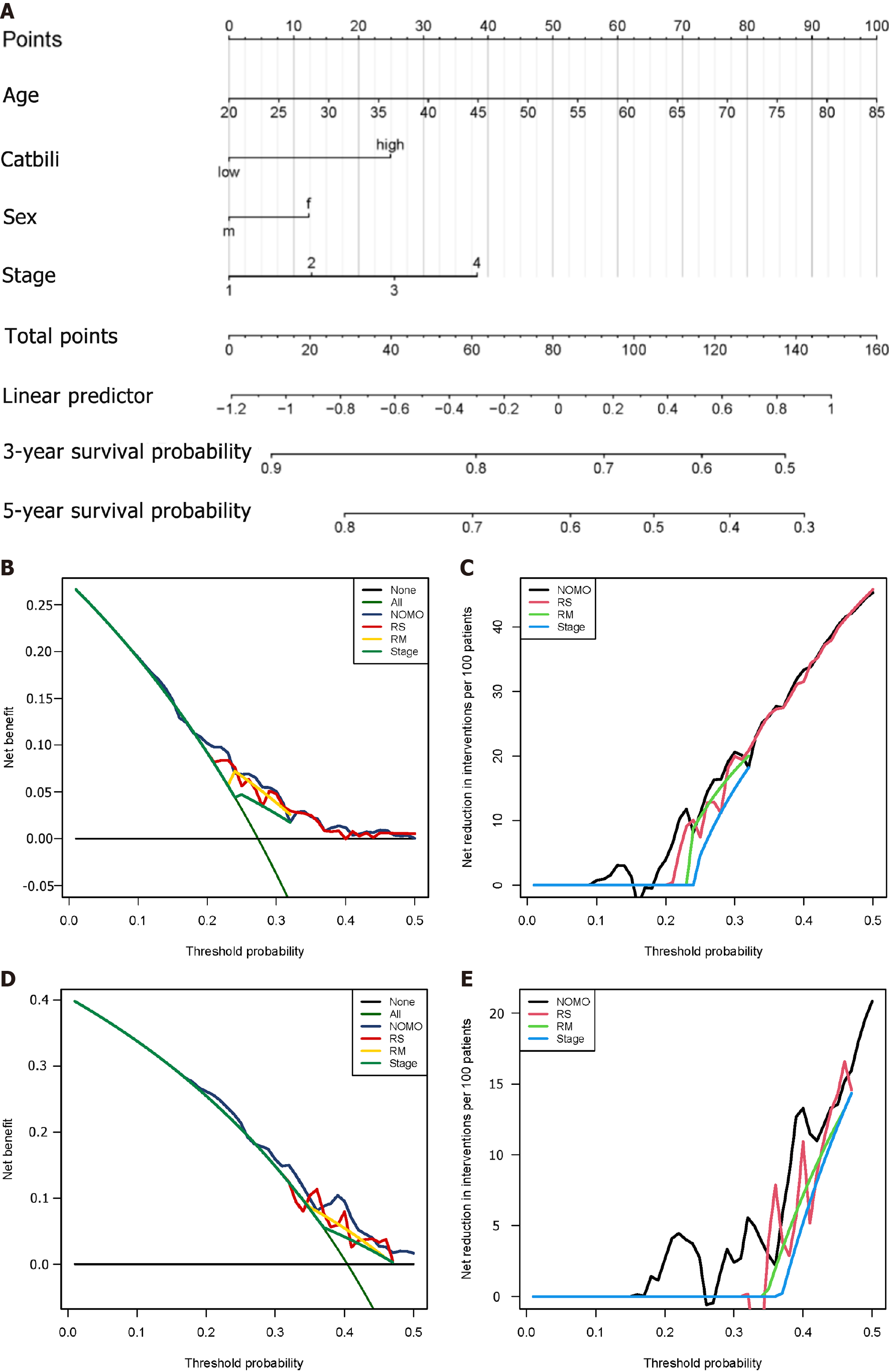
Figure 12 Construction of nomogram and efficiency evaluation.
A: Nomogram shows weighted point of each factor, including staging, gender, age, and risk score; B and C: The decision curve analysis of nomogram in training set for overall survival; D and E: The net reduction interventions per 100 patients could benefit based on the decision derived from different modules: Risk score (risk group classified by risk module, stage module) and NOMO (module combined by risk score, age, sex and stage).
- Citation: Zou JY, Huang YJ, He J, Tang ZX, Qin L. Glycolytic and fatty acid oxidation genes affect the treatment and prognosis of liver cancer. World J Clin Cases 2022; 10(15): 4737-4760
- URL: https://www.wjgnet.com/2307-8960/full/v10/i15/4737.htm
- DOI: https://dx.doi.org/10.12998/wjcc.v10.i15.4737


