Copyright
©The Author(s) 2024.
World J Gastrointest Oncol. Jul 15, 2024; 16(7): 3011-3031
Published online Jul 15, 2024. doi: 10.4251/wjgo.v16.i7.3011
Published online Jul 15, 2024. doi: 10.4251/wjgo.v16.i7.3011
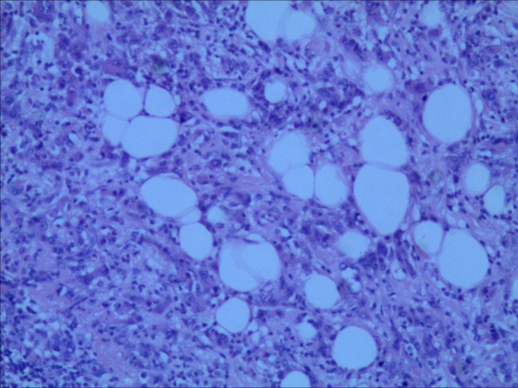
Figure 1 Typical tumor adipocyte infiltration in hematoxylin and eosin staining.
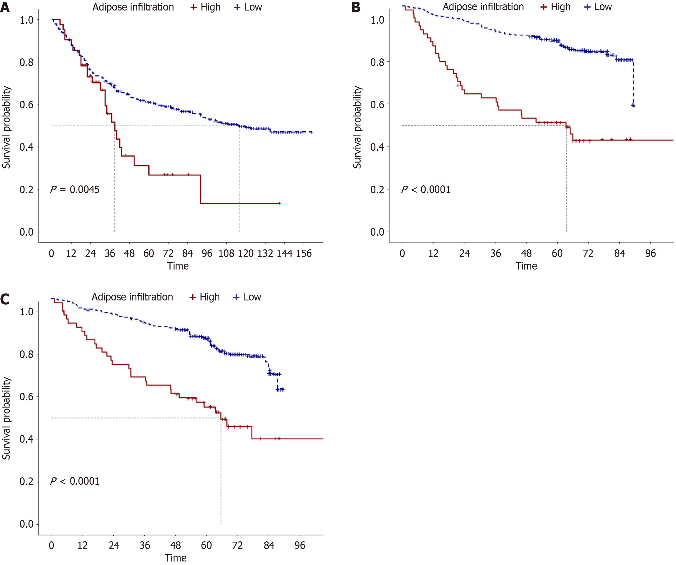
Figure 2 Kaplan-Meier survival analysis of patients with adipocyte infiltration.
A: Survival analysis in the training group; B: Survival analysis in the validation group; C: Disease-free survival analysis in the validation group.
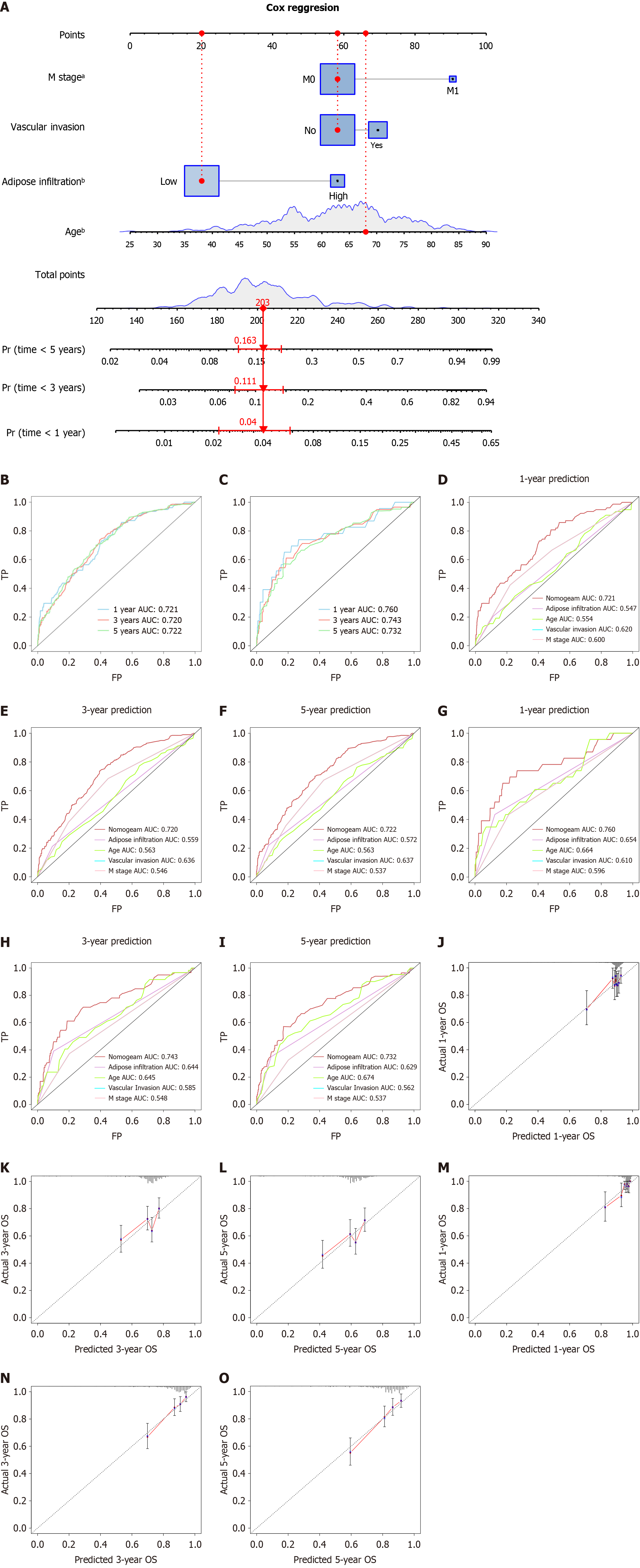
Figure 3 Construction and validation of the prognostic nomogram.
A: A prognostic nomogram for predicting the overall survival (OS) of gastric cancer patients at 1 year, 3 years, and 5 years; B: Time-dependent receiver operating characteristic curve analysis of the prognostic nomogram in the training set at 1 year, 3 years, and 5 years; C: Time-dependent receiver operating characteristic curve analysis of the prognostic nomogram in the validation set at 1 year, 3 years, and 5 years; D: Area under the curve (AUC) comparison of the nomogram with all independent factors in the training set at 1 year; E: AUC comparison of the nomogram with all independent factors in the training set at 3 years; F: AUC comparison of the nomogram with all independent factors in the training set at 5 years; G: AUC comparison of the nomogram with all independent factors in the validation set at 1 year; H: AUC comparison of the nomogram with all independent factors in the validation set at 3 years; I: AUC comparison of the nomogram with all independent factors in the validation set at 5 years; J: Calibration curves of the nomogram for 1 year in the training set; K: Calibration curves of the nomogram for 3 years in the training set; L: Calibration curves of the nomogram for 5 years in the training set; M: Calibration curves of the nomogram for 1 year in the validation set; N: Calibration curves of the nomogram for 3 years in the validation set; O: Calibration curves of the nomogram for 5 years in the validation set. aP < 0.01, bP < 0.0001. FP: False positive; TP: True positive.
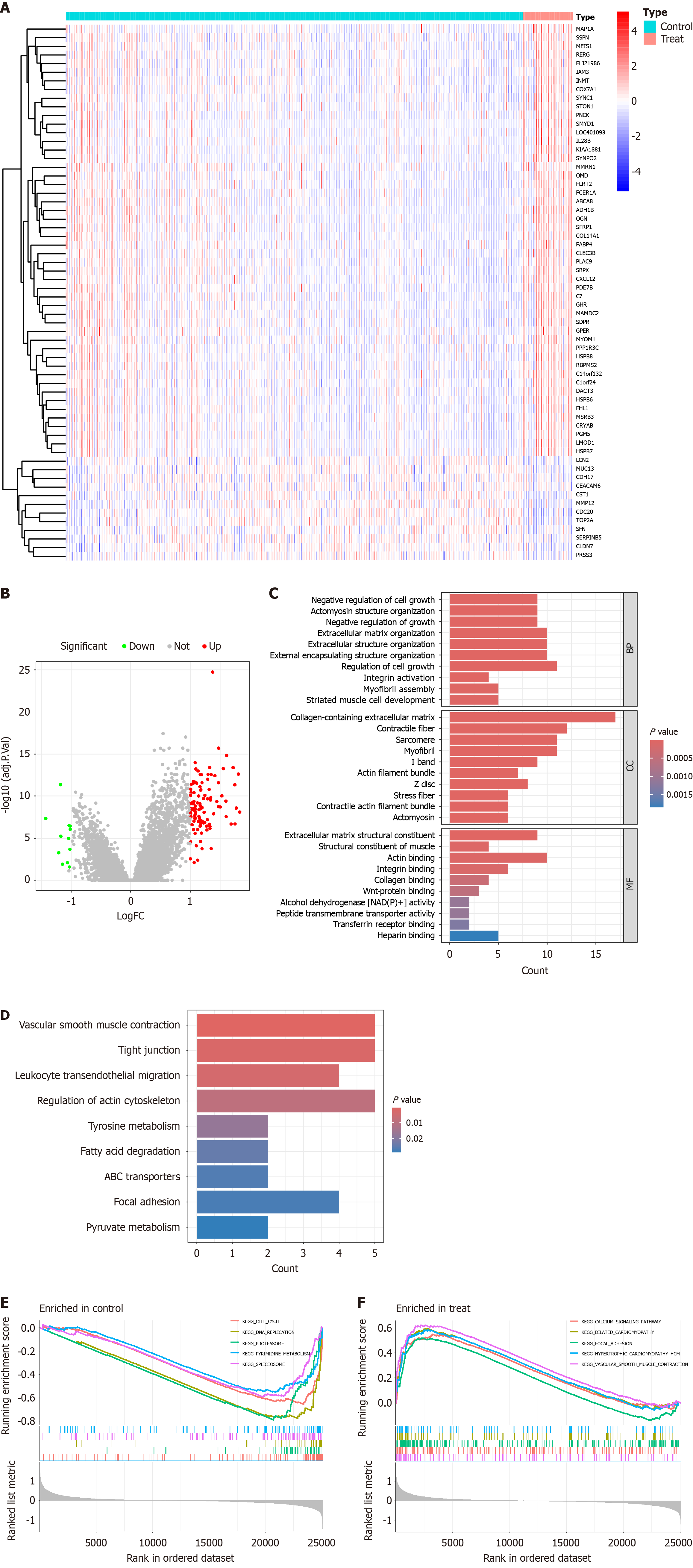
Figure 4 Analysis and functional enrichment of differentially expressed genes in the high and low expression groups of adipocytes.
A: Heatmap of differentially expressed genes (DEGs). Different colors represent the expression trends of genes in different tissues; B: Volcano plot of DEGs constructed using fold change values and P-adjust. Red dots represent upregulated DEGs, gray dots represent non-significant genes, and green dots represent downregulated DEGs; C: Bar plot of Gene Ontology enrichment analysis for DEGs; D: Bar plot of (KEGG) Encyclopedia of Genes and Genomes enrichment analysis for DEGs; E: Gene Set Enrichment Analysis enrichment analysis results for the high expression group of adipocytes; F: Gene Set Enrichment Analysis enrichment analysis results for the low expression group of adipocytes. BP: Biological process; CC: Cell compound; MF: Molecular function.
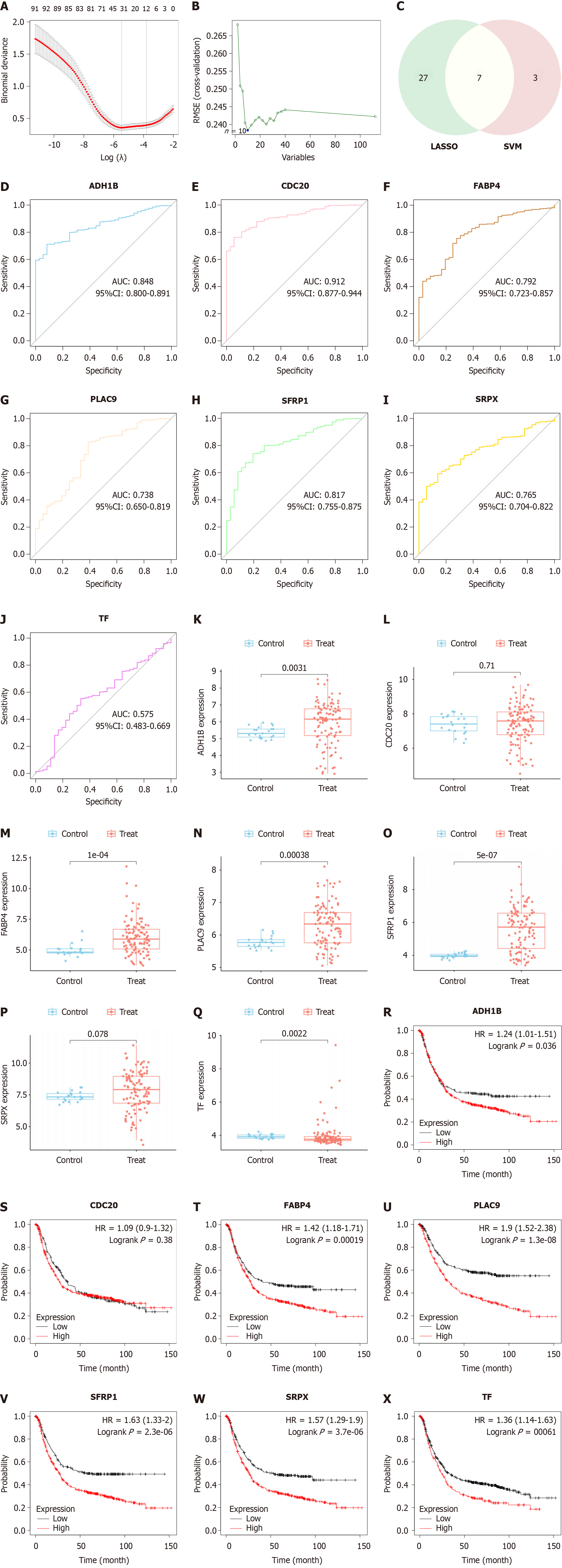
Figure 5 Selection of candidate diagnostic and prognostic biomarkers.
A: Logistic regression algorithm screened 34 diagnostic markers through the least absolute shrinkage and selection operator (LASSO); B: Support vector machine (SVM) recursive feature elimination algorithm identified 19 diagnostic markers; C: Venn diagram included seven genes; D-J: Expression levels of candidate diagnostic genes in GSE54129; K-Q: Expression levels of candidate diagnostic genes in TCGA; R-X: Kaplan-Meier survival analysis of candidate genes in gastric cancer. AUC: Area under the curve; CI: Confidence interval; HR: Hazard ratio.
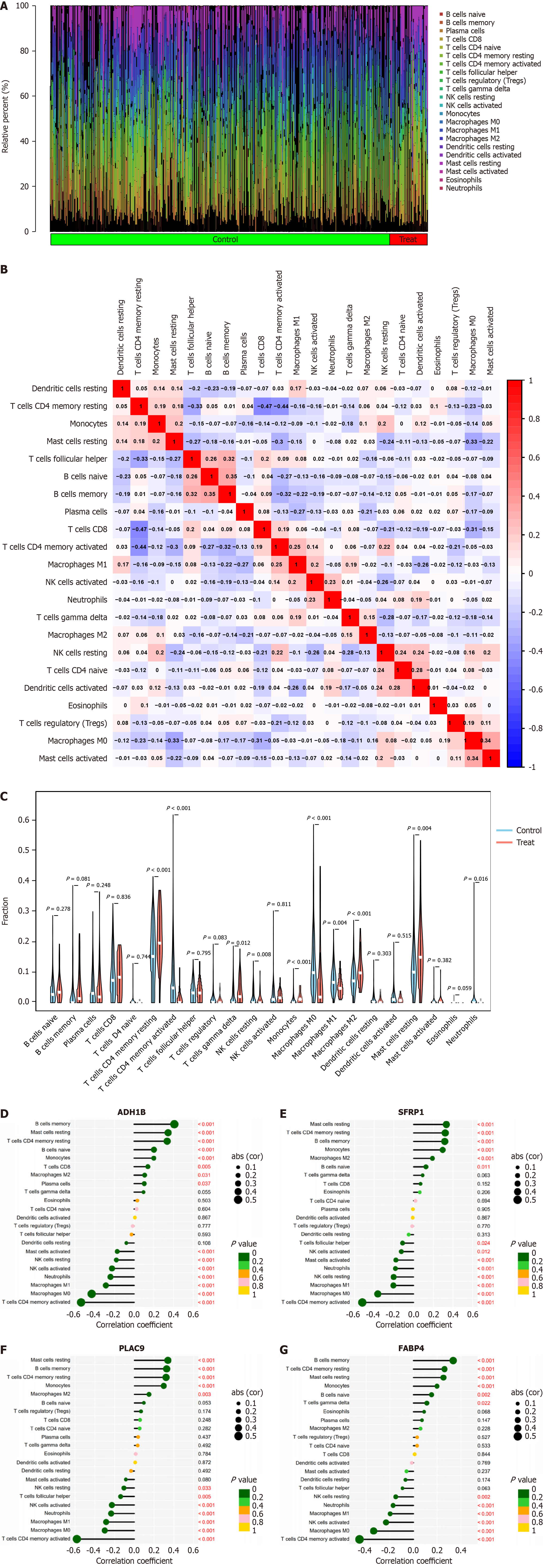
Figure 6 Assessment and visualization of immune cell infiltration between high and low expression of adipocytes in gastric cancer.
A: Proportion of infiltrating immune cells in samples with high and low expression of adipocytes in gastric cancer; B: Violin plots showed differential expression of 22 infiltrating immune cells between high and low expression of adipocytes in gastric cancer; C: Heatmap represented the 22 immune cell infiltrations between samples with high and low expression of adipocytes in gastric cancer. Blue and red colors indicate positive and negative correlations, respectively. The darker the color, the stronger the correlation; D: Lollipop plot showed the correlation between ADH1B expression levels and the infiltration of 22 immune cells; E: Lollipop plot illustrated the correlation between SFRP1 expression levels and the infiltration of 22 immune cells; F: Lollipop plot displayed the correlation between PLAC9 expression levels and the infiltration of 22 immune cells; G: Lollipop plot presented the correlation between FABP4 expression levels and the infiltration of 22 immune cells. NK: Natural killer.
- Citation: Shang JR, Zhu J, Bai L, Kulabiek D, Zhai XX, Zheng X, Qian J. Adipocytes impact on gastric cancer progression: Prognostic insights and molecular features. World J Gastrointest Oncol 2024; 16(7): 3011-3031
- URL: https://www.wjgnet.com/1948-5204/full/v16/i7/3011.htm
- DOI: https://dx.doi.org/10.4251/wjgo.v16.i7.3011


