Copyright
©The Author(s) 2024.
World J Clin Cases. Jul 16, 2024; 12(20): 4091-4107
Published online Jul 16, 2024. doi: 10.12998/wjcc.v12.i20.4091
Published online Jul 16, 2024. doi: 10.12998/wjcc.v12.i20.4091
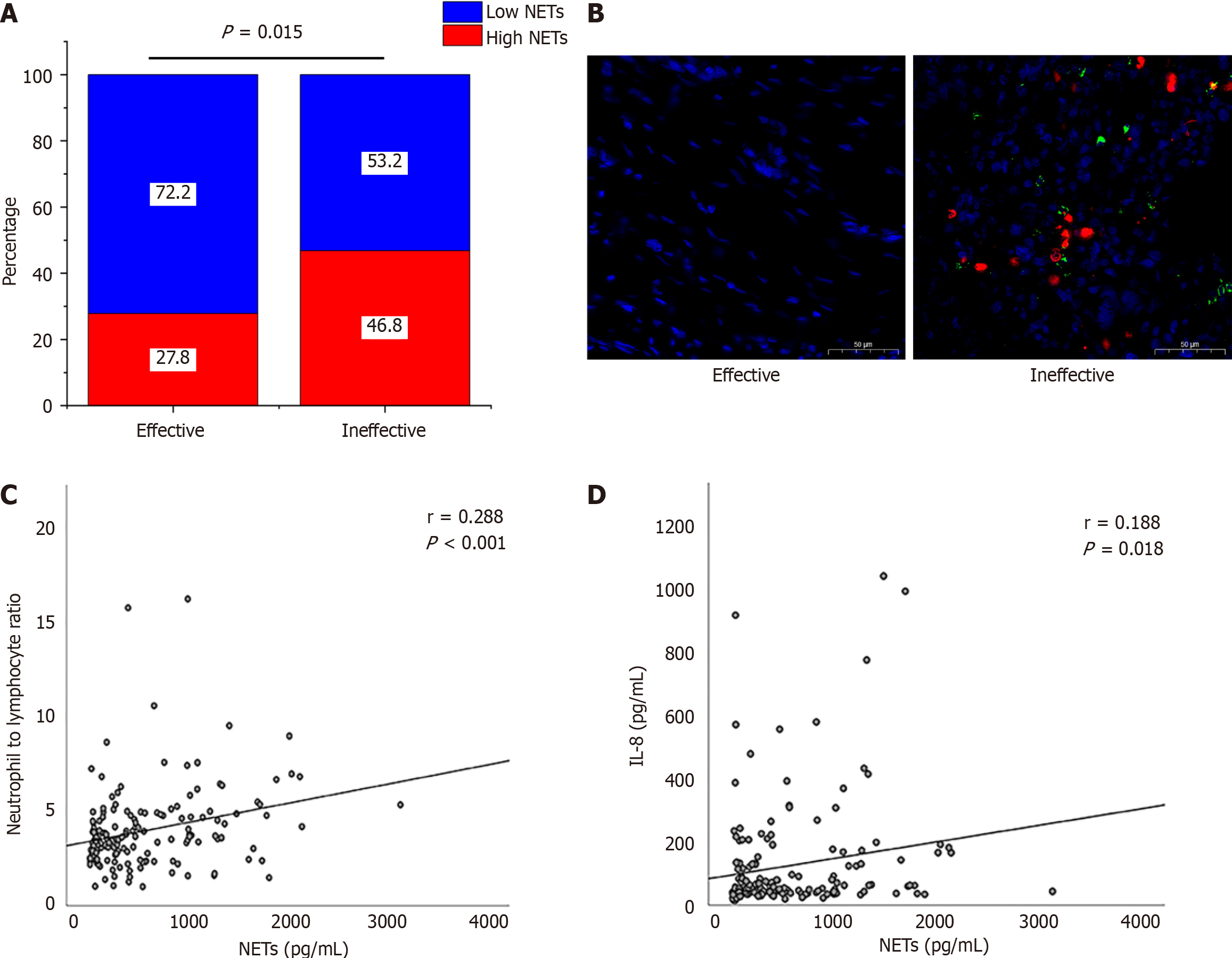
Figure 1 Correlation between neutrophil extracellular traps and chemoimmunotherapy efficacy.
A: Portion of high neutrophil extracellular traps (NETs) and low NETs in different efficacy group; B: NET formation in clinical samples. 4',6-diamidino-2-phenylindole (blue); MPO (red); cit-histone 3 (green); C: Levels of NETs positively correlated with the neutrophil-to-lymphocyte ratio; D: Levels of NETs positively correlated with the interleukin-8.
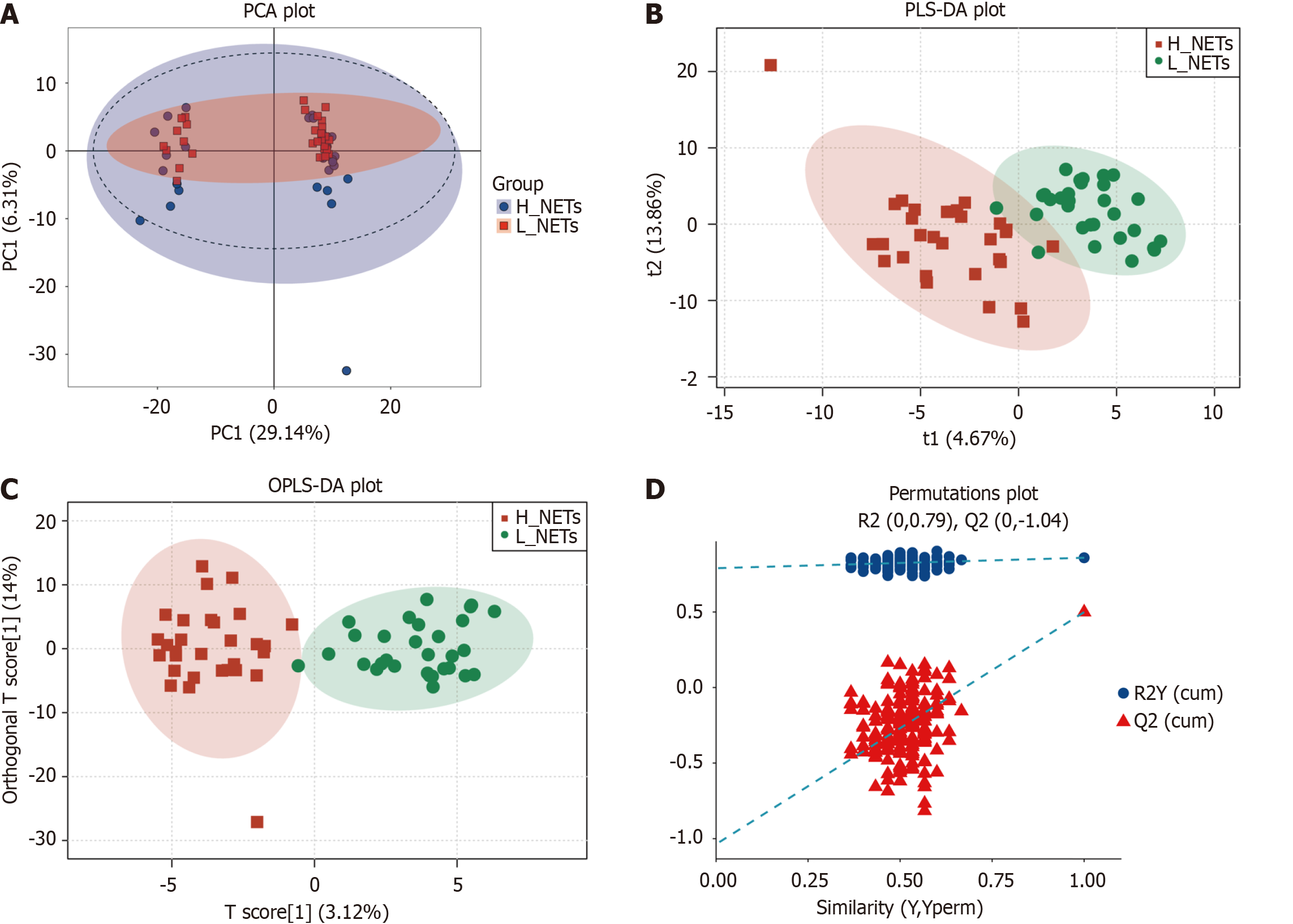
Figure 2 Metabolic profiling of the low neutrophil extracellular traps and high neutrophil extracellular traps groups.
A: Low neutrophil extracellular traps (L_NETs) and high neutrophil extracellular traps (H_NETs) groups based on principal component analysis; B: L_NETs and H_NETs groups based on partial least square discriminant analysis; C: L_NETs and H_NETs groups based on orthogonal partial least square discriminant analysis; D: L_NETs and H_NETs groups based on permutation plots.
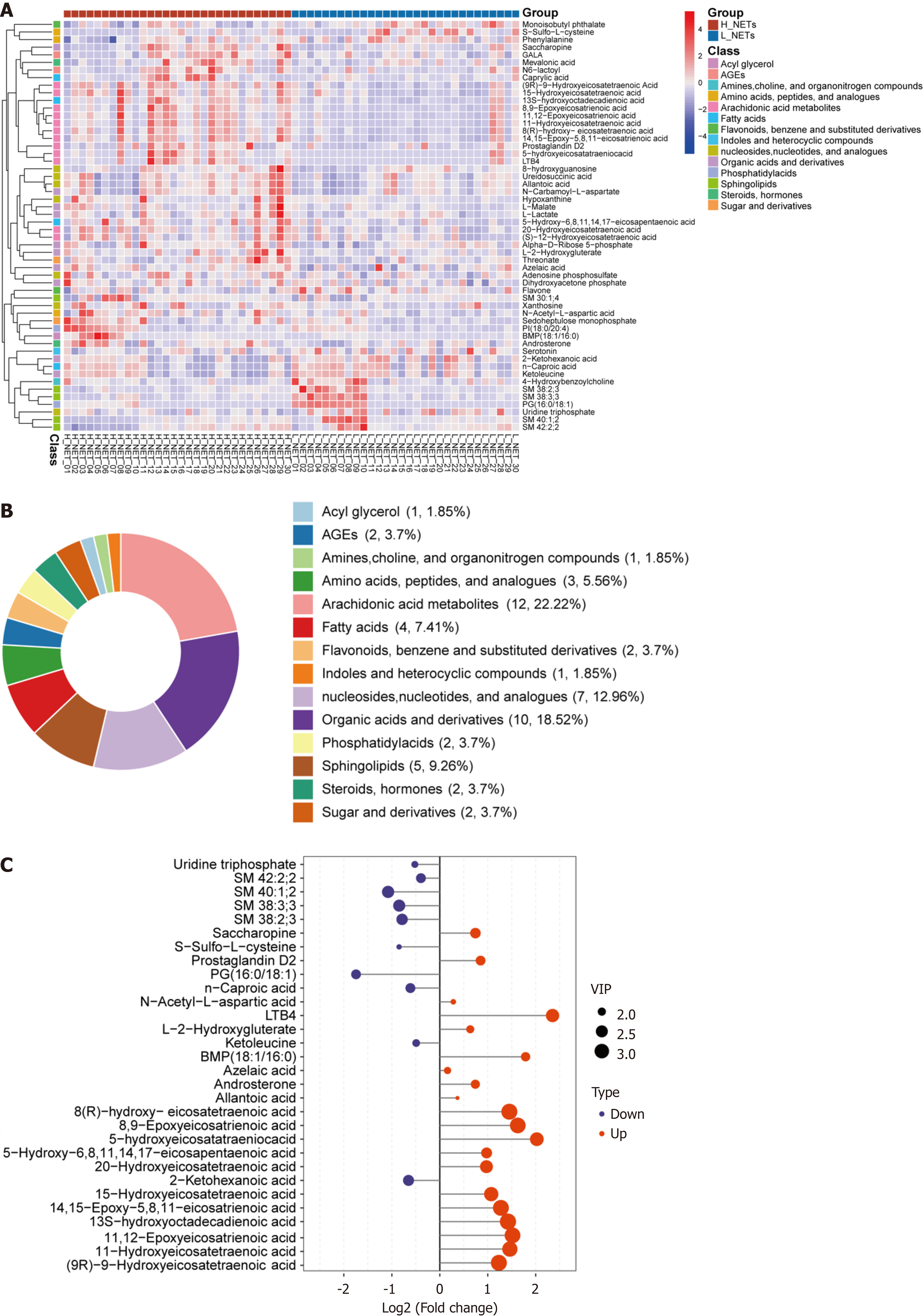
Figure 3 Identification of differential metabolites between the low neutrophil extracellular traps and high neutrophil extracellular traps groups.
A: Heatmap displaying 54 differential metabolites within the low neutrophil extracellular traps and high neutrophil extracellular traps groups; B: Classification, number, and proportion of differential metabolites; C: Variable importance in projection score plot of the top 30 differential metabolites ranked according to importance.
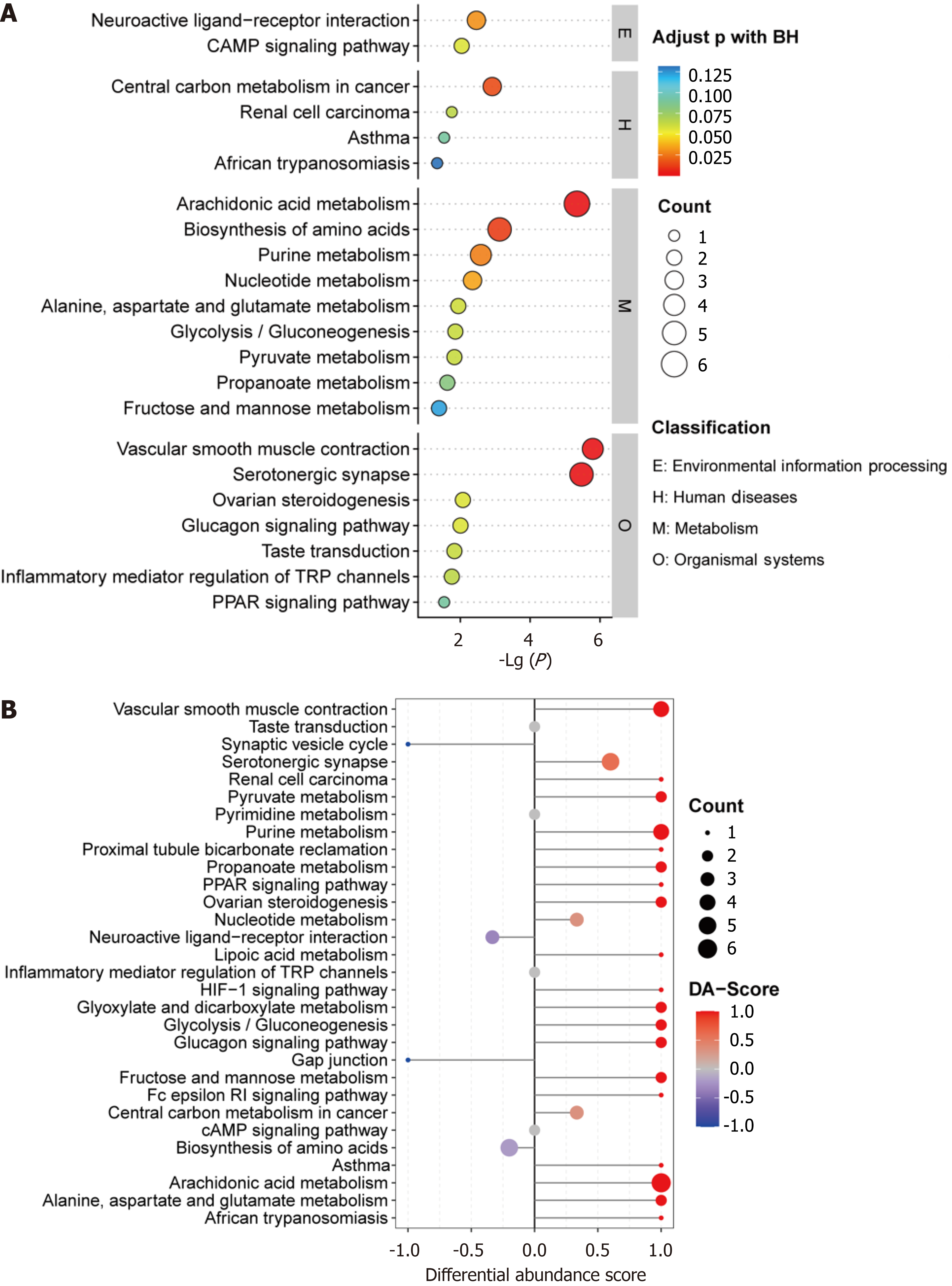
Figure 4 Kyoto Encyclopedia of Genes and Genomes pathway analysis of differential metabolites between the low neutrophil extracellular traps and high neutrophil extracellular traps groups.
A: Bubble map of enriched Kyoto Encyclopedia of Genes and Genomes pathways; B: Differential abundance score of Kyoto Encyclopedia of Genes and Genomes pathways.
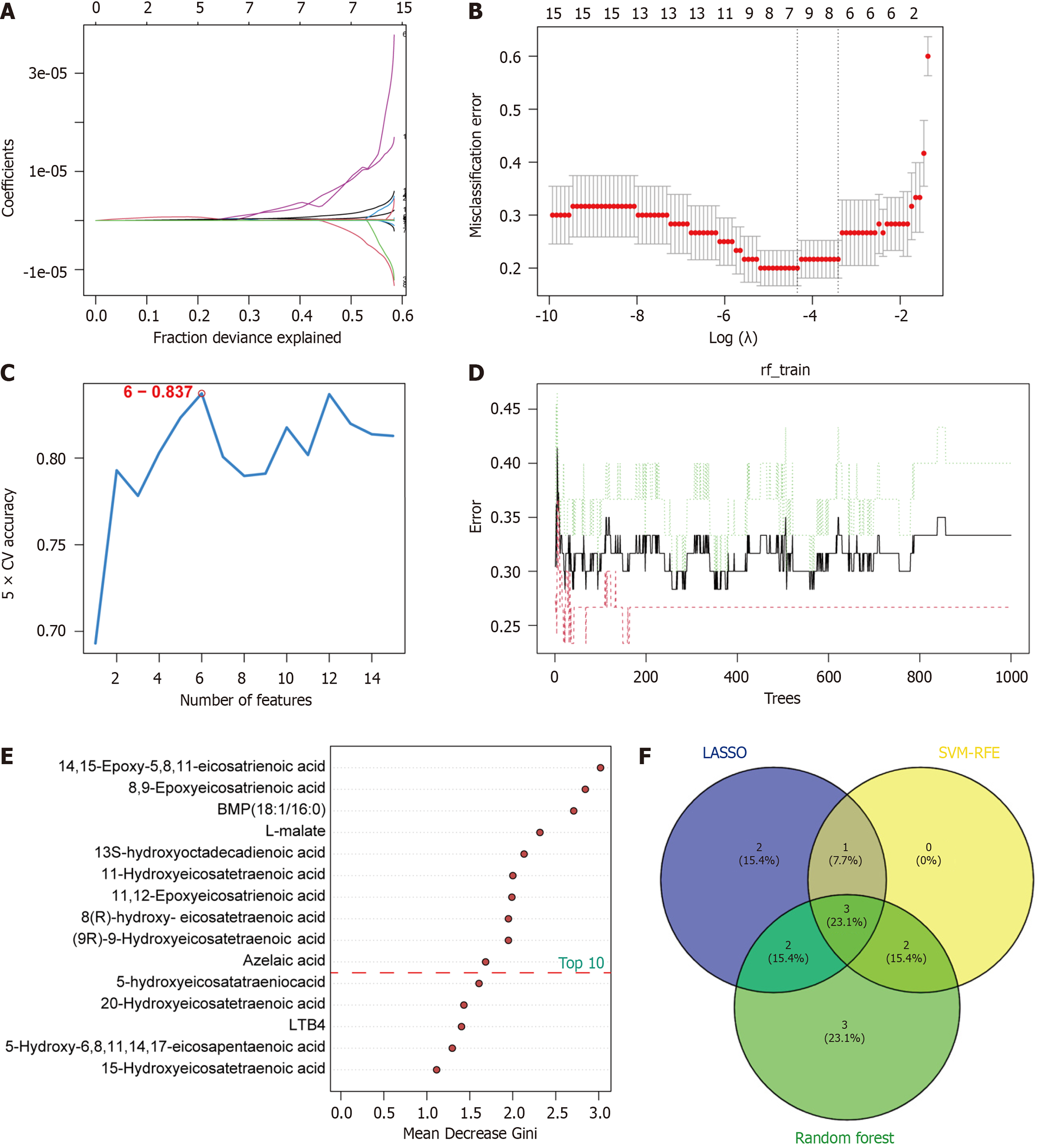
Figure 5 Screening of metabolic biomarkers via three machine learning algorithms.
A and B: Least absolute shrinkage and selection operator regression model showed eight metabolites corresponded to the lowest binominal deviation; C: Support vector machine-recursive feature elimination model showed six biomarkers with the highest accuracy; D and E: Top 10 metabolites ranked by mean decrease Gini in the random forest model; F: Venn diagram revealing three shared metabolites in three algorithms.
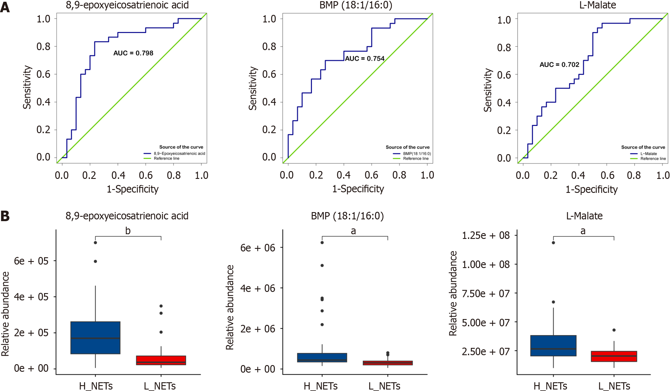
Figure 6 Receiver operating characteristic analysis and relative abundance of three metabolites.
A: Receiver operating characteristic analysis of three shared metabolites; B: Relative abundance level of three shared metabolites. aP < 0.01; bP < 0.001.
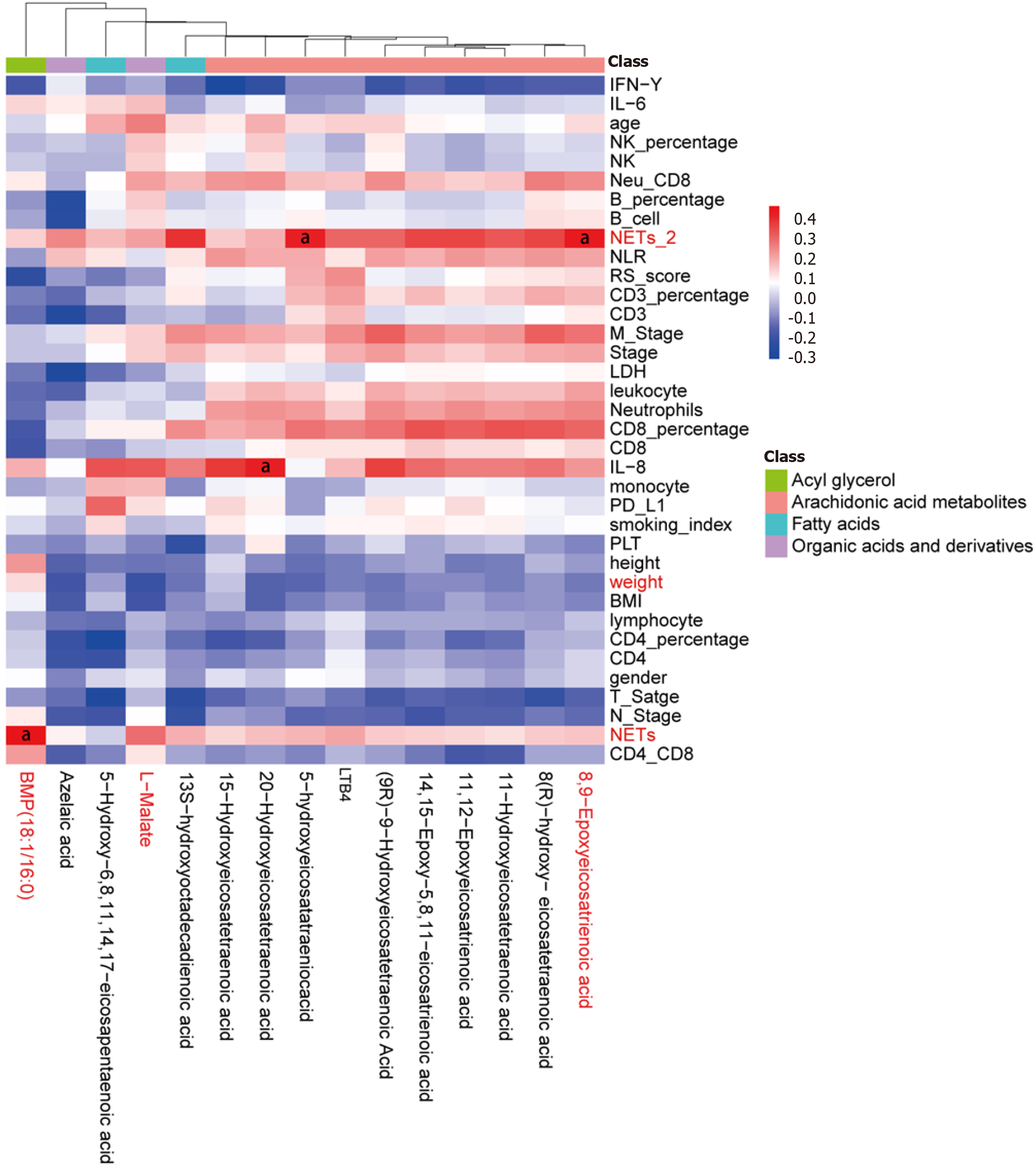
Figure 7 Heatmap displaying the correlation between differential metabolites and clinical characteristics.
aP < 0.05.
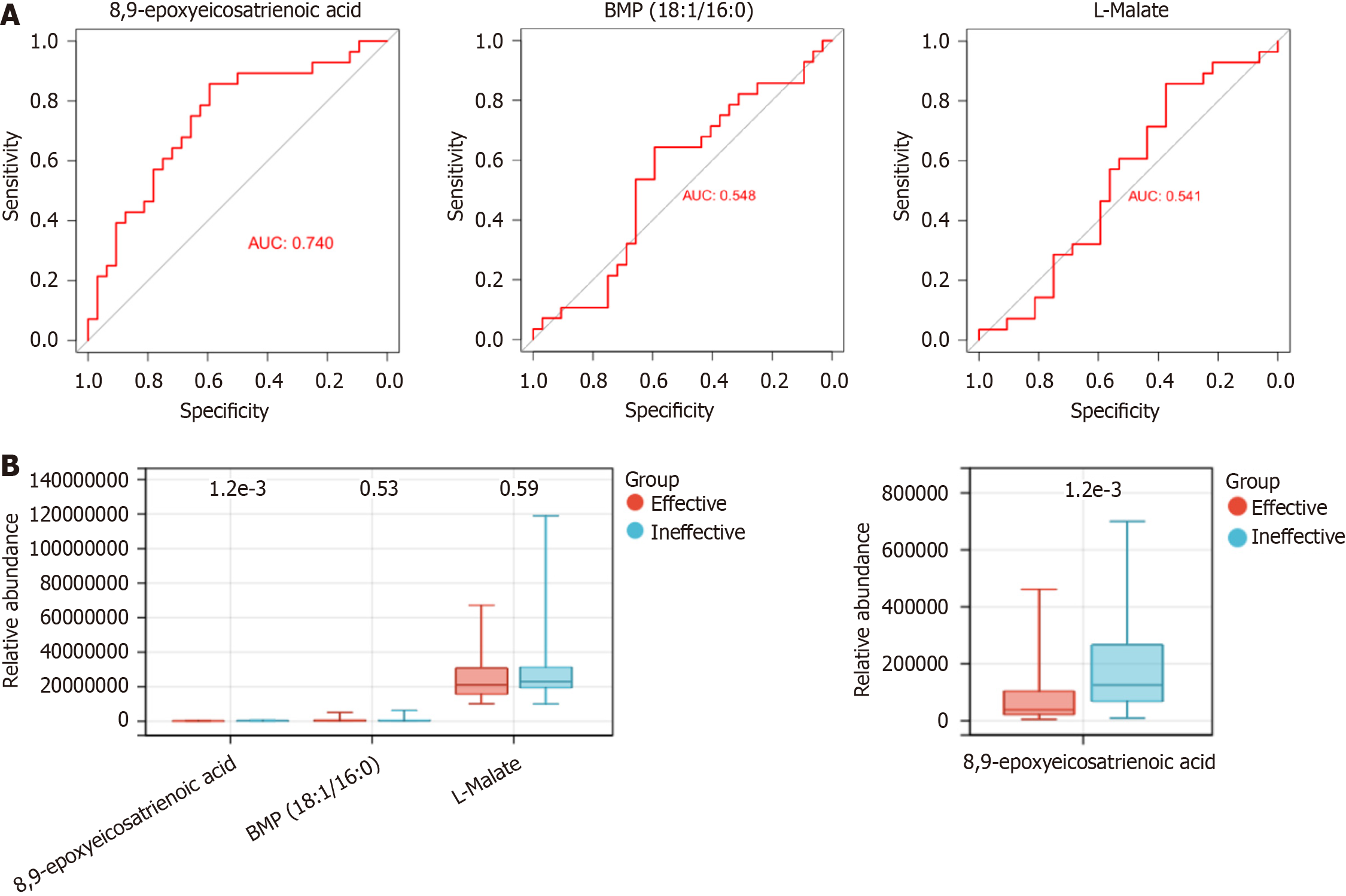
Figure 8 The predictive value of key metabolites in chemoimmunotherapy efficacy prediction.
A and B: Receiver operating characteristic analysis (A) and relative abundance level (B) of three shared metabolites.
- Citation: Li YN, Su JL, Tan SH, Chen XL, Cheng TL, Jiang Z, Luo YZ, Zhang LM. Machine learning based on metabolomics unveils neutrophil extracellular trap-related metabolic signatures in non-small cell lung cancer patients undergoing chemoimmunotherapy. World J Clin Cases 2024; 12(20): 4091-4107
- URL: https://www.wjgnet.com/2307-8960/full/v12/i20/4091.htm
- DOI: https://dx.doi.org/10.12998/wjcc.v12.i20.4091


