Copyright
©The Author(s) 2023.
World J Clin Cases. May 26, 2023; 11(15): 3444-3456
Published online May 26, 2023. doi: 10.12998/wjcc.v11.i15.3444
Published online May 26, 2023. doi: 10.12998/wjcc.v11.i15.3444
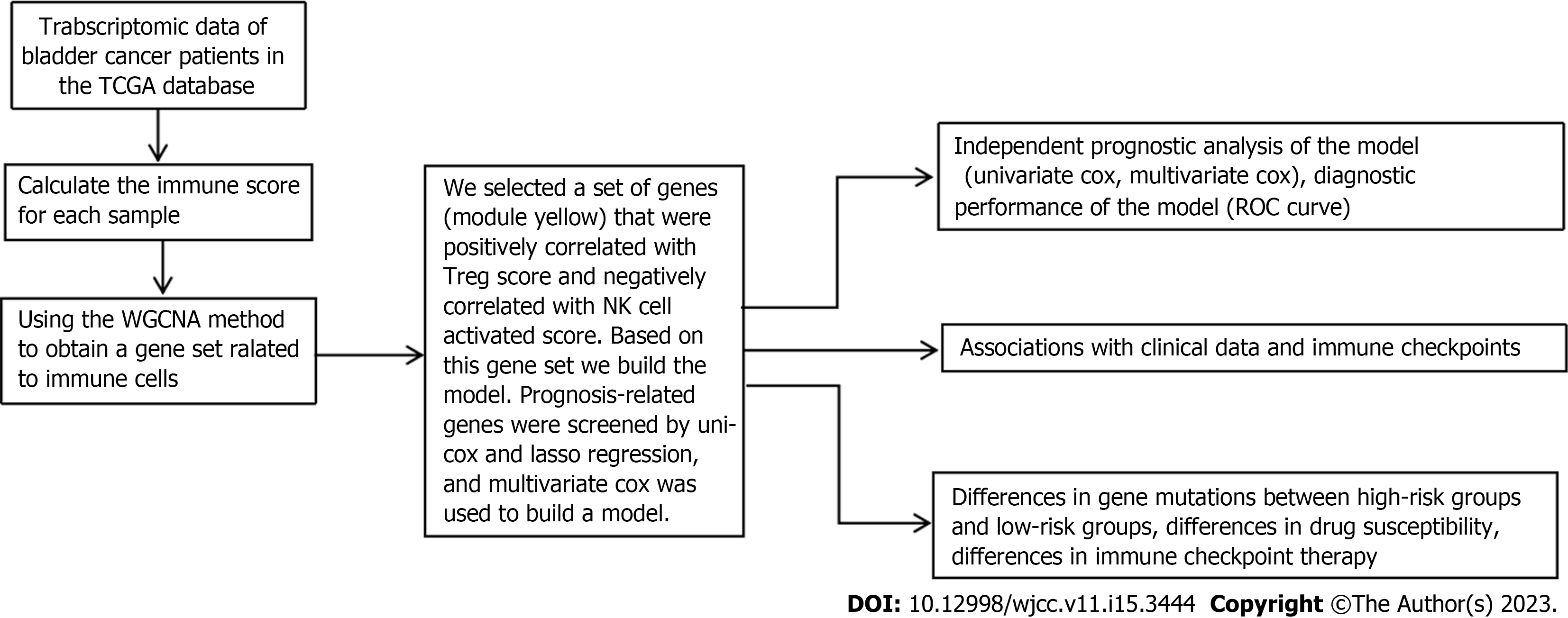
Figure 1 The flowchart of our study.
TCGA: The Cancer Genome Atlas; NK: Natural killer; WGCNA: Weighted gene coexpression network analysis.
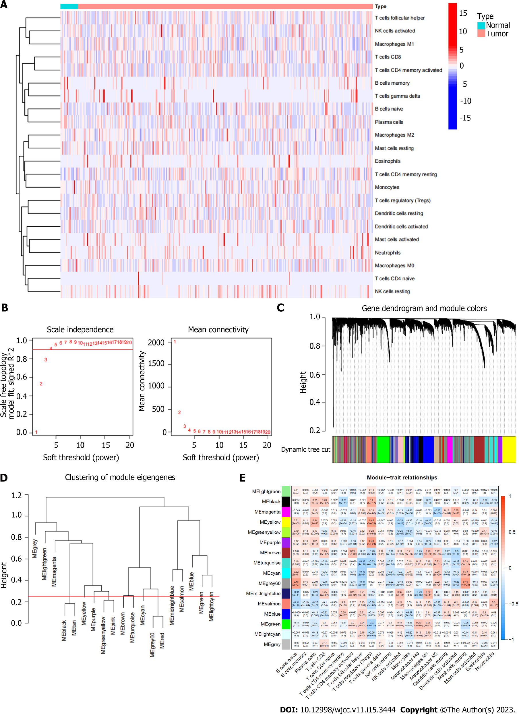
Figure 2 Immune infiltration status of TCGA database samples and gene sets related to immune cell infiltration.
A: Heatmap of the distribution of immune cell infiltration in each sample; B: The scale independence and the mean connectivity; C: Hierarchical clustering was used to obtain coexpressive gene modules; Different gene modules are assigned to different colors; D: Clustering diagram of each gene module; E: Clustering diagram of each gene module.
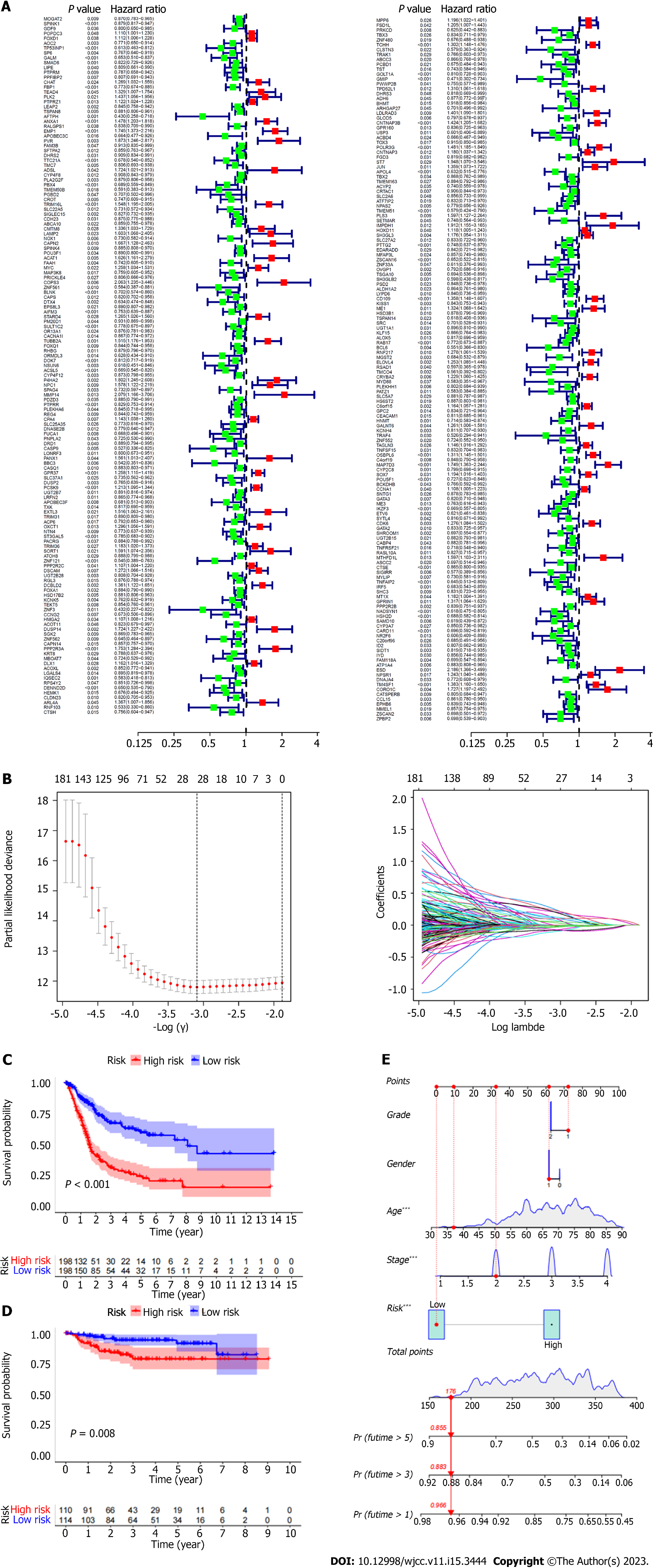
Figure 3 Screening of survival related gene sets (based on immune infiltration).
A: Screening of prognostic genes by univariate Cox; B: Least absolute shrinkage and selection operator (LASSO) regression model; C: Kaplan Meier curve shows that in The Cancer Immunome Atlas (TCGA) database, the prognosis of patients between high and low risk groups is different (Training group); D: Kaplan Meier curve shows the difference in prognosis between high and low risk groups in geo database (Test group); E: Nomograms were used to measure patient survival in The Cancer Immunome Atlas database.
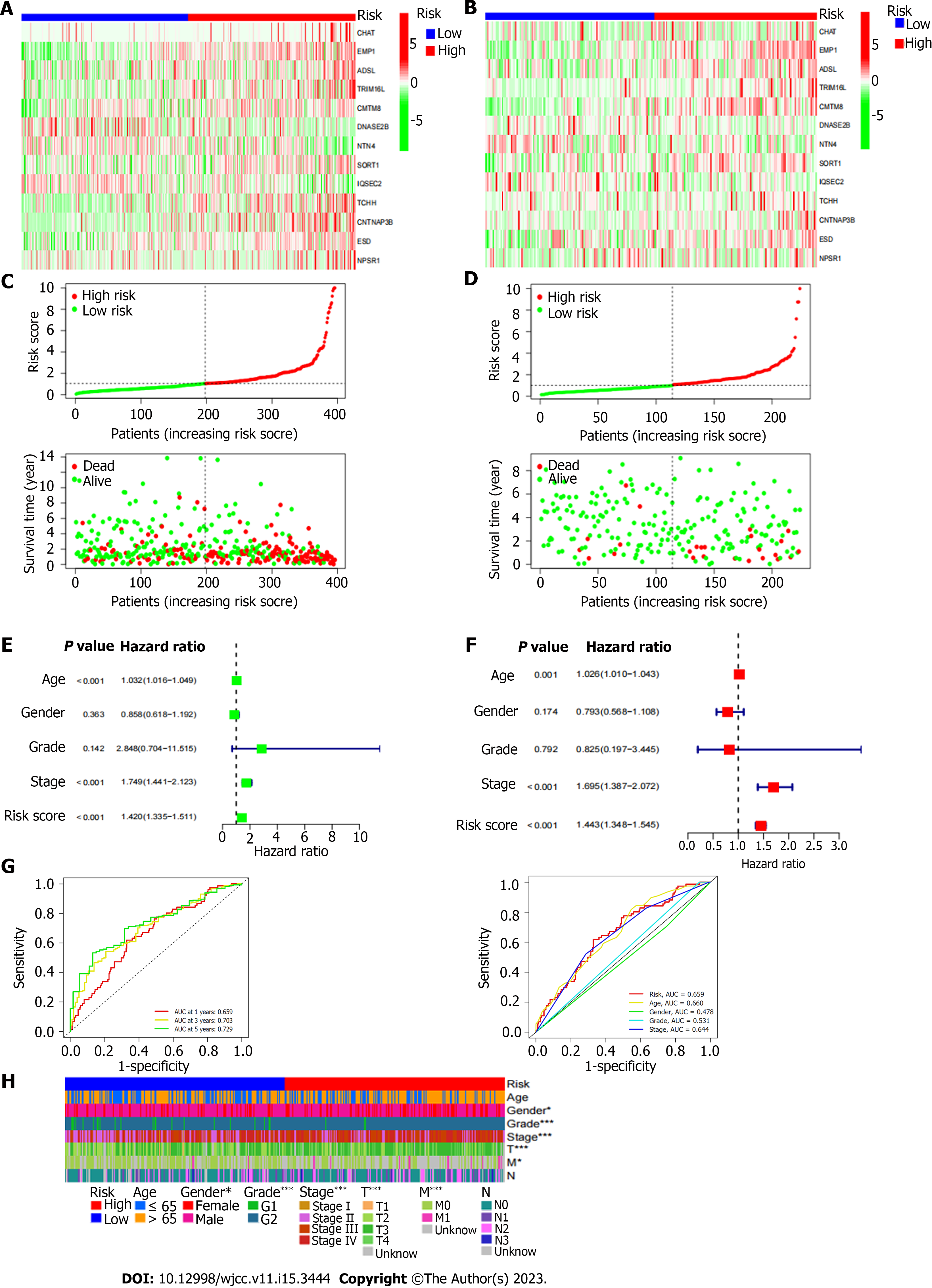
Figure 4 Differences in prognosis between high-risk and low-risk patients.
A: Heat map of gene expression differences between high and low risk groups in The Cancer Genome Atlas database; B: Heat map of gene expression differences between high and low risk groups in Gene Expression Omnibus database; E: The ROC curve of the risk score and clinicopathological variables; F: Distribution heat map of model genes and clinicopathological variables; G: The ROC curve of the risk score and clinicopathological variables; H: Distribution heat map of model genes and clinicopathological variables.
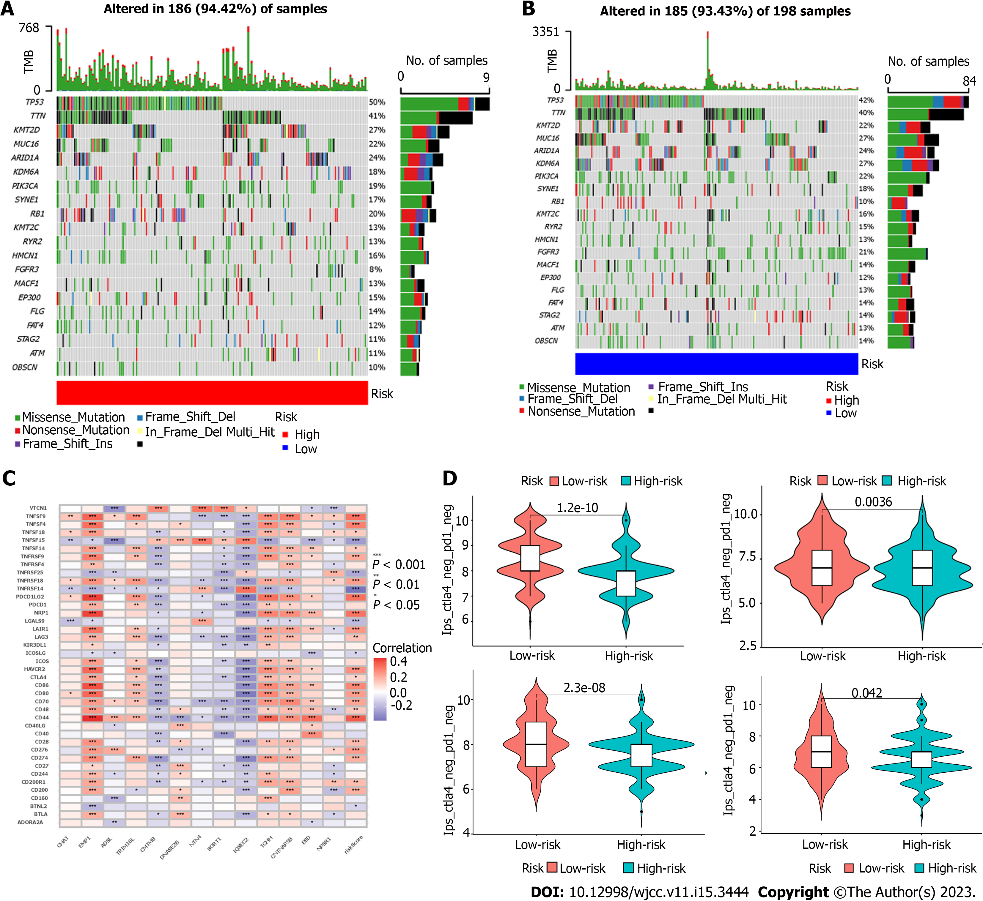
Figure 5 Different treatment-related characteristics of patients in the high-risk and low-risk groups.
A and B: Significant differences in mutation frequency of gene between the high risk group and the low risk group; C: Correlation between genes, riskscore and immune checkpoints in the model; D: The Estimation of the immunophenoscore in Immunotherapy Response.
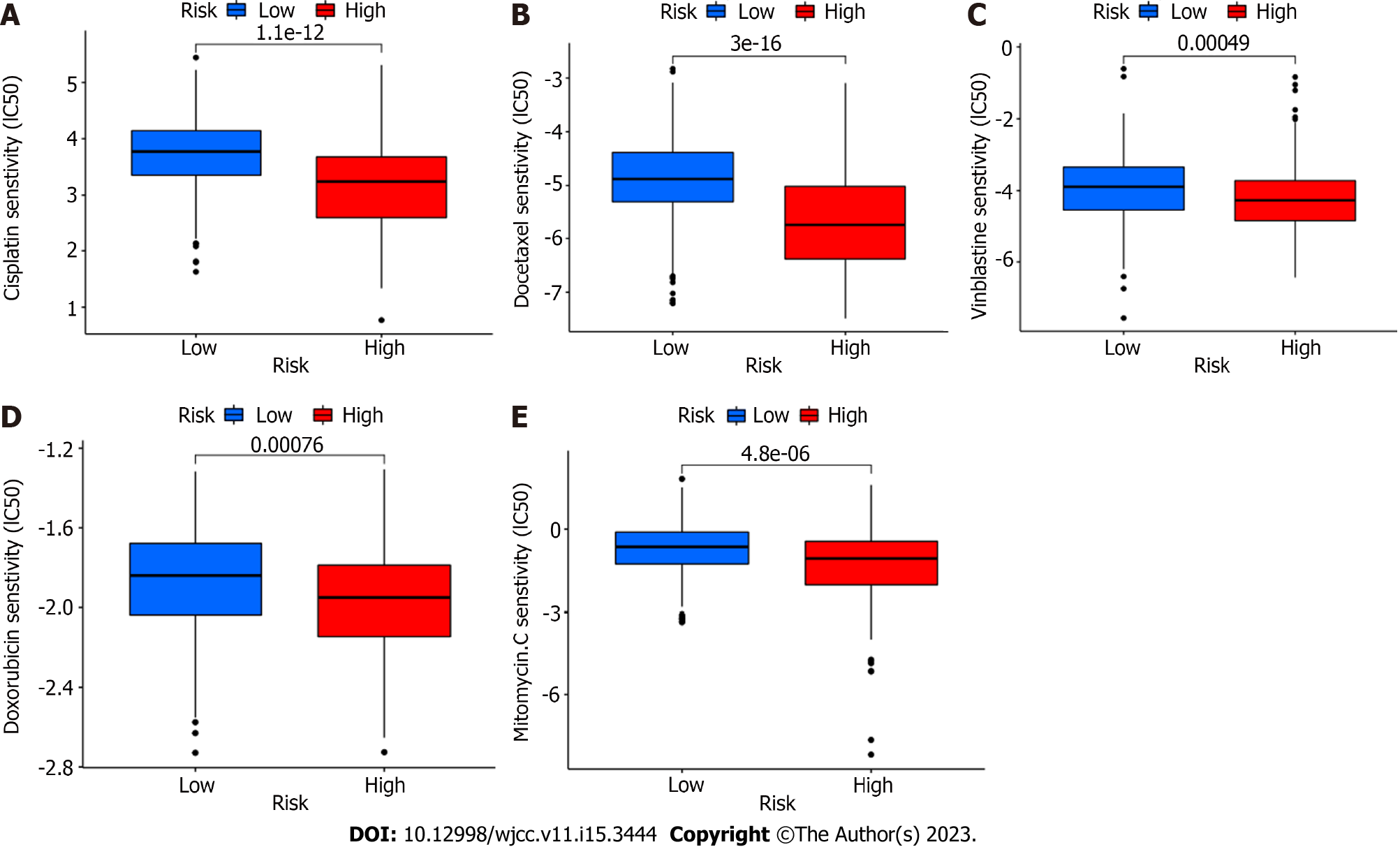
Figure 6 Differences in IC50 values of different drugs between high and low risk groups.
A: IC50 values of cisplatin between high and low risk groups; B: IC50 values of Docetaxel between high and low risk groups; C: IC50 values of vinblastine between high and low risk groups; D: IC50 values of Doxorubicin between high and low risk groups; E: IC50 values of Mitormycin. C between high and low risk groups.
- Citation: Yang YJ, Xu XQ, Zhang YC, Hu PC, Yang WX. Establishment of a prognostic model related to tregs and natural killer cells infiltration in bladder cancer. World J Clin Cases 2023; 11(15): 3444-3456
- URL: https://www.wjgnet.com/2307-8960/full/v11/i15/3444.htm
- DOI: https://dx.doi.org/10.12998/wjcc.v11.i15.3444


