Copyright
©The Author(s) 2022.
World J Clin Cases. Mar 6, 2022; 10(7): 2115-2126
Published online Mar 6, 2022. doi: 10.12998/wjcc.v10.i7.2115
Published online Mar 6, 2022. doi: 10.12998/wjcc.v10.i7.2115
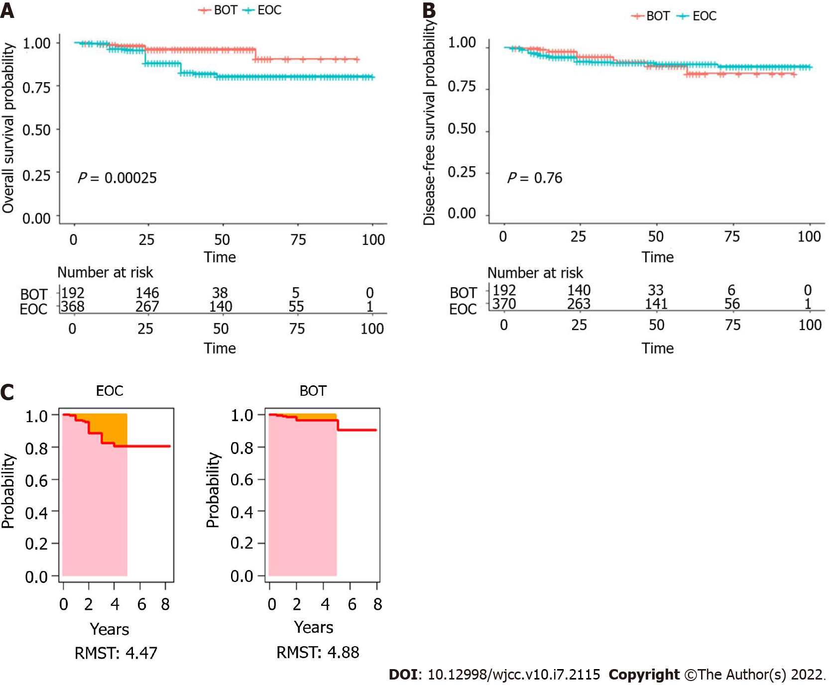
Figure 1 Survival outcome before propensity score matching for patients with borderline ovarian tumors and epithelial ovarian cancer.
A: Kaplan–Meier curves for overall survival; B: Kaplan–Meier curves for disease-free survival; C: Survival curves of restricted mean survival time. EOC: Epithelial ovarian cancer; BOT: Borderline ovarian tumor; RMST: Restricted mean survival time.
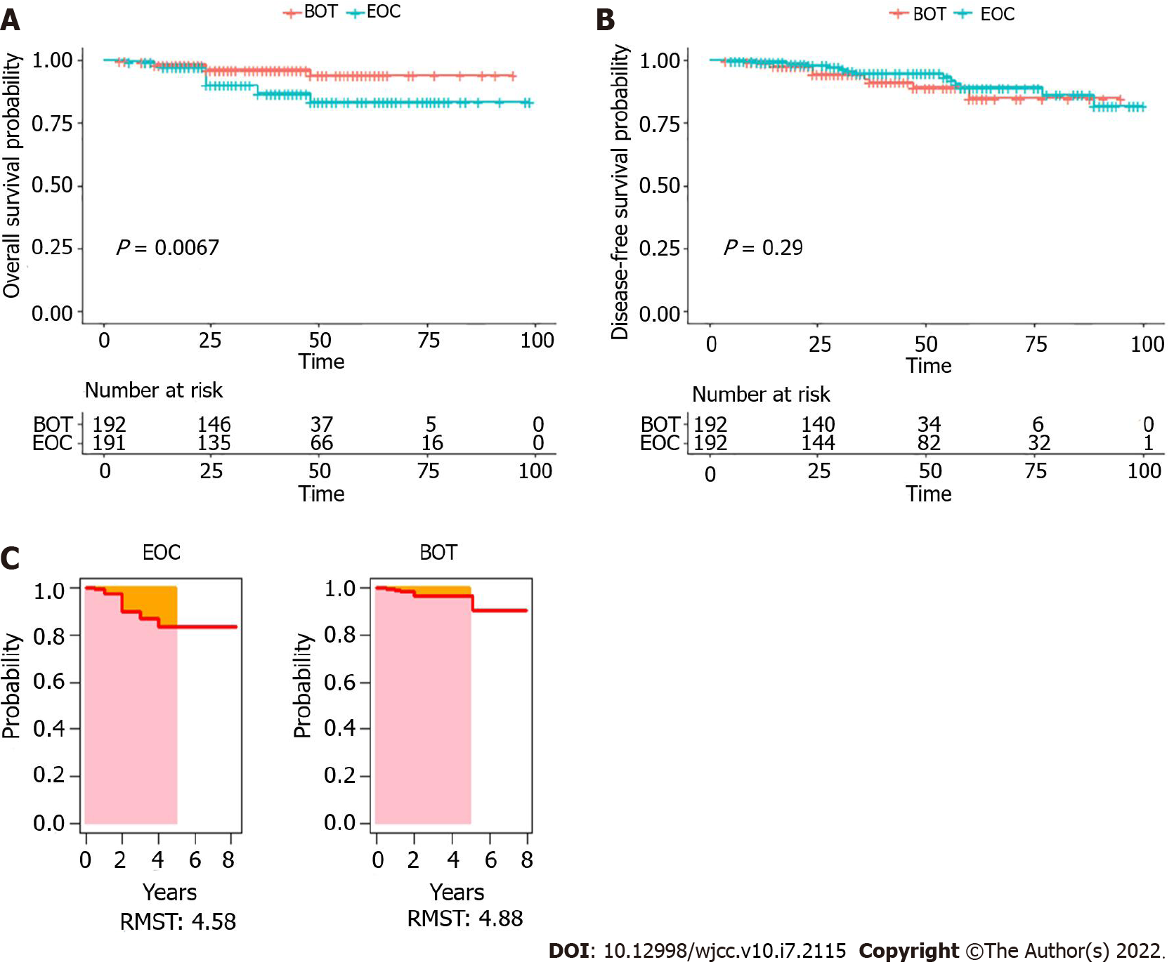
Figure 2 Survival outcome after propensity score matching for patients with borderline ovarian tumors and epithelial ovarian cancer.
A: Kaplan–Meier curves for overall survival; B: Kaplan–Meier curves for disease-free survival; C: Survival curves of restricted mean survival time. EOC: Epithelial ovarian cancer; BOT: Borderline ovarian tumor; RMST: Restricted mean survival time.
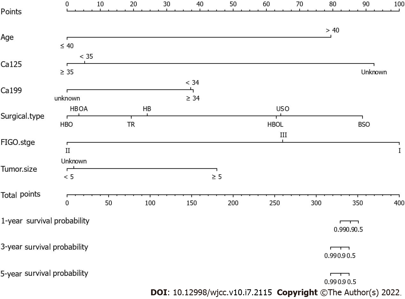
Figure 3 A nomogram predicting the 1-, 3-, and 5-year overall survival of patients with borderline ovarian tumors by points identified on the points scale for each variable.
The total points projected on the borderline ovarian tumors bottom scales determine the likelihood of 1-, 3-, and 5-year survival. BSO: bilateral salpingo-oophorectomy; FIGO: Federation international of gynecology and obstetrics; HBO: total hysterectomy with bilateral adnexectomy and omentectomy; HBOL: total hysterectomy with bilateral adnexectomy, omentectomy, and lymph node dissection; TR: tumor resection.
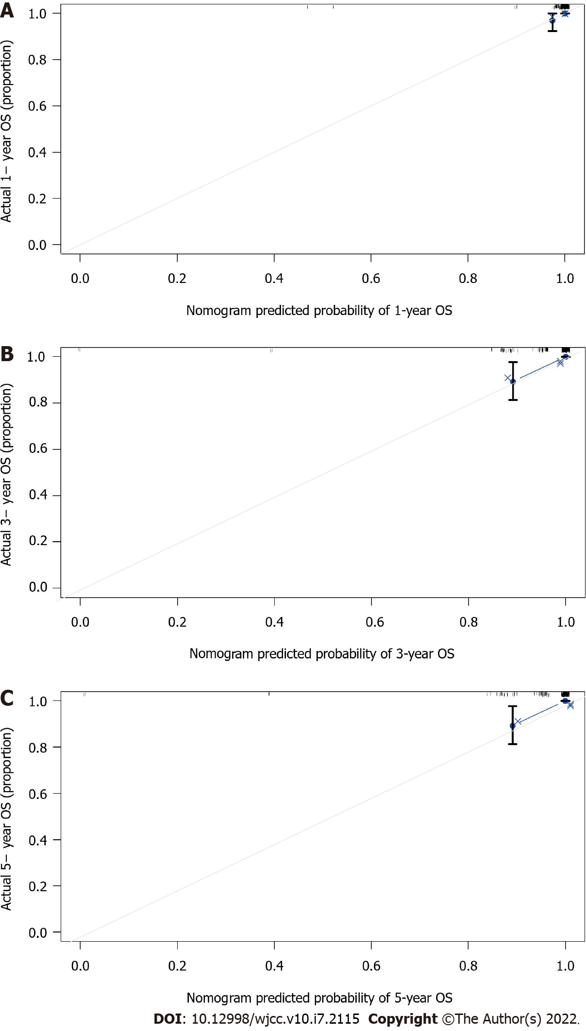
Figure 4 Calibration curves of the nomogram.
A: the 1-year overall survival (OS) nomogram calibration curves in patients with borderline ovarian tumors (BOTs); B: the 3-year OS nomogram calibration curves in patients with BOTs; C: the 5-year OS nomogram calibration curves in patients with BOTs. The x-axis indicates the predicted survival probability, and the y-axis indicates the actual survival probability. The 45-degree line (gray dashed line) shows the performance of the ideal nomogram, and the blue dashed line demonstrates the actual nomogram.
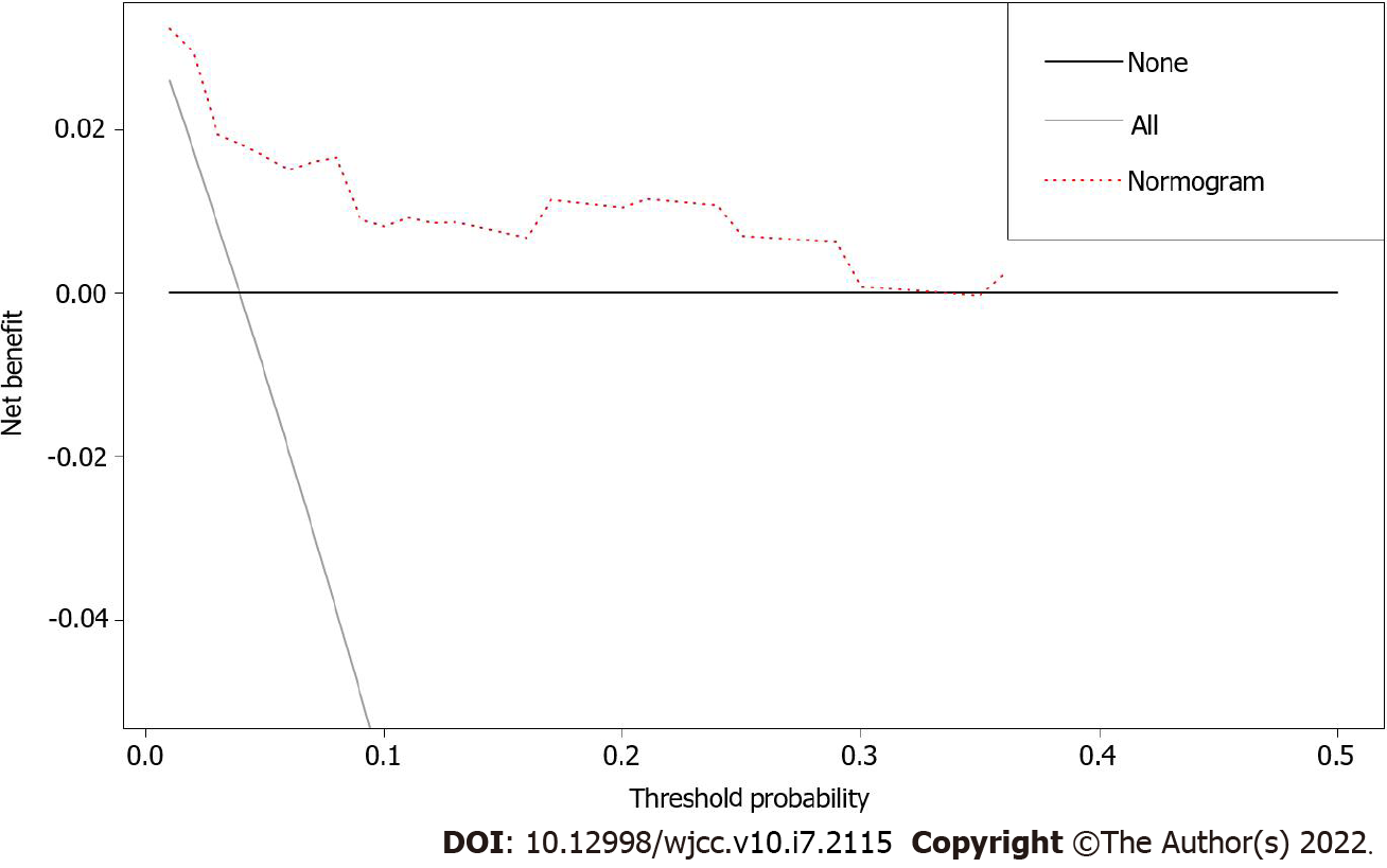
Figure 5 Decision curve analysis of the nomogram predicting overall survival.
The x-axis assumes the threshold probability, and the y-axis measures the net benefit. The black line represents that none of the patients died, whereas the gray line indicates that all patients died at a specific threshold probability. The red dashed line shows the net benefit of using the nomogram.
- Citation: Gong XQ, Zhang Y. Develop a nomogram to predict overall survival of patients with borderline ovarian tumors. World J Clin Cases 2022; 10(7): 2115-2126
- URL: https://www.wjgnet.com/2307-8960/full/v10/i7/2115.htm
- DOI: https://dx.doi.org/10.12998/wjcc.v10.i7.2115


