Copyright
©The Author(s) 2024.
World J Transplant. Sep 18, 2024; 14(3): 93561
Published online Sep 18, 2024. doi: 10.5500/wjt.v14.i3.93561
Published online Sep 18, 2024. doi: 10.5500/wjt.v14.i3.93561
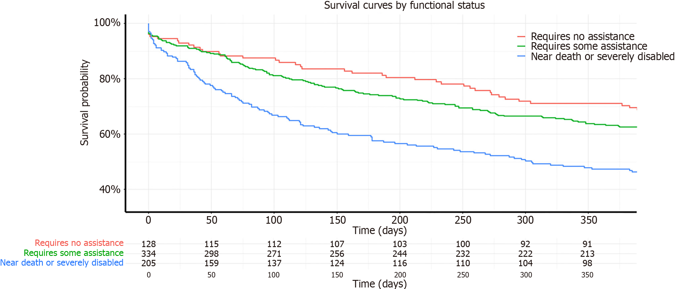
Figure 1 Survival curves by functional status at one year.
Kaplan-Meier survival curves illustrating the survival probability of up to one year of follow up for recipients categorized by their Karnofsky Performance Status functional status at the time of transplant. The categories are color-coded as follows: Red for "Requires No Assistance". Green for "Requires Some Assistance" and Blue for "Near Death or Severely Disabled". Numbers at risk at various time points are displayed below the x-axis for each category.
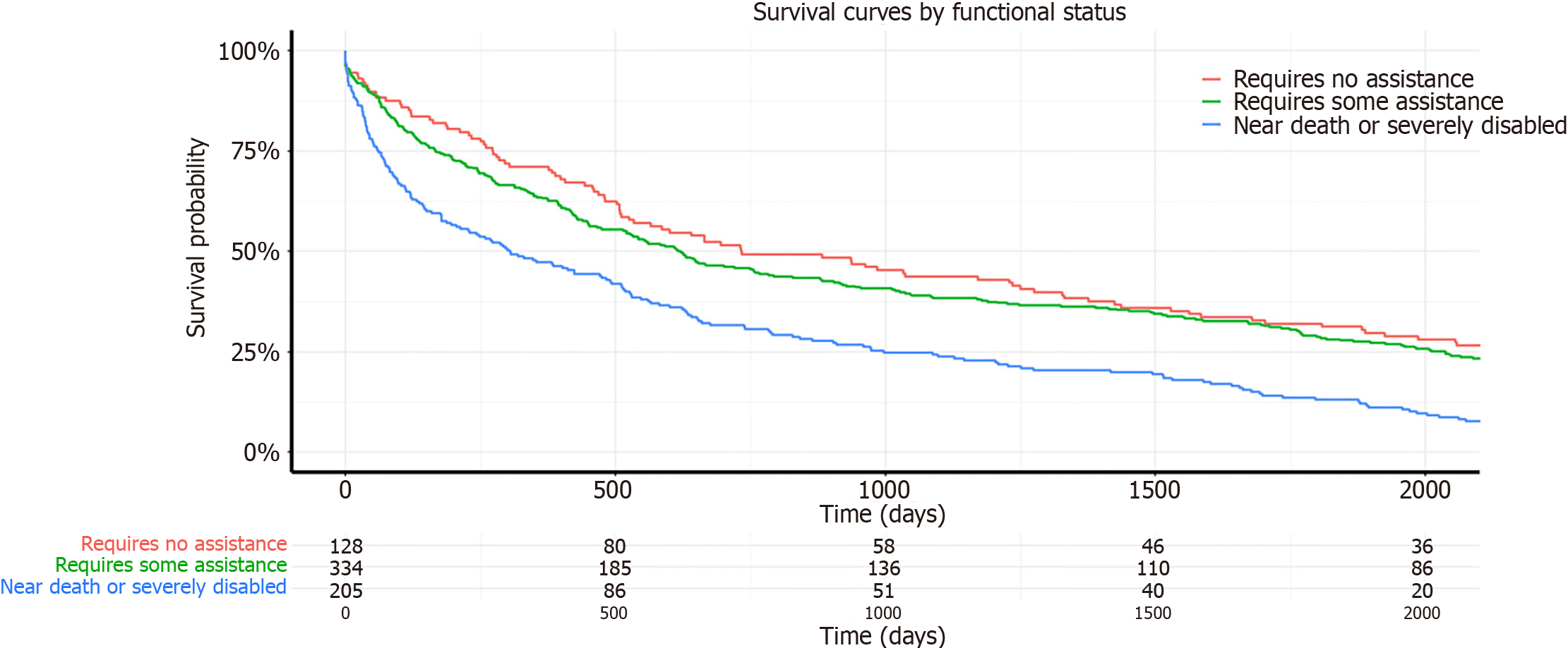
Figure 2 Survival curves by functional status at five years.
Kaplan-Meier survival curves illustrating the survival probability of up to five years of follow up for recipients categorized by their Karnofsky Performance Status functional status at the time of transplant. The categories are color-coded as follows: Red for "Requires No Assistance". Green for "Requires Some Assistance", and Blue for "Near Death or Severely Disabled". Numbers at risk at various time points are displayed below the x-axis for each category.
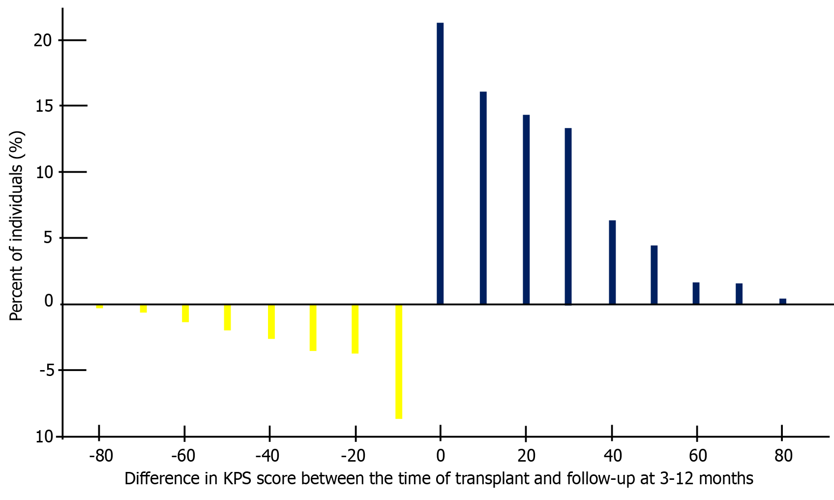
Figure 3 Distribution Karnofsky Performance Status score difference between the time of transplant and at follow-up.
Distribution of the difference in Karnofsky Performance Status (KPS) scores between the time of transplant and follow-up at 3-12 months. The x-axis represents the difference in KPS scores, with negative values indicating a decrease and positive values indicating an improvement. The y-axis represents the percentage of individuals. Yellow bars indicate a decrease in KPS, while blue bars indicate an improvement. KPS: Karnofsky Performance Status.
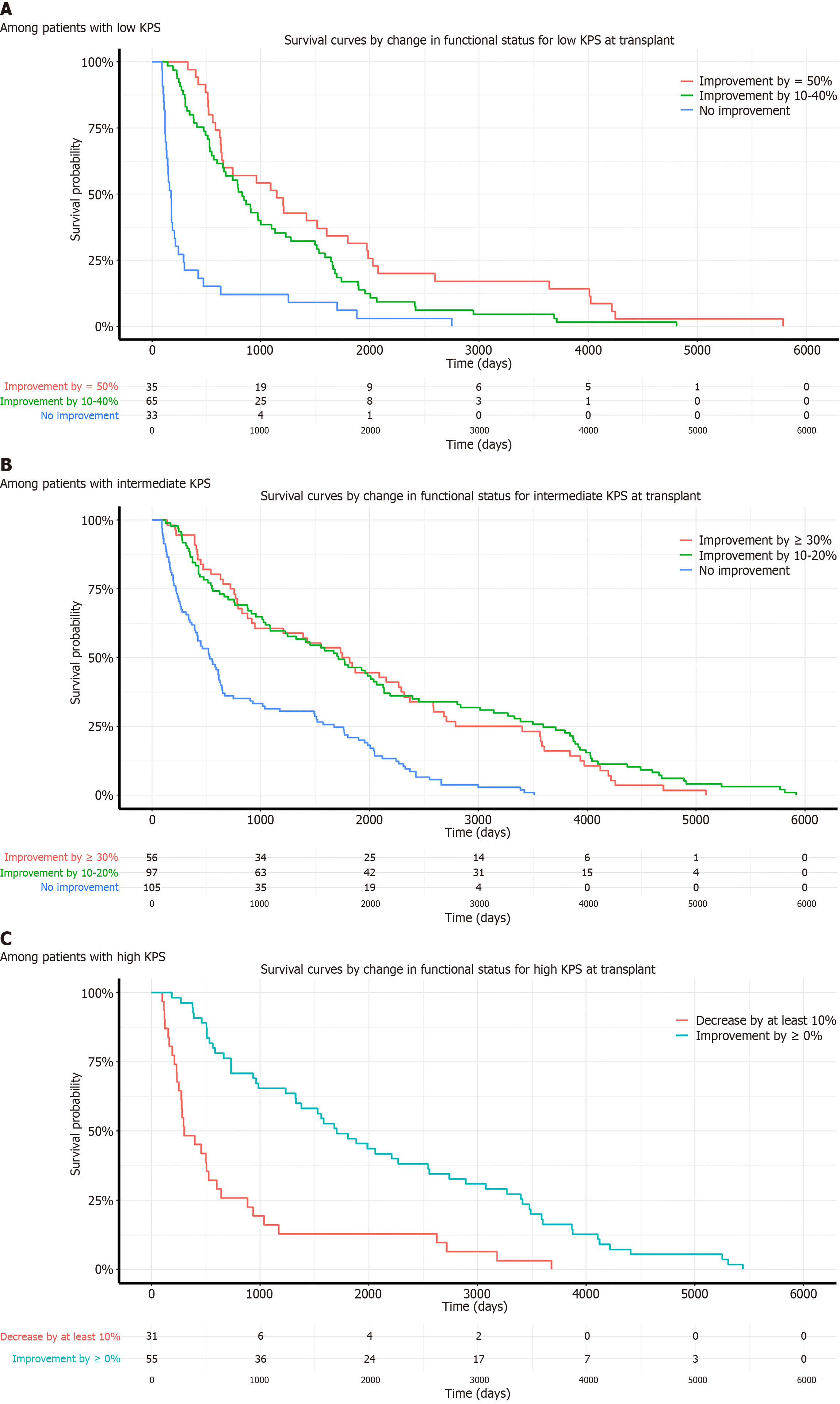
Figure 4 Post transplant survival probability curves of intestinal transplant recipients by Changes in Karnofsky Performance Status after transplant.
A: Among patients with low Karnofsky Performance Status (KPS). Survival curves illustrating post-transplant survival probability for recipients with low KPS at the time of transplant. The categories are based on the improvement in KPS: Red for "Improvement by ≥ 50%", Green for "Improvement by 10%-40%" and Blue for "No improvement". Numbers at risk at various time points are displayed below the x-axis for each category; B: Among patients with intermediate KPS. Survival curves illustrating post-transplant survival probability for recipients with intermediate KPS at the time of transplant. The categories are based on the improvement in KPS: Red for "Improvement by ≥ 30%, "Green for "Improvement by 10%-20%" and Blue for "No improvement". Numbers at risk at various time points are displayed below the x-axis for each category; C: Among patients with high KPS. Survival curves illustrating post-transplant survival probability for recipients with high KPS at the time of transplant. The categories are based on the change in KPS: Red for "Decrease by at least 10%" and Blue for "Improvement by ≥ 0%". Numbers at risk at various time points are displayed below the x-axis for each category.
- Citation: Boateng S, Ameyaw P, Gyabaah S, Adjepong Y, Njei B. Recipient functional status impacts on short and long-term intestinal transplant outcomes in United States adults. World J Transplant 2024; 14(3): 93561
- URL: https://www.wjgnet.com/2220-3230/full/v14/i3/93561.htm
- DOI: https://dx.doi.org/10.5500/wjt.v14.i3.93561


