Copyright
©The Author(s) 2024.
World J Psychiatry. Sep 19, 2024; 14(9): 1397-1403
Published online Sep 19, 2024. doi: 10.5498/wjp.v14.i9.1397
Published online Sep 19, 2024. doi: 10.5498/wjp.v14.i9.1397
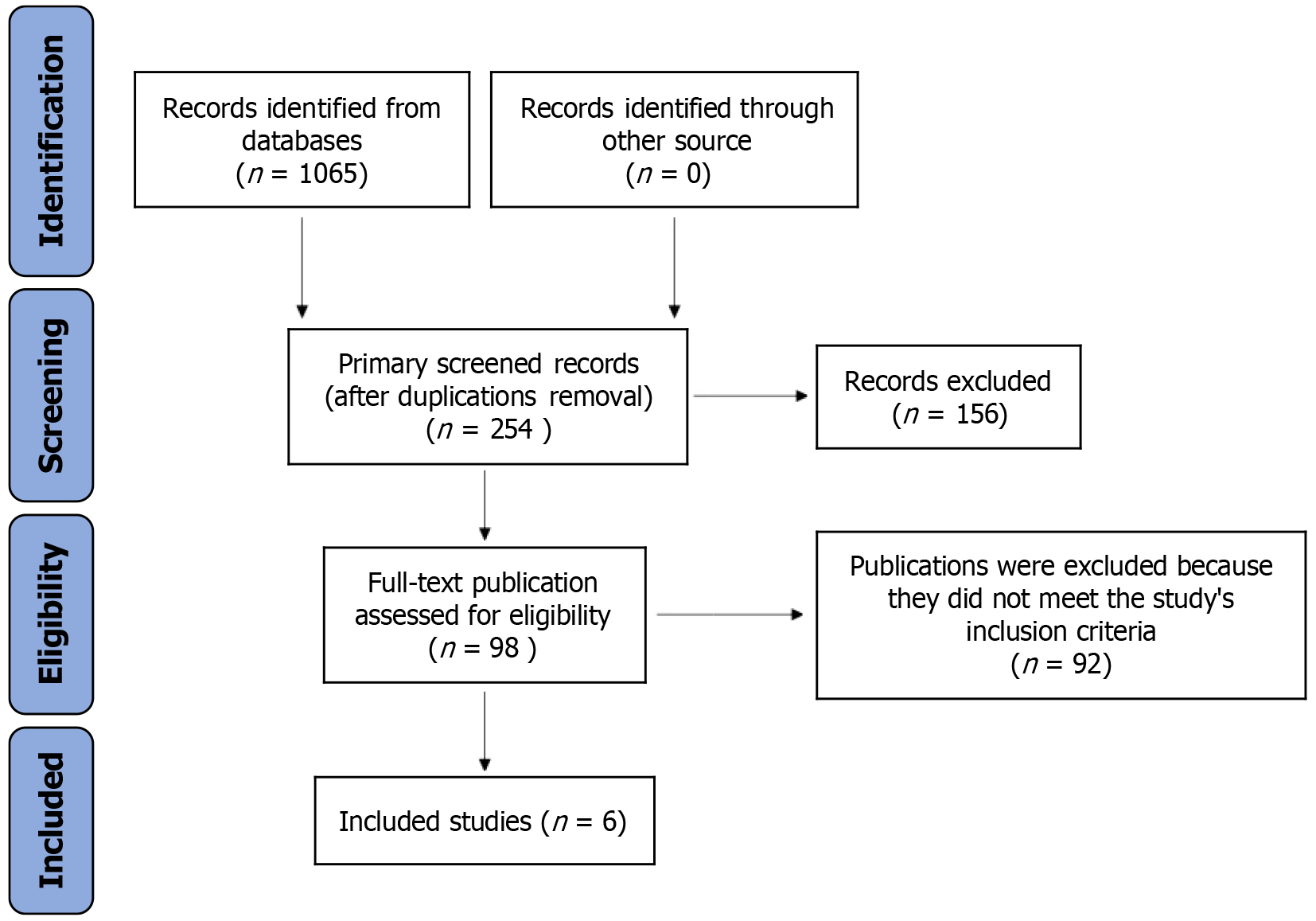
Figure 1
Flow diagram of the study selection process.
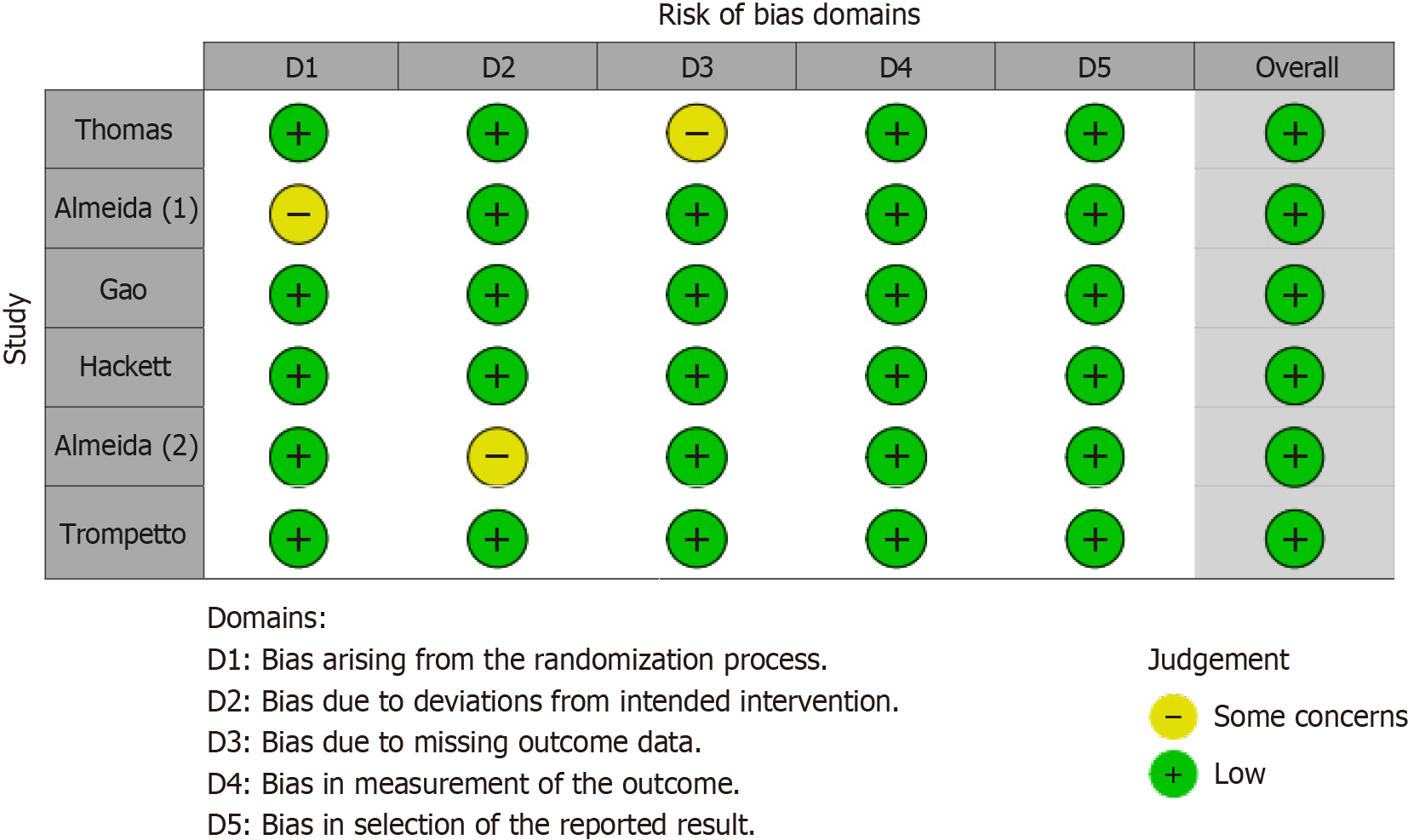
Figure 2
Traffic light plot showing the risk of bias assessment.
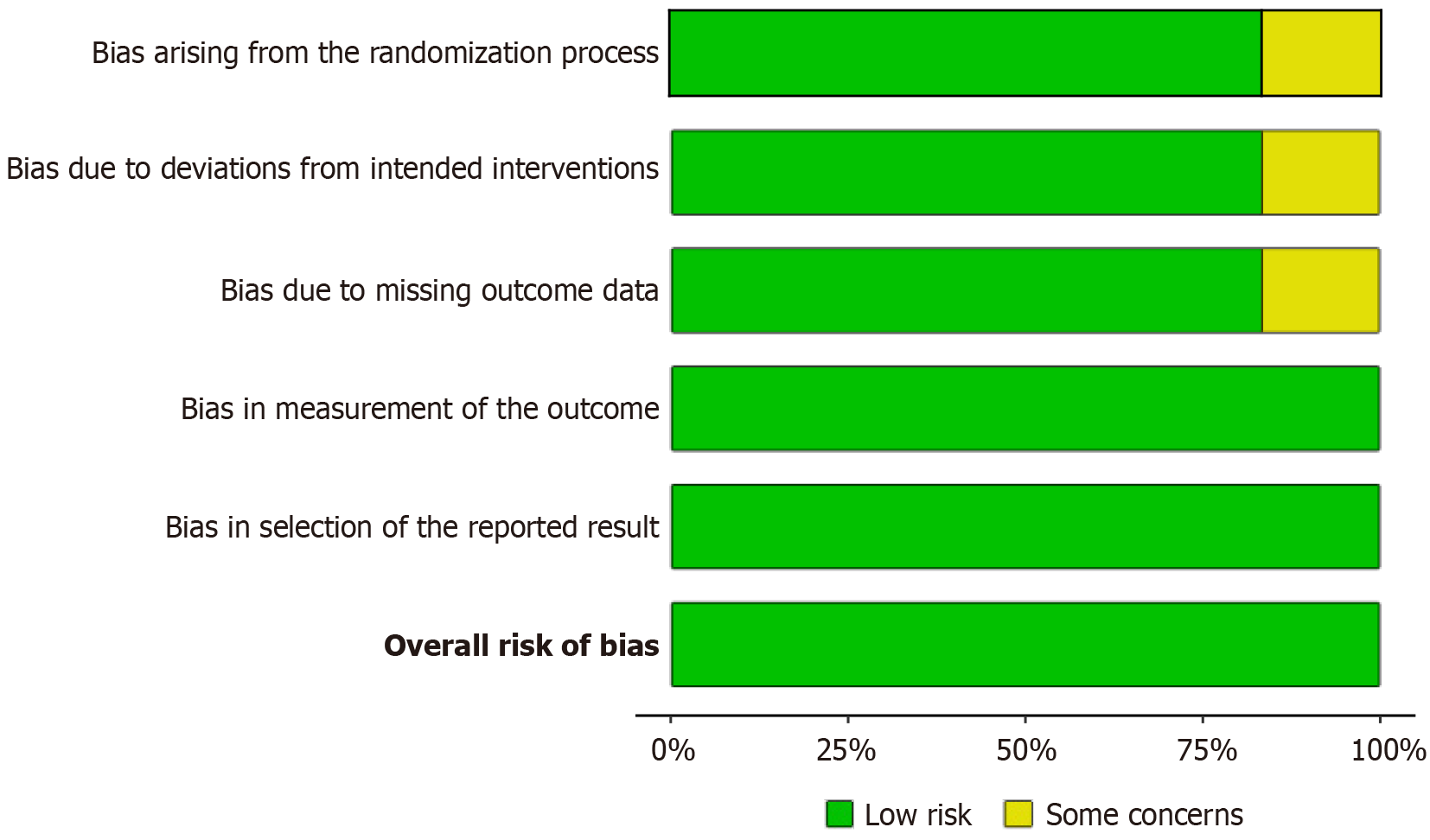
Figure 3
Bar graph summarizing bias across various domains.
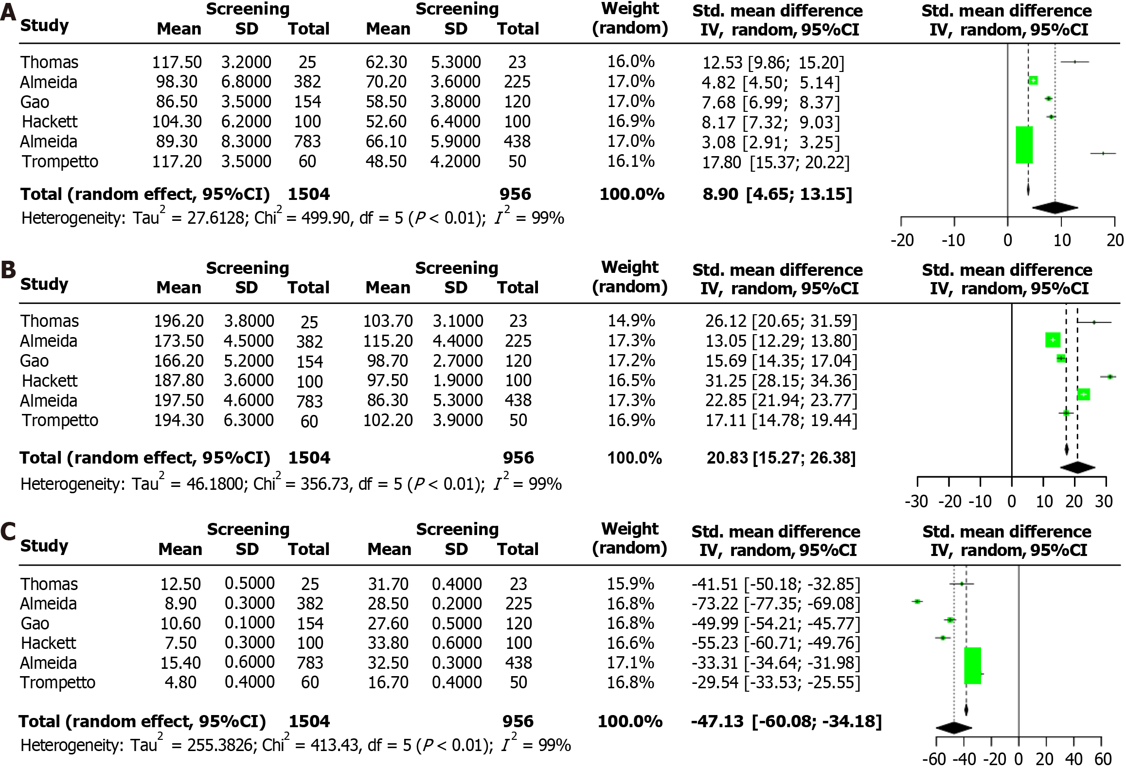
Figure 4 Functional outcomes, quality of life, and mortality in post-stroke depression screened patients compared to controls.
A: Forest maps compared functional independence measure scores between patients screened for post-stroke depression (PSD) and control patients; B: The forest plots of stroke-specific quality of life scale scores were compared between PSD screening group and control group; C: The forest map shows the mortality rates within five years of stroke in patients screened for PSD versus those who were not screened.
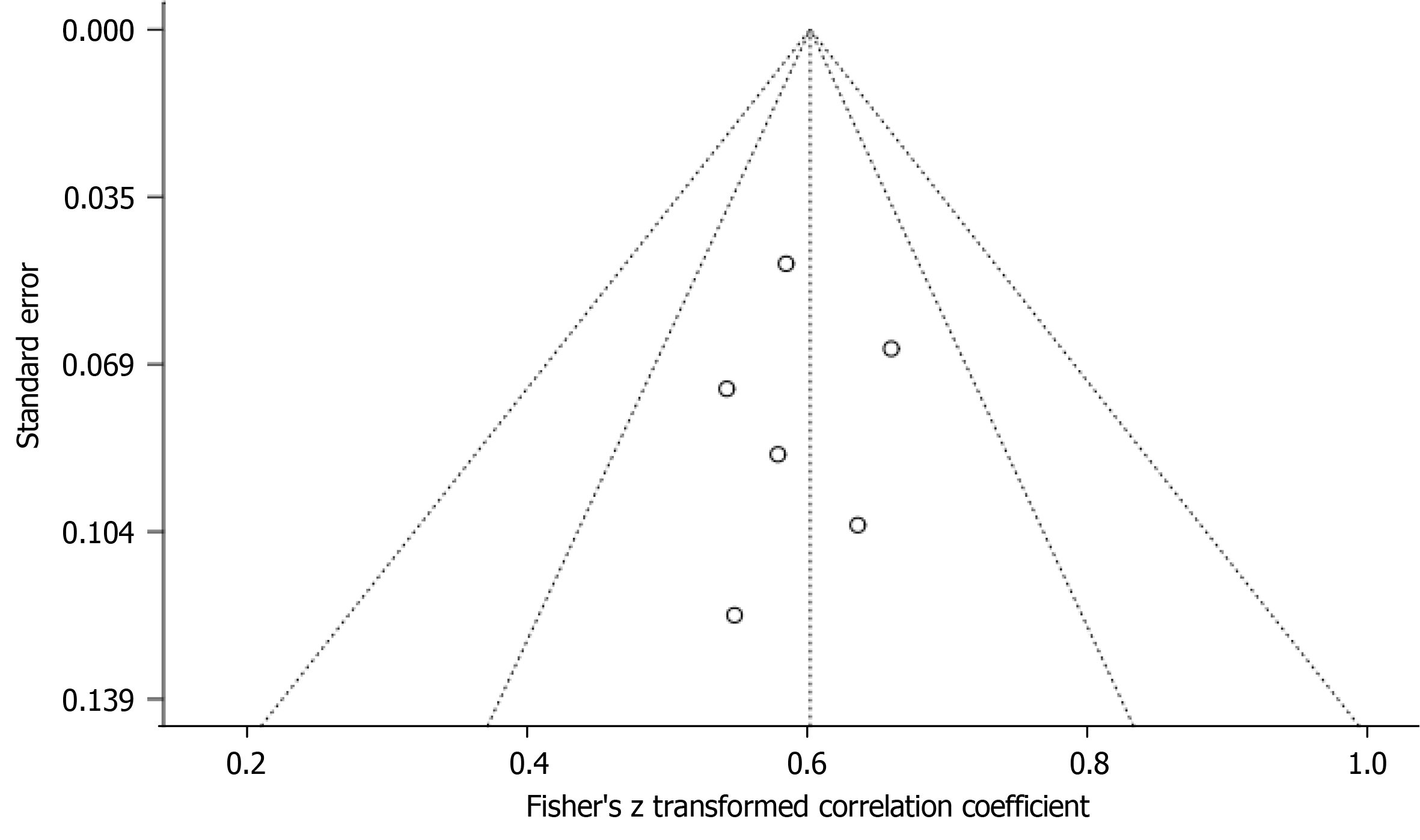
Figure 5
Funnel plot and Egger's regression test assessing publication bias for five-year mortality rates.
- Citation: Dai J, Zhao SS, Zhang SX. Early screening for post-stroke depression and its effect on functional outcomes, quality of life, and mortality: A meta-analysis. World J Psychiatry 2024; 14(9): 1397-1403
- URL: https://www.wjgnet.com/2220-3206/full/v14/i9/1397.htm
- DOI: https://dx.doi.org/10.5498/wjp.v14.i9.1397


