Copyright
©The Author(s) 2022.
World J Cardiol. Jul 26, 2022; 14(7): 427-437
Published online Jul 26, 2022. doi: 10.4330/wjc.v14.i7.427
Published online Jul 26, 2022. doi: 10.4330/wjc.v14.i7.427
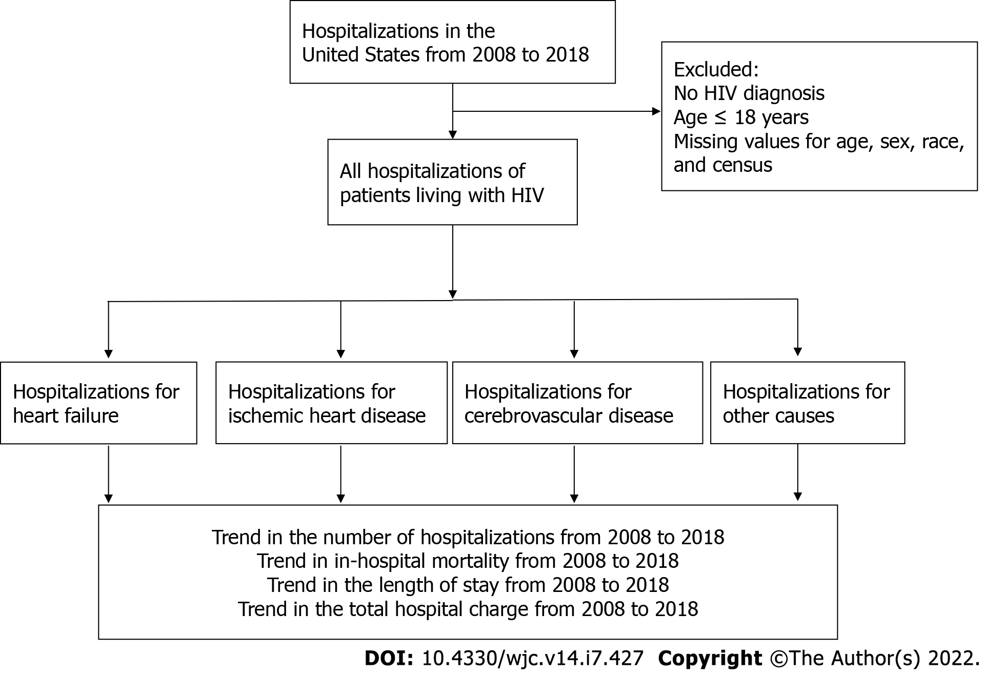
Figure 1 Flow chart of this study.
The flow chart illustrates the underlying design of the present study. HIV: Human immunodeficiency virus.
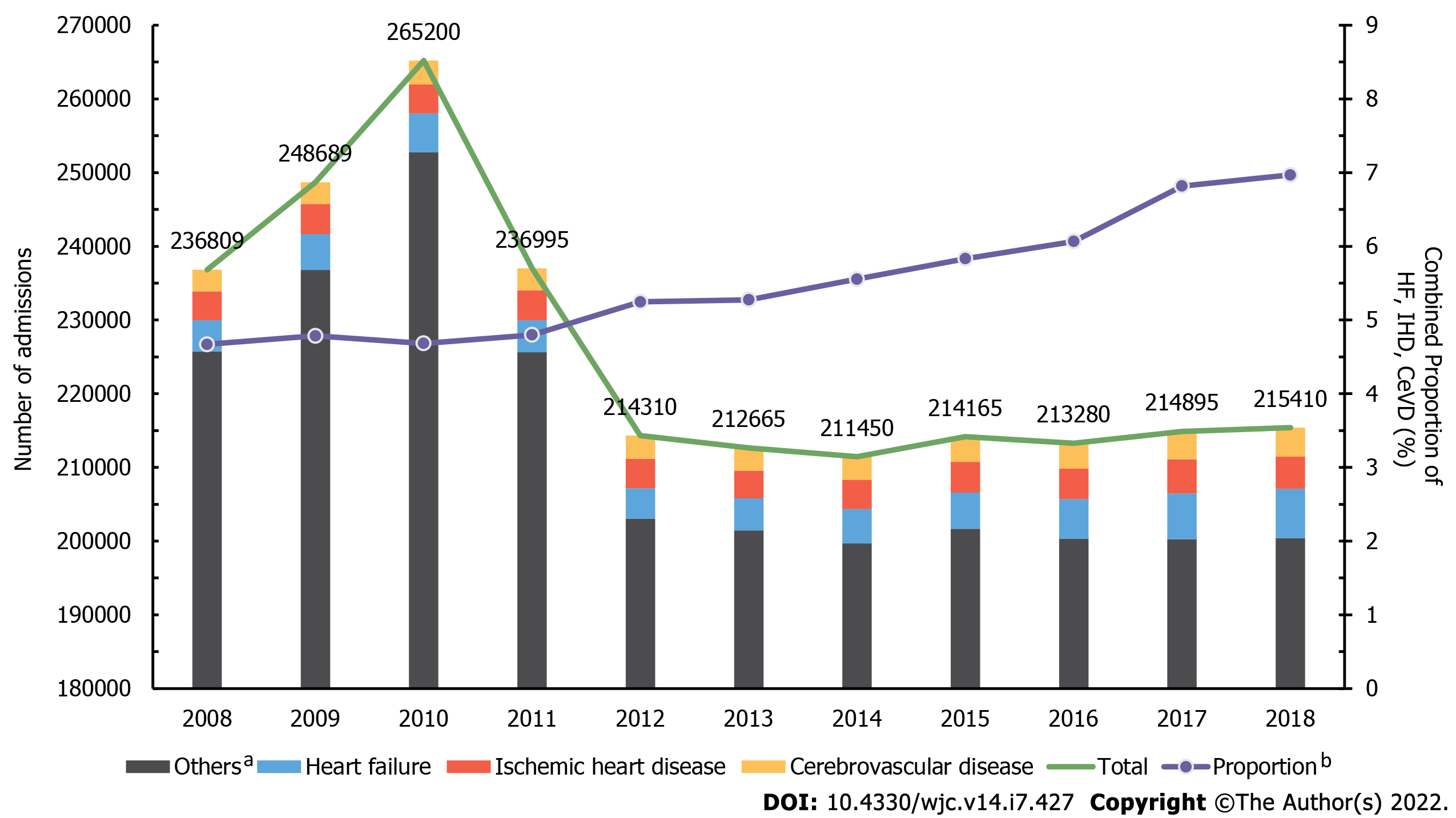
Figure 2 Yearly trend of heart failure and other cardiovascular diseases in all admissions of people living with human immunodeficiency virus.
Bar graph shows the yearly trend in the admissions of heart failure (HF) (blue), ischemic heart disease (IHD) (red), and cerebrovascular disease (CeVD) (yellow) in people living with human immunodeficiency virus (HIV). Gray bars show the number of all admissions of people living with human immunodeficiency virus (PLWH) for reasons other than HF, IHD, and CeVD. Violet line represents the combined proportion of HF, IHD, and CeVD among all hospitalizations of PLWH. Green line shows the total number of hospitalizations occurring in PLWH. a“Others” refer to all admissions of PLWH for reasons other than HF, IHF, and CeVD. b“Proportion” refers to the combined proportion of HF, IHD, and CeVD among all hospitalizations of PLWH. CeVD: Cerebrovascular disease; HF: Heart failure; IHD: Ischemic heart disease; PLWH: People living with human immunodeficiency virus.
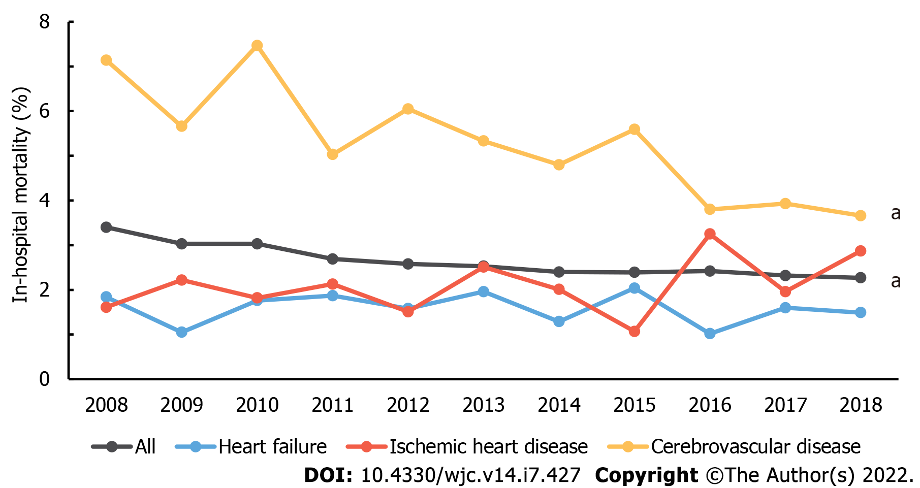
Figure 3 Yearly trend of average in-hospital mortality rate in admissions due to heart failure and other cardiovascular diseases in people living with human immunodeficiency virus.
Line graphs illustrate the trend of in-hospital mortality in all admissions due to heart failure (blue), ischemic heart disease (red), and cerebrovascular disease (yellow). Gray line shows the in-hospital mortality of all admissions occurring in people living with human immunodeficiency virus. Significant Ptrend < 0.05 is marked with an asterisk (a) at the end of the linear graph.
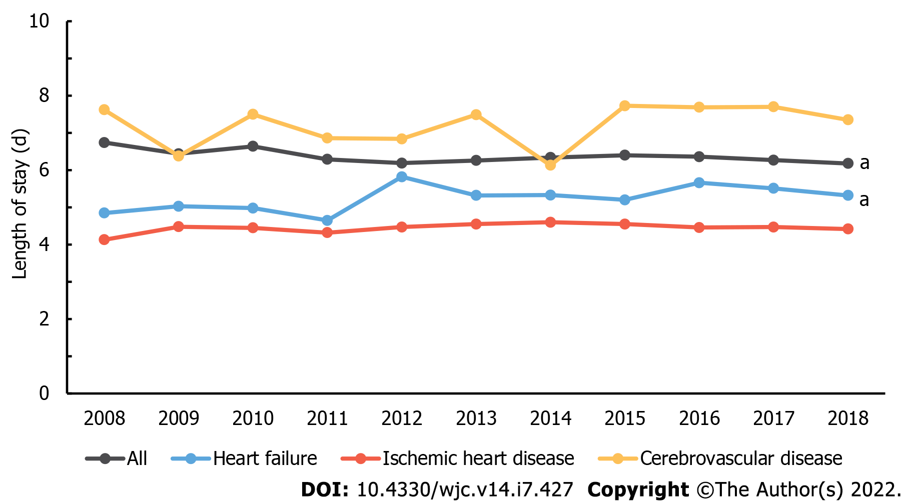
Figure 4 Yearly trend of average length of hospital stay in admissions due to heart failure and other cardiovascular diseases in people living with human immunodeficiency virus.
Line graphs illustrate the trend of length of hospital stay in all admissions due to heart failure (blue), ischemic heart disease (red), and cerebrovascular disease (yellow). Gray line shows the length of hospital stay in all admissions occurring in PLWH. Significant Ptrend < 0.05 is marked with an asterisk (a) at the end of the linear graph.
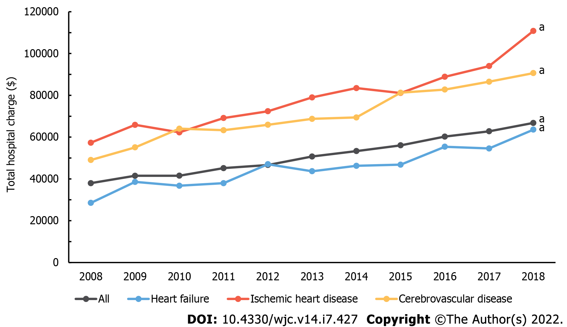
Figure 5 Yearly trend of average total hospital charge in admissions due to heart failure and other cardiovascular diseases in people living with human immunodeficiency virus.
Line graphs illustrate the trend of total hospital charge in all admissions due to heart failure (blue), ischemic heart disease (red), and cerebrovascular disease (yellow). Gray line shows the total hospital charge in all admissions occurring in PLWH. Significant P-trend < 0.05 is marked with an asterisk (a) at the end of the linear graph.
- Citation: Park DY, An S, Romero ME, Murthi M, Atluri R. National trend of heart failure and other cardiovascular diseases in people living with human immunodeficiency virus. World J Cardiol 2022; 14(7): 427-437
- URL: https://www.wjgnet.com/1949-8462/full/v14/i7/427.htm
- DOI: https://dx.doi.org/10.4330/wjc.v14.i7.427


