Copyright
©The Author(s) 2025.
World J Gastrointest Oncol. Jun 15, 2025; 17(6): 105781
Published online Jun 15, 2025. doi: 10.4251/wjgo.v17.i6.105781
Published online Jun 15, 2025. doi: 10.4251/wjgo.v17.i6.105781
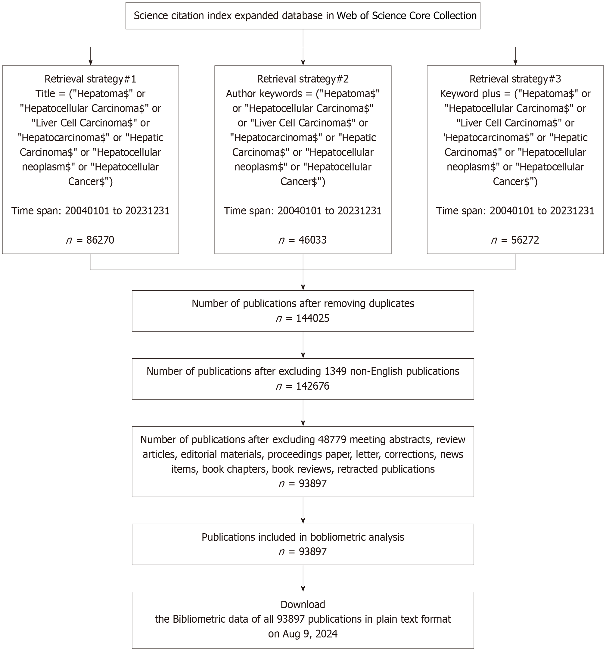
Figure 1 Flow diagram of search strategy.
A total of 93987 articles retrieved from the Web of Science Core Collection were subjected to bibliometric analysis.
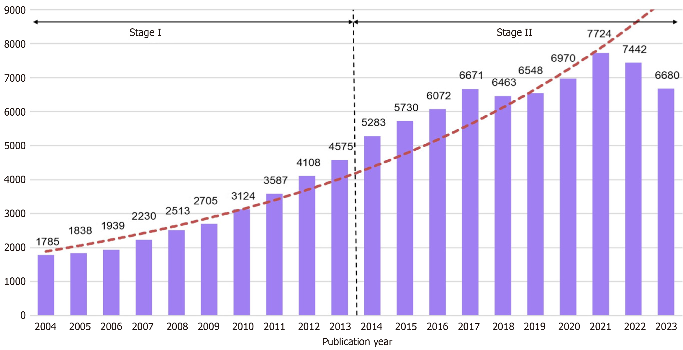
Figure 2 Annual global publications on hepatocellular carcinoma from 2004 to 2023.
The annual number of publications exhibited a fluctuating upward trend overall, with the red line representing the trend in publication volume.
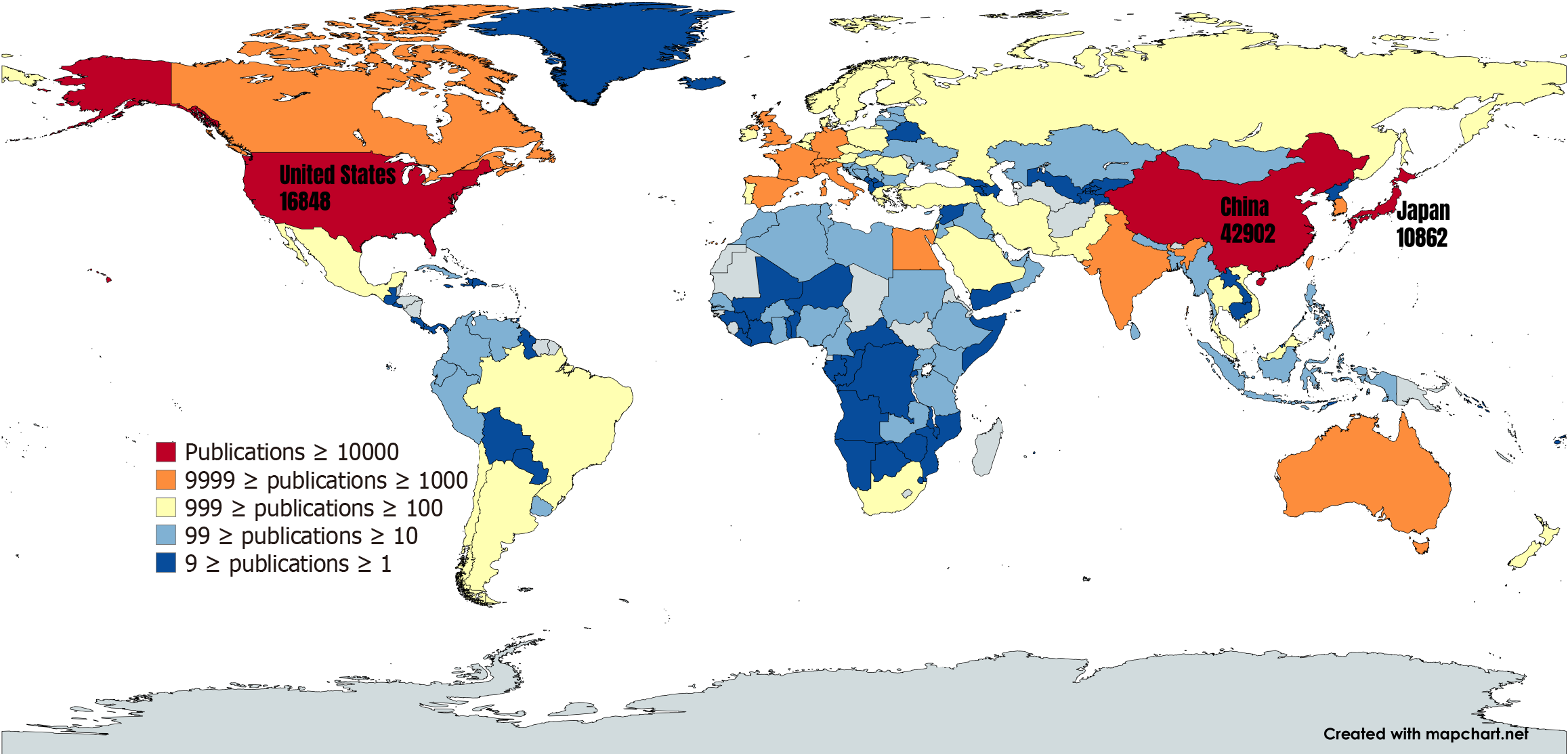
Figure 3 The geographical distribution and visualization of productive countries/regions.
Global distribution of publications between 2004-2023. Color gradient from blue to red indicates increasing publication volume from low to high.
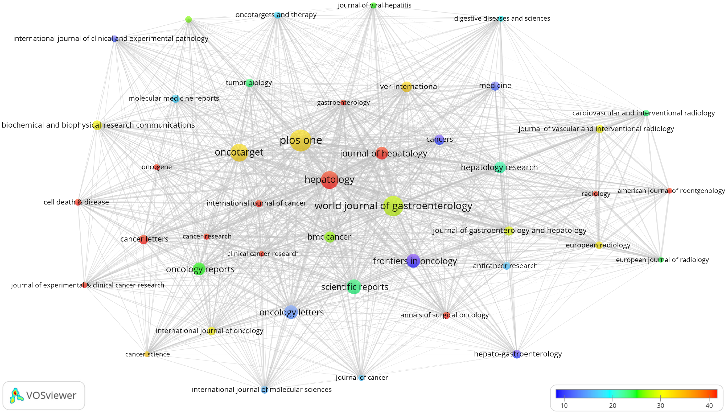
Figure 4 Network visualization map of the 44 most productive journals on hepatocellular carcinoma.
Visualization map of publications across 44 journals. Each node represents an individual journal, where the circle size corresponds to the publication volume (larger circles indicate higher publication counts). Node color represents citation frequency, with a gradient from blue to red indicating increasing average citation counts from low to high. The thickness of the links denotes the collaboration strength, with thicker lines indicating a higher degree of cooperative activity between the two journals.
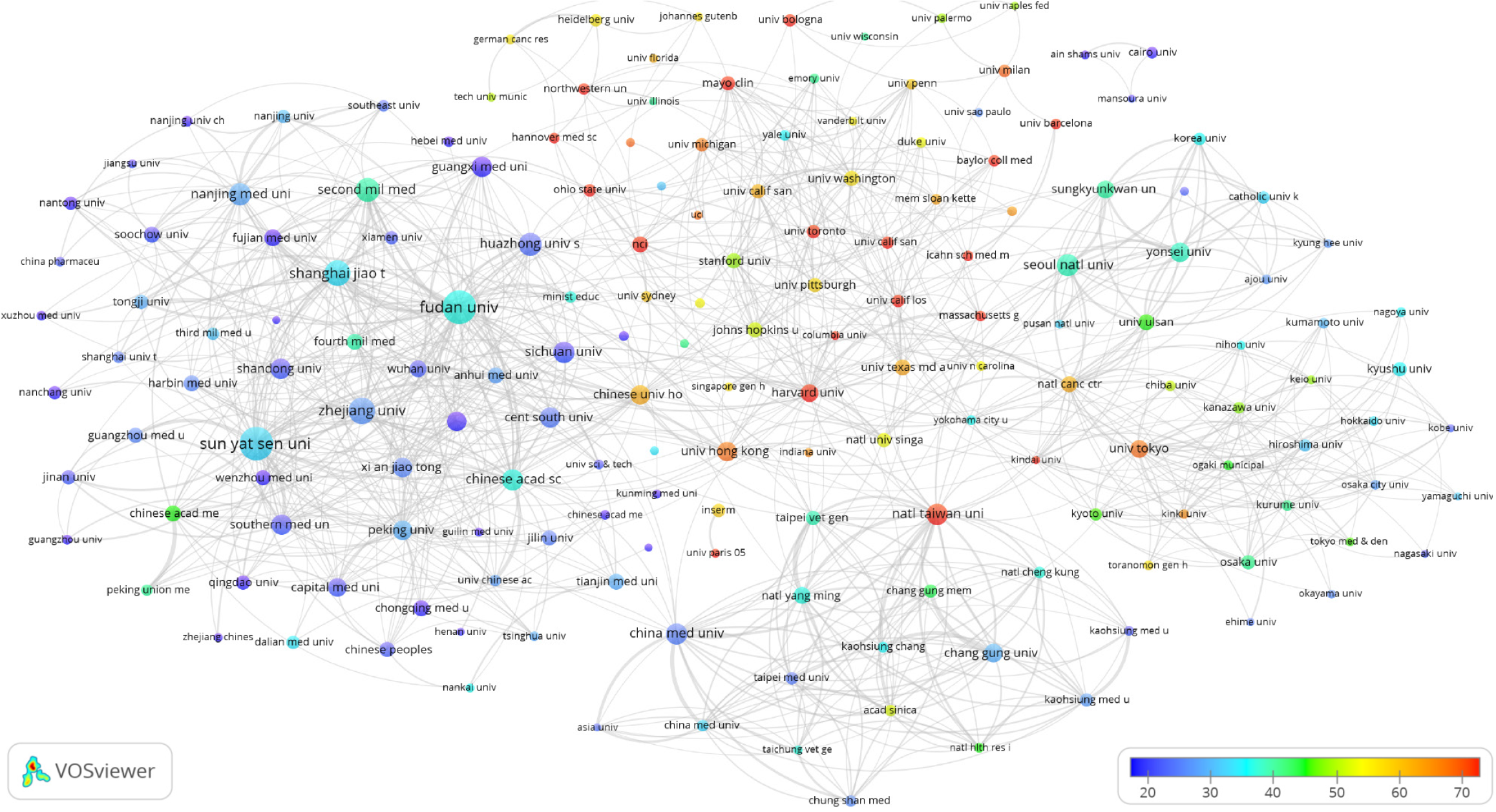
Figure 5 Network visualization map of the 173 most productive institutions on hepatocellular carcinoma.
Visualization map of publications from 173 high-yield institutions. Each node represents an individual journal, with circle size proportional to publication volume (larger circles denote higher output). Node coloration reflects citation frequency, transitioning from blue to red to indicate increasing average citation rates from low to high. The thickness of the links represents the strength of collaboration, with thicker lines indicating more intensive cooperation between two institutions.
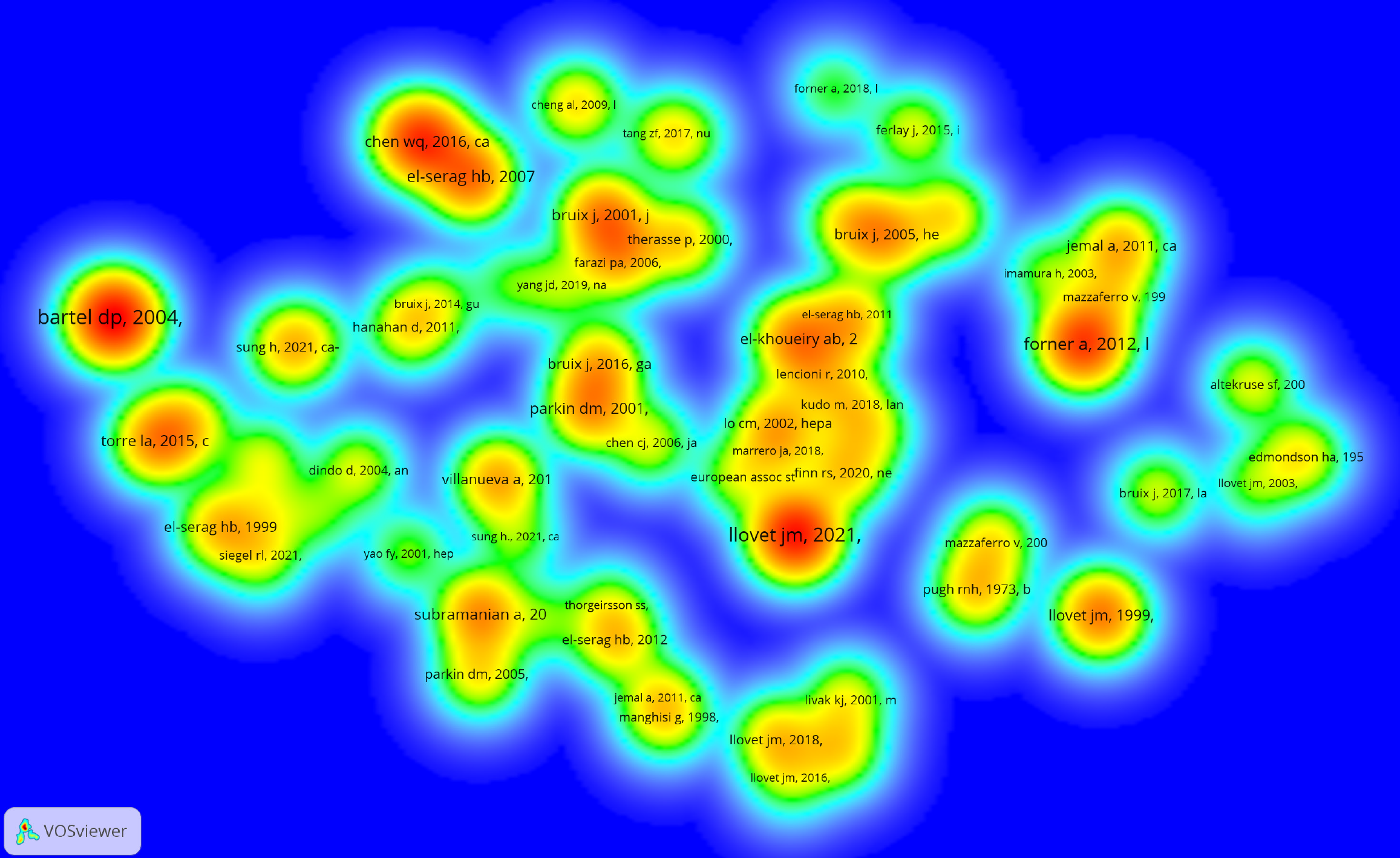
Figure 6 Density visualization map of the top 70 co-cited references on hepatocellular carcinoma.
Density visualization of the reference co-citation network. The collaborative network comprises 70 publications, with color gradients from green to red representing increasing citation frequencies from low to high.
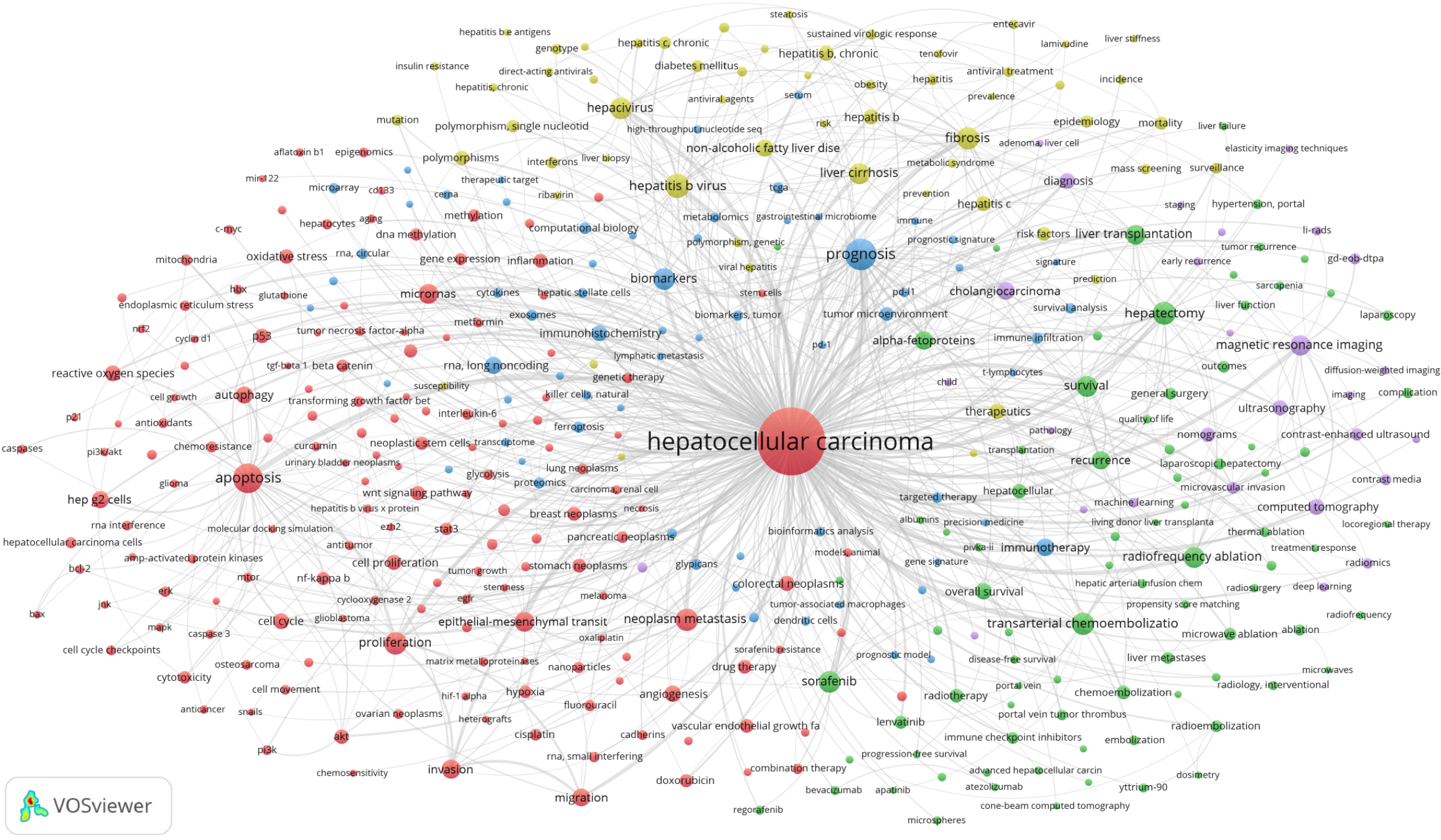
Figure 7 Network visualization map of keywords co-occurrence analysis on hepatocellular carcinoma.
Co-occurrence network map comprising 5 clusters (nodes with identical colors) formed by 391 high-frequency author keywords. Node labels display keywords, with node size proportional to keyword frequency, where larger nodes indicate higher occurrence rates.
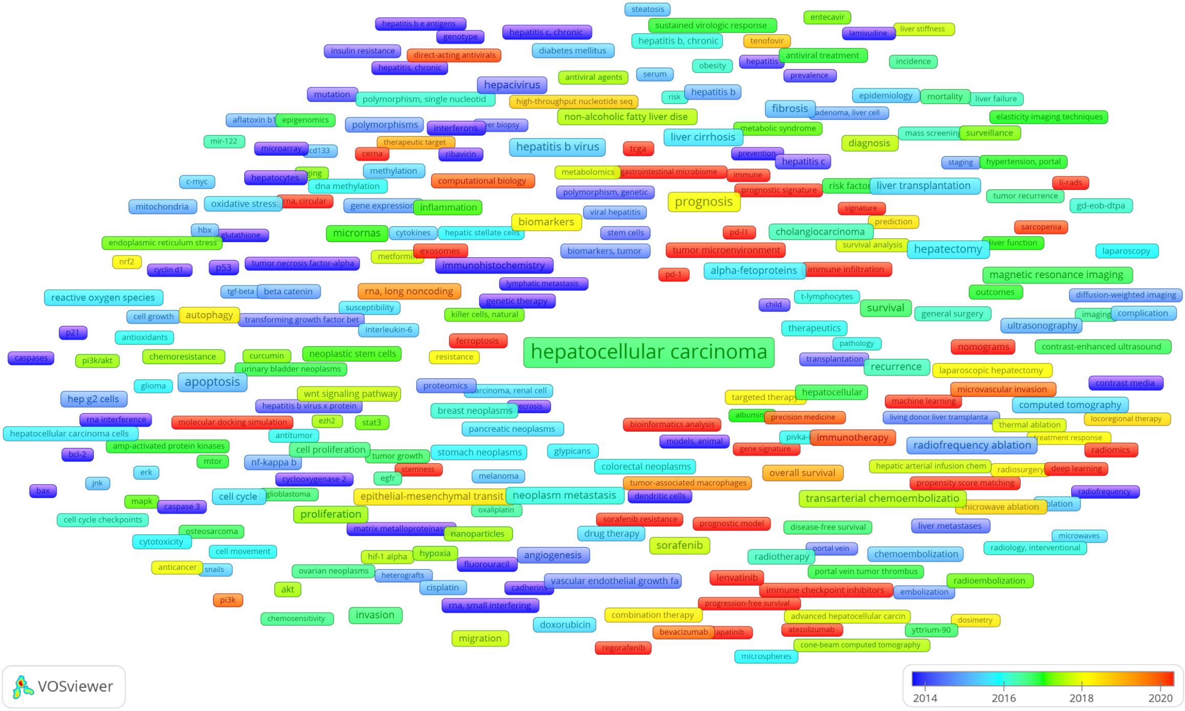
Figure 8 Overlay visualization map of keywords co-occurrence analysis on hepatocellular carcinoma.
Co-occurrence overlay map constructed from 391 high-frequency author keywords, with node labels displaying corresponding keywords. Node coloration represents the average publication year, transitioning from blue to red to indicate progressively more recent publication dates.
- Citation: Shang LQ, Guo HX, Wang P, Sun XH, You JQ, Ma JT, Wang LK, Liu JX, Wang ZQ, Shao HB. Global scientific trends on hepatocellular carcinoma research from 2004 to 2023: A bibliometric and visualized analysis. World J Gastrointest Oncol 2025; 17(6): 105781
- URL: https://www.wjgnet.com/1948-5204/full/v17/i6/105781.htm
- DOI: https://dx.doi.org/10.4251/wjgo.v17.i6.105781


