Copyright
©The Author(s) 2024.
World J Gastrointest Oncol. Aug 15, 2024; 16(8): 3507-3520
Published online Aug 15, 2024. doi: 10.4251/wjgo.v16.i8.3507
Published online Aug 15, 2024. doi: 10.4251/wjgo.v16.i8.3507
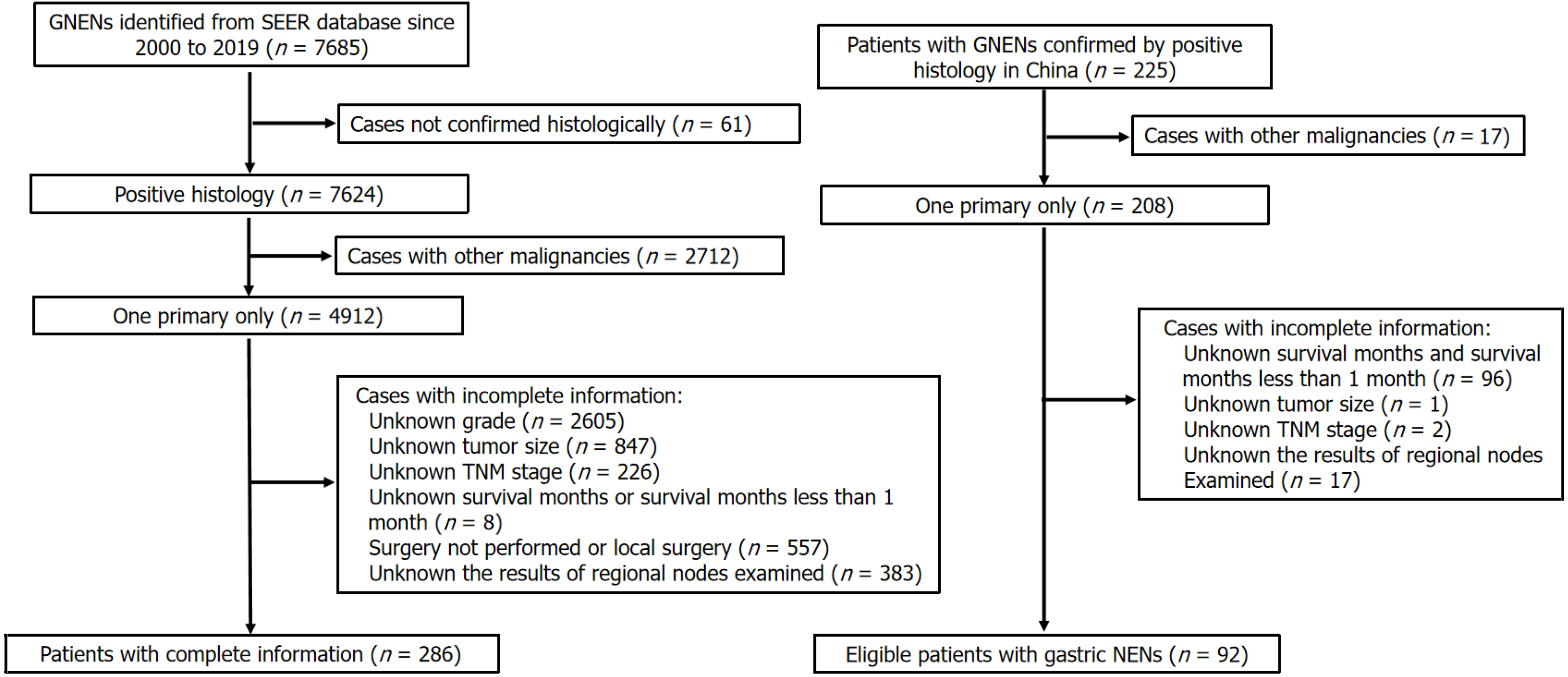
Figure 1 The flow diagram of the patients’ selection.
GNEN: Gastric neuroendocrine neoplasms; SEER: Surveillance, Epidemiology, and End Results; TNM: Tumor-node-metastasis; NEN: Neuroendocrine neoplasm.
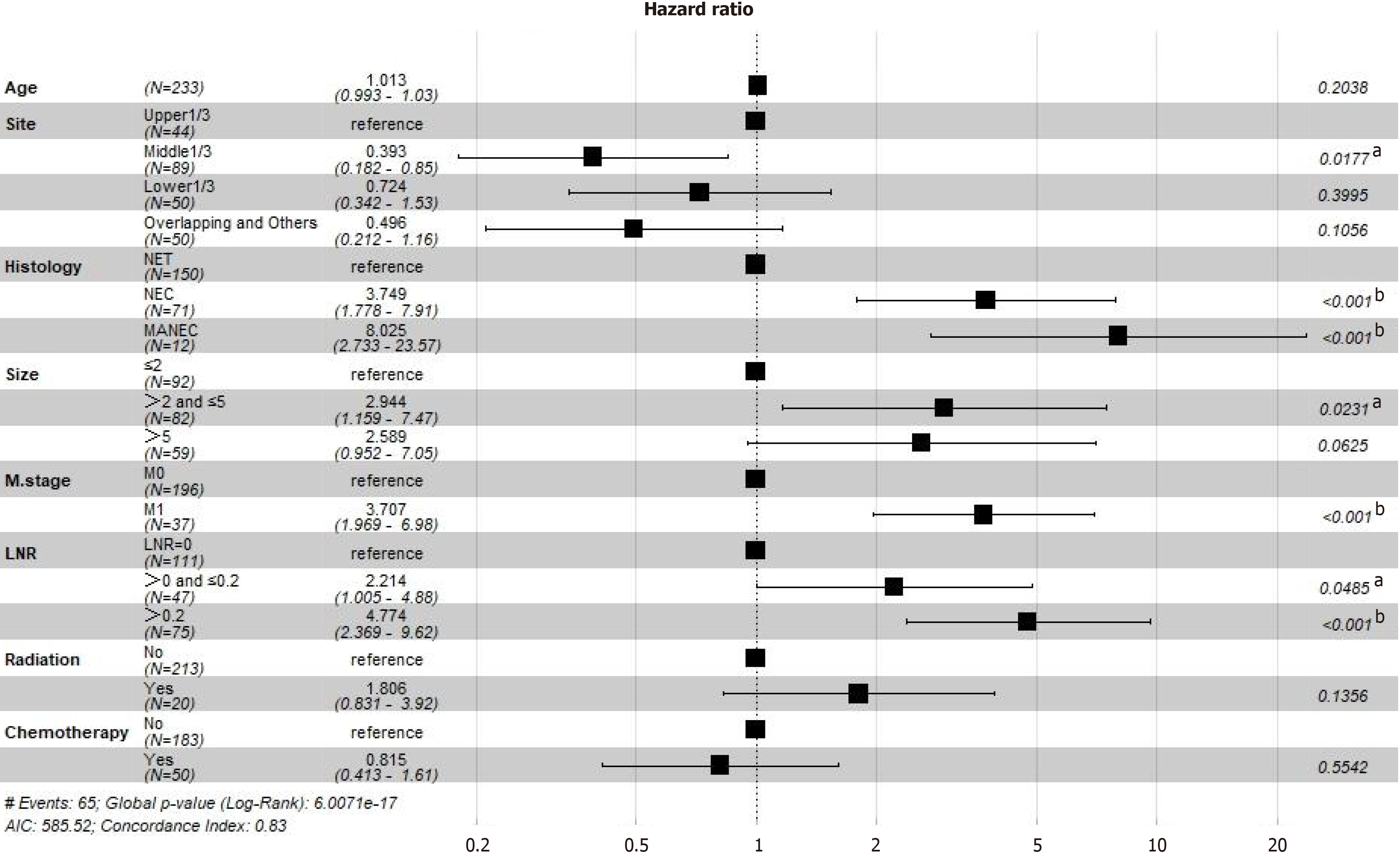
Figure 2 Forest plot of multivariate Cox regression analysis of disease-specific survival.
aP < 0.05, bP < 0.001.
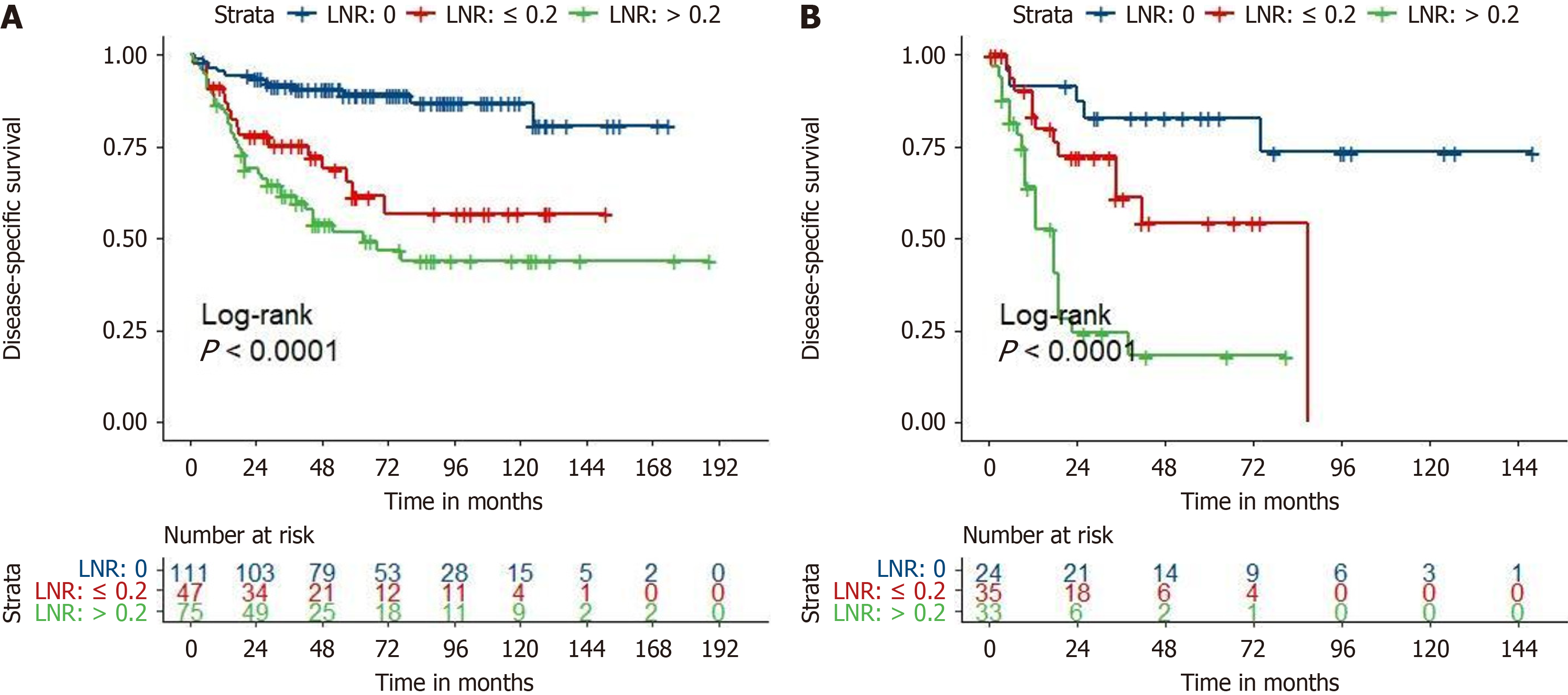
Figure 3 Kaplan-Meier survival curves of different lymph node ratio groups in the training set and the test set.
A: Training set; B: Test set. LNR: Lymph node ratio.
Figure 4 Calibration curves of the random survival forest model for 1-year, 3-year, and 5-year disease-specific survival in the test set.
A: Calibration curves of the random survival forest (RSF) model for 1-year disease-specific survival (DSS); B: Calibration curves of the RSF model for 3-year DSS; C: Calibration curves of the RSF model for 5-year DSS. DSS: Disease-specific survival.
Figure 5 The 1-year, 3-year, and 5-year receiver operating characteristic curves for the American Joint Committee on Cancer tumor-node-metastasis staging, the Cox proportional hazards model, and the random survival forest model in the test set.
A: The 1-year receiver operating characteristic (ROC) curves; B: The 3-year ROC curves; C: The 5-year ROC curves. TNM: Tumor-node-metastasis; RSF: Random survival forest; CoxPH: Cox proportional hazards.
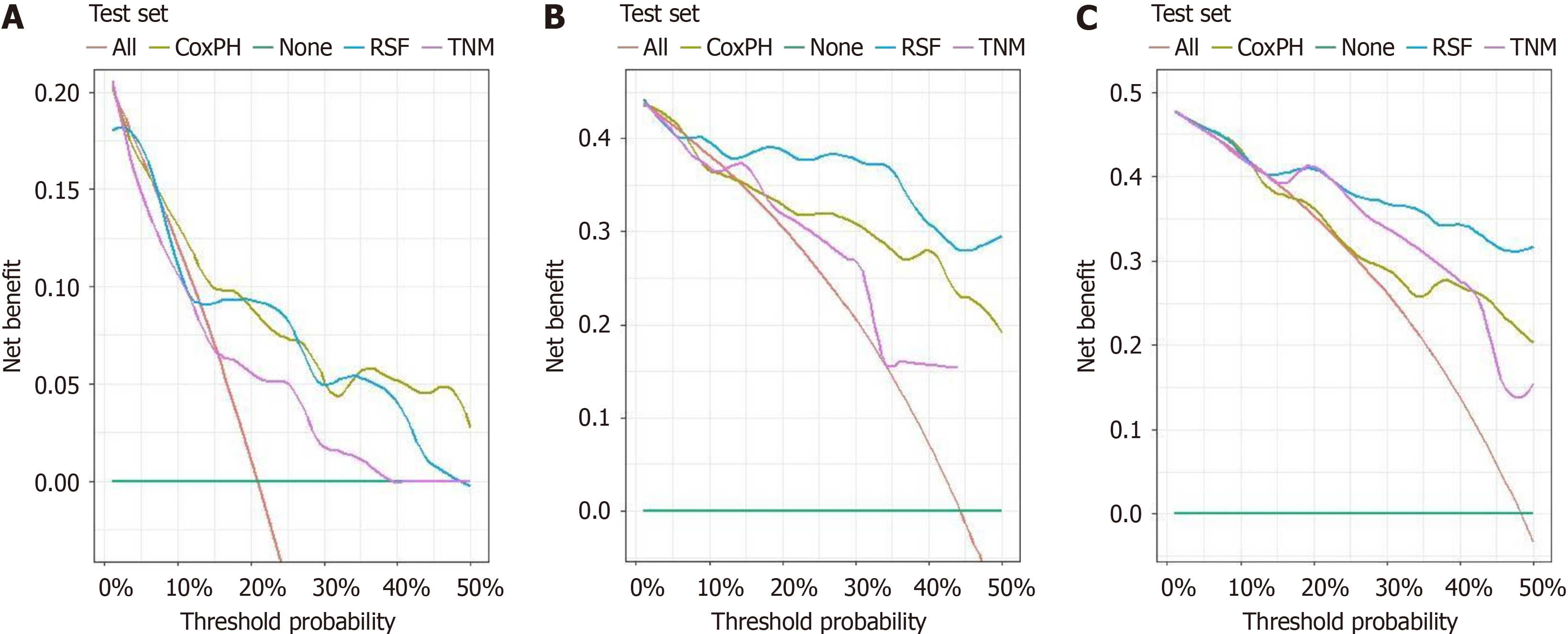
Figure 6 The 1-year, 3-year, and 5-year decision curve analysis curves for the American Joint Committee on Cancer tumor-node-metastasis staging, the Cox proportional hazards model, and the random survival forest model in the test set.
A: The 1-year decision curve analysis (DCA) curves; B: The 3-year DCA curves; C: The 5-year DCA curves. TNM: Tumor-node-metastasis; RSF: Random survival forest; CoxPH: Cox proportional hazards.
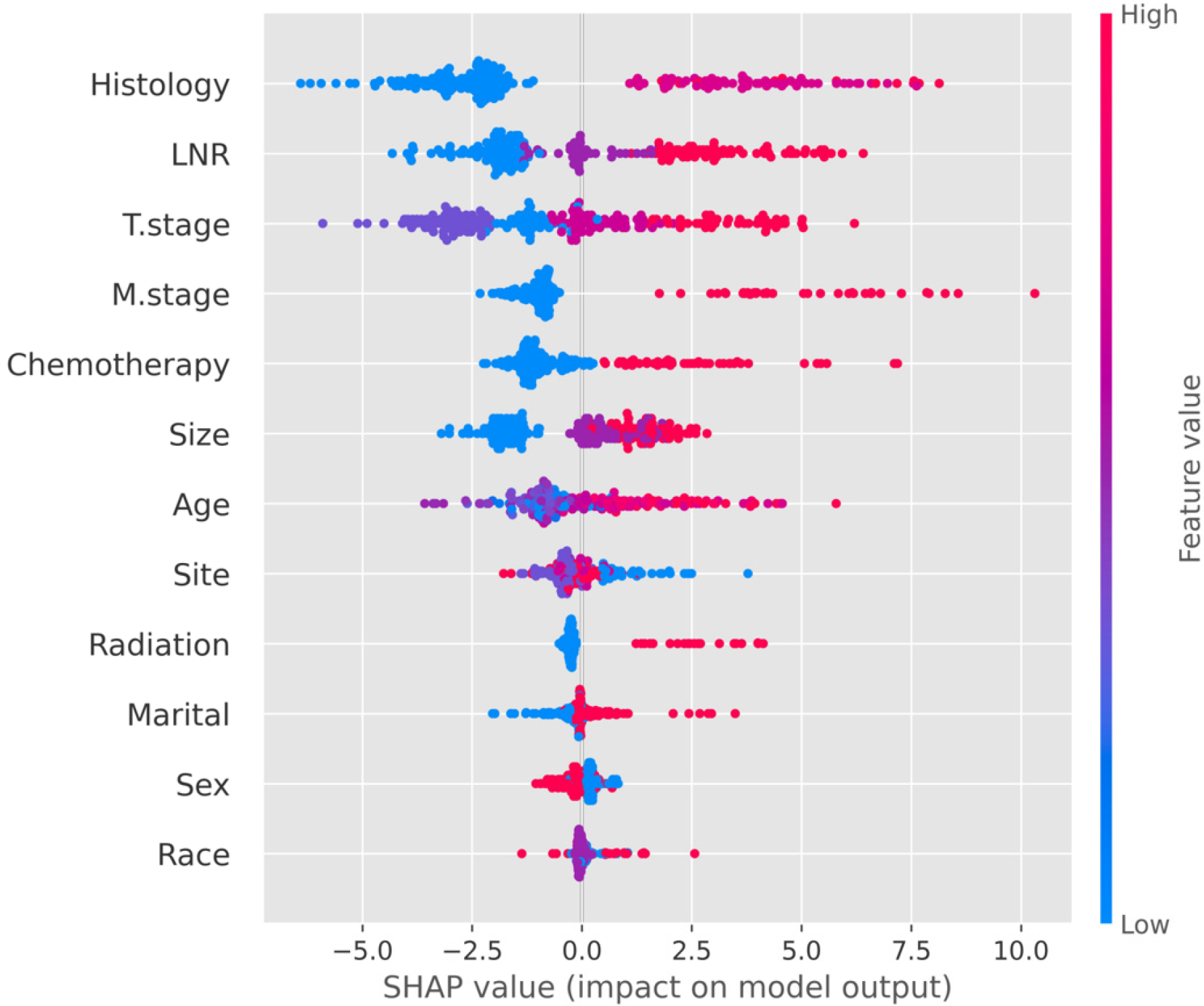
Figure 7 The SHapley Additive exPlanations plot of the random survival forest model.
A dot on the SHapley Additive exPlanations plot represents a sample. Y-axis variables are sorted according to the variables’ importance. The X-axis represents the influence of variables on the model output outcome. The left side of X = 0.0 represents the negative effect of variables on the outcome, and the right side of X = 0.0 represents the positive effect of variables on the outcome. Taking lymph node ratio as an example, the higher the lymph node ratio level, the worse the prognosis of patients. LNR: Lymph node ratio; SHAP: SHapley Additive exPlanations.
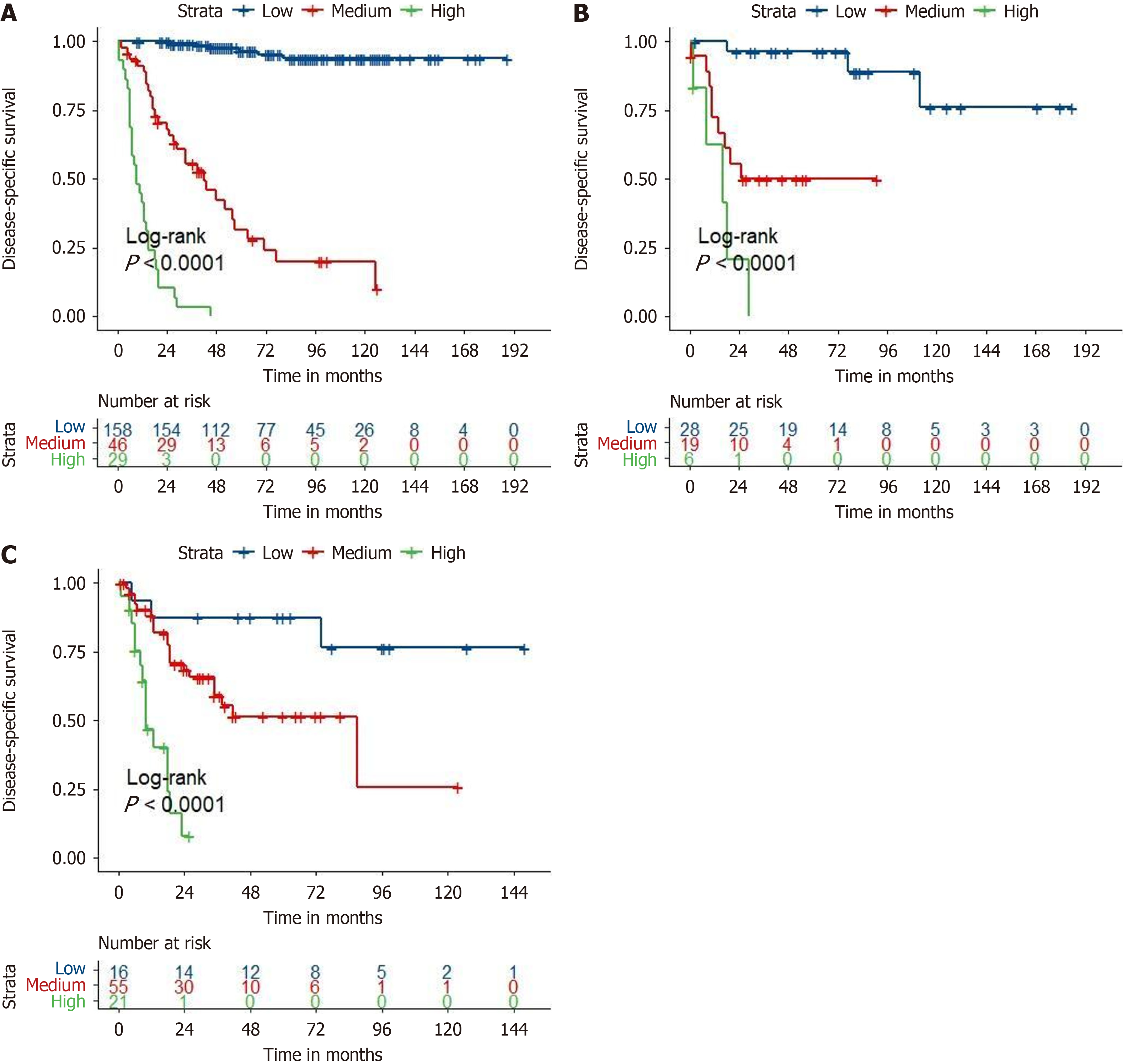
Figure 8 Kaplan-Meier survival curves of the high-, medium-, low-risk group in the training set, validation set, and the test set.
A: Training set; B: Validation set; C: Test set.
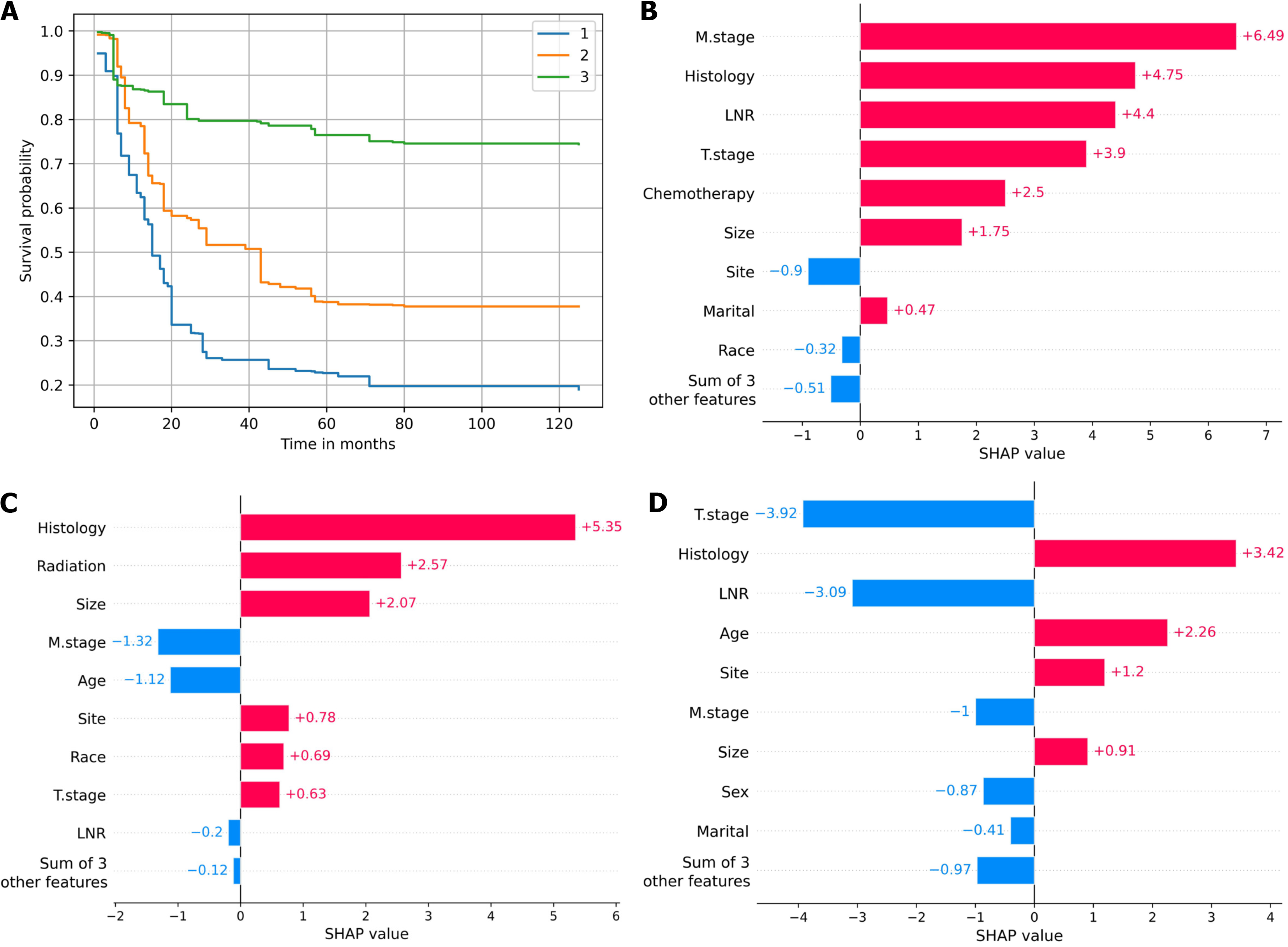
Figure 9 The individual prediction for postoperative gastric neuroendocrine neoplasm patients.
A: The survival probability at each time point of patient #1, patient #2, and patient #3; B: The local SHapley Additive exPlanations (SHAP) plot of the patient #1; C: The local SHAP plot of the patient #2; D: The local SHAP plot of the patient #3. The red color illustrated the variable was positively correlated with the outcome of the patient and the blue color illustrated the variable was negatively correlated with the outcome of the patient. LNR: Lymph node ratio; SHAP: SHapley Additive exPlanations.
- Citation: Liu W, Wu HY, Lin JX, Qu ST, Gu YJ, Zhu JZ, Xu CF. Combining lymph node ratio to develop prognostic models for postoperative gastric neuroendocrine neoplasm patients. World J Gastrointest Oncol 2024; 16(8): 3507-3520
- URL: https://www.wjgnet.com/1948-5204/full/v16/i8/3507.htm
- DOI: https://dx.doi.org/10.4251/wjgo.v16.i8.3507


