Copyright
©The Author(s) 2024.
World J Gastrointest Oncol. Jun 15, 2024; 16(6): 2571-2591
Published online Jun 15, 2024. doi: 10.4251/wjgo.v16.i6.2571
Published online Jun 15, 2024. doi: 10.4251/wjgo.v16.i6.2571
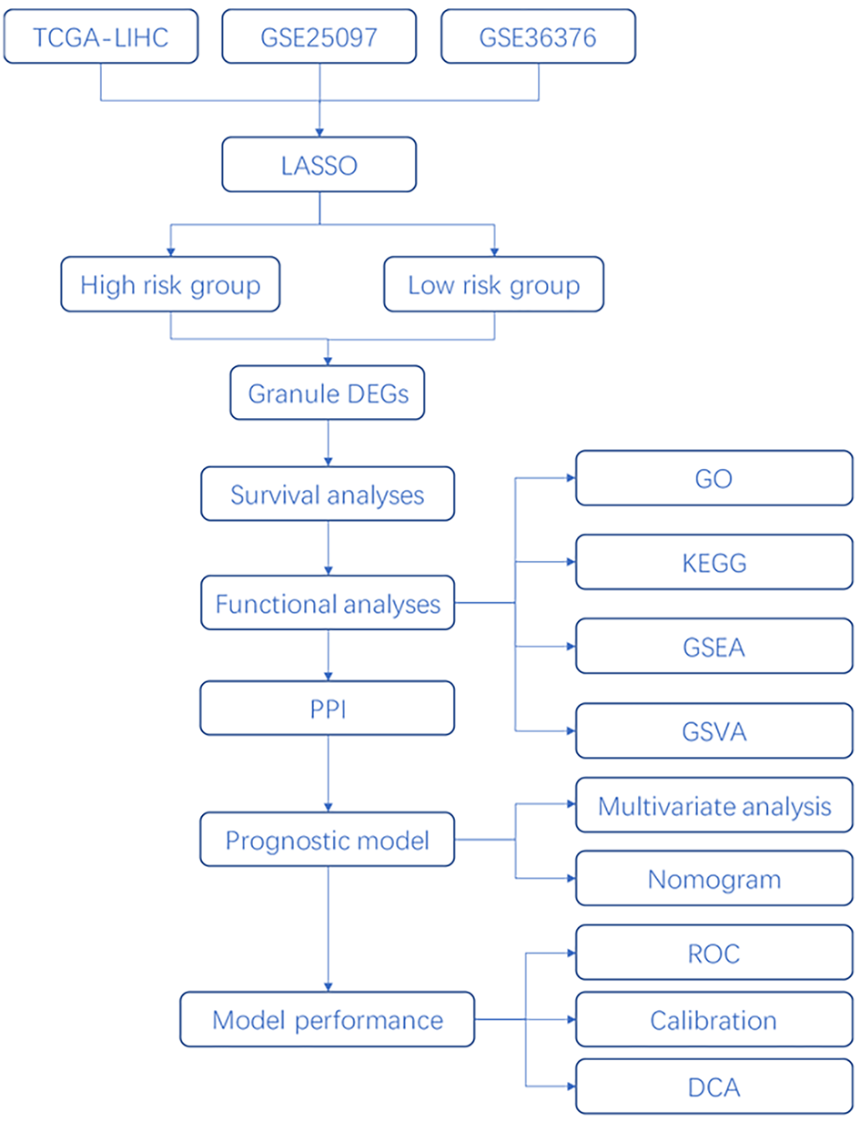
Figure 1 Project flow chart.
TCGA-LIHC: The Cancer Genome Atlas-Liver Hepatocellular Carcinoma; LASSO: Least absolute shrinkage and selection operator; PPI: Protein-protein interaction; GO: Gene Ontology; KEGG: Kyoto Encyclopedia of Genes and Genomes; GSEA: Gene Set Enrichment Analysis; GSVA: Gene Set Variation Analysis; ROC: Receiver operating characteristic curve; DCA: Decision curve analysis.
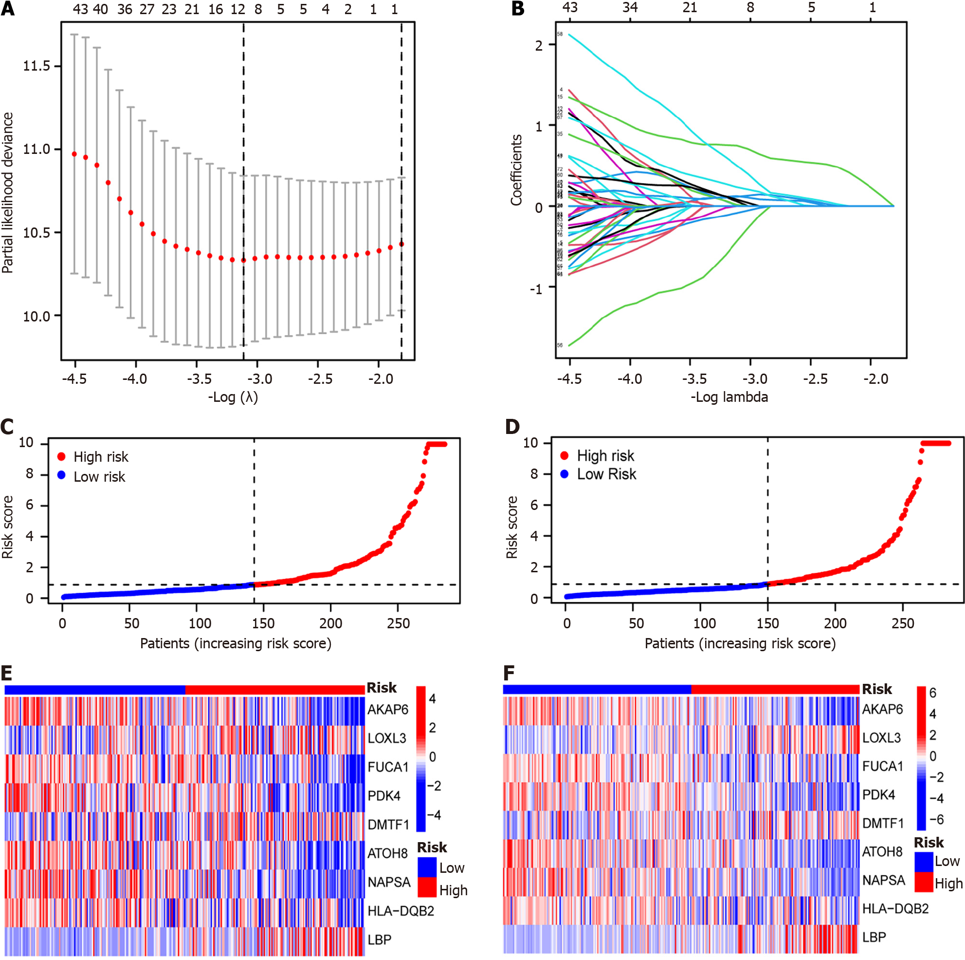
Figure 2 Risk grouping construction based on The Cancer Genome Atlas-Liver Hepatocellular Carcinoma, GSE25097, and GSE36376 combined datasets.
A: Least absolute shrinkage and selection operator is a gradient descent method for determining hub genes; B: Number of hub genes and their corresponding coefficients; C: Train group samples were classified into high- and low-risk groups based on the risk scores. Red indicates high-risk group samples, and blue indicates low-risk group samples; D: Test group samples have been classified into high-risk and low-risk groups based on the risk scores. Red indicates high-risk group samples, and blue indicates low-risk group samples; E: The hub genes expression within the high- and low-risk groups of the train group. Red indicates up-regulated expression, blue indicates under-expression of the expression, and white indicates zero expression; F: The hub genes expression within high- and low-risk groups of the test group. Red indicates up-regulated expression, blue indicates under-expression of the expression, and white indicates zero expression.
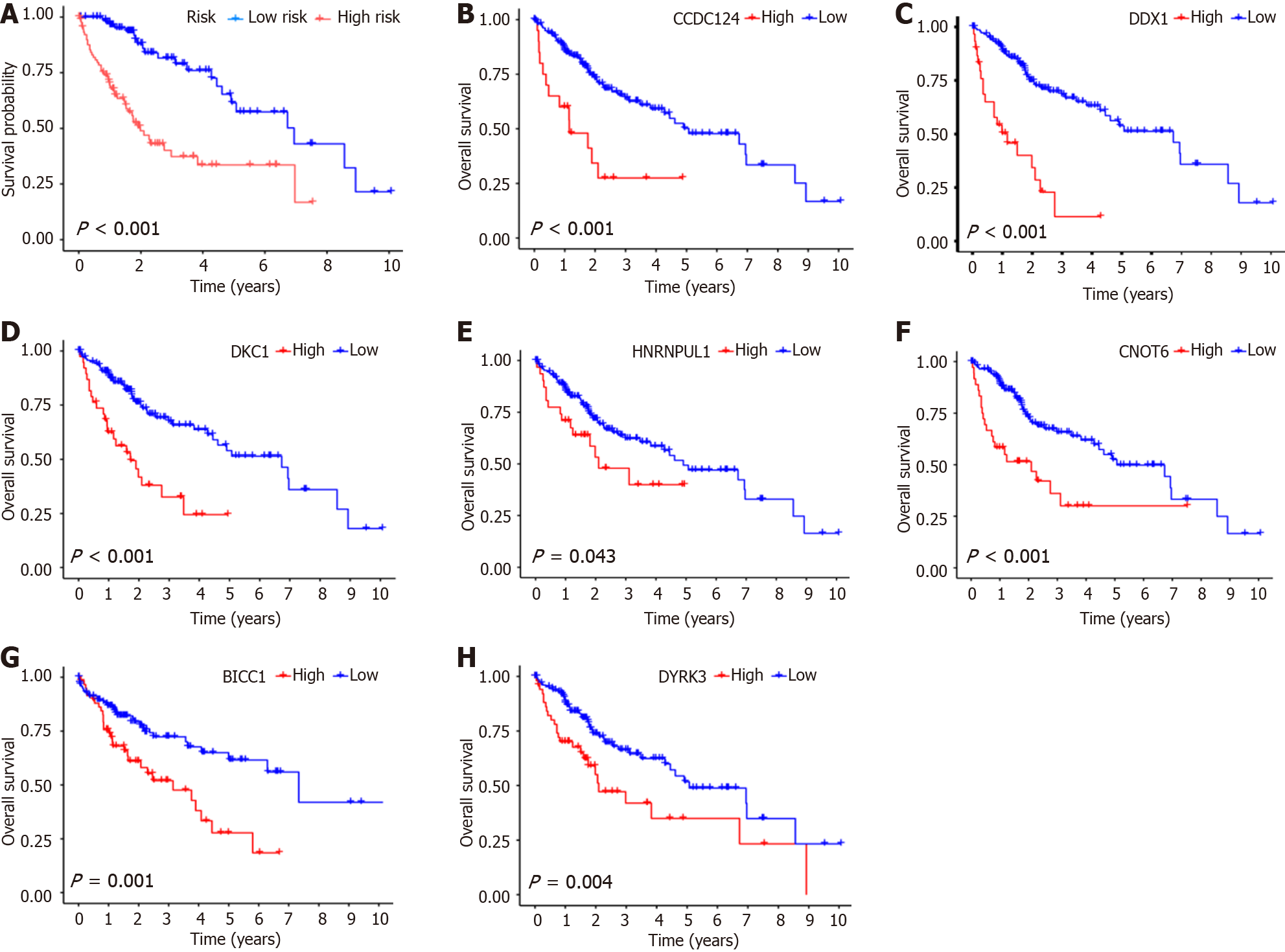
Figure 3 Survival analysis of high- and low-risk groups and hub genes in train group specimens according to The Cancer Genome Atlas-Liver Hepatocellular Carcinoma, GSE25097, and GSE36376 combined datasets.
A: Survival analysis of risk scores for train group samples. Red is indicative of high-risk group samples, and blue is indicative of low-risk group samples; B: Survival analysis of CCDC124 in train group samples. Red is indicative of high-risk group samples, and blue is indicative of low-risk group samples; C: Survival analysis of DDX1 in train group samples. Red is indicative of high-risk group samples, and blue is indicative of low-risk group samples; D: Survival analysis of DKC1 in train group samples. Red is indicative of high-risk group samples, and blue is indicative of low-risk group samples; E: Survival analysis of HNRNPUL1 in train group samples. Red is indicative of high-risk group samples, and blue is indicative of low-risk group samples; F: Survival analysis of CNOT6 in train group samples. Red is indicative of high-risk group samples, and blue is indicative of low-risk group samples; G: Survival analysis of BICC1 in train group samples. Red is indicative of high-risk group samples, and blue is indicative of low-risk group samples; H: Survival analysis of DYRK3 in train group samples. Red is indicative of high-risk group samples, and blue is indicative of low-risk group samples.
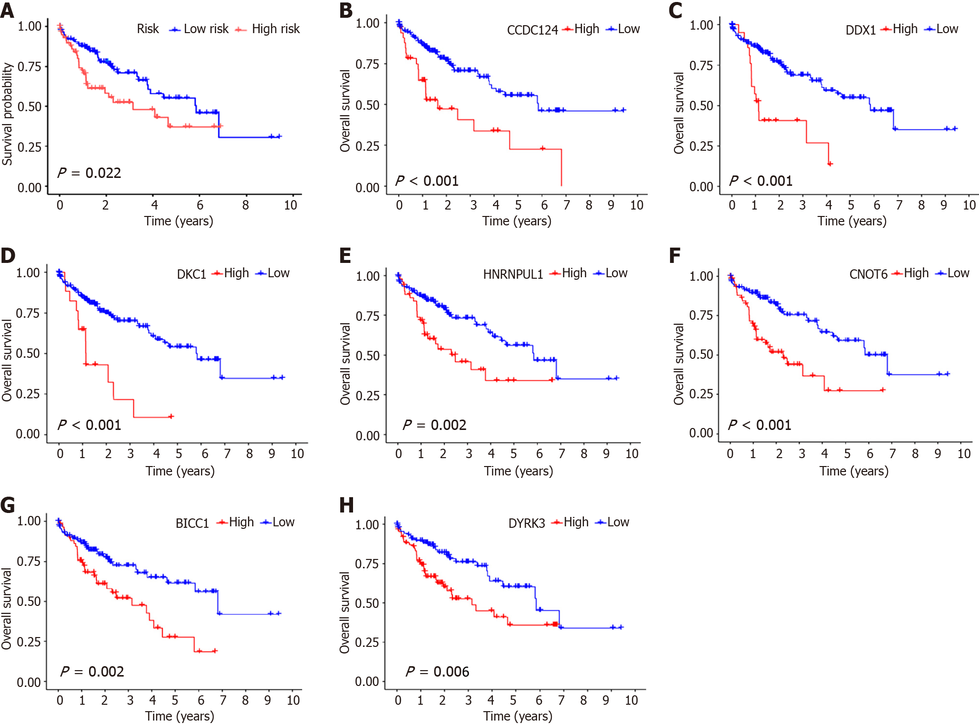
Figure 4 Hub genes survival analysis within the test group.
A: Survival analysis of risk scores for test group samples. Red represents high-risk group samples, and blue indicates low-risk group samples; B: Survival analysis of CCDC124 samples in the test group. Red indicates high-risk group samples, and blue represents low-risk group samples; C: Survival analysis of DDX1 in test group samples. Red indicates high-risk group samples, and blue indicates low-risk group samples; D: Survival analysis of DKC1 in test group samples. Red represents high-risk group samples, and blue indicates low-risk group samples; E: Survival analysis of HNRNPUL1 in the test group. Red represents high-risk group samples, and blue indicates low-risk group samples; F: Survival analysis of CNOT6 in test group samples. Red indicates high-risk group samples, and blue indicates low-risk group samples; G: Survival analysis of BICC1 in test group samples. Red indicates high-risk group samples, and blue indicates low-risk group samples; H: Survival analysis of DYRK3 in test group samples. Red indicates high-risk group samples, and blue indicates low-risk group samples.
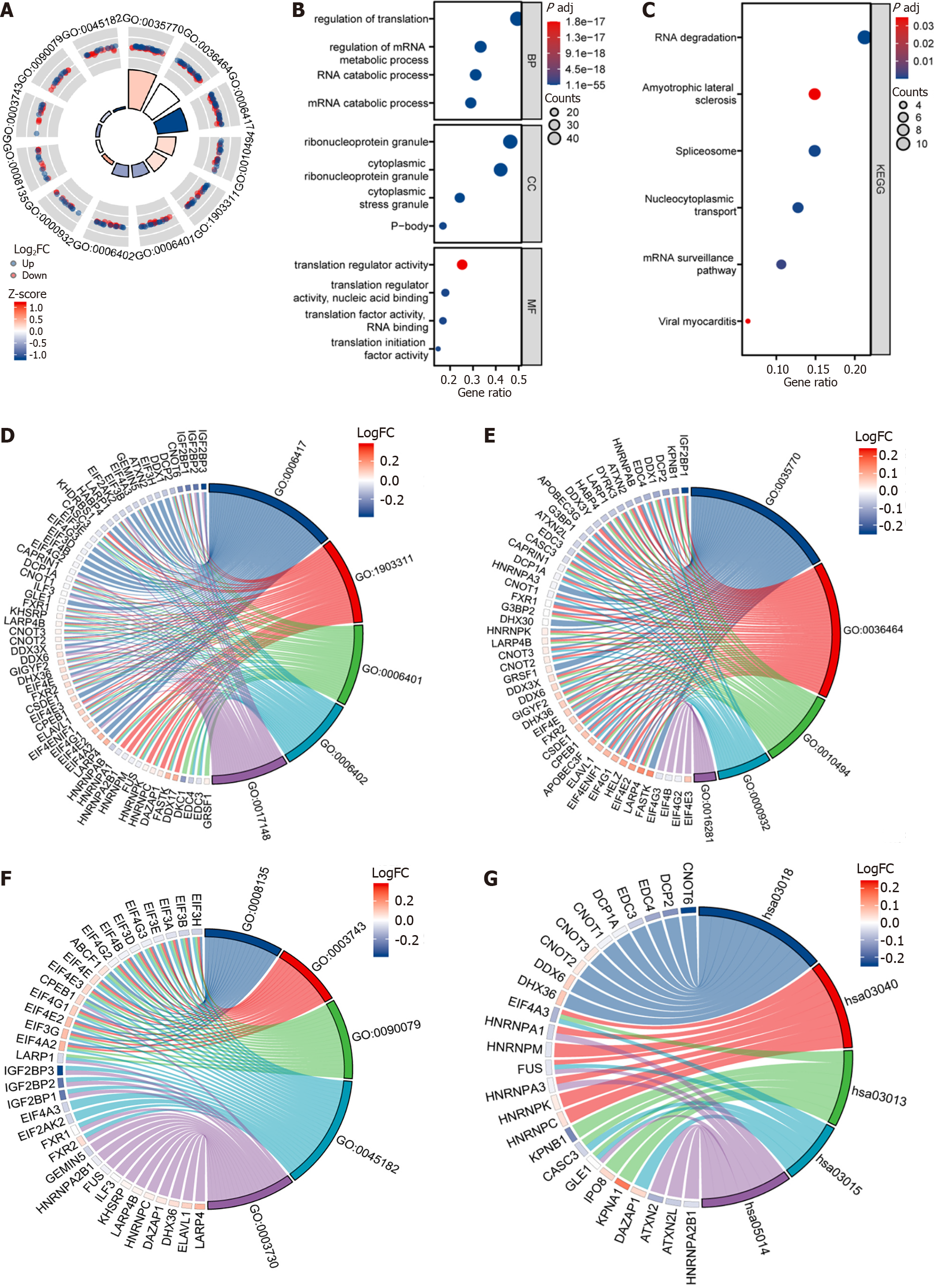
Figure 5 Gene Ontology analysis and Kyoto Encyclopedia of Genes and Genomes analysis of differentially expressed genes between high- and low-risk groups in The Cancer Genome Atlas-Liver Hepatocellular Carcinoma, GSE25097, and GSE36376 combined datasets.
A: The circle diagram visualization Gene Ontology (GO) enrichment analysis outcomes among the high- and low-risk groups, the outer circle is GO terms, red dots indicate genes overexpressed genes, blue dots indicate under-expressed genes, quadrilateral colors indicate the z-score of GO terms, blue indicates the z-score is negative, and the corresponding GO terms would probably exhibit inhibition, and red indicates z-score is positive, and it is more probable for the activation of the term to take place in the corresponding GO terms; B: Dot plot of GO enrichment analysis for differentially expressed genes; C: The abscissa represents the gene ratio. The ordinate represents the pathway name, the node size indicates the genes enriched number included within the pathway, and the node color is indicative of the P value; D: Biological processes function enrichment chord diagram, node color represents gene expression level. Red indicates the gene overexpressed gene, and blue indicates the under-expressed gene; E: Cellular component function enrichment chord diagram, node color represents gene expression level. Red indicates the gene overexpressed gene, and blue indicates the under-expressed gene; F: Molecular function enrichment chord diagram, node color represents gene expression level. Red indicates the gene overexpressed gene, and blue indicates the under-expressed gene; G: Kyoto Encyclopedia of Genes and Genomes function enrichment chord diagram, node color represents gene expression level. Red indicates the gene overexpressed gene, and blue indicates the under-expressed gene. FC: Fold change.
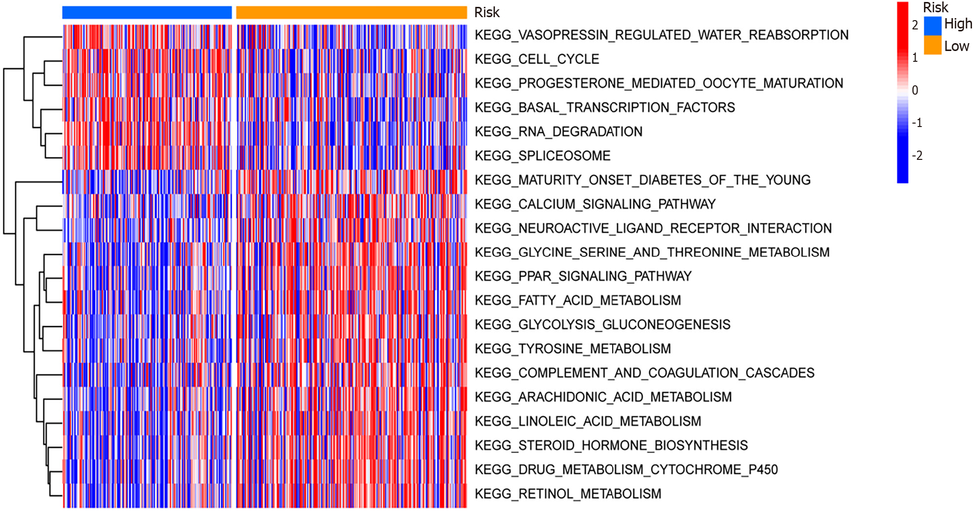
Figure 6 Gene Set Variation Analysis and Gene Set Enrichment Analysis of differential genes among high- and low-risk groups within The Cancer Genome Atlas-Liver Hepatocellular Carcinoma, GSE25097, and GSE36376 combined datasets.
The main biological functions and pathway heat maps obtained from Gene Set Variation Analysis are displayed. Blue indicates low risk, and yellow indicates high risk. Red represents overexpression in this pathway, and blue indicates under-expression in this pathway. KEGG: Kyoto Encyclopedia of Genes and Genomes.
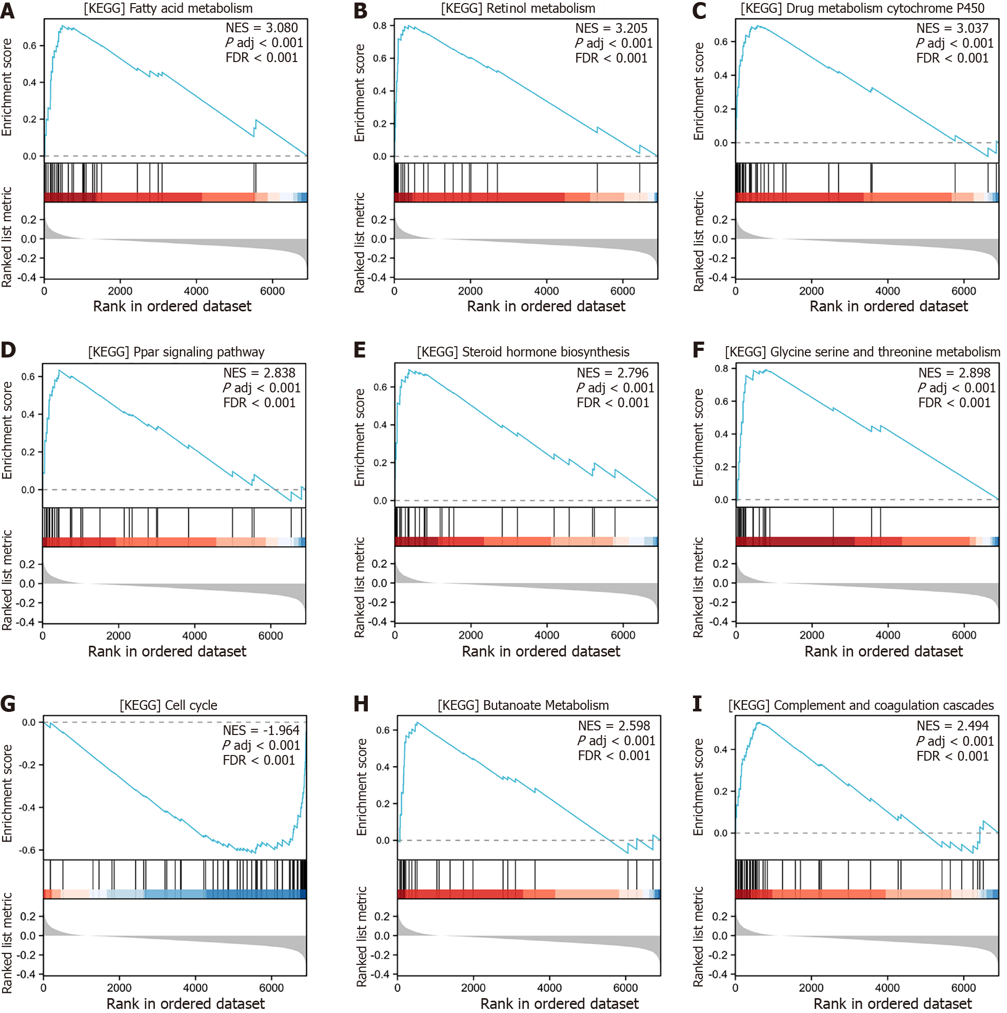
Figure 7 Gene Set Enrichment Analysis of differentially expressed genes between high- and low-risk groups in The Cancer Genome Atlas-Liver Hepatocellular Carcinoma, GSE25097, and GSE36376 combined datasets.
A: Gene Set Enrichment Analysis (GSEA) analysis illustrated that low risk was significantly up-regulated within the KEGG_FATTY_ACID_METABOLISM pathway compared to high risk; B: GSEA analysis illustrated that low risk was significantly up-regulated within the KEGG_RETINOL_METABOLISM pathway compared to high risk; C: GSEA analysis illustrated that low risk was significantly up-regulated within the KEGG_DRUG_METABOLISM_CYTOCHROME_P450 pathway compared to high risk; D: GSEA analysis illustrated that low risk was significantly up-regulated within the KEGG_PPAR_SIGNALING_PATHWAY pathway compared to high risk; E: GSEA analysis illustrated that low risk was significantly up-regulated within the KEGG_STEROID_HORMONE_BIOSYNTHESIS pathway compared to high risk; F: GSEA analysis illustrated that low risk was significantly up-regulated within the KEGG_GLYCINE_SERINE_AND_THREONINE_METABOLISM pathway compared to high risk; G: GSEA analysis illustrated that low risk was significantly down-regulated within the KEGG_CELL_CYCLE pathway compared to high risk; H: GSEA analysis illustrated that low risk was significantly up-regulated within the KEGG_BUTANOATE_METABOLISM pathway compared to high risk; I: GSEA analysis illustrated that low risk was significantly up-regulated within the KEGG_COMPLEMENT_AND_COAGULATION_CASCADES pathway compared to high risk. KEGG: Kyoto Encyclopedia of Genes and Genomes.
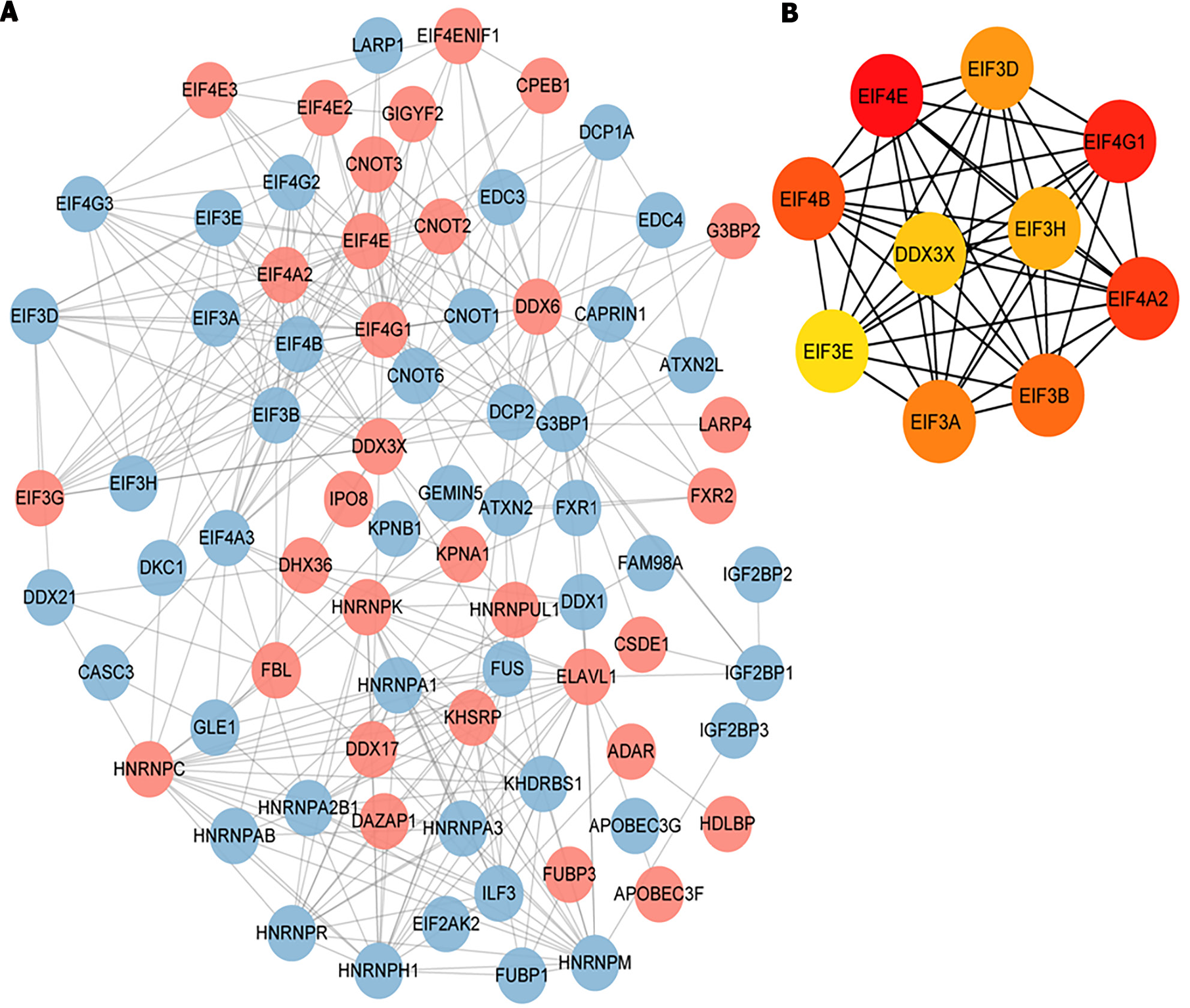
Figure 8 Protein-protein interaction analysis.
A: Protein-protein interaction analysis was conducted utilizing the STRING database for kinetokines-related genes, and the visualization of interaction relationship was carried out, where red indicates up-regulated genes and blue indicates downregulated genes; B: The resulting top 10 hub genes were analyzed utilizing the CytoHubba plug-in.
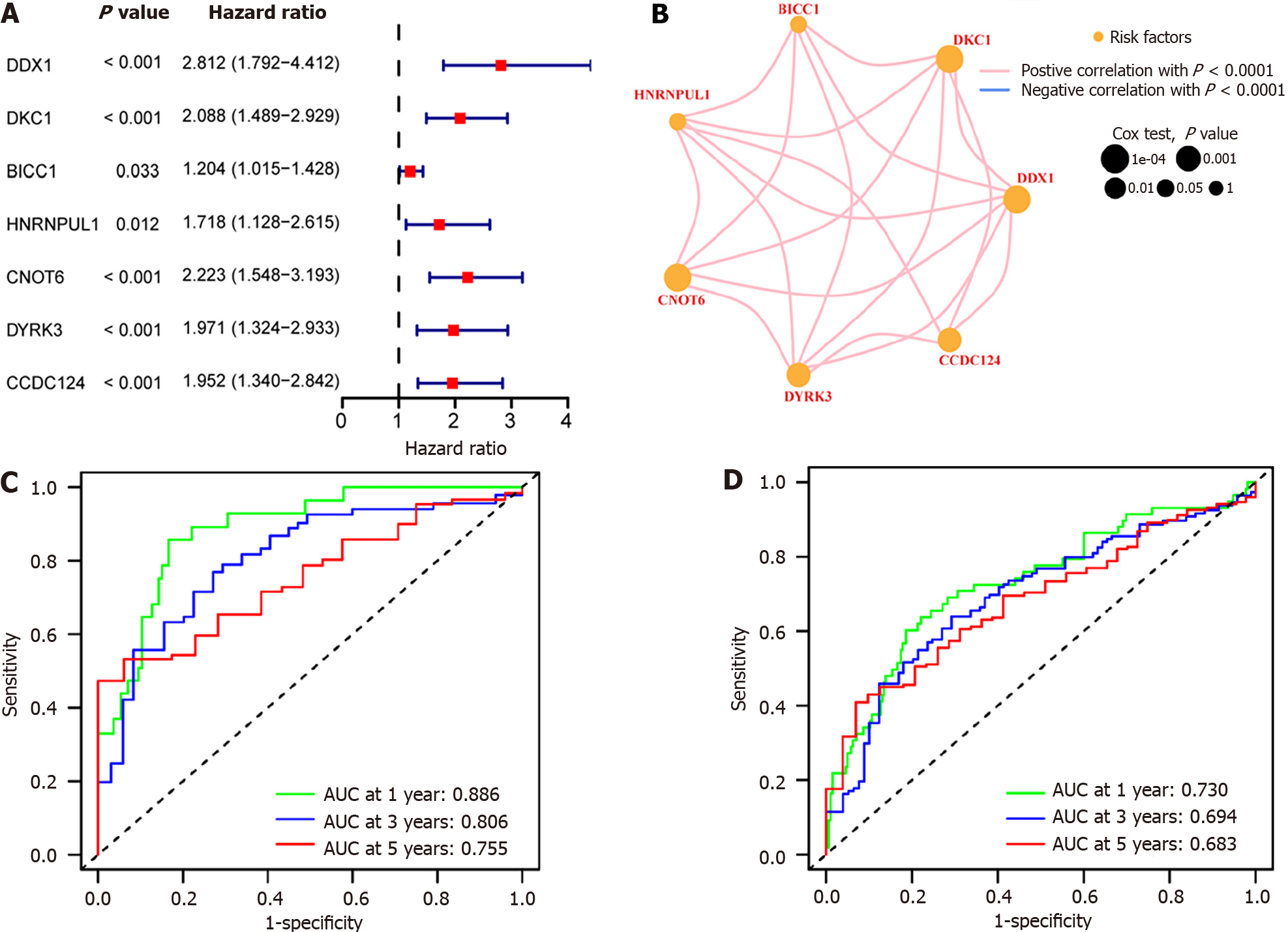
Figure 9 Hub gene association and prognosis analysis relied on The Cancer Genome Atlas-Liver Hepatocellular Carcinoma, GSE25097, and GSE36376 combined datasets.
A: Univariate Cox analysis of Hub genes in hepatocellular carcinoma (HCC). The left side of the dotted line represents hazard ratio (HR) < 1, revealing that this gene expression serves as a protective factor for the prognosis of HCC; the right side of the dotted line represents HR > 1, suggesting that this gene expression is a predictive risk factor for HCC; B: Visualization of interactions between Hub-genes. The red line indicates a positive association between the two different genes; the size of dot indicates the P value of the gene’s effect on the prognosis of HCC samples, and the orange dot represents that the gene is a risk factor for HCC; C: Receiver operating characteristic (ROC) curve. Green represents 1-year survival, blue represents 3-year survival, and red represents 5-year survival; D: ROC curve of test group. Green represents 1-year survival, blue represents 3-year survival, and red represents 5-year survival. AUC: Area under the curve.
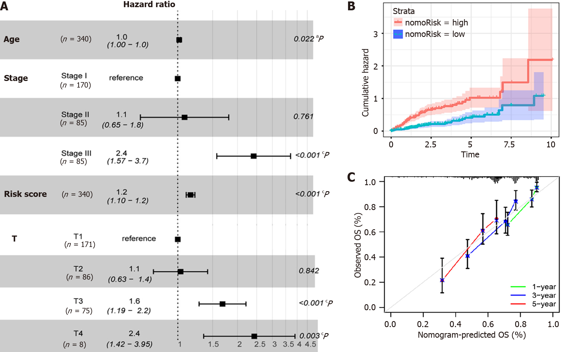
Figure 10 Multivariate Cox analysis and model performance of prognostic factors based on The Cancer Genome Atlas-Liver Hepatocellular Carcinoma, GSE25097, and GSE36376 combined datasets.
A: Visualization of the correlation between risk scores and clinical characteristics and hepatocellular carcinoma (HCC) prognosis, aP ≤ 0.05, bP ≤ 0.01, cP ≤ 0.001; B: The prognostic model classified the HCC sample into high-risk and low-risk groups, and there was a significant variance in survival among the high- and low-risk groups. Red is indicative of the high-risk group, and blue is indicative of the low-risk group; C: Calibration curve of HCC clinical prognosis model. Green represents 1-year survival, blue represents 3-year survival, and red represents 5-year survival. OS: Overall survival.
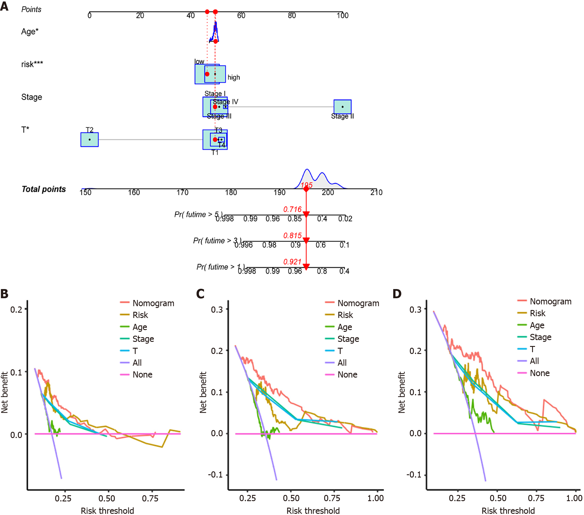
Figure 11 Prognostic model nomograms and decision curve analysis curves based on The Cancer Genome Atlas-Liver Hepatocellular Carcinoma, GSE25097, and GSE36376 combined datasets.
A: Clinical prognostic model nomogram of hepatocellular carcinoma (HCC). aP ≤ 0.05, cP ≤ 0.001; B: Decision curve analysis (DCA) curve for 1-year survival. The area under the curve represents the possible prognostic benefit for HCC patients based on this factor; C: DCA curve for 3-year survival. The area under the curve represents the possible prognostic benefit for HCC patients based on this factor; D: DCA curve for 5-year survival. The area under the curve represents the possible prognostic benefit for HCC patients based on this factor.
- Citation: Ren QS, Sun Q, Cheng SQ, Du LM, Guo PX. Hepatocellular carcinoma: An analysis of the expression status of stress granules and their prognostic value. World J Gastrointest Oncol 2024; 16(6): 2571-2591
- URL: https://www.wjgnet.com/1948-5204/full/v16/i6/2571.htm
- DOI: https://dx.doi.org/10.4251/wjgo.v16.i6.2571


