Copyright
©The Author(s) 2023.
World J Gastrointest Oncol. Feb 15, 2023; 15(2): 303-317
Published online Feb 15, 2023. doi: 10.4251/wjgo.v15.i2.303
Published online Feb 15, 2023. doi: 10.4251/wjgo.v15.i2.303
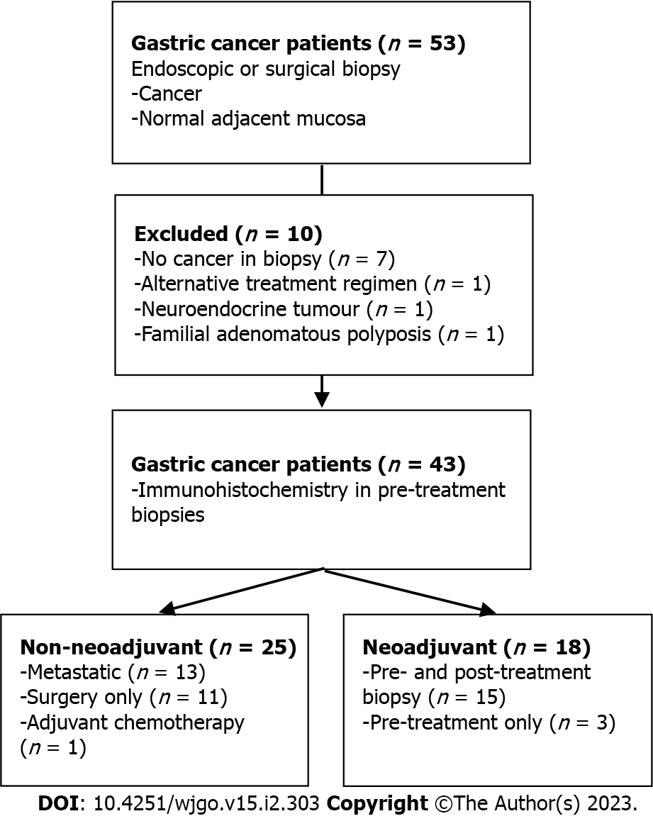
Figure 1 Study overview.
Flow chart outlining study design and patient allocation.
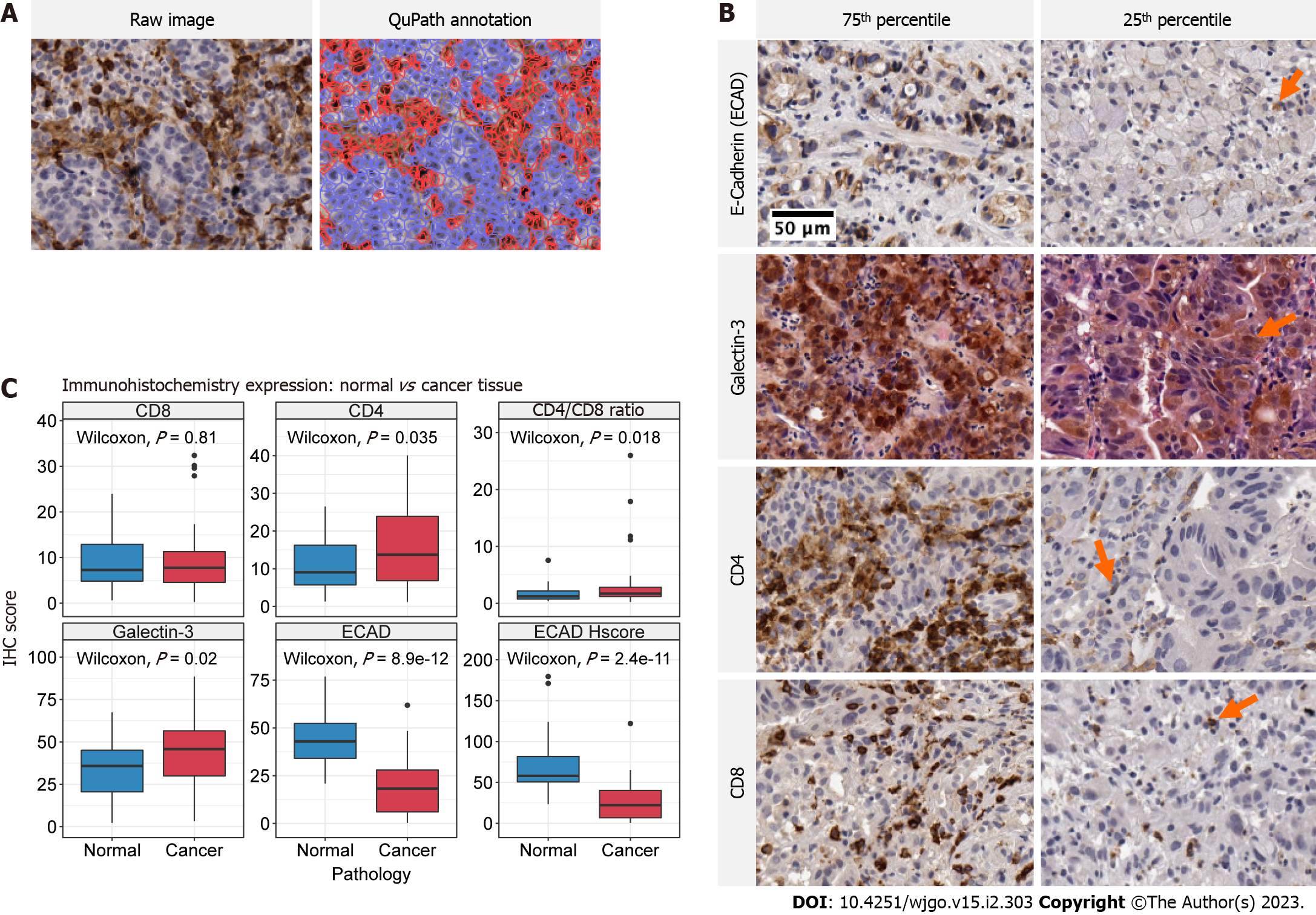
Figure 2 Immunohistochemistry stains and expression of biomarkers in treatment naïve normal and cancer tissue.
A: Representative images of QuPath digital pathology annotation using CD4 immunohistochemistry (IHC) at 10X magnification. Raw images (left) are processed and regions of interest are identified according to our methods. The annotated image (right) demonstrates the calculation of positive stained cells (red) and negative cells (blue); B: Representative IHC images taken at 10X magnification for each respective biomarker identified on the y-axis. Images of expression values within the 75th and 25th percentile are presented in the left and right columns, respectively. Arrows demonstrate positive staining in low expression specimens; C: Boxplot comparison of expression for each respective biomarker in treatment naive normal and cancer tissue. The IHC biomarker is labeled on the heading of each graph. The y-axis represents IHC score, which is the percent of positive stained cells for Galectin-3, CD4, CD8 and E-cadherin and the H-score for E-cadherin H-score plot. The x-axis labels the distribution corresponding to normal (blue) and cancer (red) tissue. The raw P value for Wilcoxon tests is annotated in each panel.
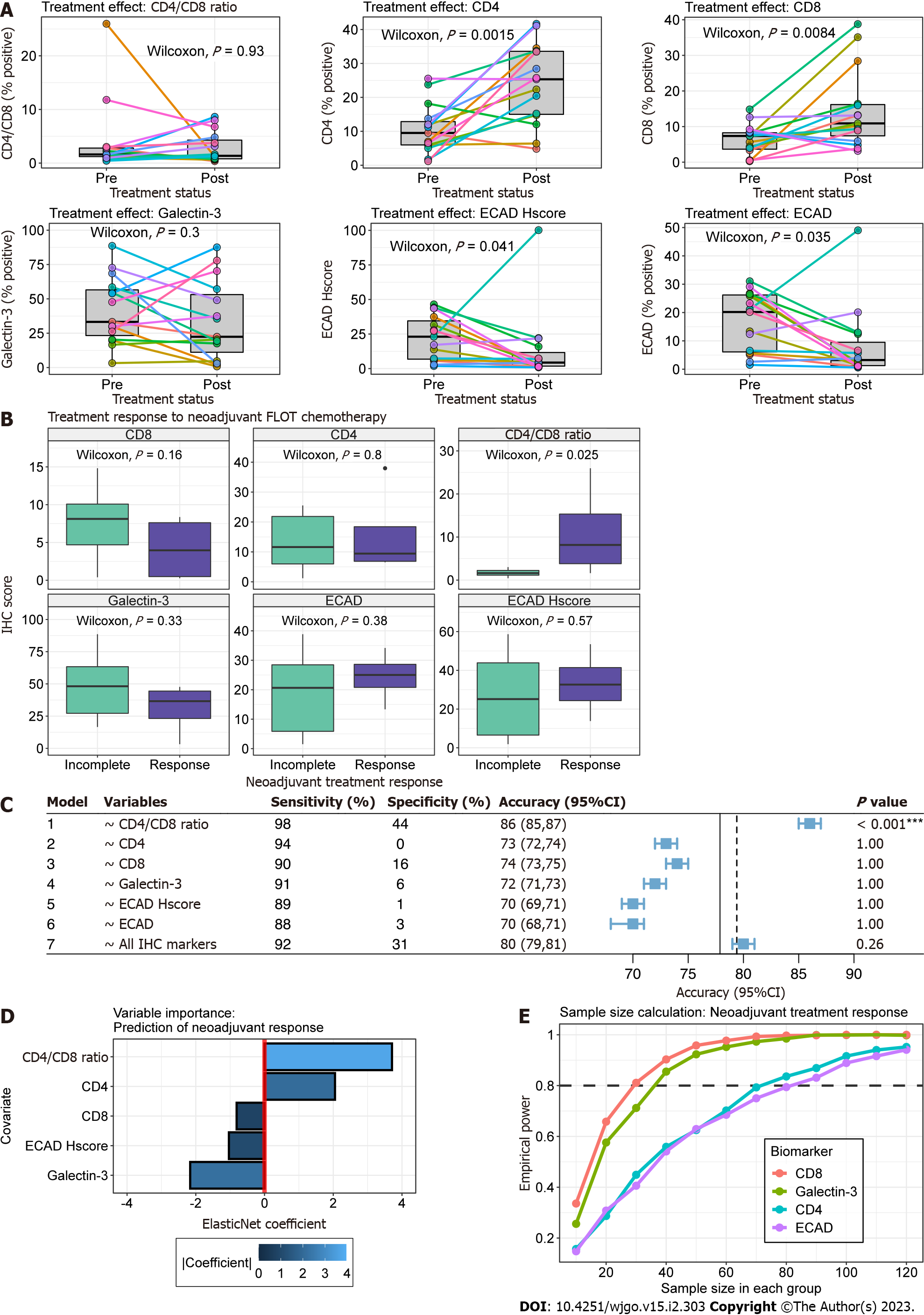
Figure 3 Association between biomarker expression and neoadjuvant 5-fluorouracil, leucovorin, oxaliplatin and docetaxel chemotherapy.
A: Paired boxplots for biomarker expression pre- and post-neoadjuvant chemotherapy. Each coloured point and line correspond to a single patient. Boxplots in grey represent the distribution of expression for all patients before and after chemotherapy. Paired Wilcoxon P value is present in each plot; B: Boxplot comparison of expression for each respective biomarker between treatment response (purple) and incomplete response (green). The immunohistochemistry (IHC) biomarker is labeled on the heading of each graph. The y-axis represents IHC score, which is the percent of positive stained cells for Galectin-3, CD4, CD8 and E-cadherin and the H-score for ECAD H-score plot; C: Forest plot for metrics of ElasticNet models. Models were constructed using the treatment response as the dependent variable and the corresponding independent variable(s) identified in the variable column. The plot represents the out-of-sample accuracy (blue square) and 95% confidence intervals (whiskers) for models estimated from 1000 bootstraps with replacement. The no information rate, defined as the maximum accuracy of a classifier if it predicted the majority class every time, is shown by the solid and dotted vertical lines for univariable and multivariable models, respectively; D: Barplot of model coefficients from multivariable glmnet model. The y-axis represents model covariates and the x-axis the coefficient value. Treatment response is related to increasing covariate values or decreasing covariate values for positive and negative coefficients, respectively. The absolute importance of the coefficient is shown in blue according to the scale legend; E: Lineplot illustrating monte-carlo simulations for two-sample Wilcoxon sample size calculations. The y-axis is the empirical power and the x-axis is the sample size in each group. Each coloured line corresponds to a biomarker labelled according to the legend.
- Citation: Skubleny D, Lin A, Garg S, McLean R, McCall M, Ghosh S, Spratlin JL, Schiller D, Rayat G. Increased CD4/CD8 Lymphocyte ratio predicts favourable neoadjuvant treatment response in gastric cancer: A prospective pilot study. World J Gastrointest Oncol 2023; 15(2): 303-317
- URL: https://www.wjgnet.com/1948-5204/full/v15/i2/303.htm
- DOI: https://dx.doi.org/10.4251/wjgo.v15.i2.303


