Copyright
©The Author(s) 2024.
World J Gastroenterol. Mar 21, 2024; 30(11): 1609-1620
Published online Mar 21, 2024. doi: 10.3748/wjg.v30.i11.1609
Published online Mar 21, 2024. doi: 10.3748/wjg.v30.i11.1609
Figure 1 UMAP visualization of single-cell RNA sequencing data.
A: UMAP visualization of 15 cell groups obtained through the Louvain algorithm; B: UMAP visualization of 7 cell types. CAF: Cancer-associated fibroblast; HPC: Hepatic progenitor cell; TAM: Tumor-associated macrophage; TEC: Tumor-associated endothelial cell.
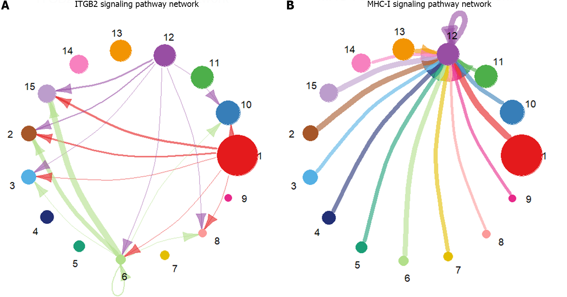
Figure 2 Circle plot of signaling pathway networks inferred by CellChat.
A: Visualization of the inferred integrin beta2 signaling pathway network details; B: Visualization of the inferred major histocompatibility class I signaling pathway network details. The different colors of the circles represent different cell groups. The size of the circle is proportional to the number of cells in the cell group. The arrows point from the source to the target, and the colors of the edges are consistent with those of the signal source. The width of the edges represents the communication probability. ITGB2: Integrin beta2; MHC-I: Major histocompatibility class I.
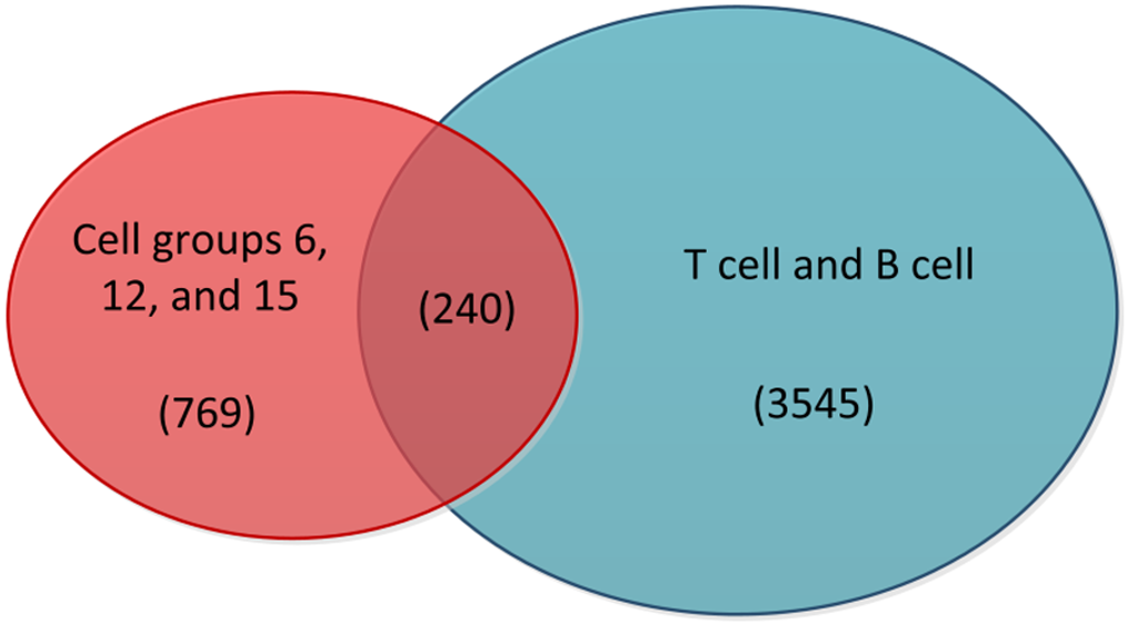
Figure 3 Venn diagram of highly active cells with T cells and B cells.
The red portion in the diagram represents cells from cell groups 6, 12, and 15, while the blue portion represents T cells and B cells. The middle section indicates the intersection between the two, and the numbers in parentheses correspond to the cell counts in these three sections.
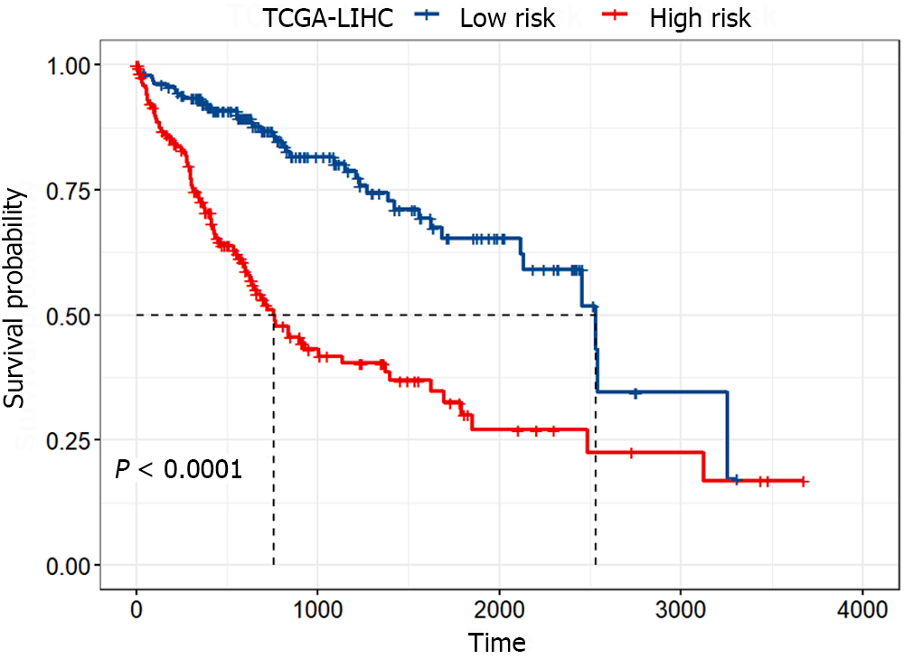
Figure 4 Kaplan-Meier survival curves of the high-risk and low-risk groups.
The red and blue curves represent the high-risk and low-risk groups, respectively, which were divided according to the median risk score. The significance of the difference between the two was evaluated through the log-rank test. TCGA-LIHC: The Cancer Genome Atlas Liver Hepatocellular Carcinoma.
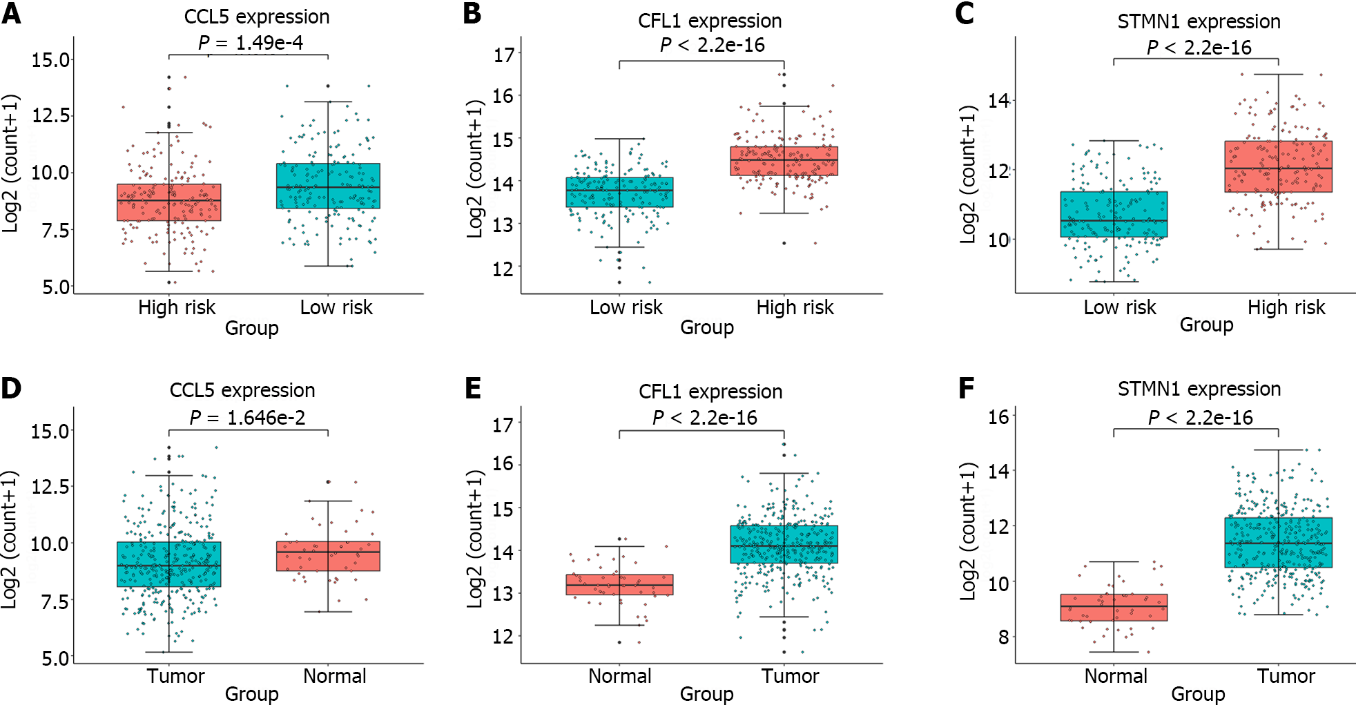
Figure 5 Box plots depicting the expression analysis of the genes employed in constructing the gene signature.
A-C: Expression analysis of C-C chemokine ligand 5 (CCL5), cofilin 1 (CFL1), and stathmin 1 (STMN1) in the high-risk and low-risk groups; D-F: Expression analysis of CCL5, CFL1, and STMN1 in the tumor and normal groups. The high-risk and normal groups are represented by red boxes, while the low-risk and tumor groups are represented by blue boxes. The significant differences between groups were evaluated through t tests. CCL5: C-C chemokine ligand 5; CFL1: Cofilin 1; STMN1: Stathmin 1.
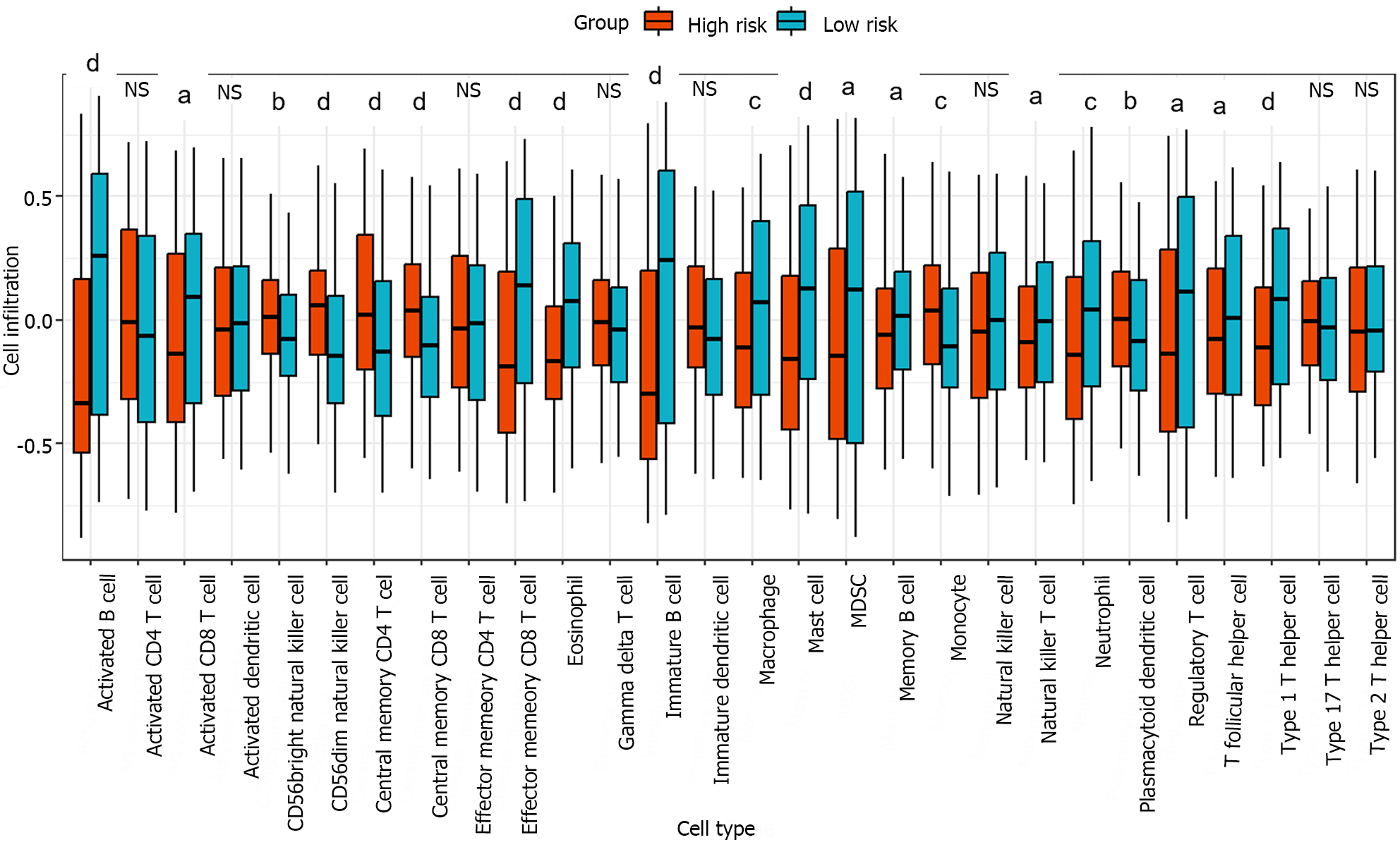
Figure 6 Box plot of the degree of immune cell infiltration in the high-risk and low-risk groups.
The infiltration degree of 28 immune cell types in the high-risk and low-risk groups was analyzed, and the significant differences between the two groups were evaluated using the Kruskal-Wallis test. aP < 0.05; bP < 0.01; cP < 0.001; dP < 0.0001.
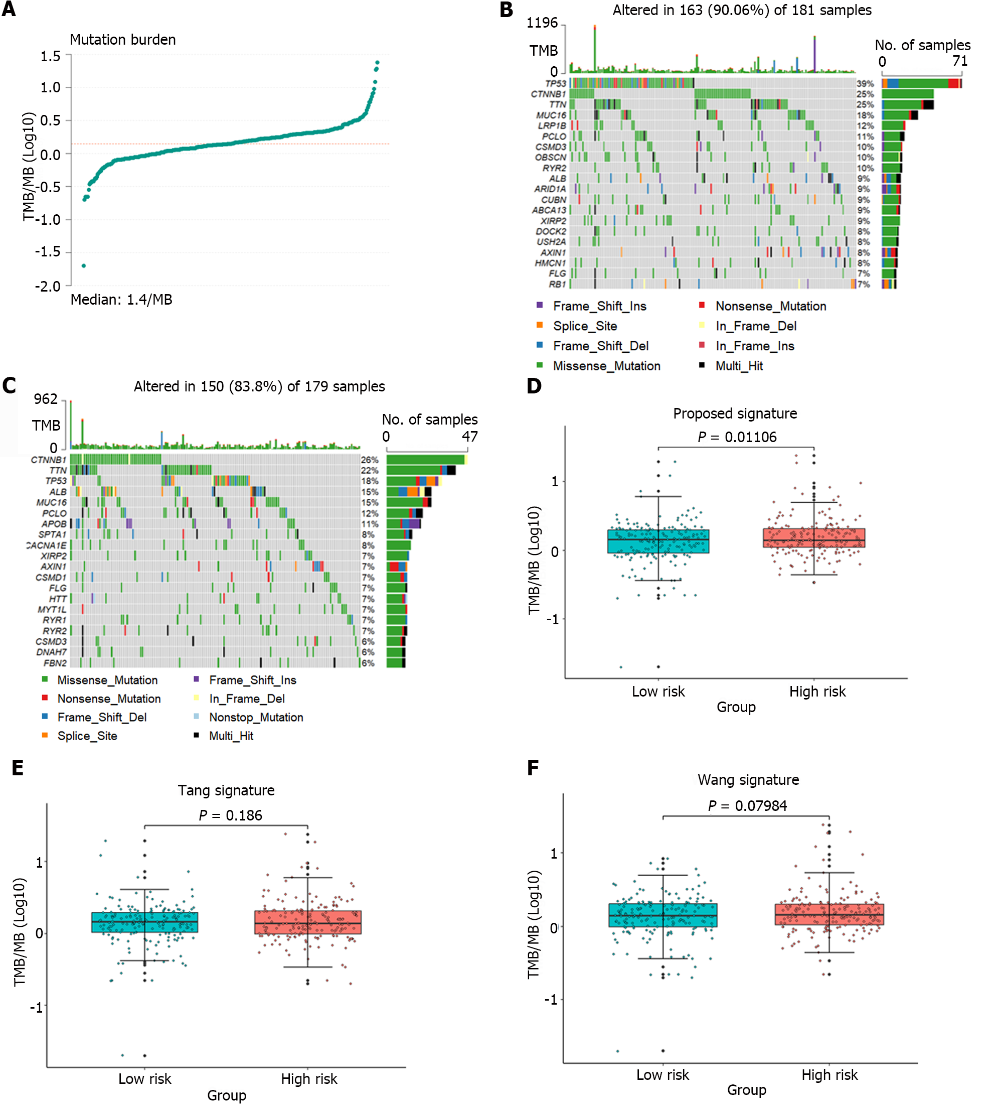
Figure 7 Analysis of the tumor mutation burden in the samples.
A: The distribution of tumor mutation burden (TMB) for all samples; B and C: Waterfall plots depicting mutation landscapes in the high-risk and low-risk groups, respectively; D-F: A comparative analysis of TMB was conducted in the high-risk and low-risk groups identified by the gene signature identified in this article and the groups identified by the gene signature proposed by Tang et al[11] and Wang et al[12].
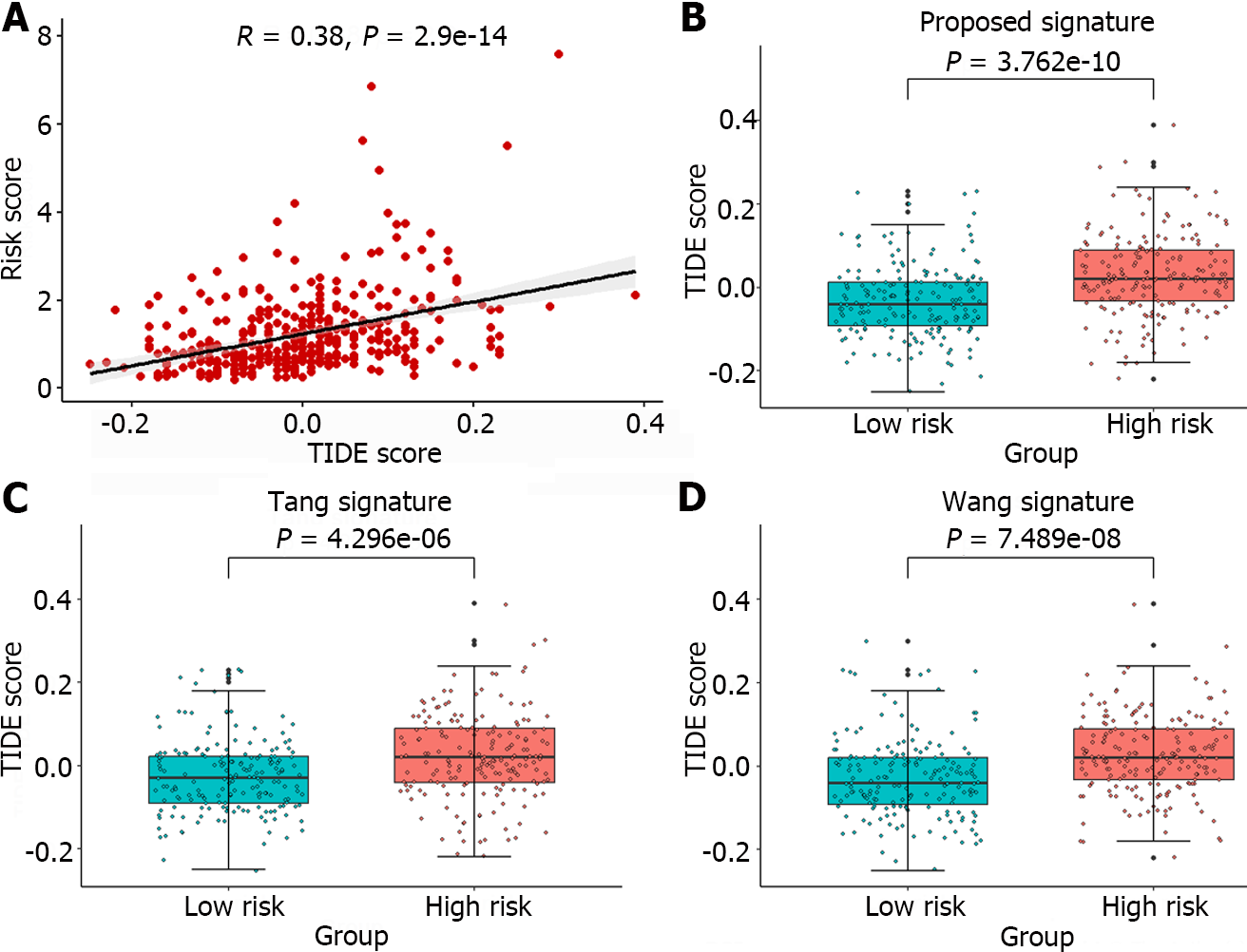
Figure 8 Analysis of predicted TIDE scores in the sample.
A: Pearson correlation analysis between the sample risk score and TIDE score; B-D: A comparative analysis of the TIDE score was conducted for the high-risk and low-risk groups identified by the gene signature in this article and the groups identified by the gene signatures proposed by Tang et al[11] and Wang et al[12].
- Citation: Li JT, Zhang HM, Wang W, Wei DQ. Identification of an immune-related gene signature for predicting prognosis and immunotherapy efficacy in liver cancer via cell-cell communication. World J Gastroenterol 2024; 30(11): 1609-1620
- URL: https://www.wjgnet.com/1007-9327/full/v30/i11/1609.htm
- DOI: https://dx.doi.org/10.3748/wjg.v30.i11.1609


