Copyright
©The Author(s) 2015.
World J Clin Oncol. Aug 10, 2015; 6(4): 73-79
Published online Aug 10, 2015. doi: 10.5306/wjco.v6.i4.73
Published online Aug 10, 2015. doi: 10.5306/wjco.v6.i4.73
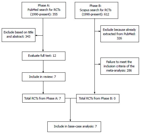
Figure 1 Phases of our literature search illustrated according to the PRISMA schematic.
RCTs: Randomized controlled trials.
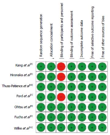
Figure 2 Application of the Cochrane Collaboration’s tool for assessing risk of bias in randomised trials.
The figure shows the summary of risk-of-bias assessments for the 7 randomized, controlled trials included in our analysis. Low risk of bias is represented by green circles (see Higgins et al[7] for further details).
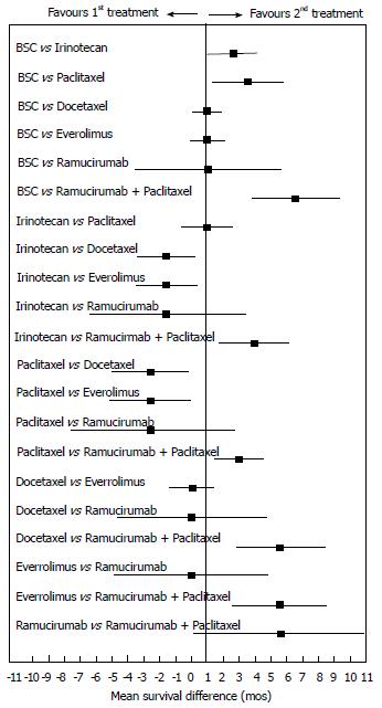
Figure 3 Meta-analytical values of mean survival difference estimated for 6 direct comparisons (each of the 6 active treatments vs best supportive care) and for 15 head-to-head indirect comparisons between the active treatments.
Each horizontal bar indicates the two-sided 95%CrI for the mean survival difference (solid square). BSC: Best supportive care.
Figure 4 Histogram of rankings generated by the Bayesian network meta-analysis.
The graphs reflect a total of 20000 iterations and consist of as many histograms as the treatments (N = 6 plus best supportive care) included in the analysis. In each panel, the histogram shows the percent distribution of the simulations across ranks 1 (most effective treatment) through 7 (least effective treatment); the y-axis shows probability on a 0 to 1 scale. BSC: Best supportive care.
- Citation: Badiani B, Maratea D, Messori A. Second-line treatments for advanced gastric cancer: Interpreting outcomes by network meta-analysis. World J Clin Oncol 2015; 6(4): 73-79
- URL: https://www.wjgnet.com/2218-4333/full/v6/i4/73.htm
- DOI: https://dx.doi.org/10.5306/wjco.v6.i4.73


