Copyright
©The Author(s) 2024.
World J Clin Oncol. Jun 24, 2024; 15(6): 765-782
Published online Jun 24, 2024. doi: 10.5306/wjco.v15.i6.765
Published online Jun 24, 2024. doi: 10.5306/wjco.v15.i6.765
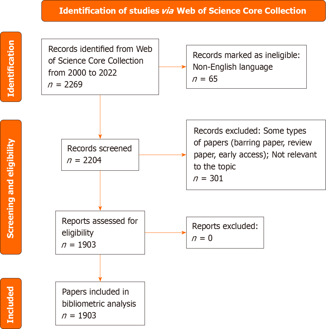
Figure 1
Flowchart of data collection from articles on lung cancer bone metastasis.
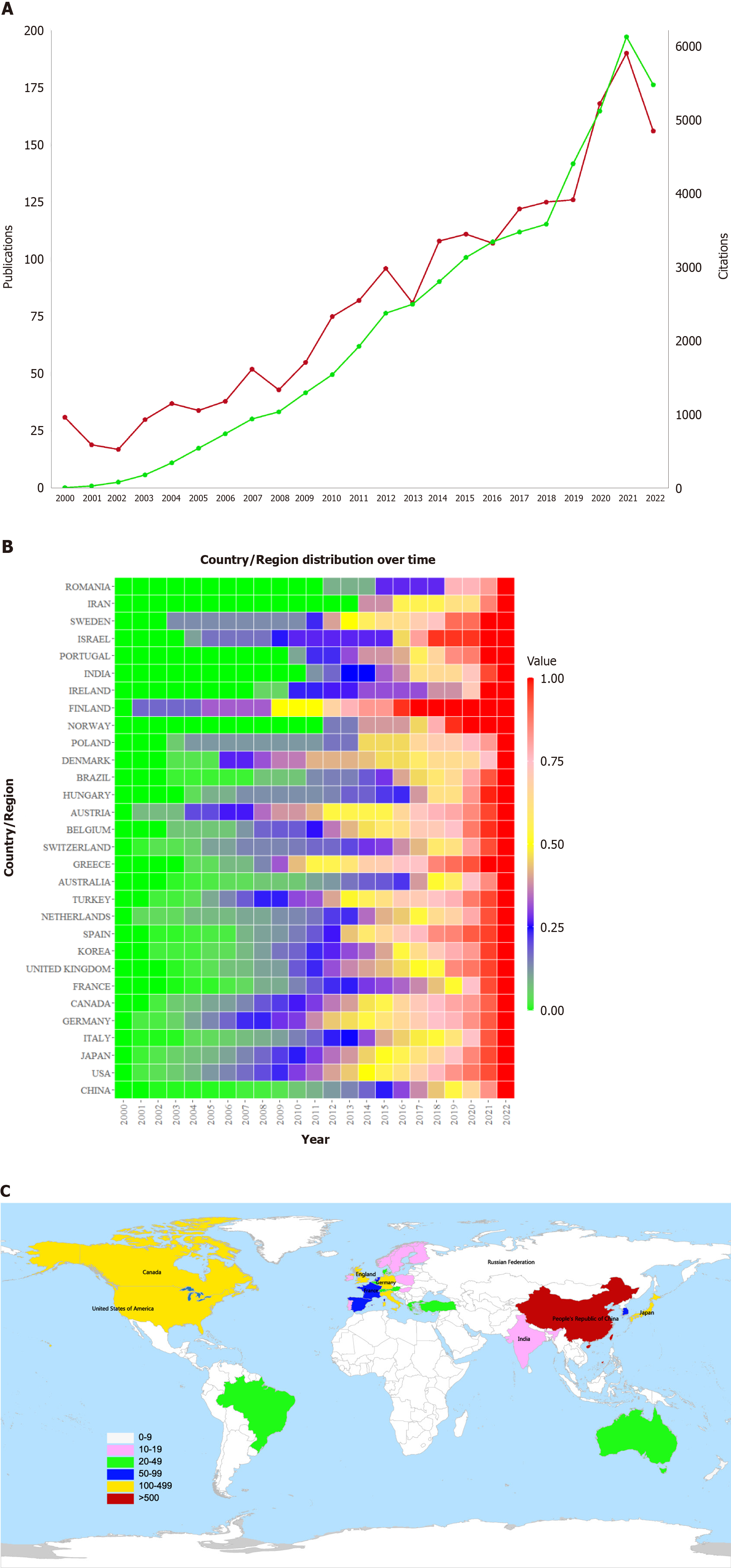
Figure 2 Annual change and distribution map of lung cancer bone metastasis knowledge volume.
A: Annual publications and citations of articles on lung cancer bone metastasis (LCBM) from 2000 to 2022, the red line corresponds to “publications”; the green line corresponds to “citations”; B: Thermal diagram of the time distribution of national/regional articles, the values represent the ratio of the total number of papers published in a country from 2000 to a certain year to the total number of papers published in a country; C: Analysis chart of articles on LCBM at the country/region level.
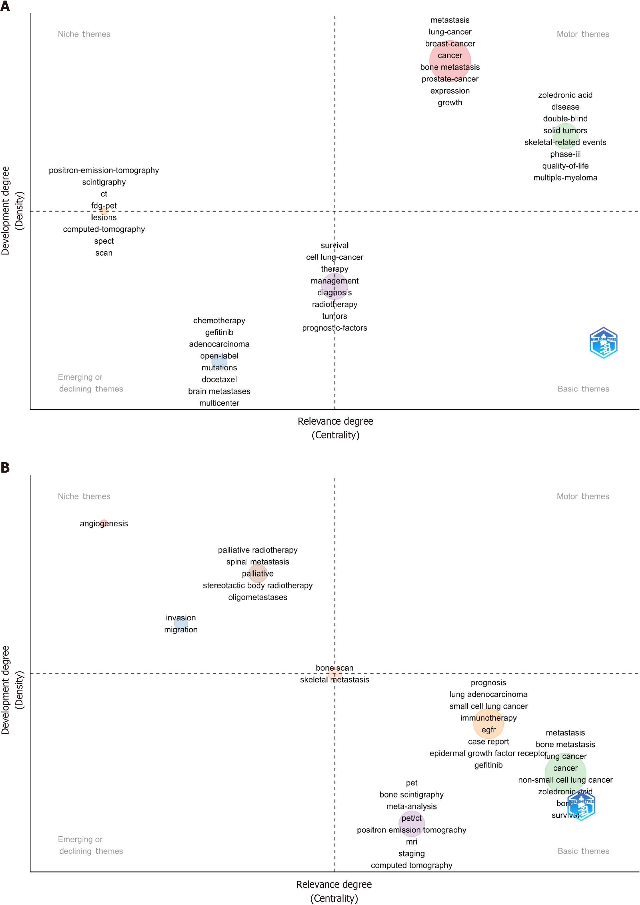
Figure 3 Theme strategic coordinate map.
A: Keywords plus; B: Authors’ keywords.
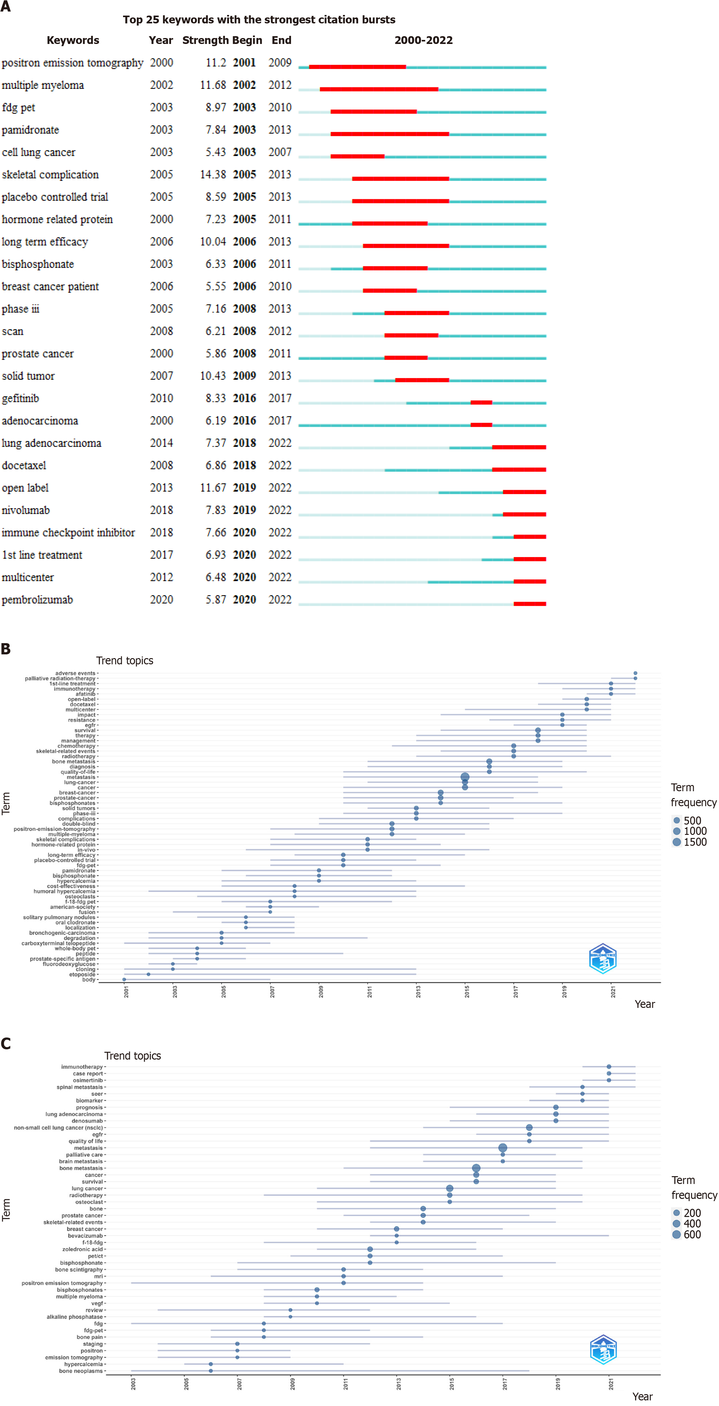
Figure 4 Time distribution chart of popular keywords.
A: Burst detection graph of all keywords in articles on lung cancer bone metastasis (LCBM); B: Topic trend graph drawn based on keywords plus of the articles on LCBM; C: Topic trend graph drawn based on the authors’ keywords in the articles on LCBM.
Figure 5 Keyword time heat map.
A and B: Keywords plus; C and D: Authors’ keywords. The A and C values represent the ratio of the frequency of a keyword in each year to its highest frequency in a year. The B and D values represent the ratio of the total frequency of the keyword from 2000 to a certain year to its total frequency.
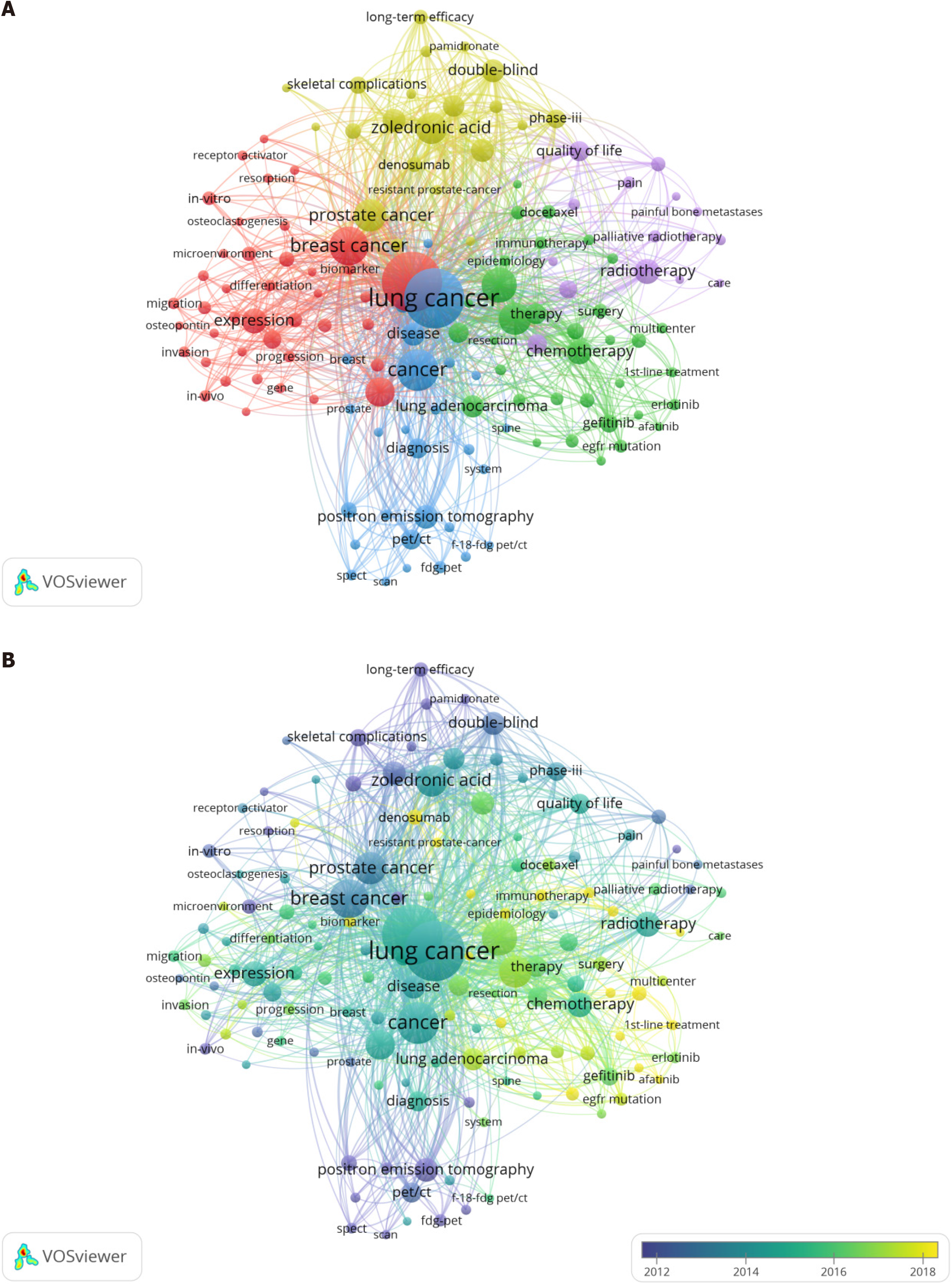
Figure 6 Analysis of the co-occurrence of all keywords.
A: Network visualization map; B: Overlay visualization map. The small circle represents the keyword. The area of the small circle represents the frequency of the keyword. The colors of the different areas represent their categories. The lines of the connecting circles represent keywords that appear in an article at the same time.
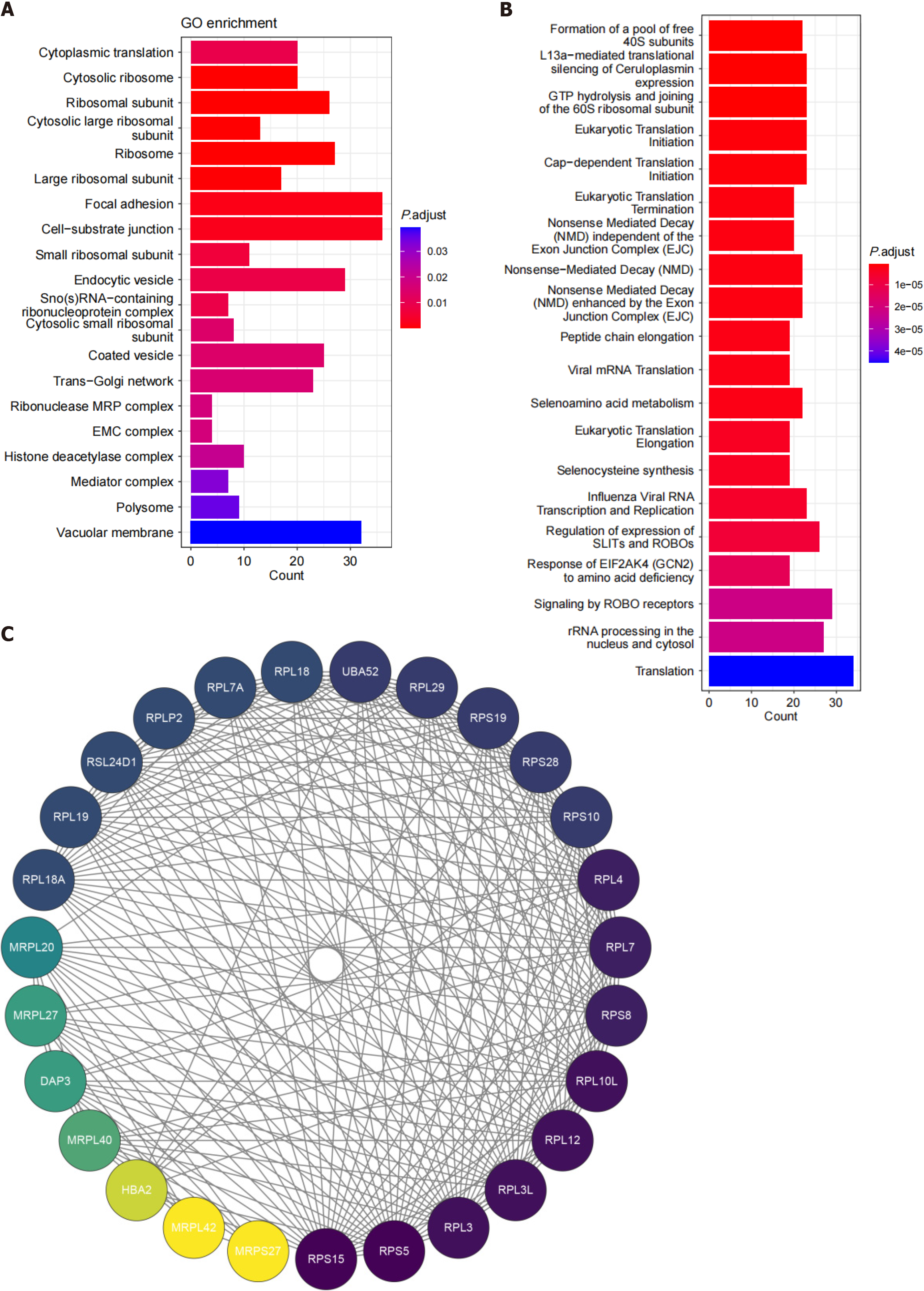
Figure 7 Molecular map of lung cancer bone metastasis.
A: Bubble map of differentially expressed genes (DEGs) based on the Gene Ontology enrichment analysis; B: Bubble map of DEGs based on the Reactome enrichment analysis; C: Protein-protein interaction network diagram related to the ribosome pathway. GO: Gene Ontology.
- Citation: Chen Y, Chen XS, He RQ, Huang ZG, Lu HP, Huang H, Yang DP, Tang ZQ, Yang X, Zhang HJ, Qv N, Kong JL, Chen G. What enlightenment has the development of lung cancer bone metastasis brought in the last 22 years. World J Clin Oncol 2024; 15(6): 765-782
- URL: https://www.wjgnet.com/2218-4333/full/v15/i6/765.htm
- DOI: https://dx.doi.org/10.5306/wjco.v15.i6.765


