Copyright
©2010 Baishideng Publishing Group Co.
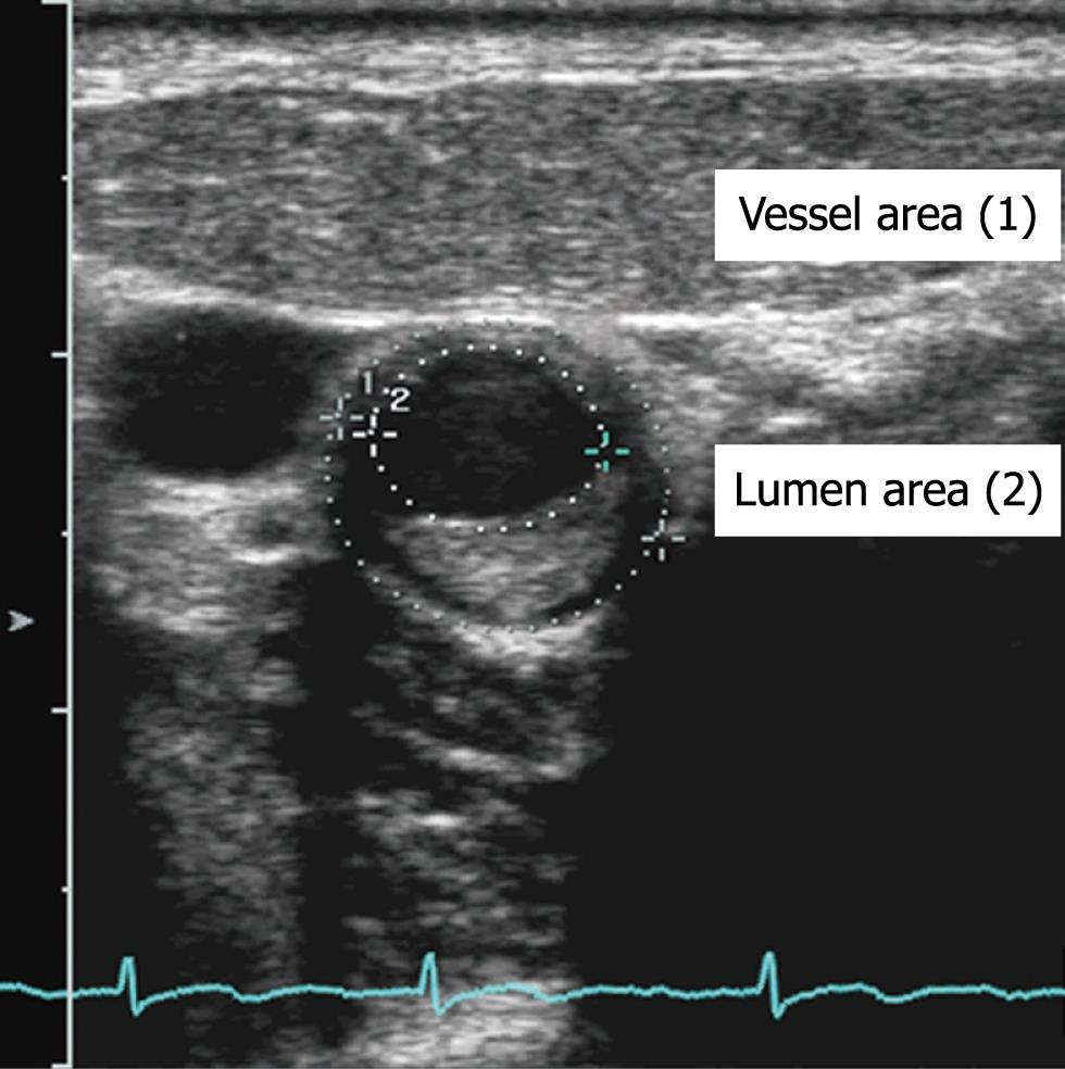
Figure 1 An example of carotid artery atherosclerosis seen with ultrasonography.
Percent vessel area stenosis is plaque area (vessel area minus luminal area) divided by vessel area × 100.
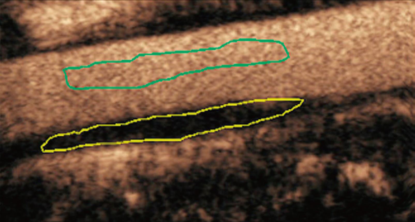
Figure 2 ROI (yellow) was drawn freehand around the peripheral margin of the plaque.
The arrival time (AT), time to peak enhancement (TTP), goodness of fit (GOF), baseline intensity (BI) and peak intensity (PI) of plaque were calculated automatically by the ACQ software. IE = PI - BI, WT = TTP - AT.
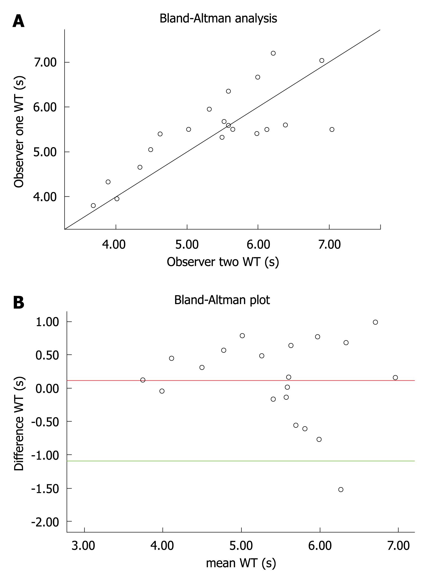
Figure 3 Data for wash-in time (WT) measurements and observer agreement.
A: Scatter plot of WT measurements (s) shows data for observer 2 (x-axis) and observer 1 (y-axis); line of perfect agreement is shown; B: Agreement plot for WT measurements made by observers 1 and 2. Plots the difference between observers’ measurements and mean measurements. Top and bottom lines show the 95% limits of agreement; middle line shows mean difference.
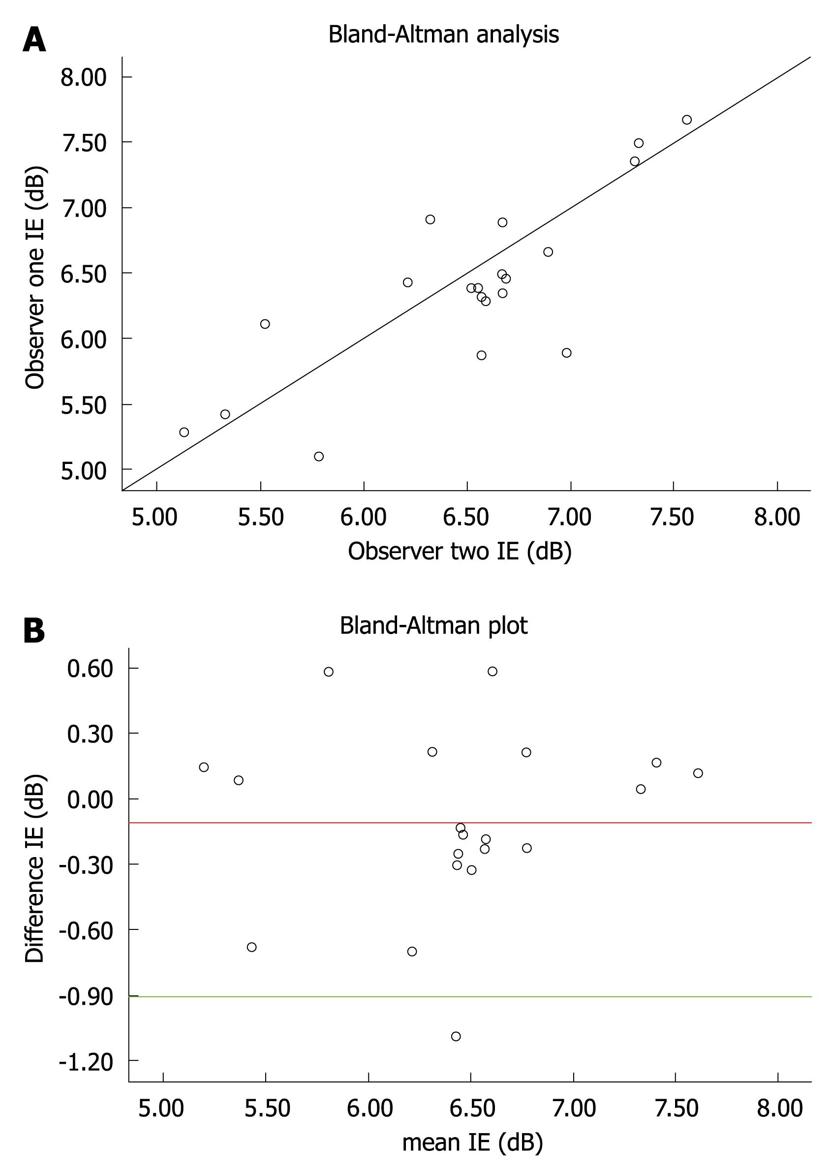
Figure 4 Data for intensity of enhancement (IE) measurements and observer agreement.
A: Scatter plot of blood flow measurements (dB) shows data for observer 2 (x-axis) and observer 1 (y-axis); line of perfect agreement is shown; B: Agreement plot for IE measurements made by observers 1 and 2. Plots the difference between observers' measurements and mean measurements. Top and bottom lines show the 95% limits of agreement; middle line shows mean difference.
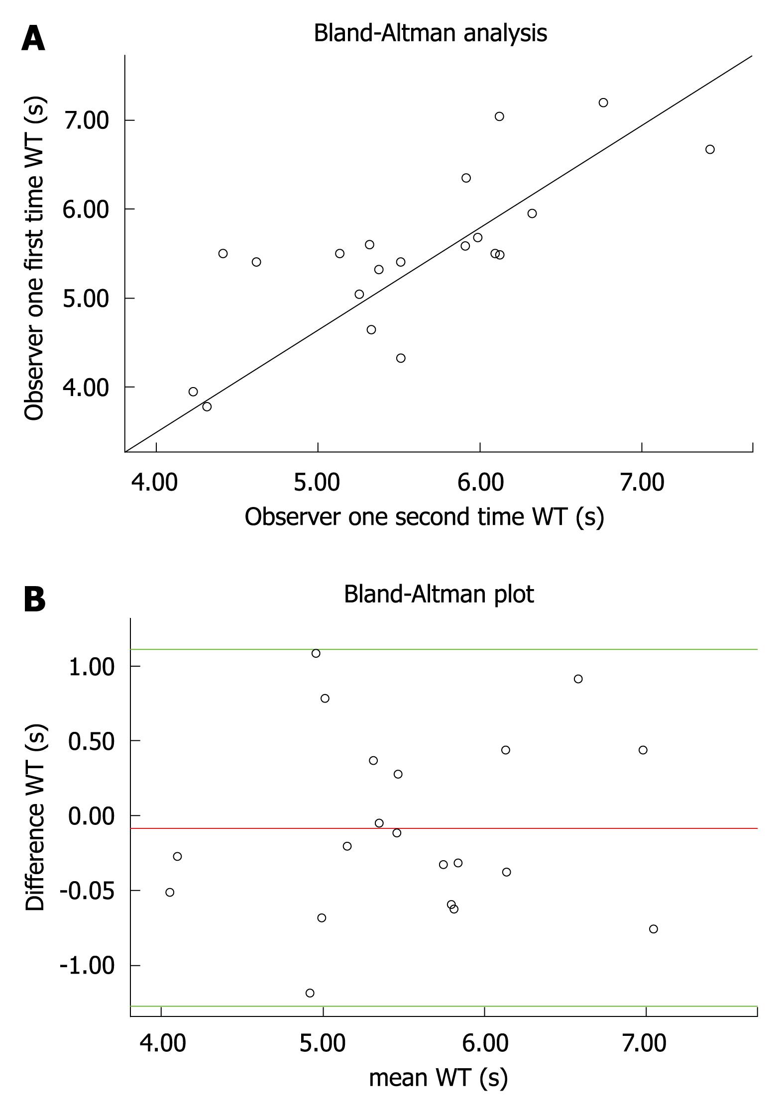
Figure 5 Data for WT measurements and intra-observer agreement.
A: Scatterplot of WT measurements (s) shows data for second time (x-axis) and first time (y-axis) measurement of observer 1; line of perfect agreement is shown; B: Agreement plot for WT measurements made by observer 1. Plots the difference between 2 measurements and mean measurements. Top and bottom lines show the 95% limits of agreement; middle line shows mean difference.
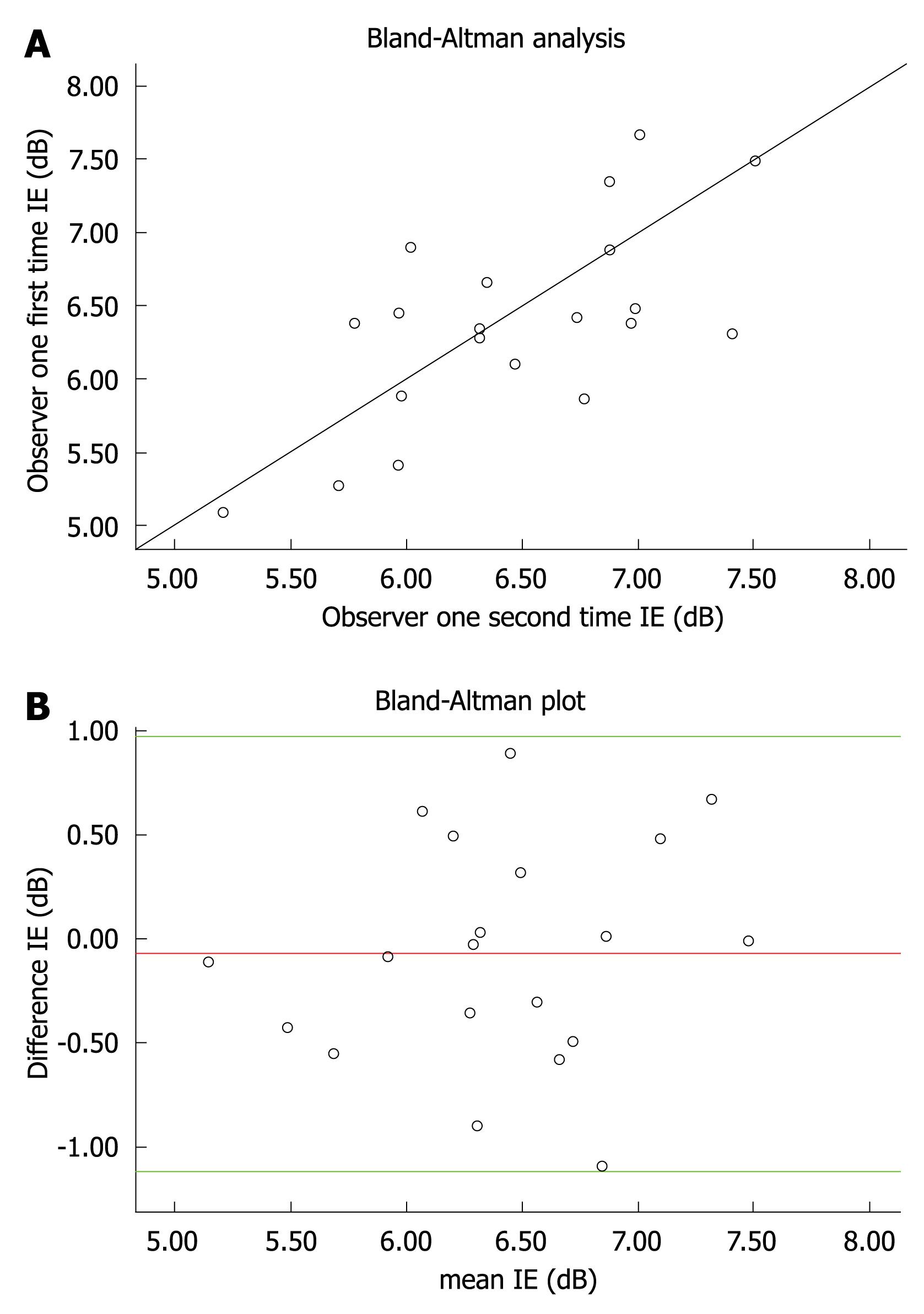
Figure 6 Data for IE measurements and intraobserver agreement.
A: Scatterplot of blood flow measurements (dB) shows data for second time (x-axis) and first time (y-axis) measurement of observer 1; line of perfect agreement is shown; B: Agreement plot for IE measurements made by 2 measurements of observer 1. Plots the difference between 2 measurements and mean measurements. Top and bottom lines show the 95% limits of agreement; middle line shows mean difference.
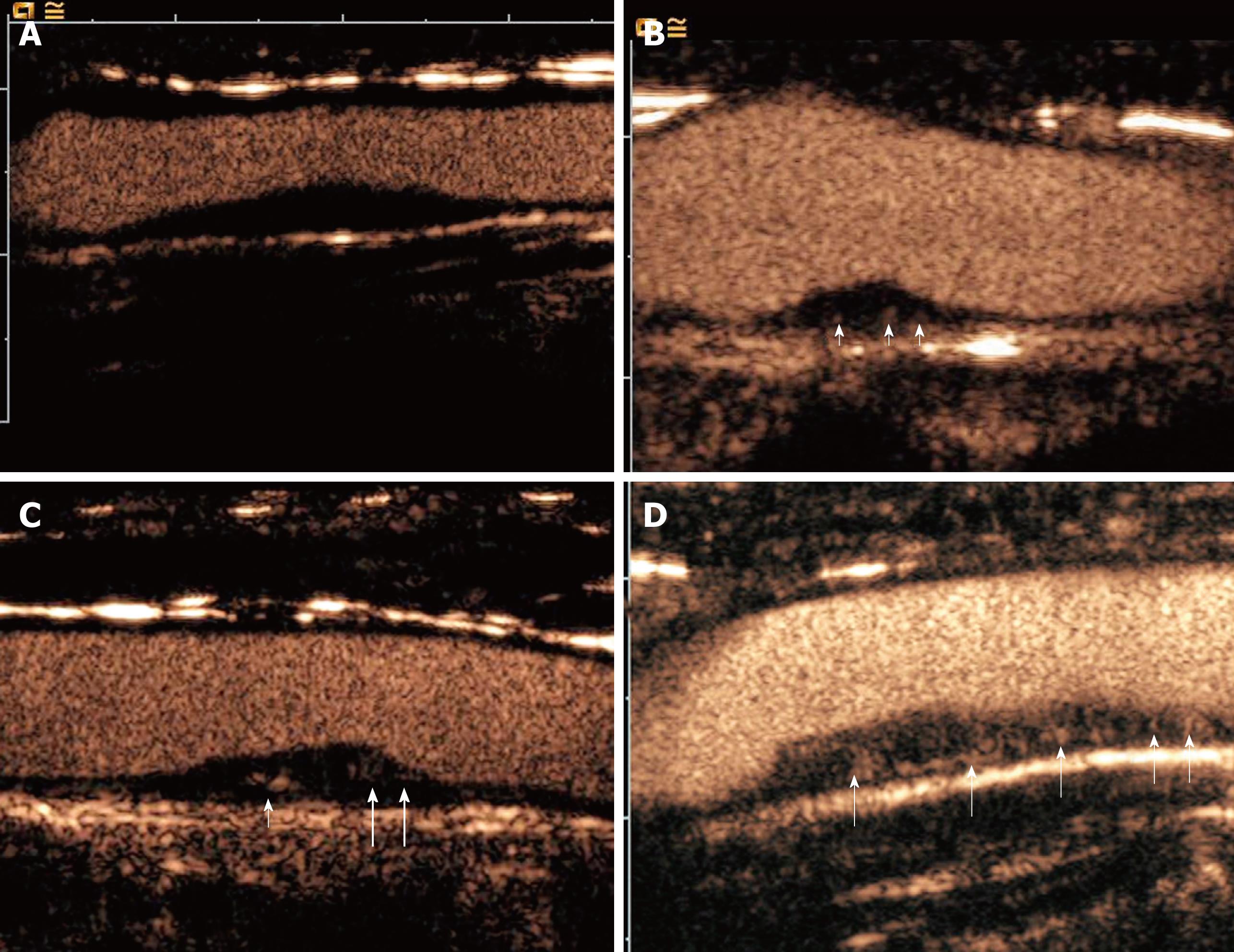
Figure 7 Definition of Grade I plaque: non-enhancement of the plaque located on the internal carotid artery.
A: Grade I: non-enhancement of the plaque located on the internal carotid artery wall; B: Grade II: the arterial wall vasa vasorum enhancement (arrows); C: Grade III: the arterial wall vasa vasorum (small arrow) and plaque shoulder (large arrows) enhancement; D: Grade IV: Extensive internal plaque enhancement (arrows).
Figure 8 Receiver operating characteristic (ROC) curve of the ability of grade of plaque enhancement to predict precursors of stroke.
A: The area under the ROC curve was 0.721. The optimal threshold for the detection of stroke was more than grade II, with 74.1% sensitivity and 66.3% specificity; B: Receiver operating characteristic (ROC) curve of the ability of IE to predict precursors of stroke. The area under the ROC curve was 0.785. The optimal threshold for the detection of stroke was 6.4 dB, with 82.4% sensitivity and 79.7% specificity; C: Receiver operating characteristic (ROC) curve of the ability of WT to predict precursors of stroke. The area under the ROC curve was 0.69. The optimal threshold for the detection of stroke was 4.15 s, with 67.6% sensitivity and 73.9% specificity.
- Citation: Huang PT, Chen CC, Aronow WS, Wang XT, Nair CK, Xue NY, Shen X, Li SY, Huang FG, Cosgrove D. Assessment of neovascularization within carotid plaques in patients with ischemic stroke. World J Cardiol 2010; 2(4): 89-97
- URL: https://www.wjgnet.com/1949-8462/full/v2/i4/89.htm
- DOI: https://dx.doi.org/10.4330/wjc.v2.i4.89


