Copyright
©The Author(s) 2024.
World J Cardiol. Feb 26, 2024; 16(2): 80-91
Published online Feb 26, 2024. doi: 10.4330/wjc.v16.i2.80
Published online Feb 26, 2024. doi: 10.4330/wjc.v16.i2.80
Figure 1 The nomogram prediction model for the risk of pre-hospital delay.
Each indicator in the nomogram corresponds to a specific vertical line that ascends from the respective score on the horizontal axis labeled "Points." Along each indicator's line, a specific score is assigned based on the patient's characteristics. Four specific scores from different indicators are added together to calculate the total score. The total score is located on the horizontal axis labeled "Total Points." A vertical line is drawn downward from the total score to intersect with the axis labeled "Risk of Pre-hospital Delay." The value corresponding to the intersection point indicates the estimated risk of pre-hospital delay for the patient.
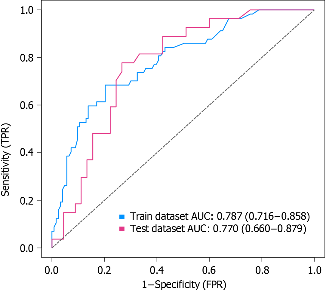
Figure 2 Receiver operating characteristic curve analysis of the nomogram model.
The figure displays the receiver operating characteristic (ROC) curve analysis of the developed nomogram model. The area under the ROC curve (AUC) is used as a measure of the model's discriminatory ability. The false positive rate is plotted on the x-axis, while the true positive rate is plotted on the y-axis. The AUC values indicate the accuracy of the model in distinguishing between individuals who experienced pre-hospital delay and those who did not. A higher AUC value suggests a better predictive performance of the model. TPR: True positive rate; FPR: False positive rate.
Figure 3 Calibration curve of the nomogram model.
A and B: The figure illustrates the calibration curve analysis of the developed nomogram model in both the development group (A) and the validation group (B). The calibration curve assesses the agreement between the predicted and observed probabilities of pre-hospital delay likelihood. The x-axis represents the predicted probabilities, while the y-axis represents the observed probabilities. The goodness-of-fit is evaluated to determine the accuracy of the model. A well-calibrated model would show a close alignment of the predicted probabilities with the observed probabilities along the 45-degree diagonal line. GOF: Goodness-of-fit.
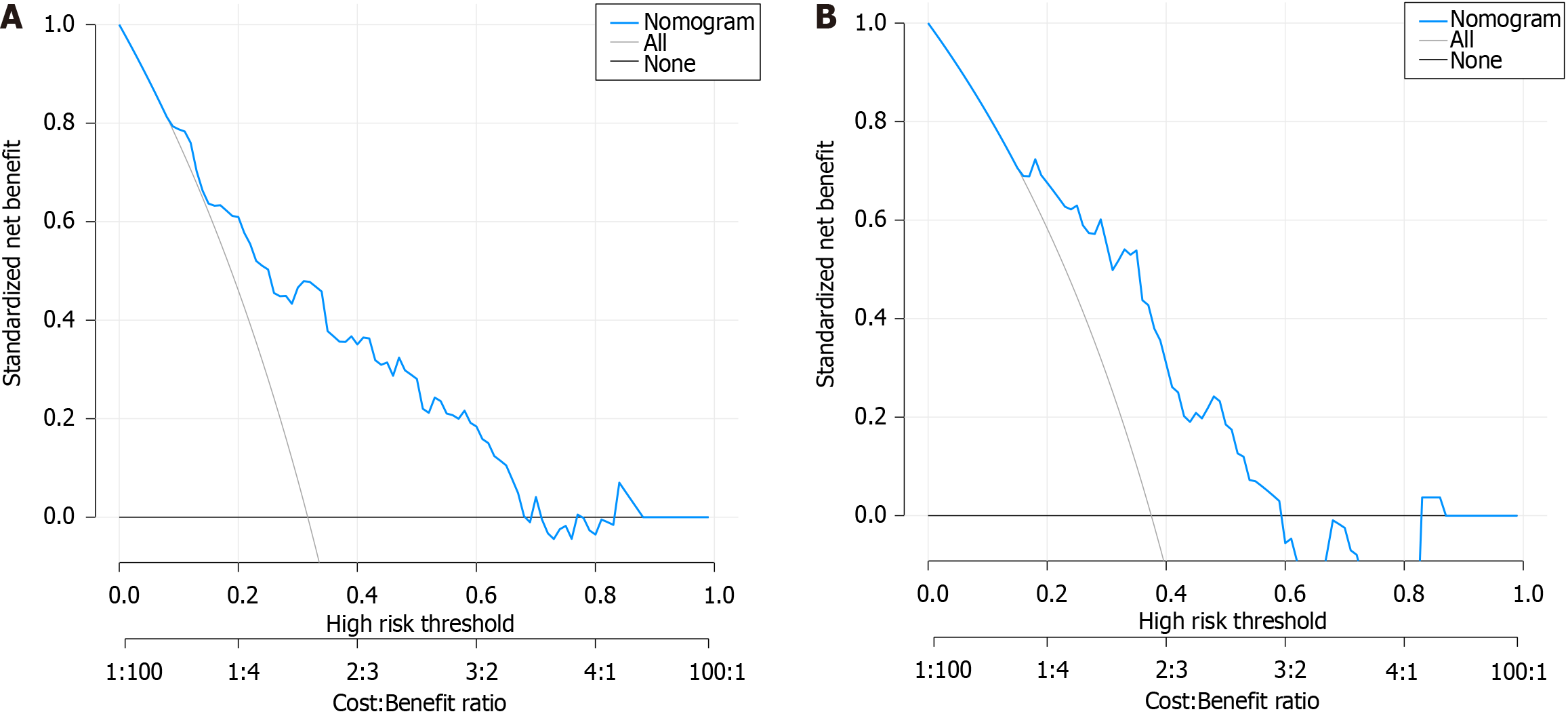
Figure 4 Decision curve analysis curve of the nomogram model.
A and B: The figure presents the decision curve analysis (DCA) curve of the developed nomogram model in both the development group (A) and the validation group (B). The DCA curve measures the net benefit of the model by plotting the threshold probability on the x-axis against the net benefit on the y-axis. The net benefit is calculated by weighting the true-positive and false-positive classifications based on the clinical consequence of each classification. The DCA curve assesses the clinical usefulness of the nomogram model by comparing it to the strategies of treating all or no patients with the condition of interest. A higher net benefit value indicates a better clinical utility of the model.
- Citation: Cao JY, Zhang LX, Zhou XJ. Development and validation of a nomogram model for predicting the risk of pre-hospital delay in patients with acute myocardial infarction. World J Cardiol 2024; 16(2): 80-91
- URL: https://www.wjgnet.com/1949-8462/full/v16/i2/80.htm
- DOI: https://dx.doi.org/10.4330/wjc.v16.i2.80


