Copyright
©The Author(s) 2024.
World J Diabetes. Jul 15, 2024; 15(7): 1562-1588
Published online Jul 15, 2024. doi: 10.4239/wjd.v15.i7.1562
Published online Jul 15, 2024. doi: 10.4239/wjd.v15.i7.1562
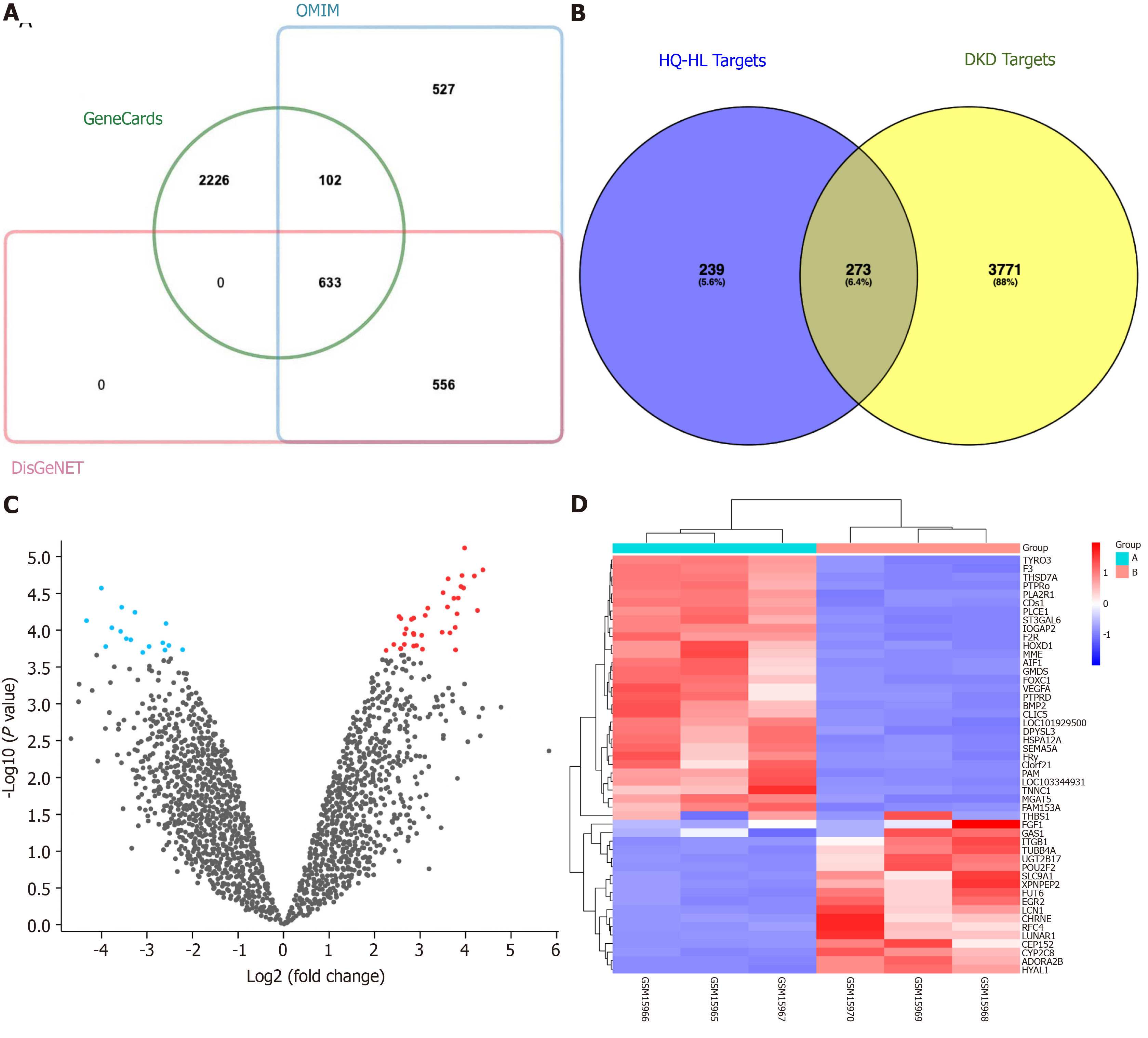
Figure 1 Screening of Astragalus-Coptis drug pair common targets.
A: Venn diagram illustrating the target genes associated with diabetic kidney disease (DKD); B: Venn diagram depicting the 273 common targets between the active ingredient targets and DKD targets; C: Volcano plot displaying differential gene expression patterns in DKD samples, where red and blue indicate upregulated and downregulated genes, respectively, while gray represents no significant difference; D: Heatmap presenting the expression profiles of these 50 differential gene expression analysis. Columns correspond to sample groups, while rows represent individual genes. The cyan Group A denotes normal samples, whereas the red Group B signifies DKD samples. OMIM: Online Mendelian Inheritance in Man database.
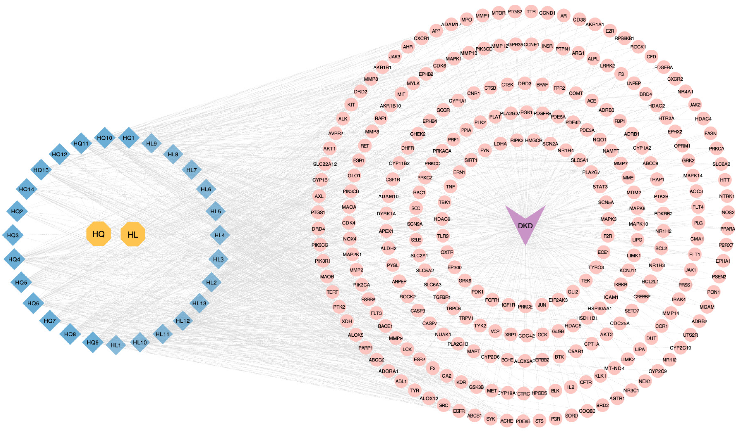
Figure 2 Disease-active ingredient-target network.
The yellow octagon nodes represent the Astragalus-Coptis drug pair, while the blue prismatic nodes depict the active ingredients in this drug pair. The purple arrow nodes symbolize diabetic kidney disease, and the pink circular nodes represent the common targets. The edges illustrate the interaction between the active ingredient and its target. DKD: Diabetic kidney disease.
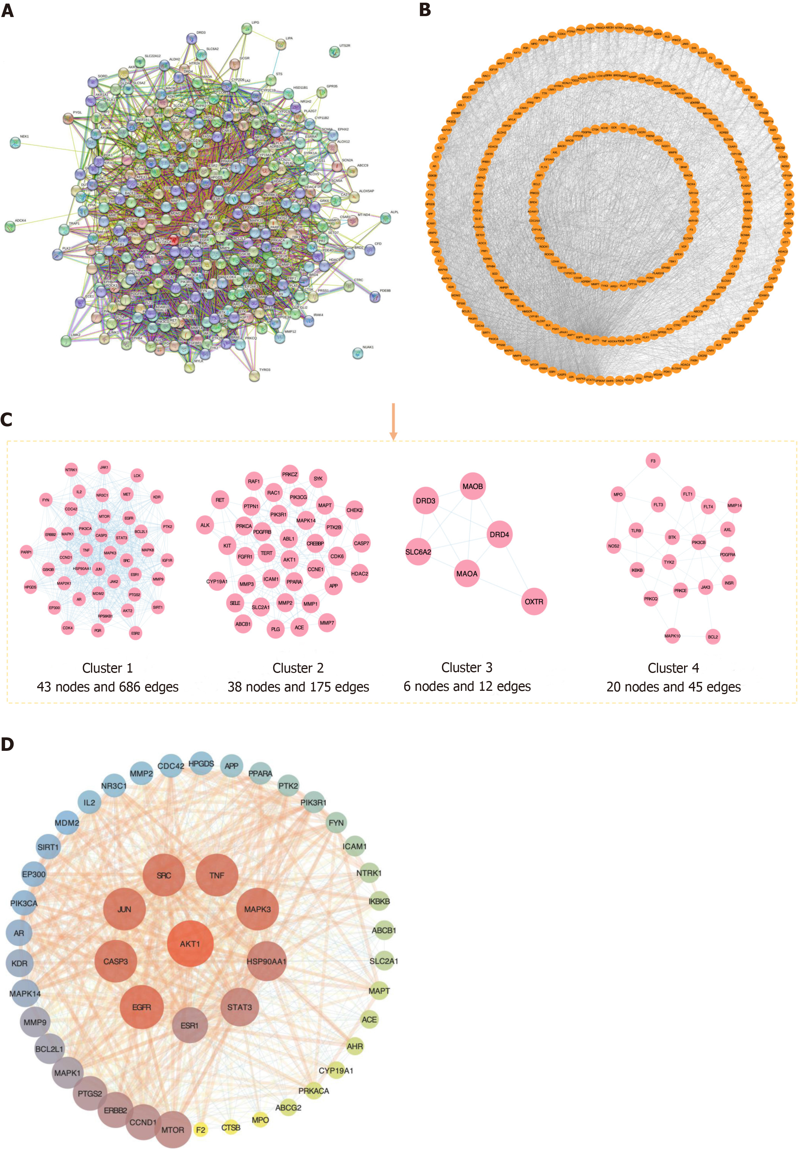
Figure 3 Protein-protein interaction network.
A: The protein-protein interaction (PPI) network of common targets; B: The PPI network, commonly targeted, was optimized using Cytoscape 3.10.1; C: Cluster analysis-based construction of a PPI network utilizing MCODE plugin; D: The central core PPI network consisted of 48 nodes and 707 edges, wherein 10 nodes exhibiting an orange-to-purple gradient symbolized key targets associated with Astragalus-Coptis drug pair combination for treating diabetic kidney disease. Node sizes were proportionate to target degrees in the network.
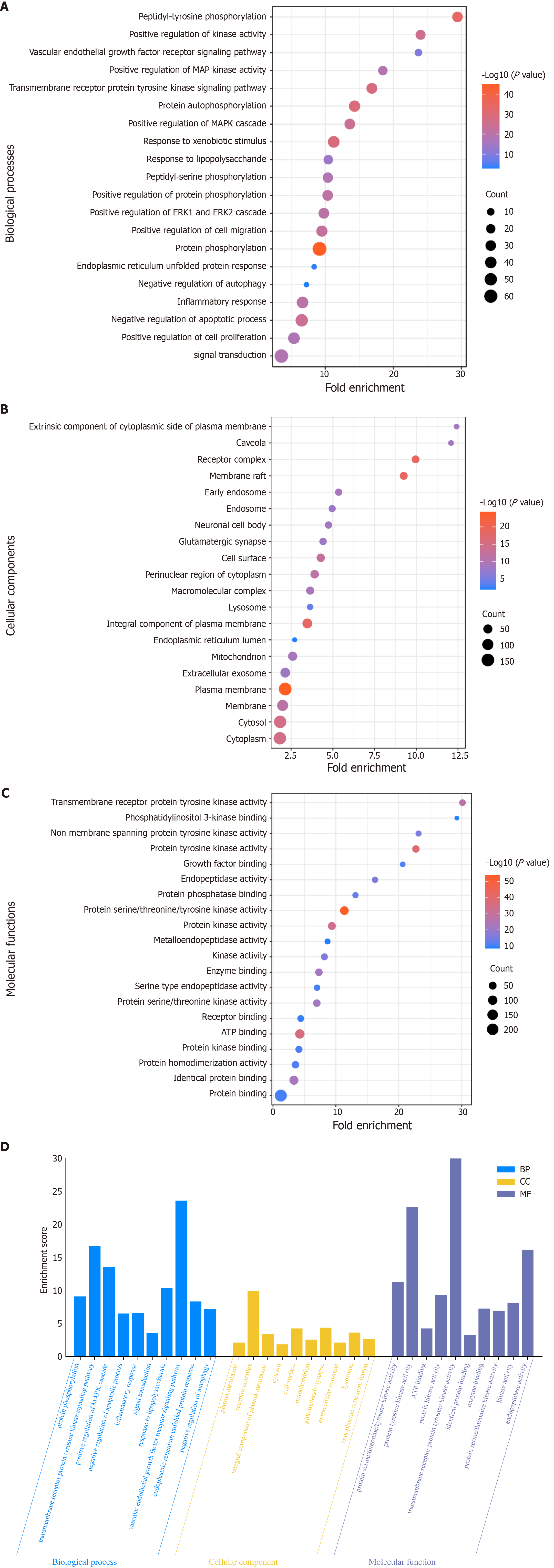
Figure 4 Gene Ontology enrichment diagram.
A: Bubble map illustrating cellular biological processes (BP); B: Bubble plot depicting cellular components (CC); C: Bubble plot representing molecular function (MF). The X- and Y-axes display the fold enrichment and full name, respectively, while the color and size of the bubbles indicate the P value and number of genes, correspondingly; D: Top 10 BP, CC, and MF from Gene Ontology enrichment analysis are visualized as blue, orange, and purple bars, respectively.
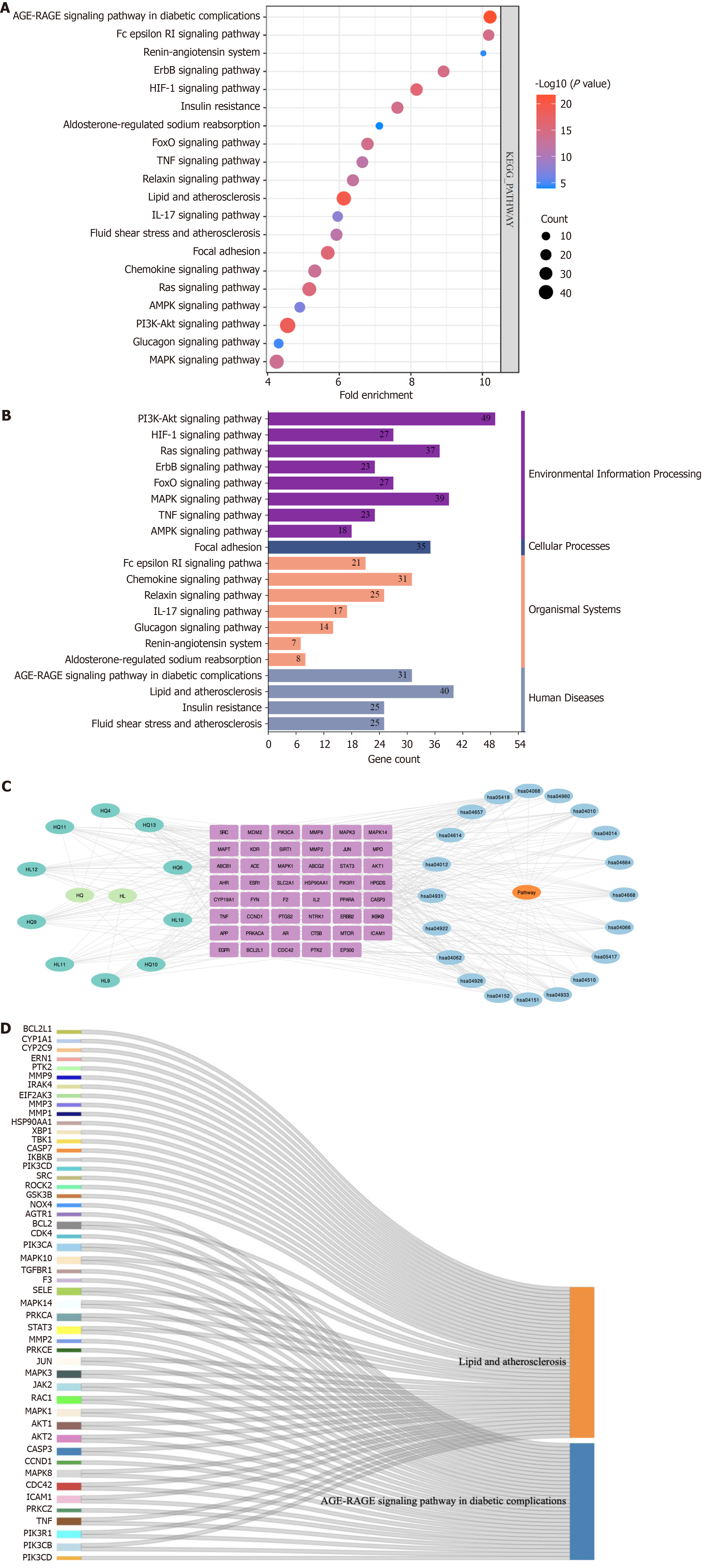
Figure 5 Kyoto Encyclopedia of Genes and Genomes pathway enrichment diagram.
A: Bubble plot depicting the top 20 pathways identified through Kyoto Encyclopedia of Genes and Genomes (KEGG) enrichment analysis; B: Classification of the top 20 pathways based on KEGG enrichment analysis according to their respective KEGG types; C: Diagram illustrating the active ingredient-target-signaling pathway. The cyan node represents the active ingredient, while the purple node signifies the target. The blue node denotes the pathway itself; D: Sankey diagram showcasing KEGG core pathways. The left rectangular node in this sankey plot represents the target, whereas the right rectangular node symbolizes the corresponding KEGG pathway. The lines represent associations between targets and pathways.
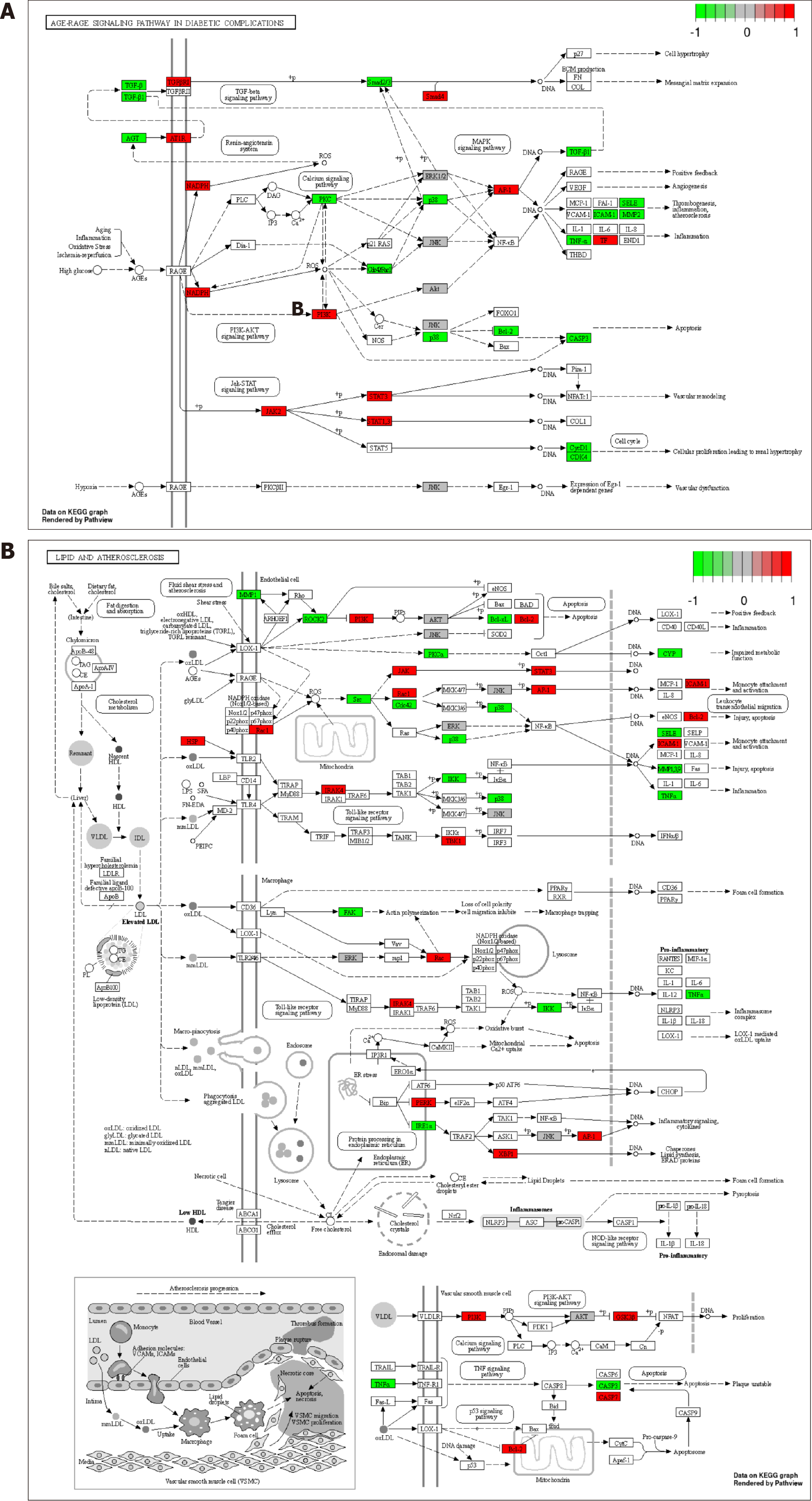
Figure 6 Distribution of common targets in the core pathways.
A: Distribution of common targets associated with the advanced glycation end products (AGE)-receptor for AGEs signaling pathway in diabetic complications; B: Distribution of relevant common targets in the Lipid and atherosclerosis pathway. Red, green, and gray rectangles represent upregulated and downregulated gene targets, respectively, without any significantly differentially expressed gene targets.
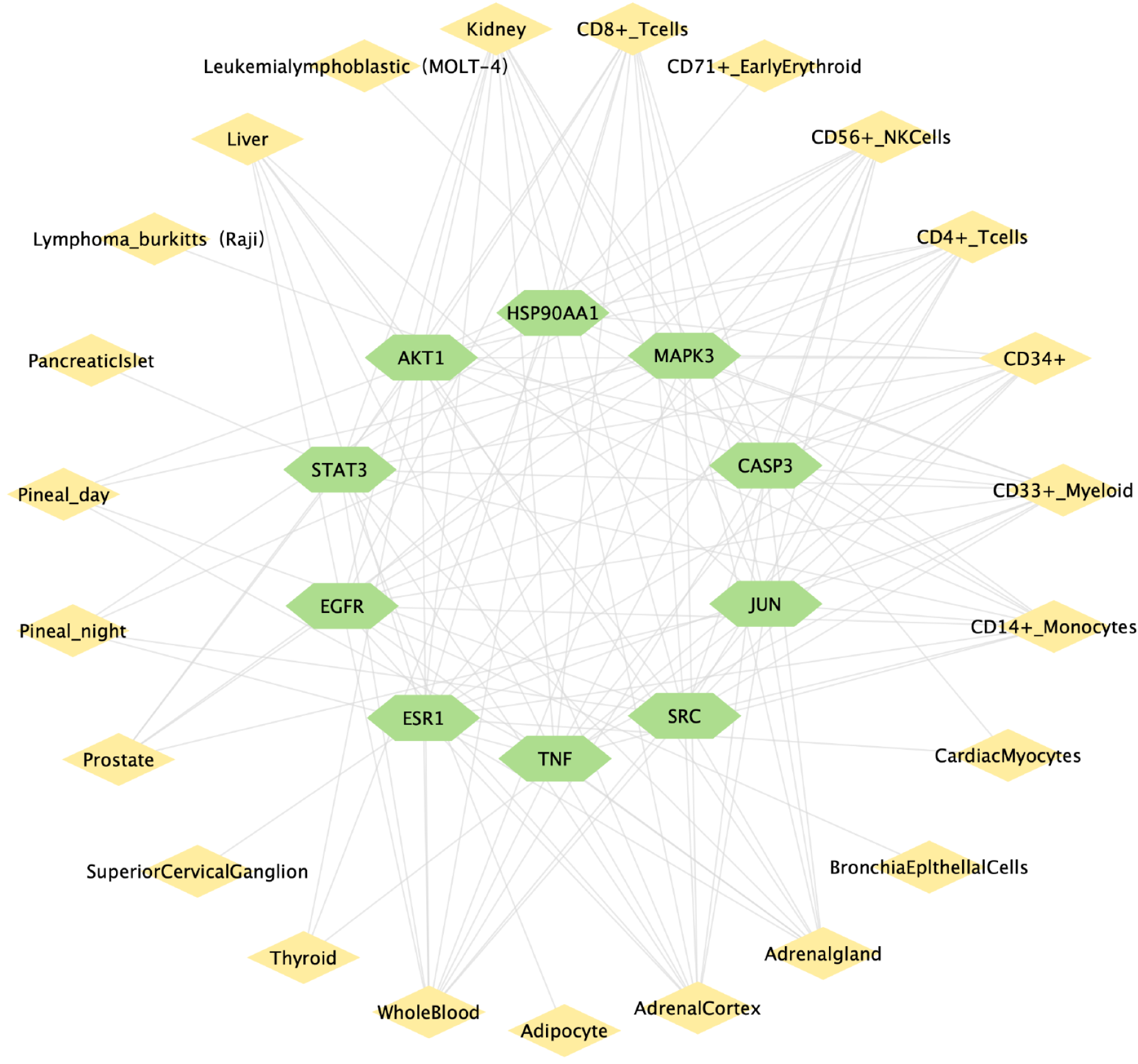
Figure 7 Diagram of the “key target-organ network”.
The green nodes represent the key targets, while the yellow nodes depict the organs. The edges symbolize the connections between these key targets and organs.
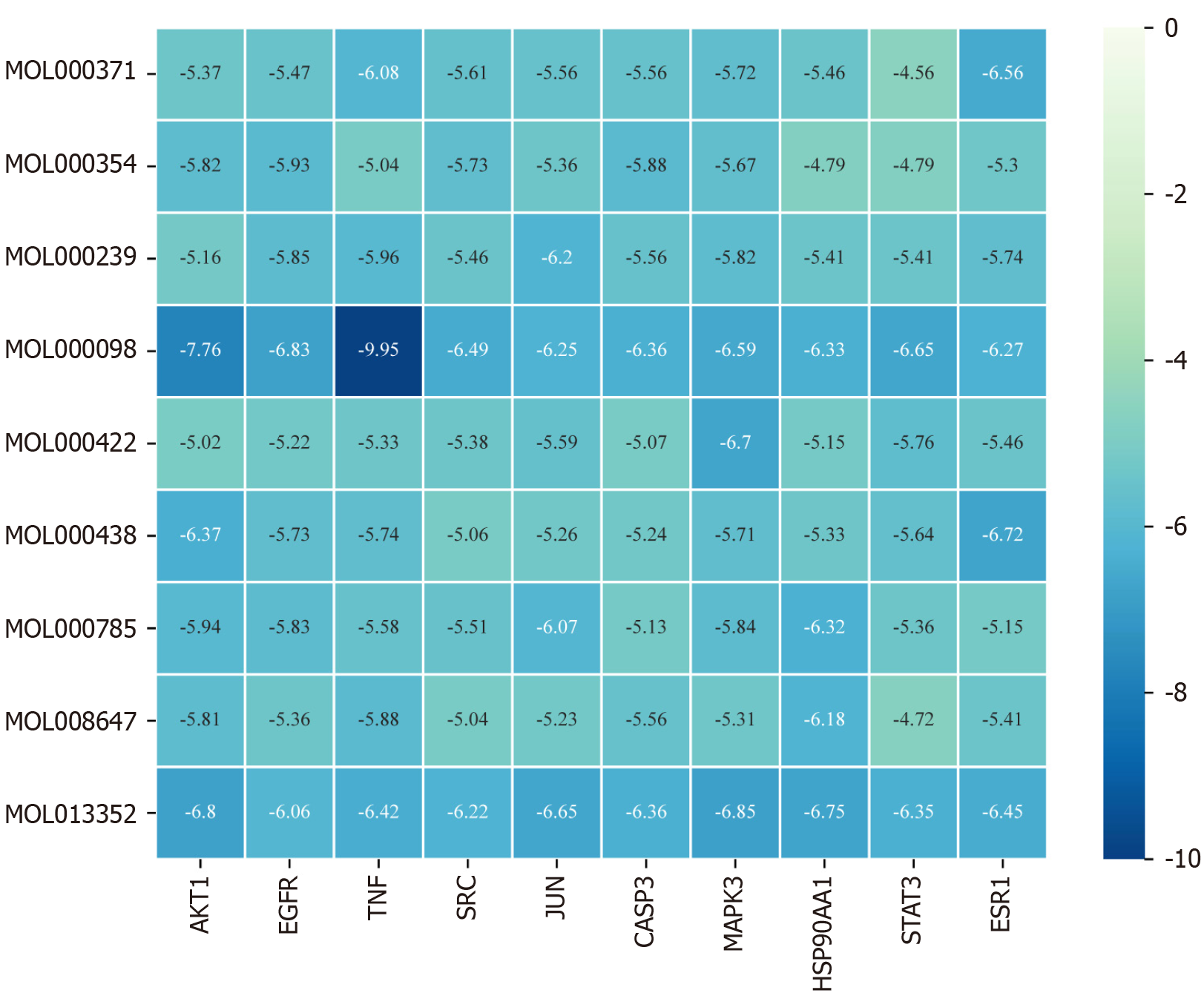
Figure 8 Heatmap of molecular docking binding energies (kcal/mol).
The X-axis corresponds to the key target receptor, while the Y-axis represents the core active ingredient. The darker shade of blue in the heatmap indicates a lower binding energy and a stronger binding affinity between the active ingredient and the target.
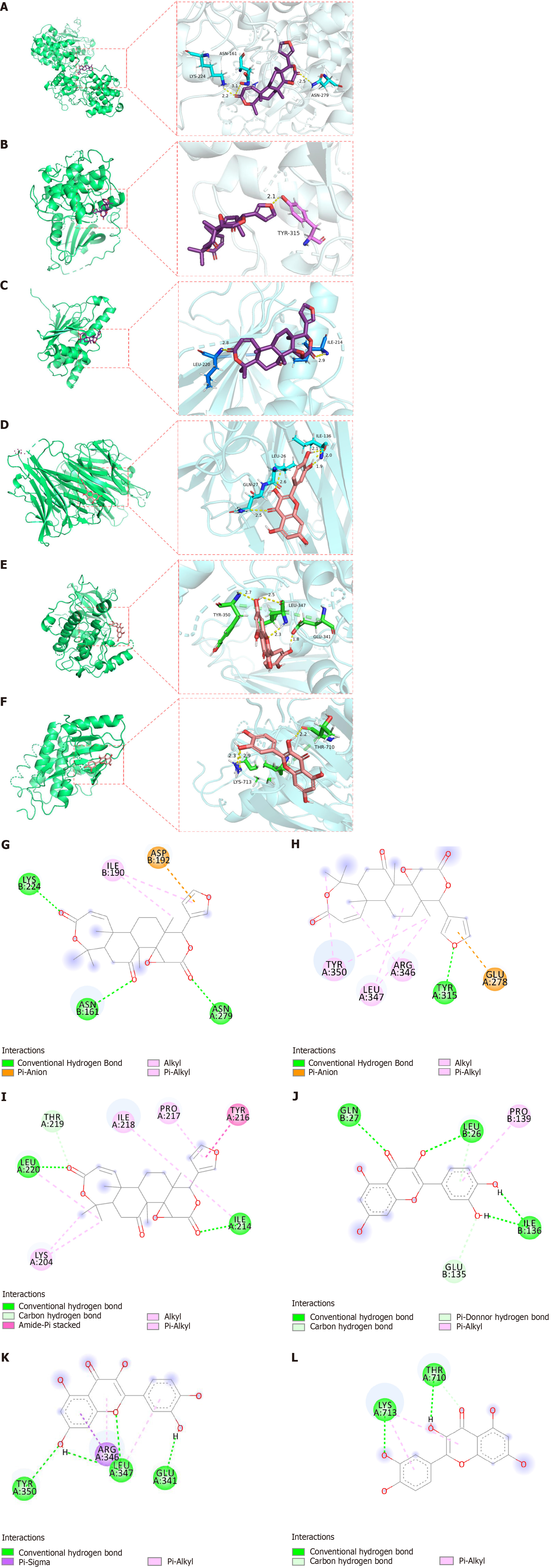
Figure 9 Docking result diagram.
A: Obacunone-mitogen-activated protein kinase 3 (MAPK3); B: Obacunone-AKT serine/threonine kinase 1 (AKT1); C: Obacunone-heat shock protein 90 alpha family class A member 1 (HSP90AA1); D: Quercetin-tumor necrosis factor (TNF); E: Quercetin-AKT serine/threonine kinase 1 (AKT1); F: Quercetin-epidermal growth factor receptor (EGFR); G-L: The different types of two-dimensional bonding modes, respectively.
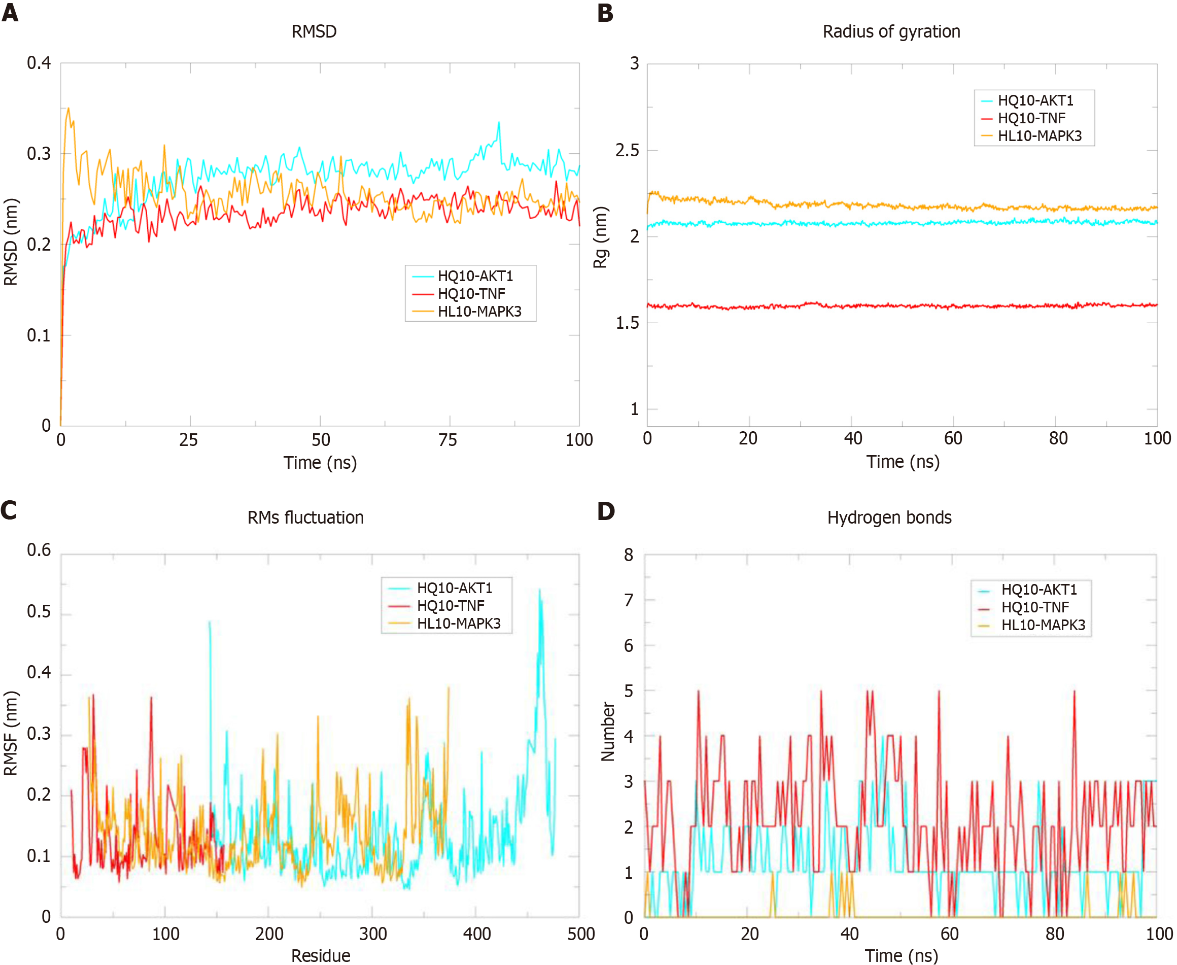
Figure 10 Molecular dynamics simulations of HL10 (obacunone)-mitogen-activated protein kinase 3, HQ10 (quercetin)-AKT serine/threonine kinase 1, and HQ10 (quercetin)-tumor necrosis factor.
A: Root mean square deviation (RMSD) plots of HL10-mitogen-activated protein kinase 3 (MAPK3), HQ10-quercetin-AKT serine/threonine kinase 1 (AKT1), and HQ10-tumor necrosis factor (TNF) protein complexes; B: Rg plot of HL10-MAPK3, HQ10-AKT1, and HQ10-TNF protein complexes; C: Root mean square fluctuation (RMSF) plots of HL10-MAPK3, HQ10-AKT1, and HQ10-TNF protein complexes; D: Number of hydrogen bonds in HL10-MAPK3, HQ10-AKT1, and HQ10-TNF protein complexes.
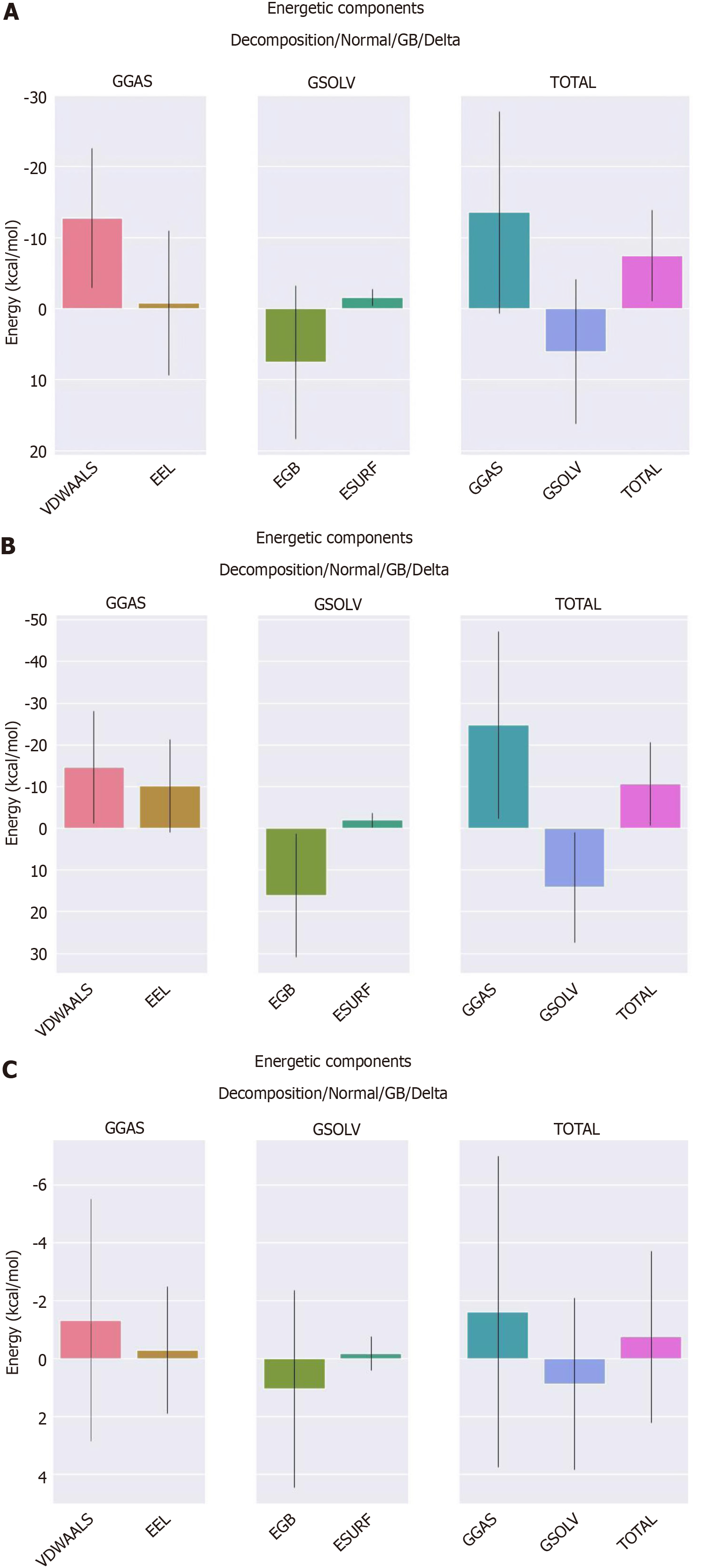
Figure 11 Binding free energy between receptor-ligand protein complexes.
A: Binding energy of the HQ10-AKT serine/threonine kinase 1 protein complex; B: Binding energy of the HQ10-tumor necrosis factor protein complex; C: Binding energy of the HL10-mitogen-activated protein kinase 3 protein complex. EEL: Electrostatic energy; EGB: Polar solvation energy; ESURF: Nonpolar solvation energy; GGAS: Total gas phase free energy; GSOLV: Total solvation free energy (overall total solvation free energy, which is calculated as the sum of total gas phase free energy and total gas phase free energy); VDWAALS: Van der Waals energy.
- Citation: Zhang MY, Zheng SQ. Network pharmacology and molecular dynamics study of the effect of the Astragalus-Coptis drug pair on diabetic kidney disease. World J Diabetes 2024; 15(7): 1562-1588
- URL: https://www.wjgnet.com/1948-9358/full/v15/i7/1562.htm
- DOI: https://dx.doi.org/10.4239/wjd.v15.i7.1562


