Copyright
©The Author(s) 2020.
World J Diabetes. Nov 15, 2020; 11(11): 553-566
Published online Nov 15, 2020. doi: 10.4239/wjd.v11.i11.553
Published online Nov 15, 2020. doi: 10.4239/wjd.v11.i11.553
Figure 1 Flow diagram showing the study selection process.
RCT: Randomized controlled trial; ET-1: Endothelin-1; ET-R: Endothelin-receptors.
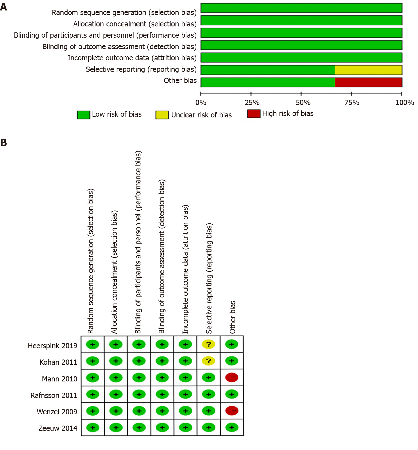
Figure 2 Quality assessment.
A: Summary of the quality assessment of the included studies; B: Quality assessment graph. Green indicates low risk of bias, red indicates high risk of bias, yellow indicates unclear risk of bias.
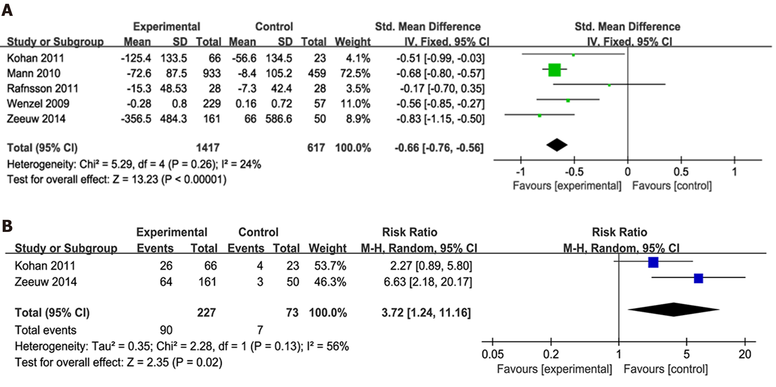
Figure 3 Forest plot of comparisons of the risk ratio between experimental and control groups.
A: In terms of the urinary albumin-to-creatinine ratio (UACR)/urinary albumin ejection rate changes from baseline; B: In terms of the 40% reduction in UACR. SD: Standard deviation.
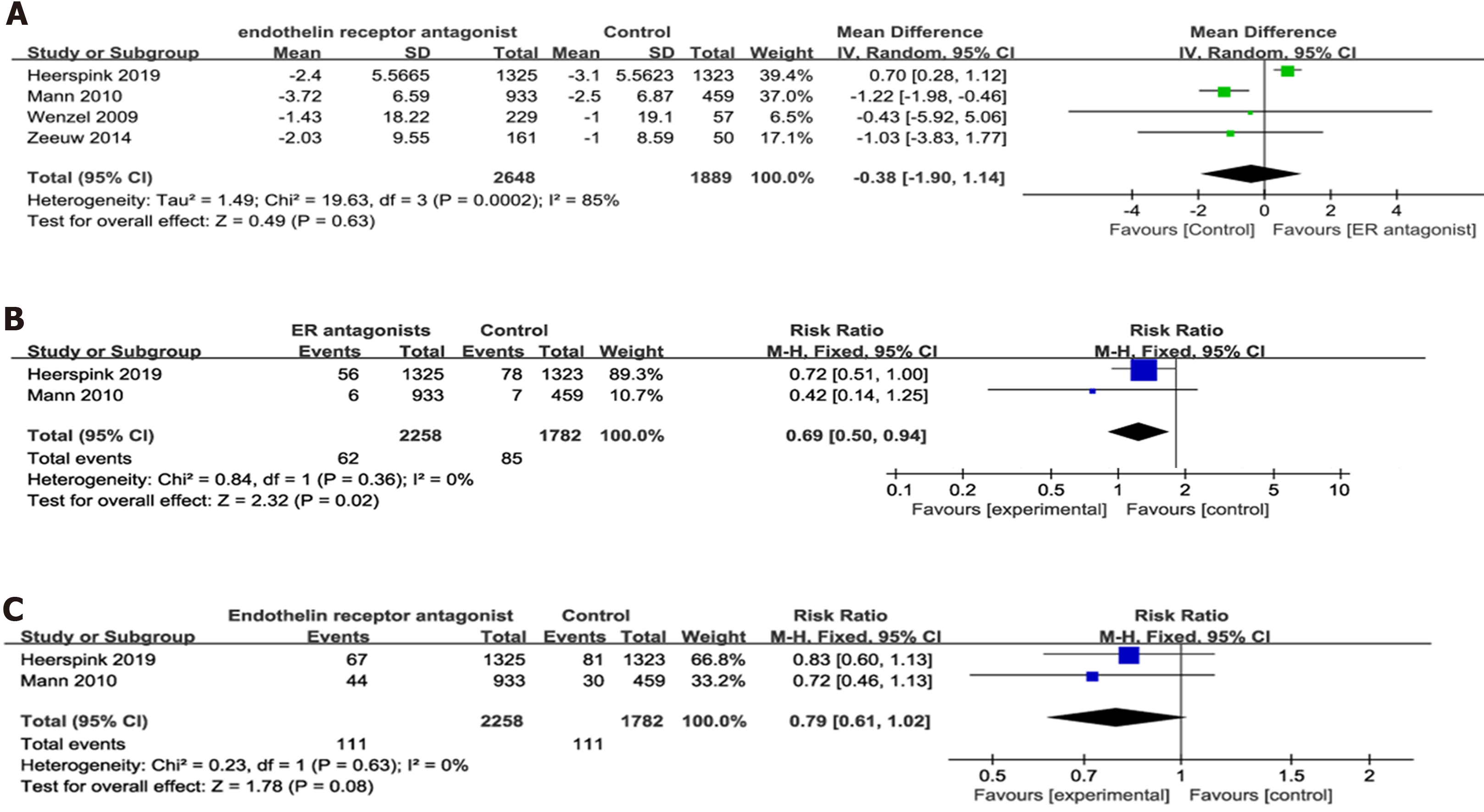
Figure 4 Forest plot of comparisons between experimental and control groups.
A: In terms of the estimated glomerular filtration rate change from baseline; B: In terms of the ratio of serum creatinine doubling; C: In terms of the onset of end-stage renal. SD: Standard deviation.
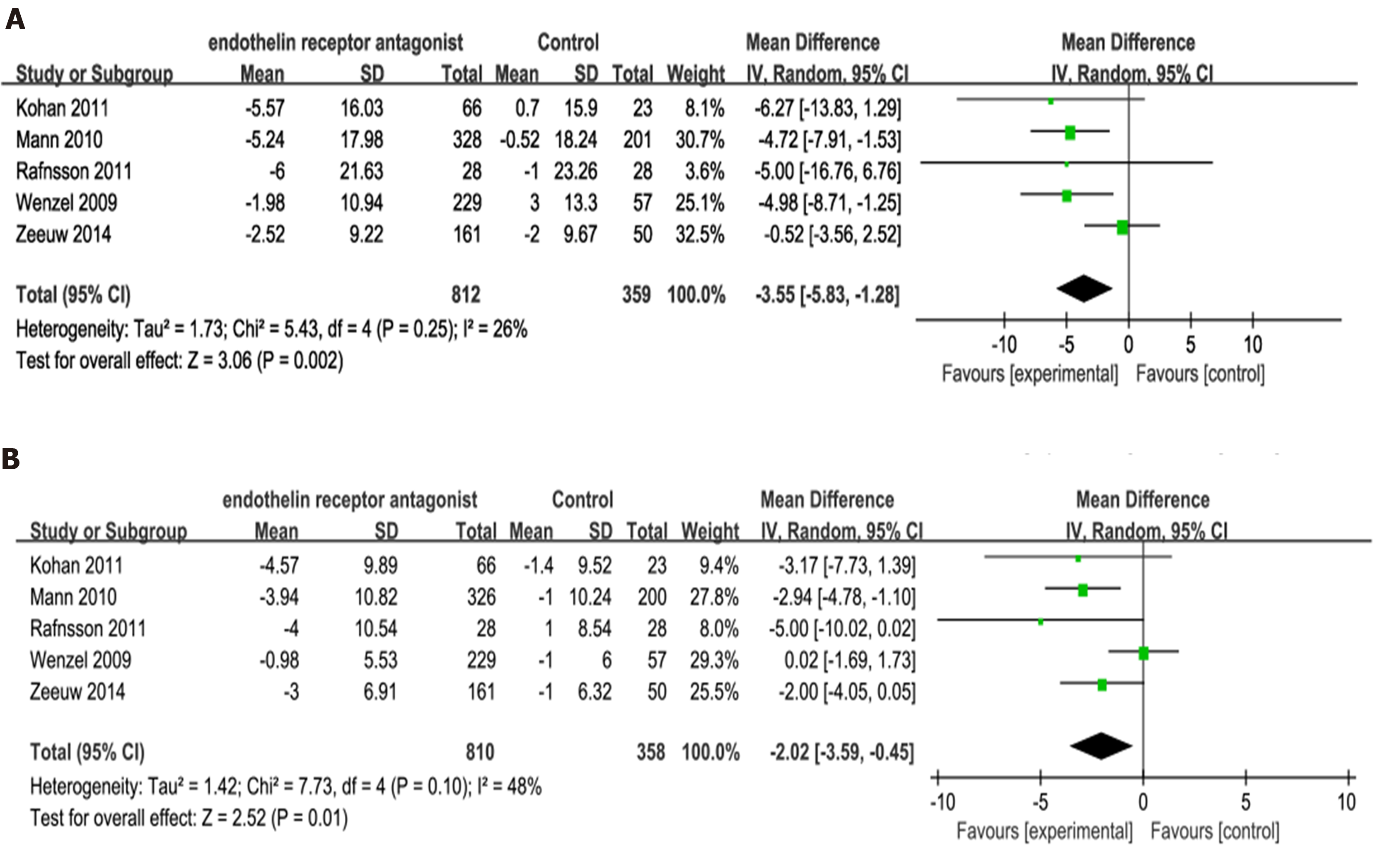
Figure 5 Forest plot of comparisons between experimental and control groups.
A: In terms of the changes in systolic blood pressure; B: In terms of the changes in diastolic blood pressure. SD: Standard deviation.
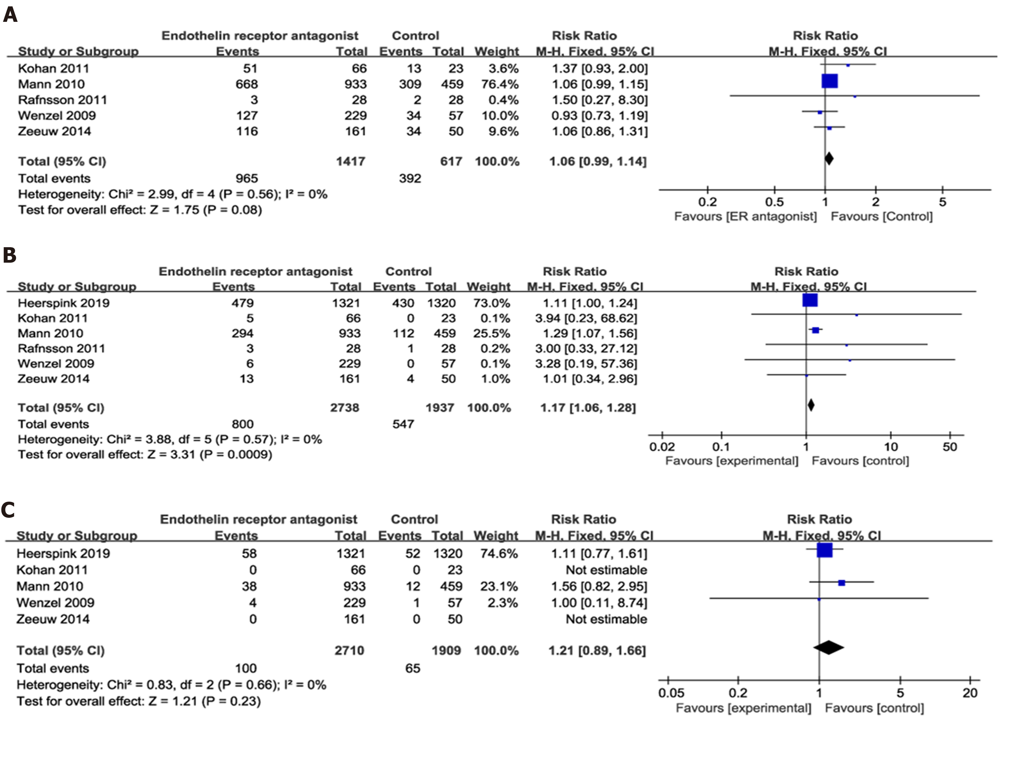
Figure 6 Forest plot of comparisons between experimental and control groups.
A: In terms of the adverse events (AE); B: In terms of the severe AEs; C: In terms of the mortality.
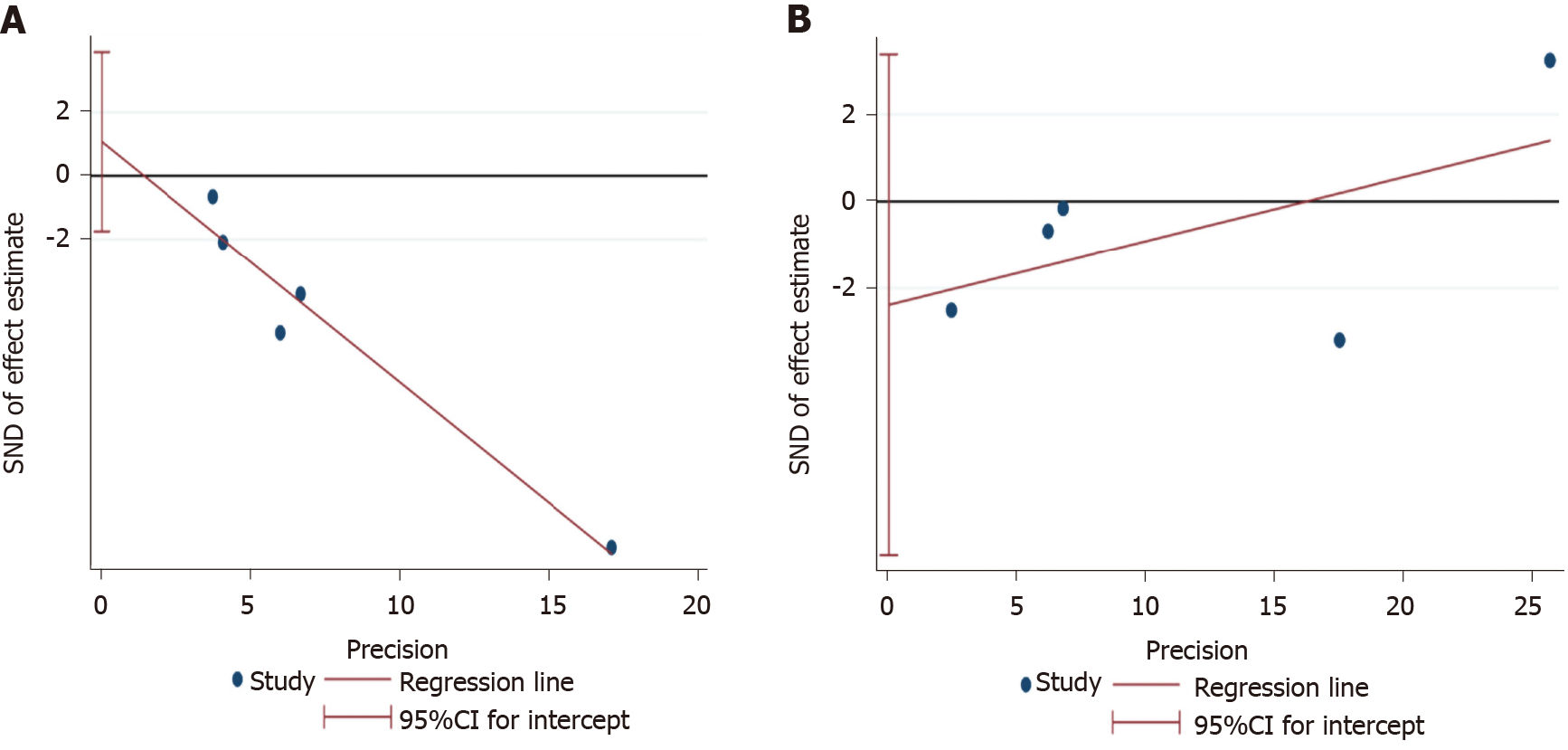
Figure 7 Egger’s test figures for publication bias in change.
A: Albuminuria; B: Estimated glomerular filtration rate outcomes.
- Citation: Zhang L, Xue S, Hou J, Chen G, Xu ZG. Endothelin receptor antagonists for the treatment of diabetic nephropathy: A meta-analysis and systematic review. World J Diabetes 2020; 11(11): 553-566
- URL: https://www.wjgnet.com/1948-9358/full/v11/i11/553.htm
- DOI: https://dx.doi.org/10.4239/wjd.v11.i11.553


