Copyright
©The Author(s) 2025.
World J Hepatol. Feb 27, 2025; 17(2): 103016
Published online Feb 27, 2025. doi: 10.4254/wjh.v17.i2.103016
Published online Feb 27, 2025. doi: 10.4254/wjh.v17.i2.103016
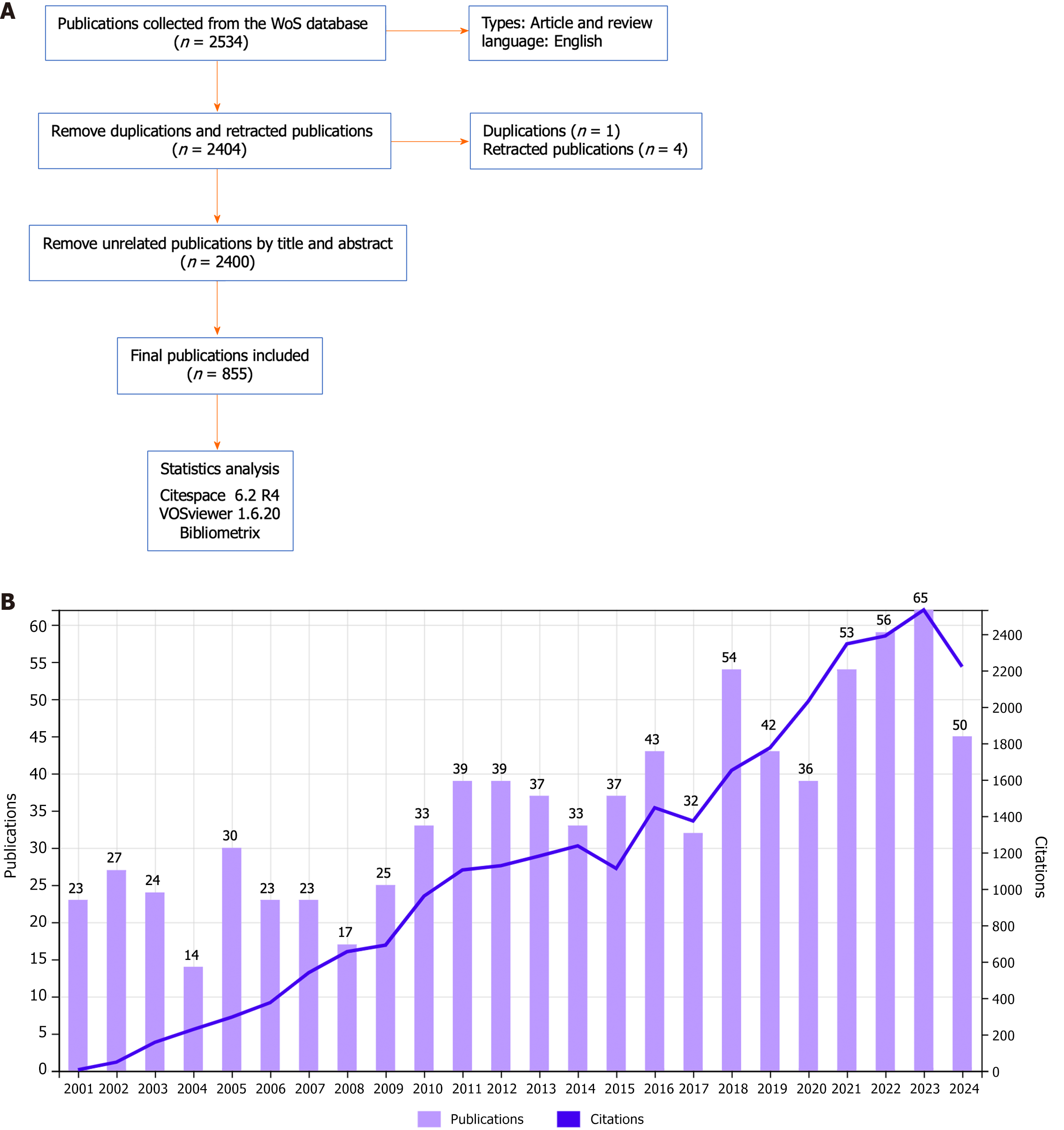
Figure 1 Flowchart of the paper screening process and the number of papers and citations.
A: Flowchart of the process of publication screening; B: Annual number of publications and citations related to the liver-bone axis. WOS: Web of Science.
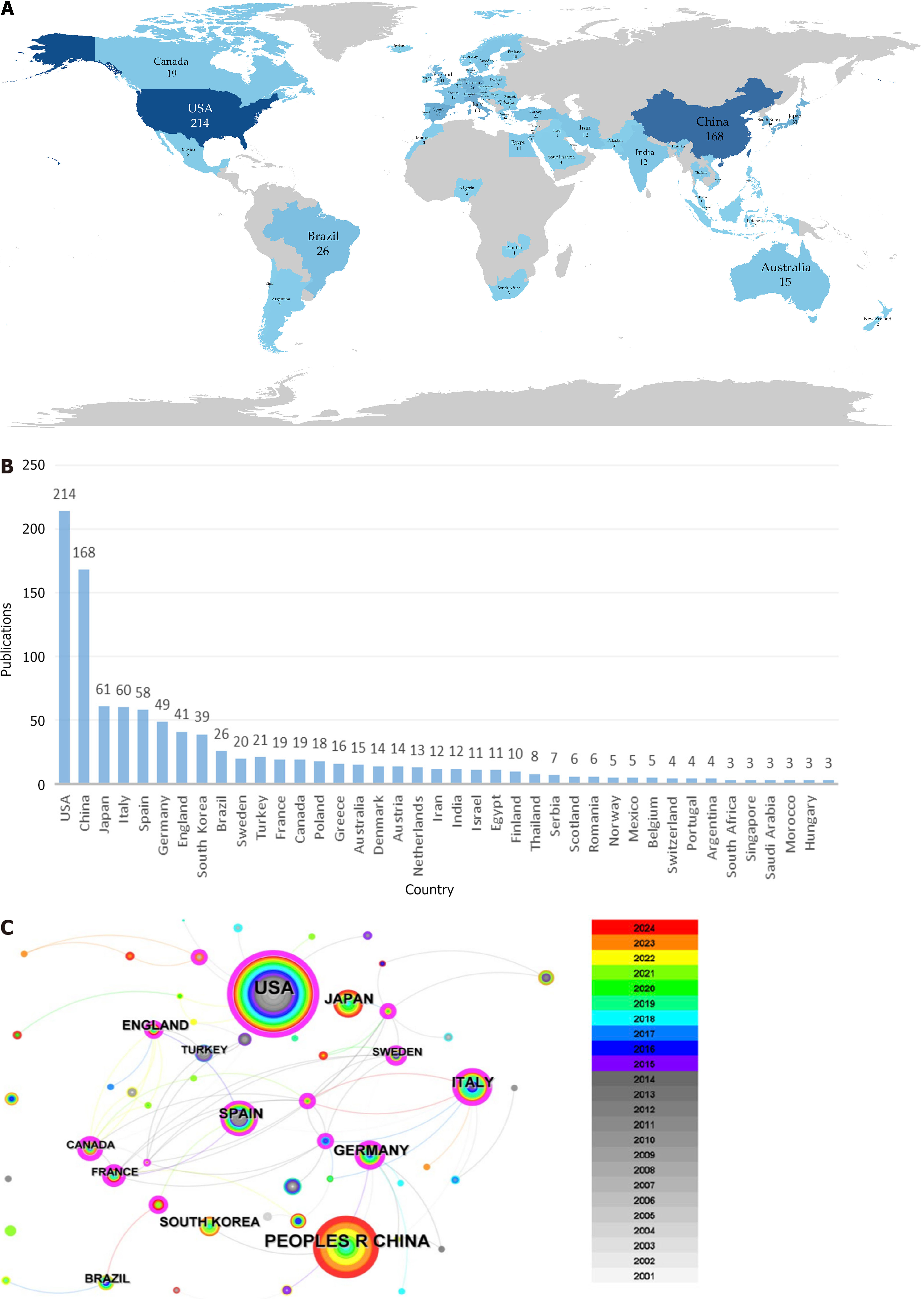
Figure 2 Analysis of country.
A: Map of the world with national publications; B: Bar chart of national publications; C: Country collaboration network. Each circle represents a country and the lines between the circles represent cooperation between countries, the thicker the line the more cooperation. Different colored rings represent different publication years, and the size of the ring represents the number of publications. Purple rings represent countries with high centrality.
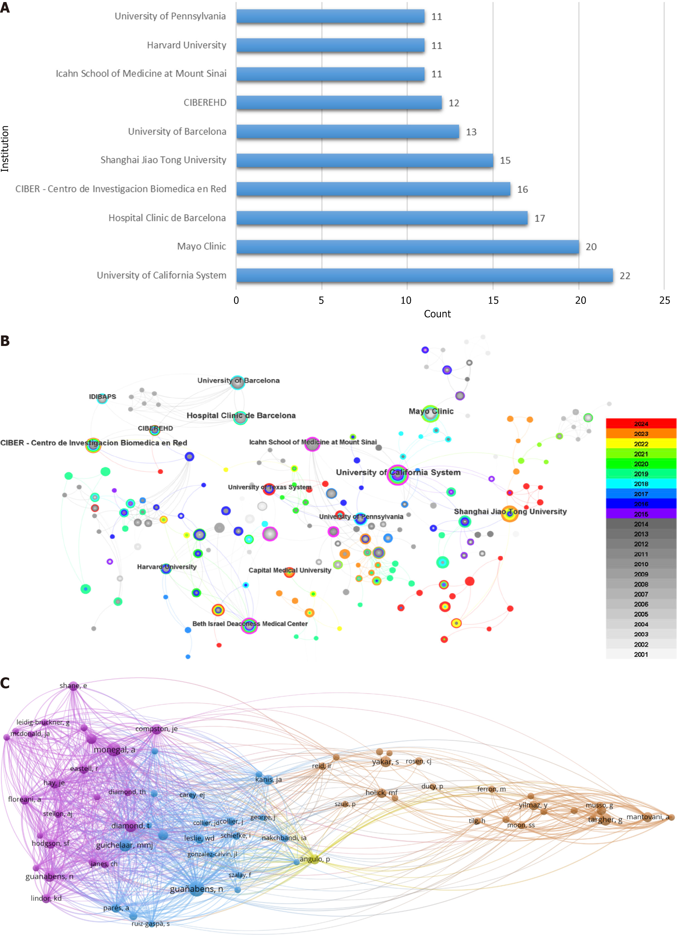
Figure 3 Analysis of institutions and authors.
A: Bar chart of the top ten issuing institutions; B: Network diagram of institutional collaborations. The thickness of the line reflects the strength of the collaboration; C: The co-citation network of authors. Each sphere represents one author, and the lines between the spheres represent two co-cited authors. Different colors represent different clusters. The threshold is 40.
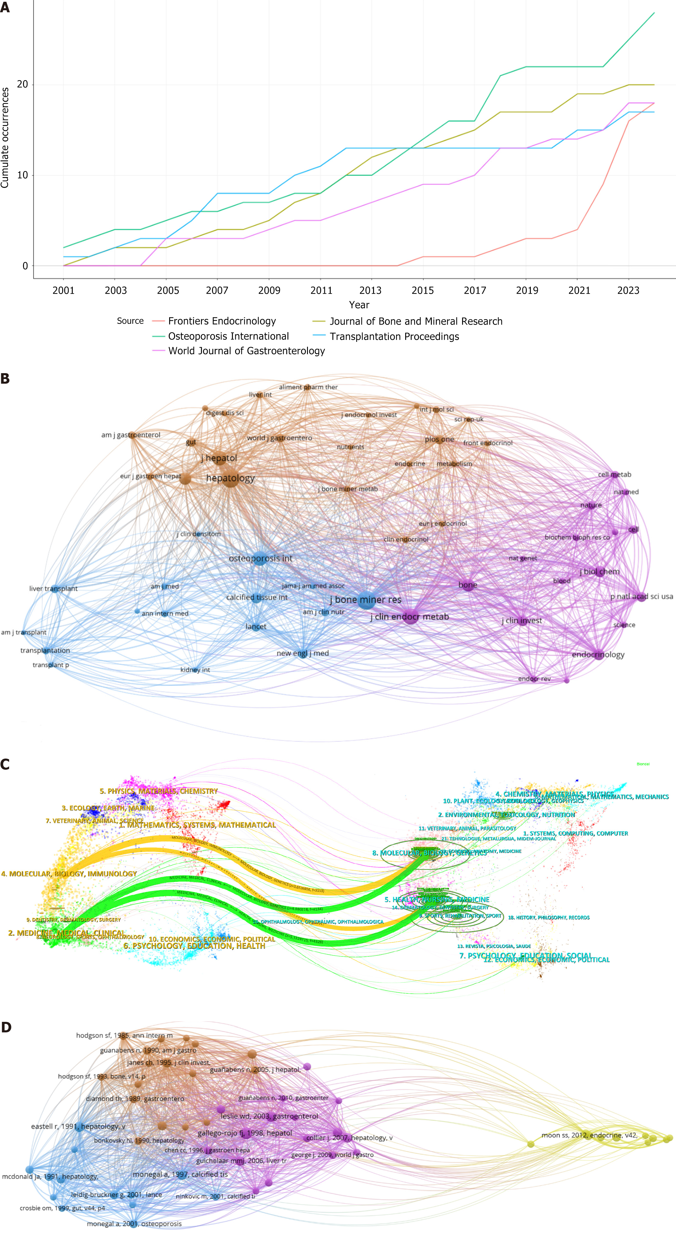
Figure 4 Analysis of journal and the co-citation network of articles.
A: Line chart of journal publications; B: The co-citation network of journals. The size of the spheres reflects the frequency of citations to journals, with different colors representing distinct clusters. The lines represent the co-citation intensity of journals. The threshold is 30; C: Dual-map overlay of articles related to the bone-liver axis. The left side represents the citing literature and the right side represents the cited literature; D: Each sphere represents one article, and the lines between the spheres represent the co-citation of two articles. Different colors represent different clusters. The threshold is 30.
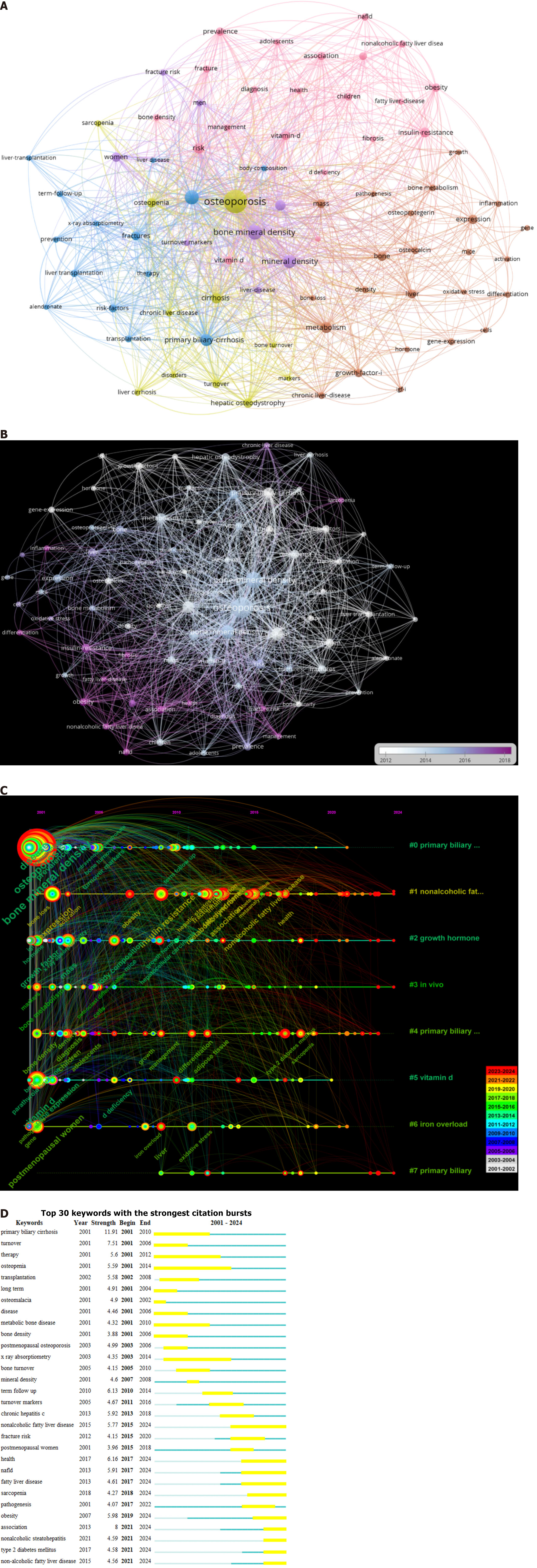
Figure 5 Analysis of keyword.
A: Network visualization of keywords. Each sphere represents one keyword, and the lines between the spheres represent the co-occurrence of two keyword. Different colors represent different clusters. The threshold is 20; B: Overlay visualization of keywords. The different colors represent the mean time the keyword appears. The threshold is 20; C: The timeline of keywords. Each circle represents one keyword. The position on the axis represents the time of the first appearance of the keyword. The colors of the rings represent the different time periods in which the keyword appeared, and the size of the ring represents the frequency of the keyword in a period. The line between two circles represents the co-occurrence of two keywords; D: Top 30 keywords with the strongest citation bursts by year. The yellow bars indicate the beginnings and ends of citation bursts.
- Citation: Zhang WJ, Xu XP, Song XH, Zhang ZR, Zhang XR, Yang B, Tao ZB, Zhang Z, Zhou XH. Liver function linked to bone health: A bibliometric of the liver-bone axis. World J Hepatol 2025; 17(2): 103016
- URL: https://www.wjgnet.com/1948-5182/full/v17/i2/103016.htm
- DOI: https://dx.doi.org/10.4254/wjh.v17.i2.103016


