Copyright
©The Author(s) 2024.
World J Hepatol. Feb 27, 2024; 16(2): 193-210
Published online Feb 27, 2024. doi: 10.4254/wjh.v16.i2.193
Published online Feb 27, 2024. doi: 10.4254/wjh.v16.i2.193
Figure 1 Flow diagram of patient inclusion.
Figure 2 Area under the receiver operating characteristic curve and area under the precision-recall curve for the model on the validation set.
A and B: The area under the receiver operating characteristic curve in Figure 2A plots the true positive rate (sensitivity) against the false positive rate (1-specificity) for various threshold values. The area under the precision-recall curve in Figure 2B illustrates precision × recall for different threshold values. The shaded region represents the 95% confidence interval in both figures. ROC: Receiver operating characteristic; CI: Confidence interval.
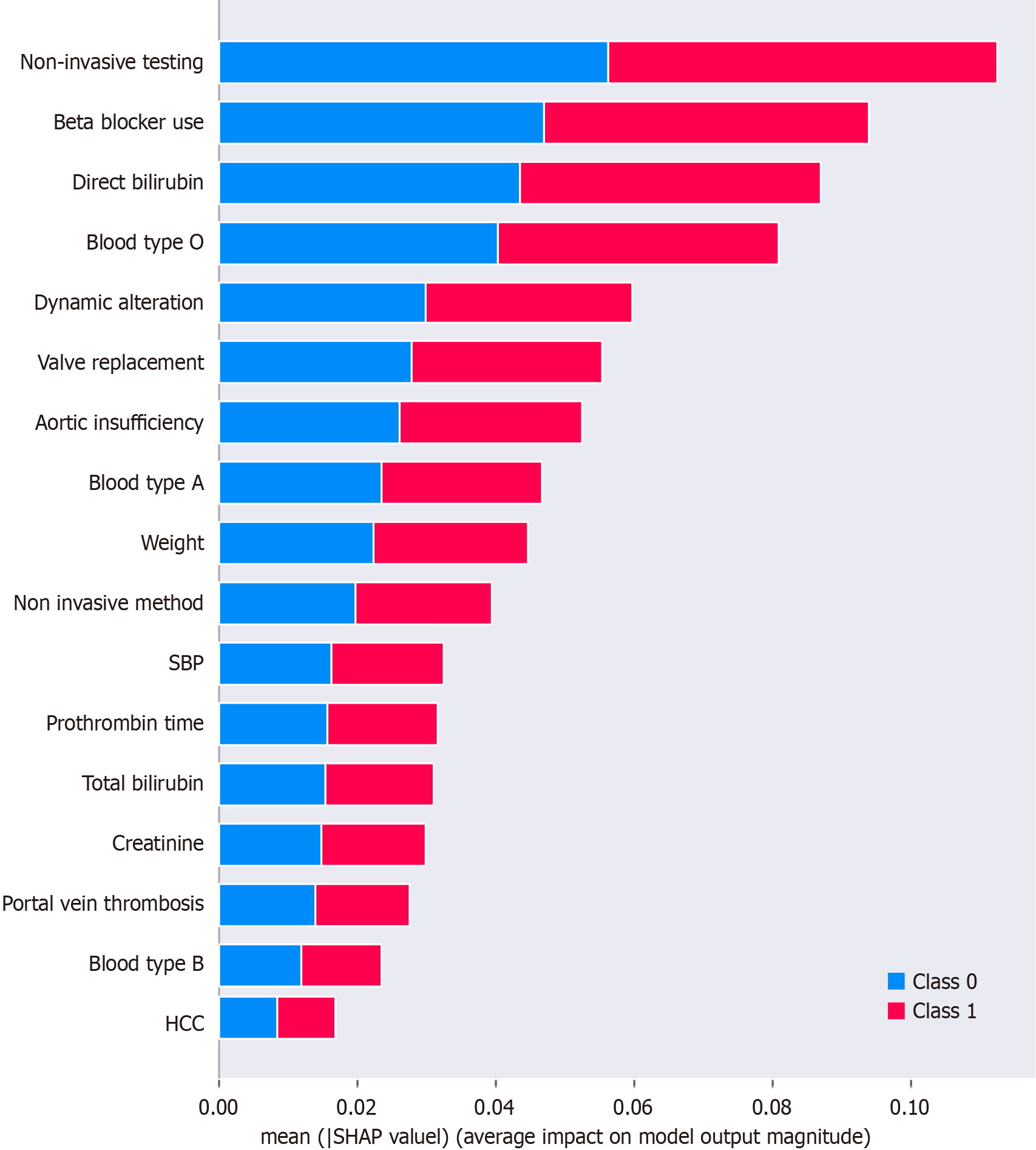
Figure 3 The x-axis represents the mean Shapley additive explanations value, which quantifies the average impact of each feature on the model’s output.
A higher mean Shapley additive explanations value means that the feature has a more significant influence on model predictions. The bars are color-coded to represent two distinct classes: Class 0 (blue), which represents absent major adverse cardiovascular event (MACE), and Class 1 (red), which represents the occurrence of MACE. The length of the bar in each color indicates the average impact of the corresponding feature on prediction of that specific class. Longer bars (regardless of color) mean that the feature has a greater average impact on model output. The direction of the influence (whether it pushes predictions towards Class 0 or Class 1) is denoted by the color. SBP: Spontaneous bacterial peritonitis; HCC: Hepatocellular carcinoma; Class 0: Major adverse cardiovascular event absent; Class 1: Major adverse cardiovascular event present; SHAP: Shapley additive explanations.
- Citation: Soldera J, Corso LL, Rech MM, Ballotin VR, Bigarella LG, Tomé F, Moraes N, Balbinot RS, Rodriguez S, Brandão ABM, Hochhegger B. Predicting major adverse cardiovascular events after orthotopic liver transplantation using a supervised machine learning model: A cohort study. World J Hepatol 2024; 16(2): 193-210
- URL: https://www.wjgnet.com/1948-5182/full/v16/i2/193.htm
- DOI: https://dx.doi.org/10.4254/wjh.v16.i2.193


