Copyright
©The Author(s) 2024.
World J Gastroenterol. Jun 7, 2024; 30(21): 2777-2792
Published online Jun 7, 2024. doi: 10.3748/wjg.v30.i21.2777
Published online Jun 7, 2024. doi: 10.3748/wjg.v30.i21.2777
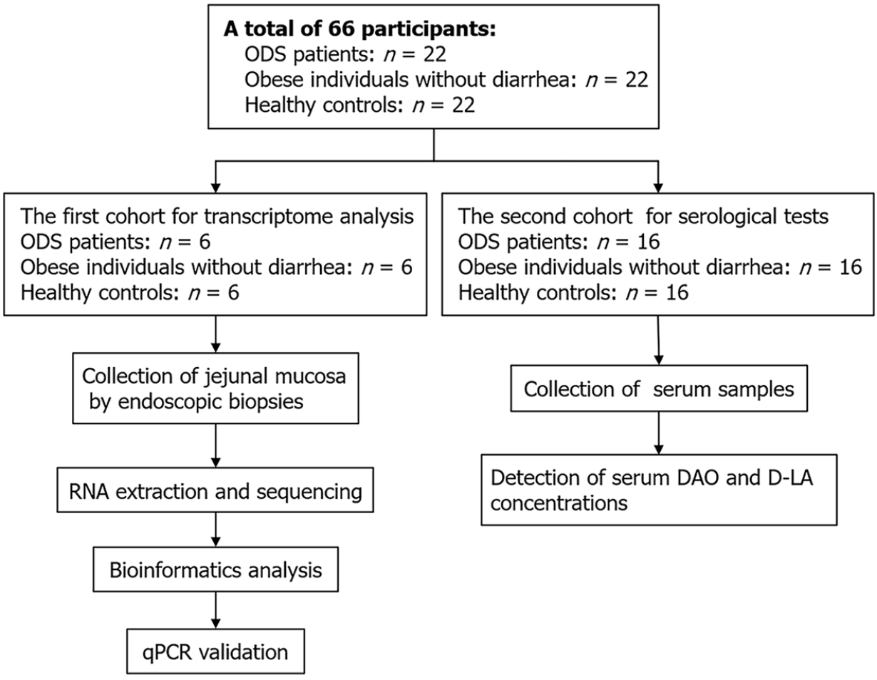
Figure 1 Study design.
ODS: Linghu’s obesity-diarrhea syndrome; DAO: Diamine oxidase; D-LA: D-lactate; qPCR: Quantitative real-time PCR.
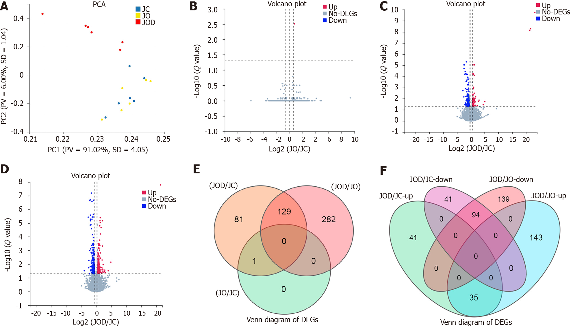
Figure 2 Transcriptomic differences.
A: Principal component analysis for all samples. Each point represents a sample; B: Volcano plot for the JO and JC groups; C: Volcano plot for the JOD and JC groups; D: Volcano plot for the JOD and JO groups. In the volcano plots, each gene is represented by a single node, and its expression level is indicated by color, with no significant differential expression in grey, significant up-regulation in red, and significant down-regulation in blue. The threshold of differentially expressed genes (DEGs) is |log2fold change| (|log2FC|) ≥ 0.585 and a P-adjusted value (Q value) < 0.05; E: Venn diagram for DEGs among the three groups; F: Venn diagram for DEGs in the JOD group compared with the JC and JO groups. All overlapped DEGs changed in the same direction in the JOD group, with 94 down-regulated and 35 up-regulated. PCA: Principal component analysis; DEGs: Differentially expressed genes.
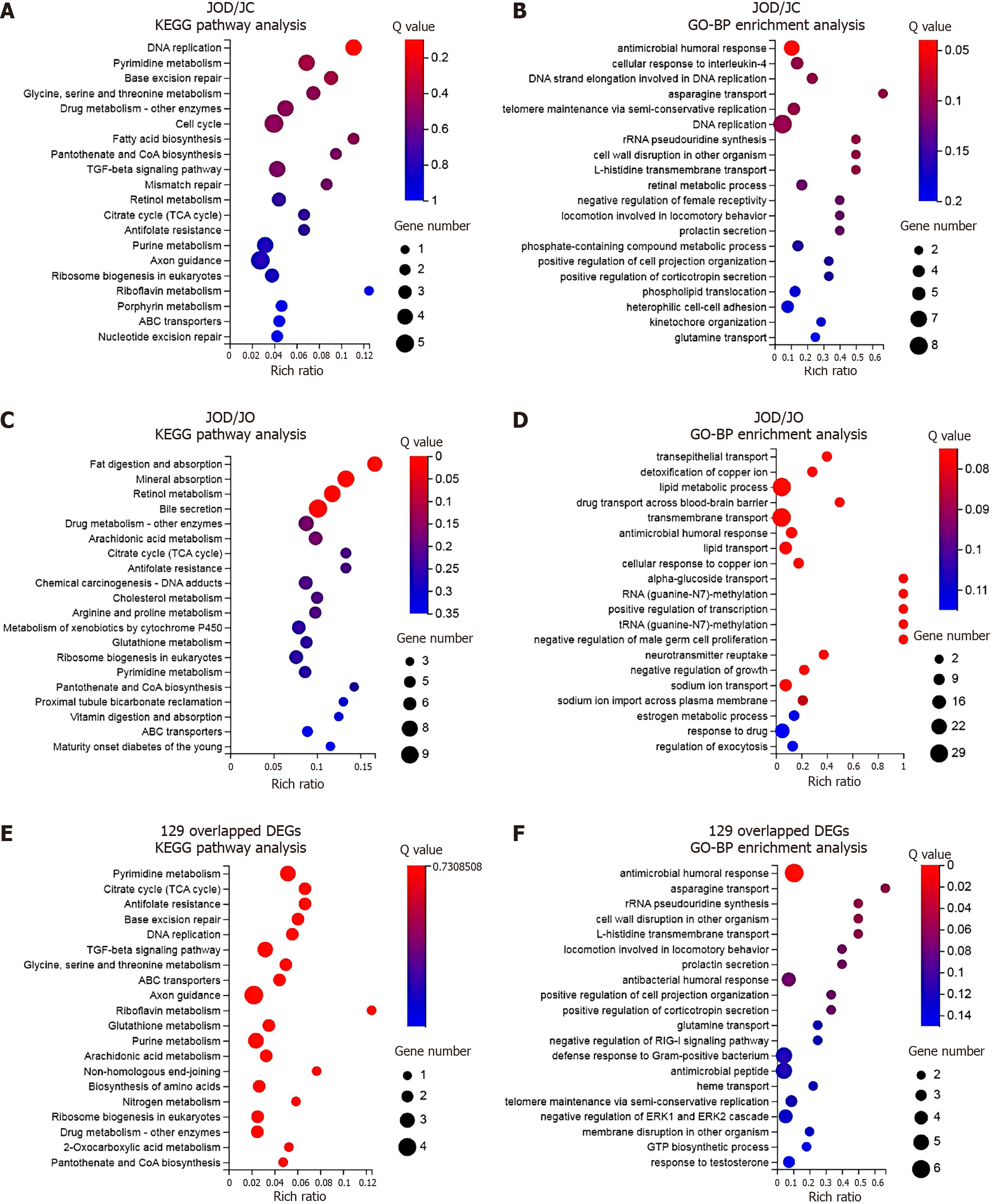
Figure 3 Functional and pathway enrichment analyses.
A: Kyoto Encyclopedia of Genes and Genomes (KEGG) pathway analysis based on the 211 differentially expressed genes (DEGs) between the JOD and JC groups; B: Gene Ontology-biological process (GO-BP) enrichment analysis based on the 211 DEGs between the JOD and JC groups; C: KEGG pathway analysis based on the 411 DEGs between the JOD and JO groups; D: GO-BP enrichment analysis based on the 411 DEGs between the JOD and JO groups; E: KEGG pathway analysis based on the 129 overlapped DEGs; F: GO-BP enrichment analysis based on the 129 overlapped DEGs. Bubble charts show the top 20 significantly enriched terms. The color of the bubbles represents the Q value of each enriched term, and the size of the bubbles represents the number of DEGs enriched in the term. The horizontal axis indicates the rich ratio of the number of DEGs enriched in the term to the total number of human genes annotated to this term. KEGG: Kyoto Encyclopedia of Genes and Genomes; GO-BP: Gene Ontology-biological process.
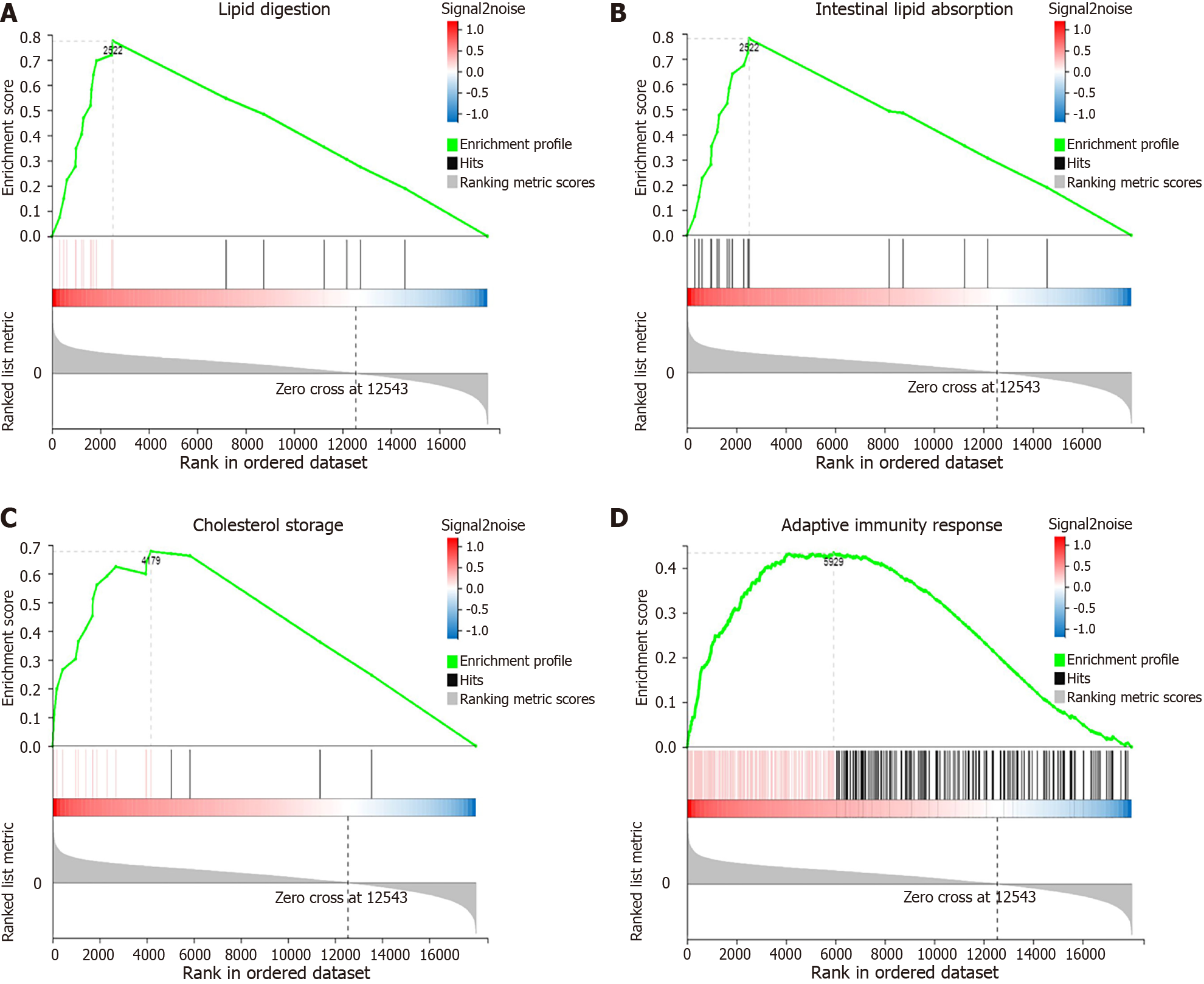
Figure 4 Gene set enrichment analysis of up-regulated biological processes in the JOD group.
A: Lipid digestion; B: Intestinal lipid absorption; C: Cholesterol storage; D: Adaptive immunity response. Each figure is divided into three parts. The top half is the line diagram of the gene enrichment score (ES). The horizontal axis represents the genes in the gene set, and the vertical axis represents the ES value corresponding to each gene. The peak value > 0 indicates that the biological process is up-regulated. The middle part is the hits chart, and each bar represents a gene. The lower half is the rank value. The Signal2noise ratio corresponding to each gene is shown in the grey area map.
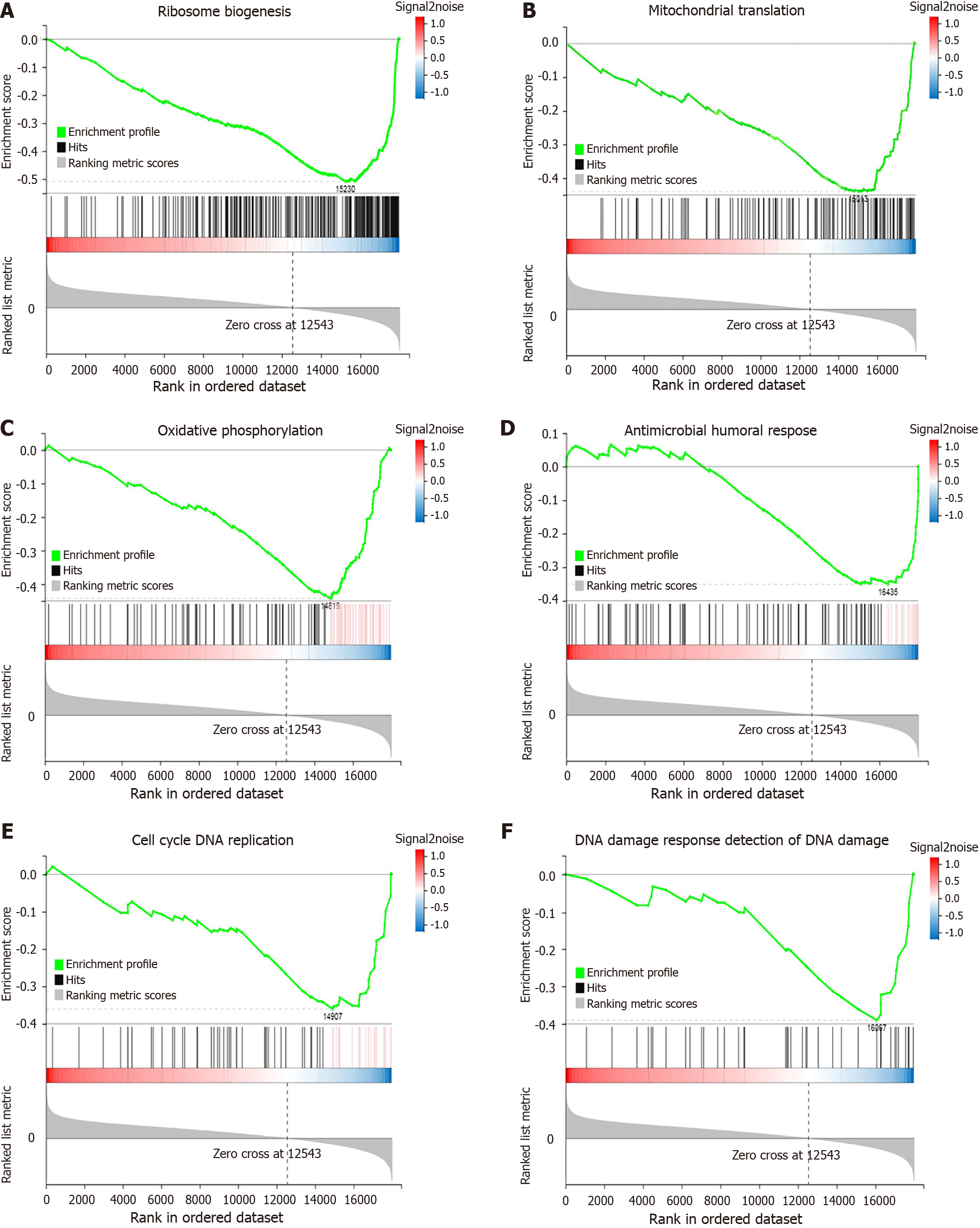
Figure 5 Gene set enrichment analysis of down-regulated biological processes in the JOD group.
A: Ribosome biogenesis; B: Mitochondrial translation; C: Oxidative phosphorylation; D: Antimicrobial humoral response; E: Cell cycle DNA replication; F: DNA damage response detection of DNA damage. Each figure is divided into three parts. The top half is the line diagram of the gene enrichment score (ES). The horizontal axis represents the genes in the gene set, and the vertical axis represents the ES value corresponding to each gene. The peak value < 0 indicates that the biological process is down-regulated. The middle part is the hits chart, and each bar represents a gene. The lower half is the rank value. The Signal2noise ratio corresponding to each gene is shown in the grey area map.
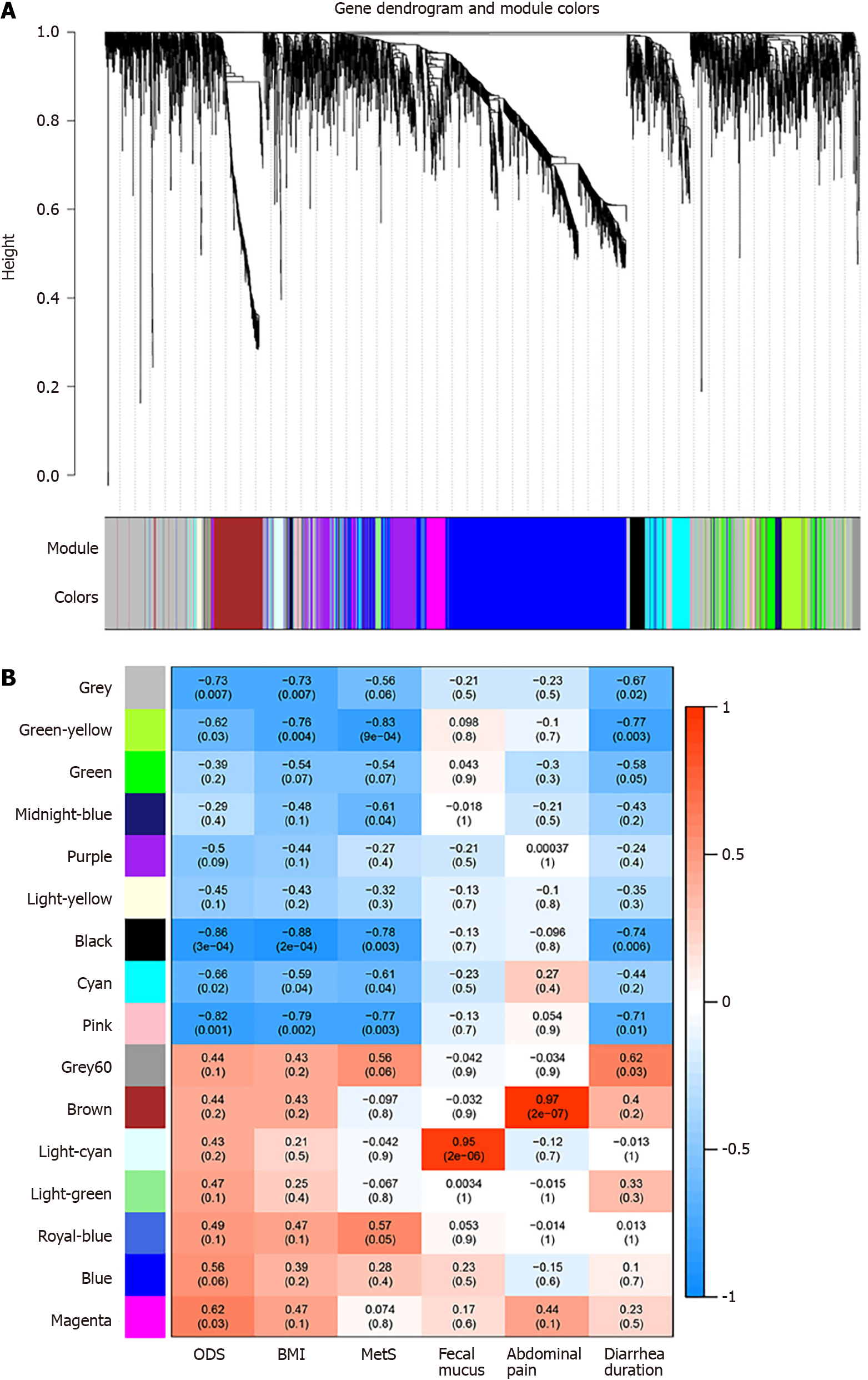
Figure 6 Identification of modules associated with the clinical traits of Linghu’s obesity-diarrhea syndrome.
A: Cluster dendrogram of co-expression network modules. The branches represent highly interconnected clusters of genes. The colors in the horizontal bar represent the co-expression modules; B: Heat map of the relationships between the module eigengenes and clinical traits. The horizontal axis corresponds to clinical traits. The colors of the vertical axis represent the co-expression modules. The color of each cell indicates the degree of correlation between the module and the clinical trait. In each cell, the number in the first row represents the Pearson correlation coefficient, and the number in the second row represents the P value of the correlation coefficient. ODS: Linghu’s obesity-diarrhea syndrome; BMI: Body mass index; MetS: Metabolic syndrome.
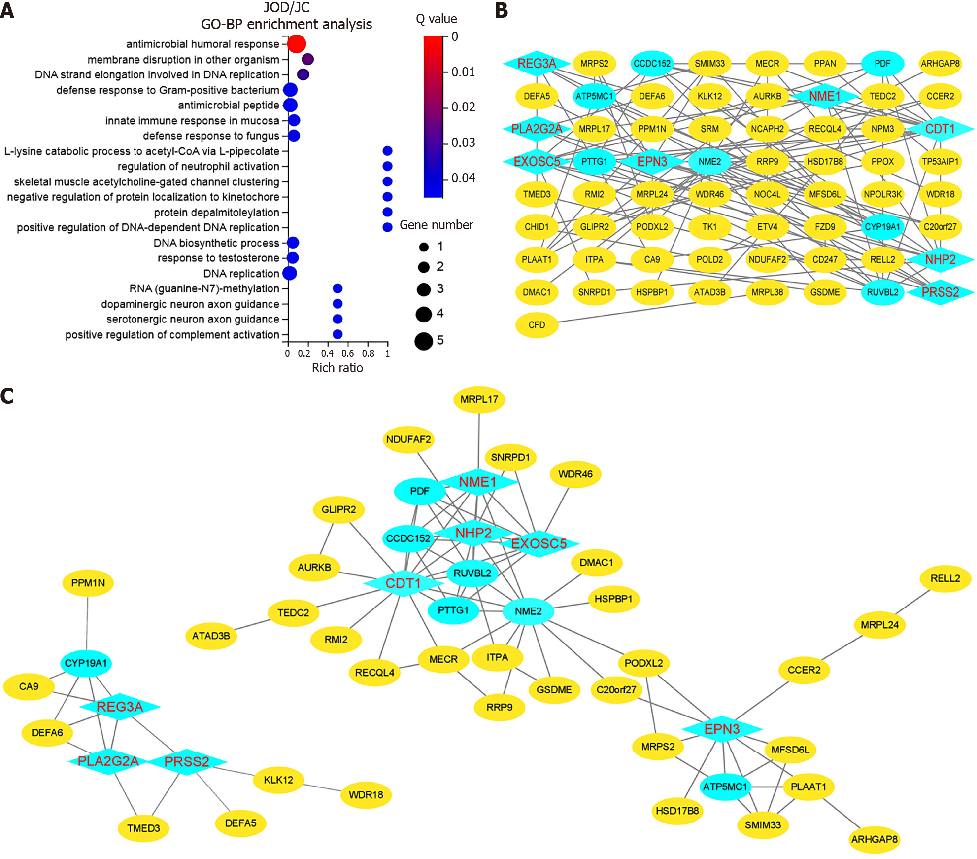
Figure 7 Functional enrichment analysis and identification of hub genes in the black module.
A: Gene Ontology-biological process enrichment analysis; B: Network of the 65 genes with the top 100 weighted values in the black module; C: Two major interaction networks. The blue nodes represent the candidate genes with a degree ≥ 5. The rhombic nodes represent the hub genes that are differentially expressed in the JOD group compared with the JC and JO groups. GO-BP: Gene Ontology-biological process.
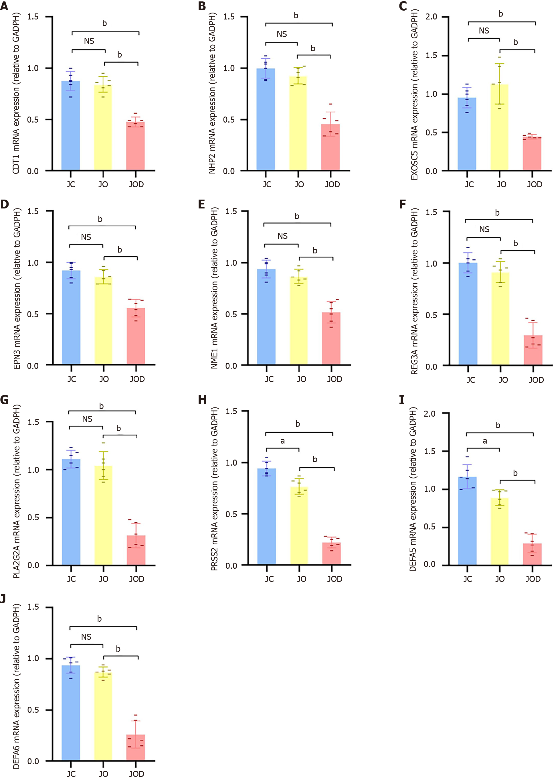
Figure 8 Validation of gene expression in jejunal mucosa by quantitative real-time PCR.
A-J: The relative mRNA expression of CDT1 (A), NHP2 (B), EXOSC5 (C), EPN3 (D), NME1 (E), REG3A (F), PLA2G2A (G), PRSS2 (H), DEFA5 (I), and DEFA6 (J) in jejunal mucosa from the JC group (n = 6), JO group (n = 6) and JOD group (n = 6). Data were expressed as mean ± SD. aP < 0.01, bP < 0.001. NS: Not significant.
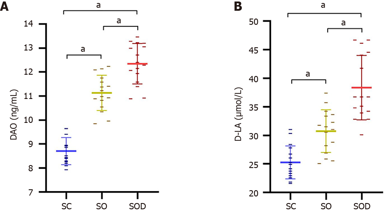
Figure 9 Intestinal barrier function measurements.
A and B: Comparison of serum diamine oxidase (A) and D-lactate (B) levels among the SC group (n = 16), SO group (n = 16), and SOD group (n = 16). Data were expressed as mean ± SD. aP < 0.001. DAO: Diamine oxidase; D-LA: D-lactate.
- Citation: Niu XT, Wang XY, Wang Y, Han K, Ru N, Xiang JY, Linghu EQ. Transcriptome analysis suggests broad jejunal alterations in Linghu’s obesity-diarrhea syndrome: A pilot study. World J Gastroenterol 2024; 30(21): 2777-2792
- URL: https://www.wjgnet.com/1007-9327/full/v30/i21/2777.htm
- DOI: https://dx.doi.org/10.3748/wjg.v30.i21.2777


