Copyright
©The Author(s) 2020.
World J Gastroenterol. Nov 28, 2020; 26(44): 6945-6962
Published online Nov 28, 2020. doi: 10.3748/wjg.v26.i44.6945
Published online Nov 28, 2020. doi: 10.3748/wjg.v26.i44.6945
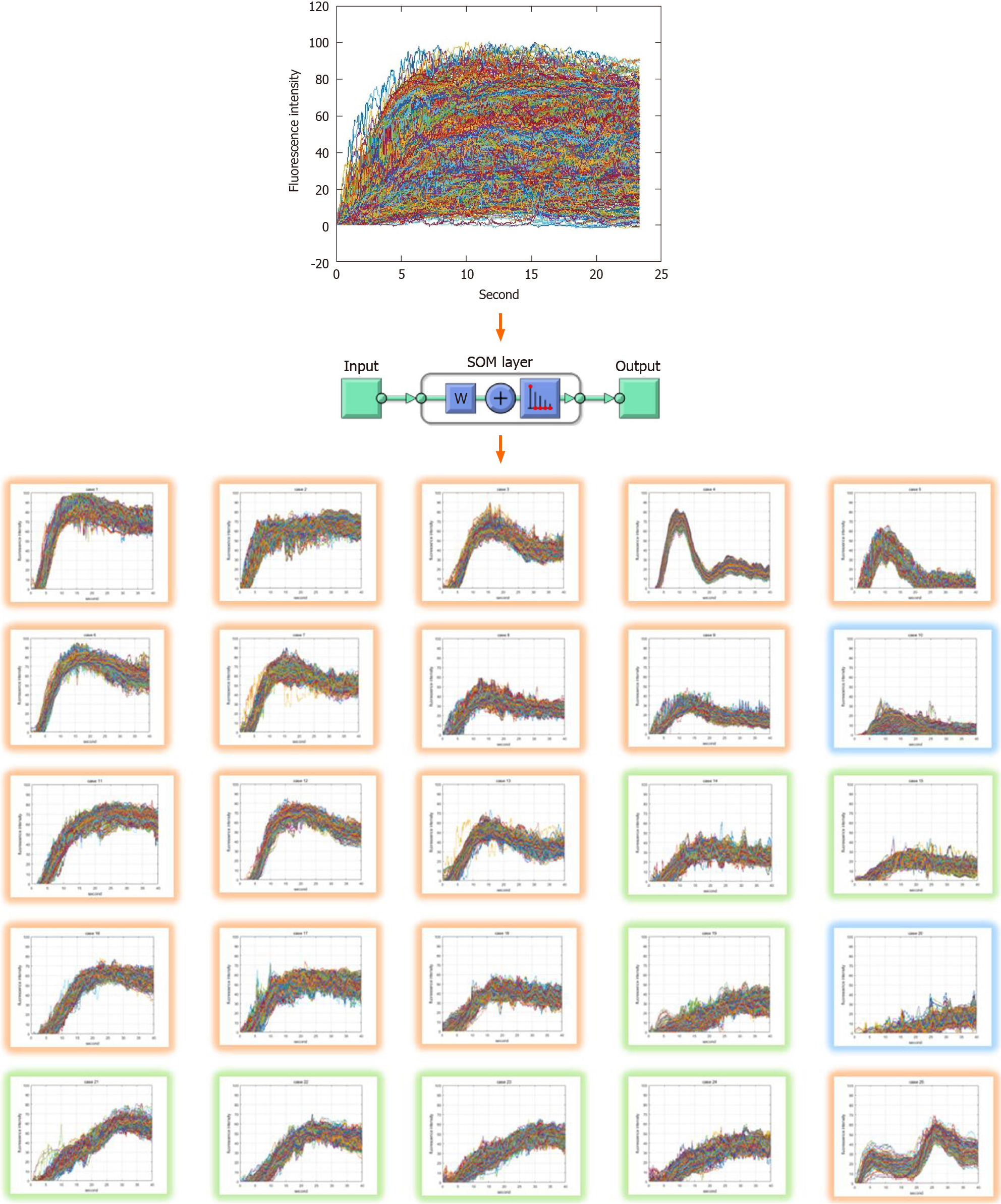
Figure 1 Classified indocyanine green curve patterns as the results of self-organizing map clustering.
The input training data set of self-organizing map network is 10000 samples and 1200 elements. The output layer is set to 5 × 5, 25 in 2 dimensions. Training was performed using the neural net clustering in MATLAB 2019. SOM: Self-organizing map.
Figure 2 Block diagram of indocyanine green curve pattern classification model.
Overview of processing algorithm including training process, indocyanine green (ICG) curve pattern classification process and risk evaluation process. Training data set is acquired through pre-processing from ICG videos of 50 patients and it consists of 10000 ICG curves. To obtain a learned self-organizing map network, the input data set is classified into 25 patterns, and risk labeling is performed on each classified pattern. When a new ICG curve comes in, the learned network classifies it into the most similar pattern and evaluates risk. ICG: Indocyanine green; SOM: Self-organizing map.
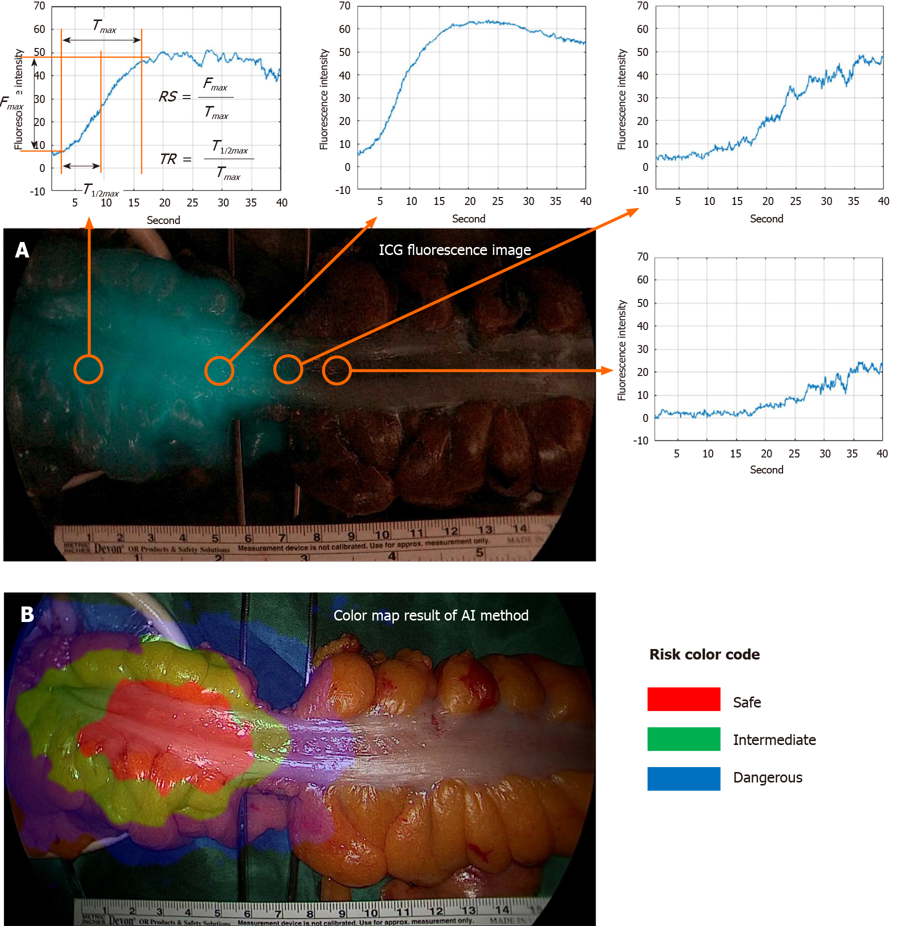
Figure 3 Risk color map result of artificial intelligence based real-time analysis microperfusion on the indocyanine green video.
A: Indocyanine green (ICG) fluorescence image and ICG curve graph at each position. Fmax is the amount of change in ICG fluorescence intensity. Tmax is the time it takes for the ICG fluorescence intensity change to become Fmax, T1/2max is the time it takes for the ICG fluorescence intensity change to become Fmax/2. Rising slope represents Fmax/Tmax. TR represents T1/2max/Tmax; B: Risk color map result of artificial intelligence method. Red region means risk-safe, green region means risk-intermediate, and blue region means risk-dangerous. TR: Time ratio; RS: Rising slope; ICG: Indocyanine green; AI: Artificial intelligence.
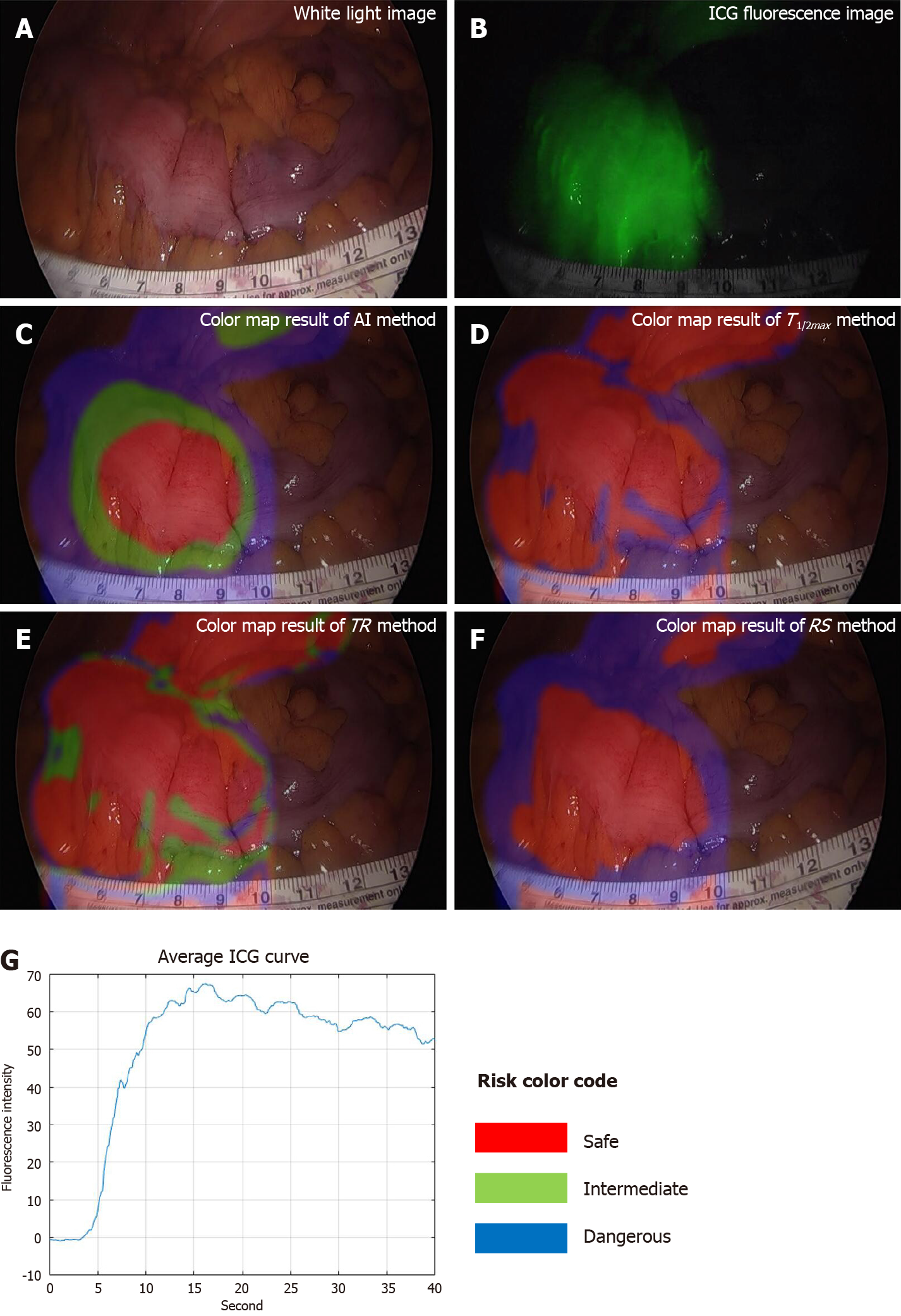
Figure 4 Results of good perfusion patient with small Tmax, large Fmax, and steep indocyanine green curve.
A: White light image; B: Indocyanine green (ICG) fluorescence image, very well observed; C: Color map result of artificial intelligence method; D: Color map result of T1/2max method; E: Color map result of time ratio method; F: Color map result of rising slope method; G: Average ICG curve. The results of all methods were the same as risk-safe. TR: Time ratio; RS: Rising slope; ICG: Indocyanine green; AI: Artificial intelligence.
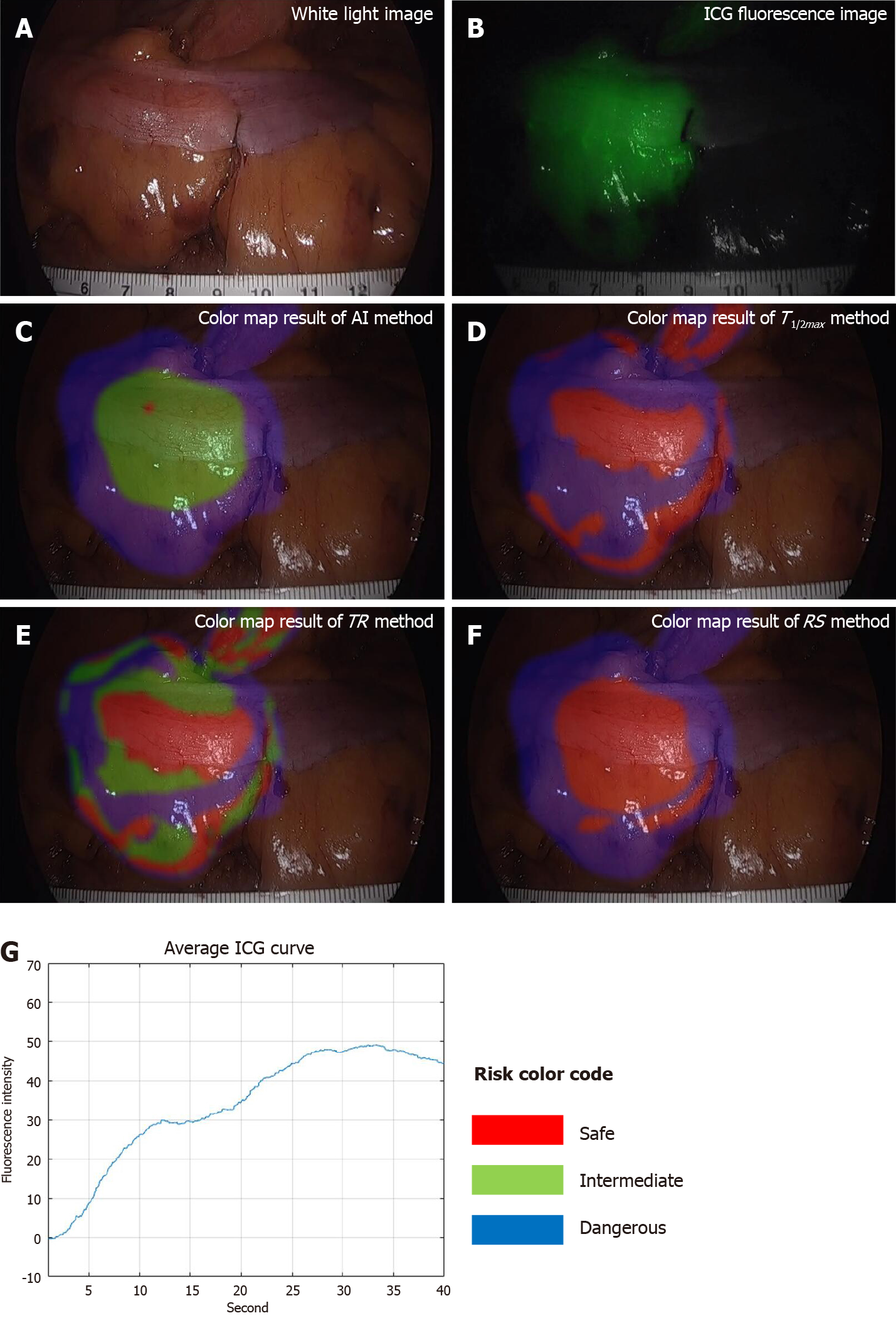
Figure 5 Results of moderate perfusion patient with large Tmax and Fmax, and stepped indocyanine green curve.
A: White light image; B: Indocyanine green (ICG) fluorescence image; C: Color map result of artificial intelligence (AI) method; D: Color map result of T1/2max method; E: Color map result of time ratio (TR) method; F: Color map result of rising slope (RS) method; G: Average ICG curve. The result of AI method was analyzed as risk-intermediate in the middle and risk-dangerous in the outside. The result of T1/2max method was mixed up with risk-safe and risk-dangerous, and the result of TR was mixed up with all risk status. The result of RS method was analyzed as risk-safe in the middle and risk-dangerous in the outside. TR: Time ratio; RS: Rising slope; ICG: Indocyanine green; AI: Artificial intelligence.
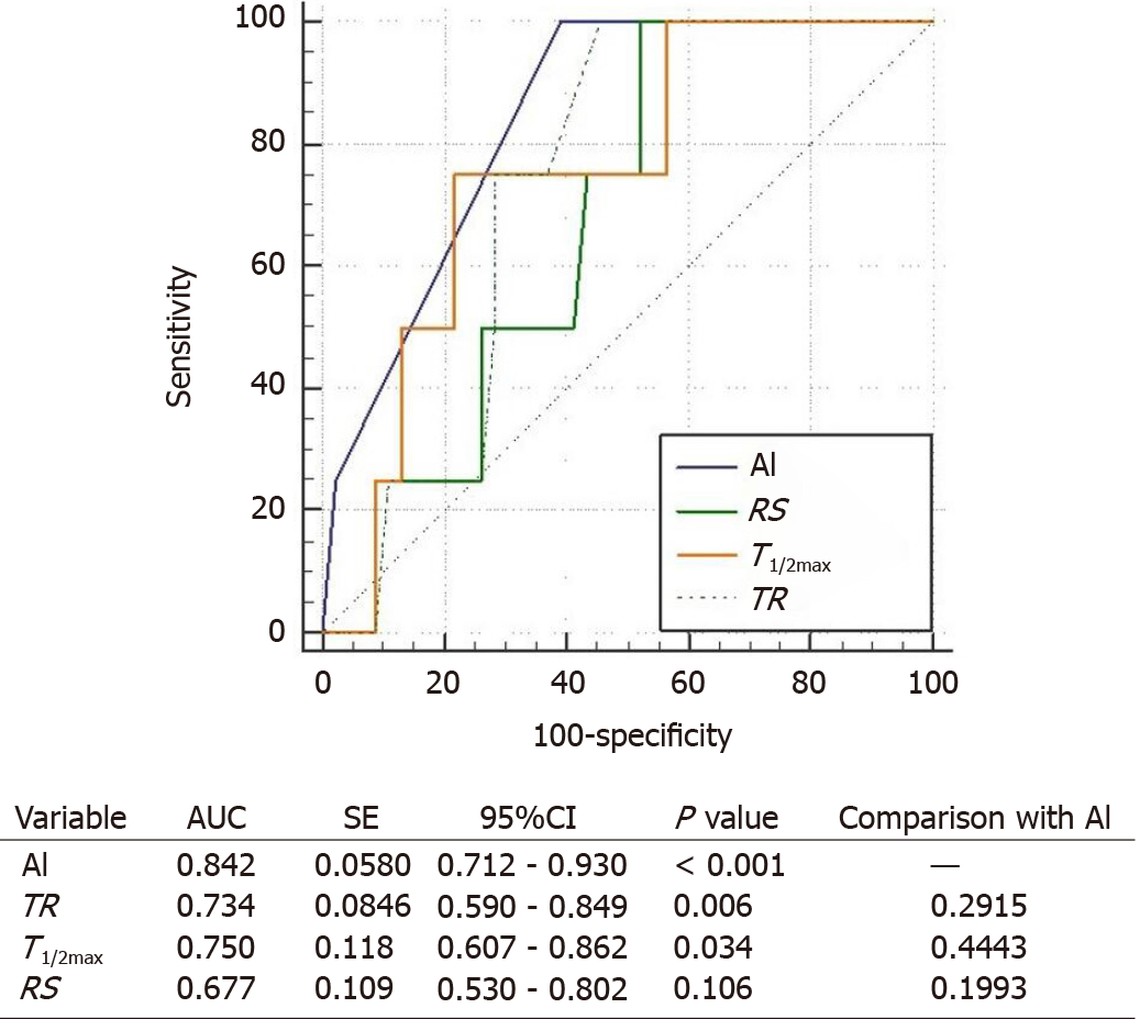
Figure 6 Comparison on the receiver operating characteristic curves of artificial intelligence-based methods and conventional parameters determines the anastomotic complication risk by hypoperfusion.
Artificial intelligence (AI) represents the AI-based method. T1/2max is the time it takes for the indocyanine green fluorescence intensity change to become Fmax/2. Rising slope represents Fmax/Tmax. Time ratio represents T1/2max/Tmax. Area under the curve stands for area under the curve. Statistically significant expresses as P value of less than 0.05. TR: Time ratio; RS: Rising slope; AI: Artificial intelligence; SE: Standard error; CI: Confidence interval; AUC: Area under the curve.
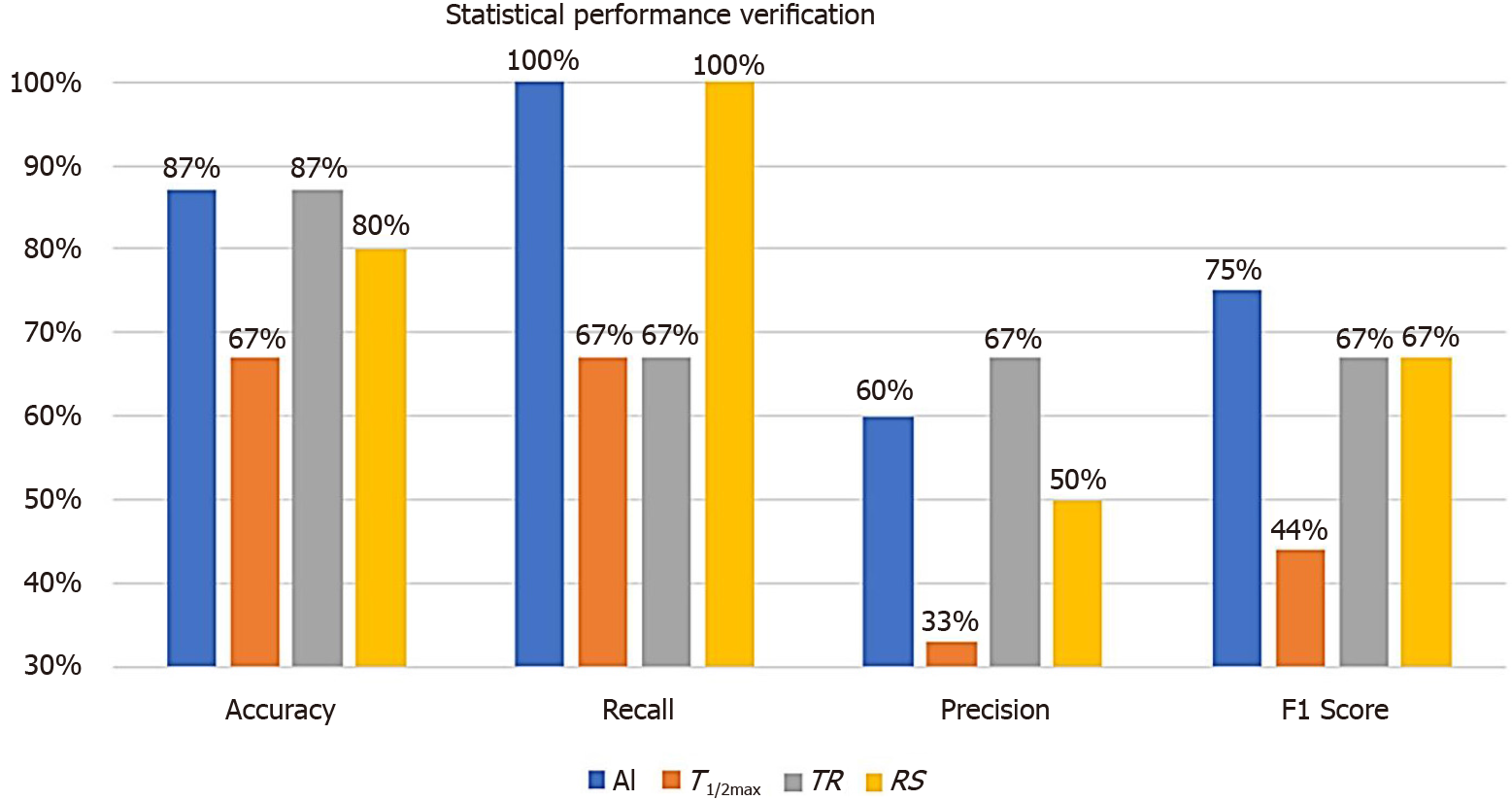
Figure 7 Statistical performance verification using classification performance evaluation metrics between artificial intelligence-based analysis and perfusion parameter of quantitative analysis.
True positive (TP), false positive (FP), false negative (FN), true negative (TN), accuracy [(TP + TN)/(TP + FN + FP + TN)], recall [TP/(TP + FN)], and precision [TP/(TP + FP)] were the classification performance evaluation metrics. F1 score represents a harmonized average of recall and precision, artificial intelligence analysis was evaluated as the most accurate parameter to predict the risk of anastomotic complications. TR: Time ratio; RS: Rising slope; AI: Artificial intelligence.
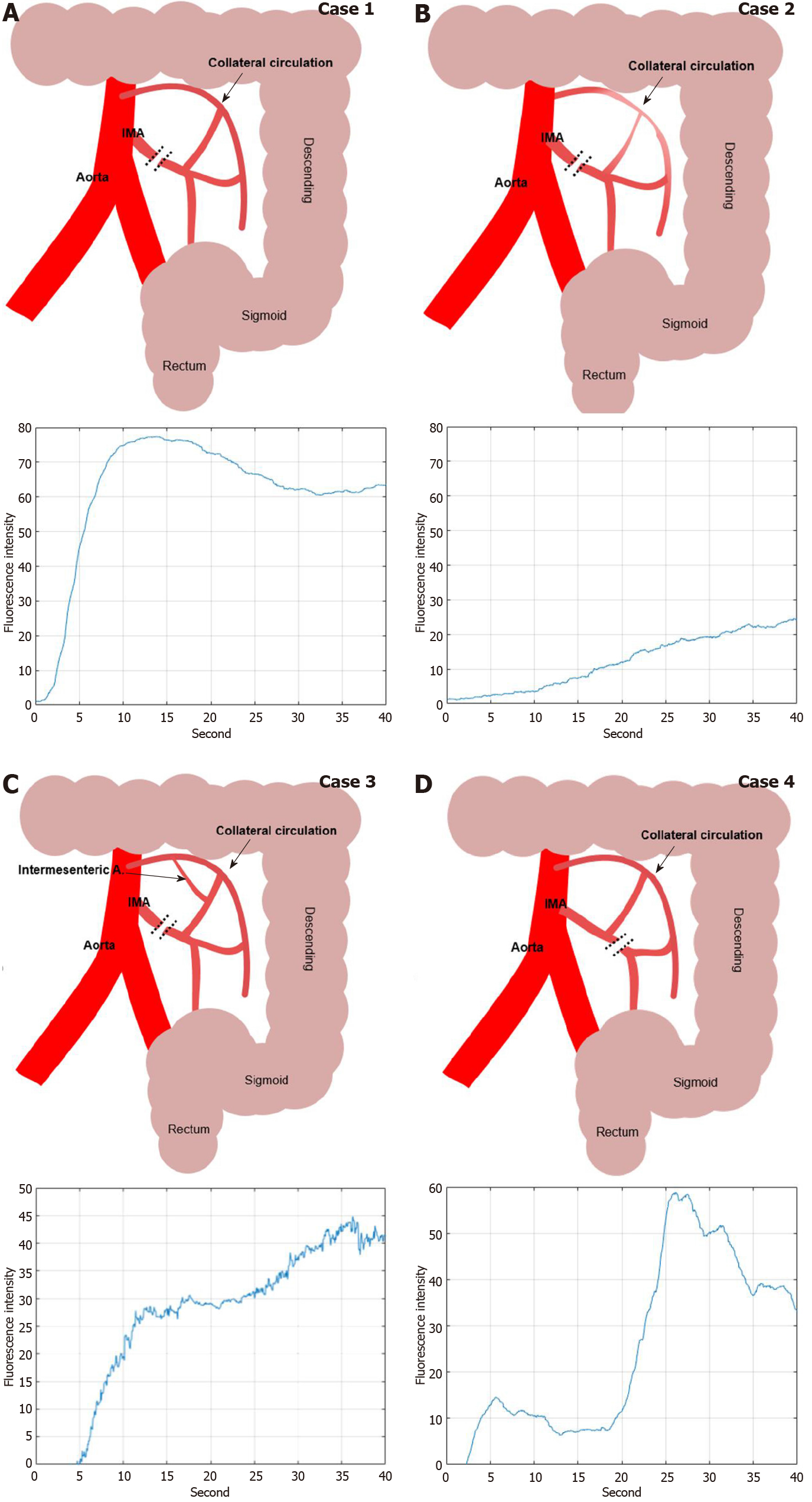
Figure 8 Various indocyanine green curve pattern by collateral circulatory structure of colonic mesentery after inferior mesenteric artery ligation during colorectal surgery.
A: High ligation of inferior mesenteric artery (IMA) with intact collateral circulation of marginal artery; B: High ligation of IMA with insufficient collateral circulation by weak marginal artery connection in the splenic flexure mesentery; C: Intermesenteric artery connected between left colic artery and middle colic artery with intact collateral circulation; D: Low ligation of IMA with intact left colic arterial flow from IMA. IMA: Inferior mesenteric artery.
- Citation: Park SH, Park HM, Baek KR, Ahn HM, Lee IY, Son GM. Artificial intelligence based real-time microcirculation analysis system for laparoscopic colorectal surgery. World J Gastroenterol 2020; 26(44): 6945-6962
- URL: https://www.wjgnet.com/1007-9327/full/v26/i44/6945.htm
- DOI: https://dx.doi.org/10.3748/wjg.v26.i44.6945


