Copyright
©The Author(s) 2021.
World J Clin Cases. Nov 6, 2021; 9(31): 9440-9451
Published online Nov 6, 2021. doi: 10.12998/wjcc.v9.i31.9440
Published online Nov 6, 2021. doi: 10.12998/wjcc.v9.i31.9440
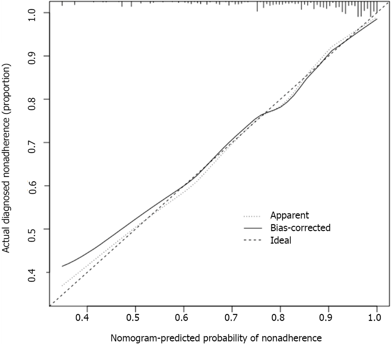
Figure 5 Calibration curves of nomogram prediction in the cohorts.
The x-axis represents the predicted risk for relapse during hospitalization after minor ischemic stroke; the y-axis denotes the actual relapse during hospitalization after minor ischemic stroke. The diagonal dotted line indicates a perfect prediction by an ideal model. The solid line represents the performance of the nomogram, of which a closer fit to the diagonal dotted line shows a better prediction.
- Citation: Yu XF, Yin WW, Huang CJ, Yuan X, Xia Y, Zhang W, Zhou X, Sun ZW. Risk factors for relapse and nomogram for relapse probability prediction in patients with minor ischemic stroke. World J Clin Cases 2021; 9(31): 9440-9451
- URL: https://www.wjgnet.com/2307-8960/full/v9/i31/9440.htm
- DOI: https://dx.doi.org/10.12998/wjcc.v9.i31.9440


