Copyright
©The Author(s) 2021.
World J Clin Cases. Jan 26, 2021; 9(3): 540-551
Published online Jan 26, 2021. doi: 10.12998/wjcc.v9.i3.540
Published online Jan 26, 2021. doi: 10.12998/wjcc.v9.i3.540
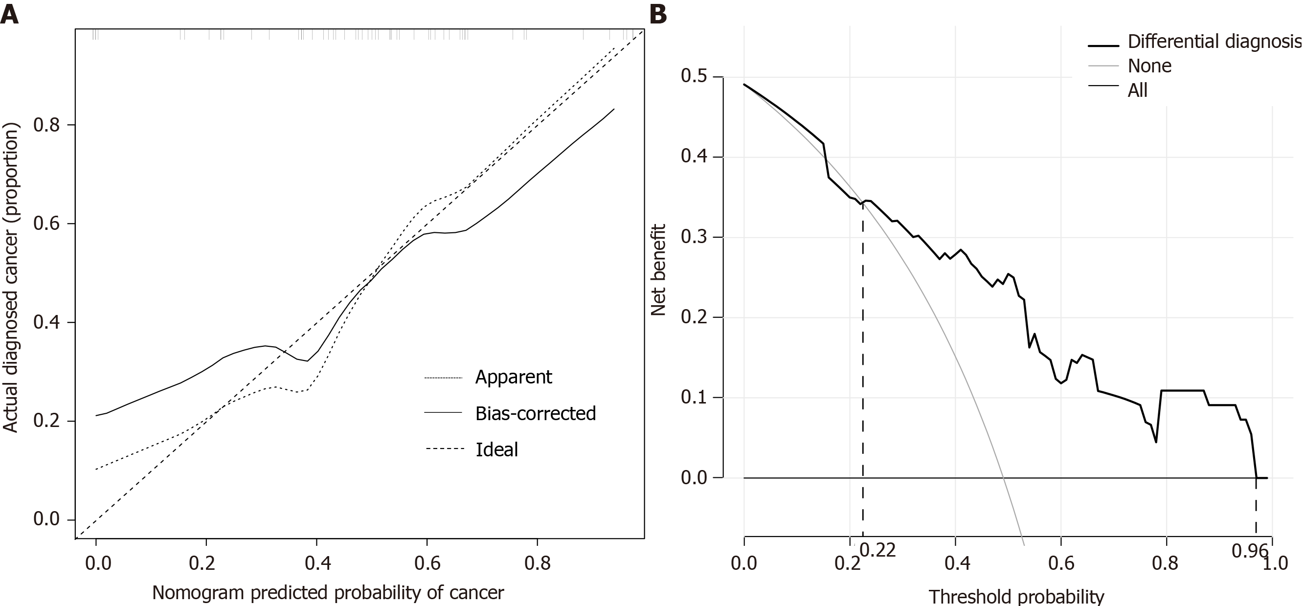
Figure 4 Validation of nomogram and assessment of clinical utility.
A: Calibration curve of the nomogram in the validation cohort. The x-axis represents the predicted risk of cancer. The y-axis represents the actual diagnosis of cancer. The diagonal dotted line represents a perfect prediction by an ideal model. The solid line represents the performance of the nomogram, of which a closer fit to the diagonal dotted line represents a perfect prediction; B: Decision curve analysis for the nomogram in the validation cohort. The y-axis measures the net benefit. The gray line represents the assumption that all patients are laryngeal cancer. The thin solid line represents the assumption that no patients are laryngeal cancer. The thick solid line represents the nomogram.
- Citation: Chen M, Fang Y, Yang Y, He PJ, Cheng L, Wu HT. Circulating immune parameters-based nomogram for predicting malignancy in laryngeal neoplasm. World J Clin Cases 2021; 9(3): 540-551
- URL: https://www.wjgnet.com/2307-8960/full/v9/i3/540.htm
- DOI: https://dx.doi.org/10.12998/wjcc.v9.i3.540


