Copyright
©The Author(s) 2023.
World J Transplant. Dec 18, 2023; 13(6): 391-402
Published online Dec 18, 2023. doi: 10.5500/wjt.v13.i6.391
Published online Dec 18, 2023. doi: 10.5500/wjt.v13.i6.391
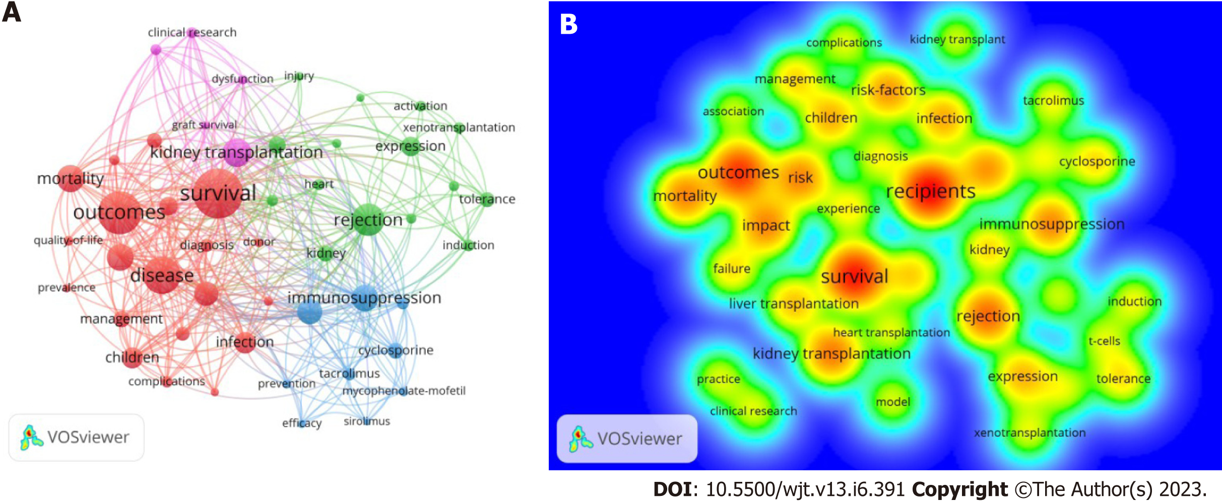
Figure 4 Cluster map of the most occurring keywords and their interconnection across the years.
A: Each circle represents a keyword, and the size of the circles represents the frequency of occurrence. Larger circles indicate that the keyword appears more frequently. Keywords included in the same cluster are displayed in the same color. The distance between the 2 circles shows the degree of the relationship; B: Overlay map of keyword occurrence over time for papers published on the field of transplantation from the United States. The red color represents the key words that have been discussed more frequently.
- Citation: Rawashdeh B, AlRyalat SA, Abuassi M, Prasad R, Cooper M. Unveiling transplantation research productivity of United States: A bibliometric analysis. World J Transplant 2023; 13(6): 391-402
- URL: https://www.wjgnet.com/2220-3230/full/v13/i6/391.htm
- DOI: https://dx.doi.org/10.5500/wjt.v13.i6.391


