Copyright
©The Author(s) 2025.
World J Diabetes. Jan 15, 2025; 16(1): 100099
Published online Jan 15, 2025. doi: 10.4239/wjd.v16.i1.100099
Published online Jan 15, 2025. doi: 10.4239/wjd.v16.i1.100099
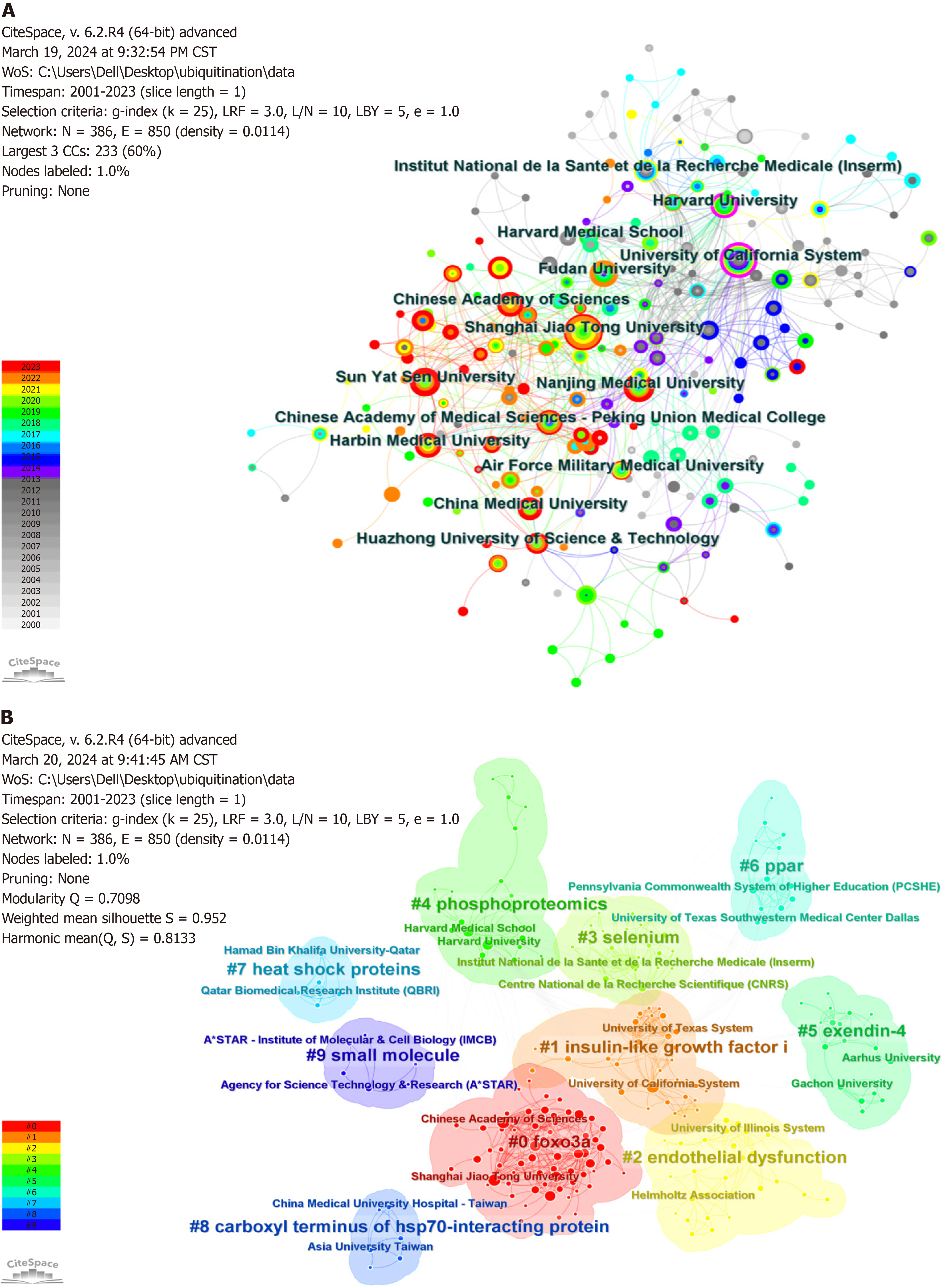
Figure 4 Visualization of institutional research in diabetes ubiquitination studies.
A: Visualization of institutional collaboration analysis. Only institutions with at least ten publications are shown in the figure. Each node represents an institution, with the size of the node proportional to the number of articles published by that institution, and the thickness of the connecting lines proportional to the intensity of collaboration between institutions. Nodes with a purple periphery indicate high centrality, and nodes of different colors represent different publication years; B: Top ten keywords clustering analysis of institutional research themes. The text with different numbers indicates the keyword clusters of these institutions, each node represents one institution, and different colors represent different clusters.
- Citation: Xiong LY, Zhao W, Hu FQ, Zhou XM, Zheng YJ. Ubiquitination in diabetes and its complications: A perspective from bibliometrics. World J Diabetes 2025; 16(1): 100099
- URL: https://www.wjgnet.com/1948-9358/full/v16/i1/100099.htm
- DOI: https://dx.doi.org/10.4239/wjd.v16.i1.100099


