Copyright
©The Author(s) 2021.
World J Diabetes. Jul 15, 2021; 12(7): 1116-1130
Published online Jul 15, 2021. doi: 10.4239/wjd.v12.i7.1116
Published online Jul 15, 2021. doi: 10.4239/wjd.v12.i7.1116
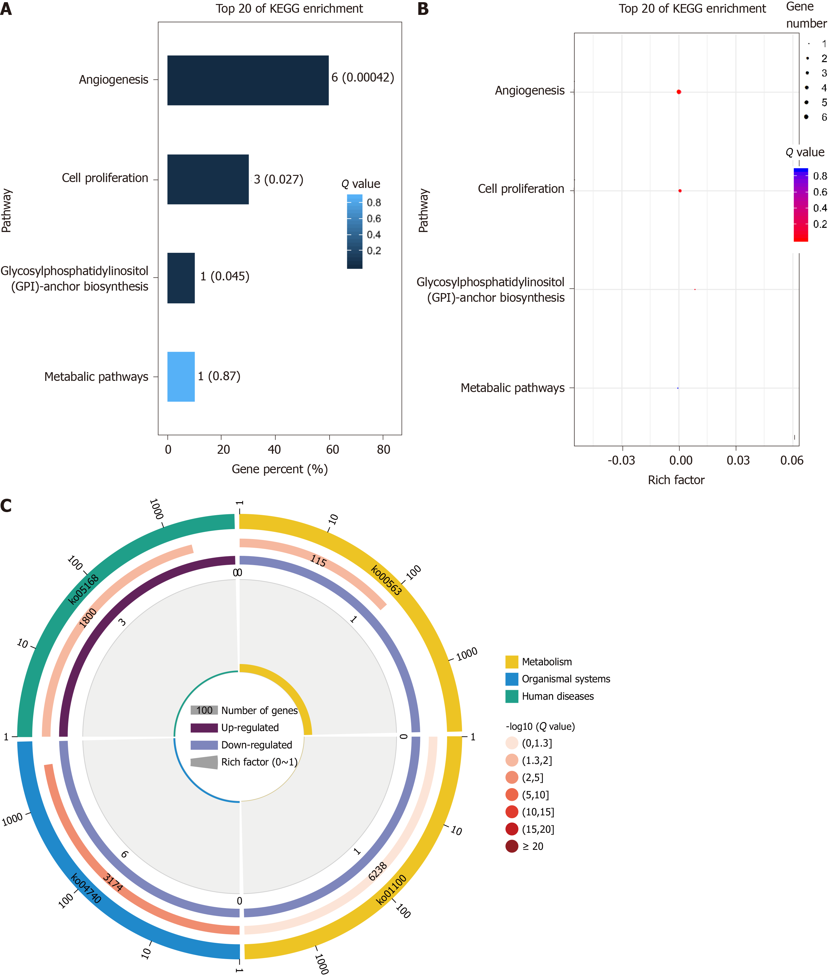
Figure 6 KO analysis results.
A: KO enrichment bar chart (top 20 pathways with the lowest Q value were used to draw the chart. The ordinate represents the pathways, whereas the abscissa shows the percentage of the number of pathways in all piRNA target genes; a darker color correlates with a smaller the Q value. The value in the column is the number and Q value of the pathways); B: KO enrichment bubble chart [top 20 pathways with the lowest Q value were used to plot. The ordinate shows the pathway, whereas the abscissa shows the enrichment factor (the number of piRNA target genes in the pathway divided by all numbers). The size indicates the number; a redder color indicates a smaller Q value]; C: KO enrichment circle diagram [first circle: top 20 enriched pathways; outside the circle is the coordinate scale of gene number, and different colors represent different classes. Second circle: number and Q value of the pathway in the background gene; the more the number of genes, a longer bar and smaller Q value leads to a redder color. Third circle: number of piRNA target genes in the pathway. Fourth circle: rich factor value of each pathway (number of piRNA target genes in the pathway divided by all numbers); background grid line, each grid represents 0.1].
- Citation: Yu Y, Ren KM, Chen XL. Expression and role of P-element-induced wimpy testis-interacting RNA in diabetic-retinopathy in mice. World J Diabetes 2021; 12(7): 1116-1130
- URL: https://www.wjgnet.com/1948-9358/full/v12/i7/1116.htm
- DOI: https://dx.doi.org/10.4239/wjd.v12.i7.1116


