Copyright
©The Author(s) 2025.
World J Gastrointest Oncol. Apr 15, 2025; 17(4): 103048
Published online Apr 15, 2025. doi: 10.4251/wjgo.v17.i4.103048
Published online Apr 15, 2025. doi: 10.4251/wjgo.v17.i4.103048
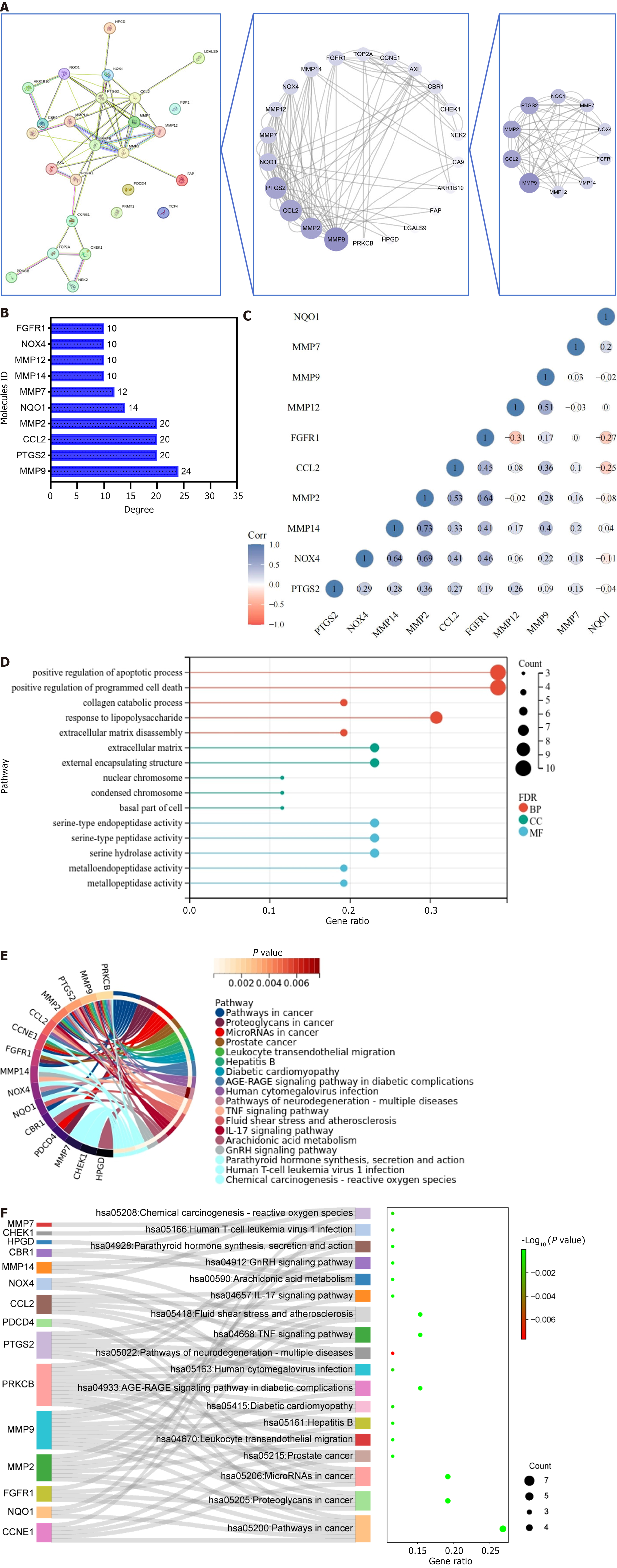
Figure 3 Screening and enrichment analysis of core targets.
A: Topology screening process of protein-protein interaction network. The larger the circle and the redder the color, the more important the target is in the network; B: Degree value of core targets; C: Correlation heatmap of the core targets. Blue represents positive correlation, red represents negative correlation, and darker color indicates stronger correlation; D: Gene ontology lollipop plot illustrating the intersecting targets. The colors red, blue, and green denote biological processes, cellular components, and molecular functions, respectively. The size of each circle corresponds to the number of enriched targets, with larger circles indicating a greater number of enriched targets; E: Kyoto encyclopedia of genes and genomes (KEGG) circle diagram of intersecting targets. The outermost left side of the circle represents the intersection target, the outermost right-side color represents the pathway, and the color of the innermost right side of the circle represents the P value of the enriched pathway. The lighter the color, the more significant the enriched pathway; F: Ranking of the front KEGG Sankey diagram. The left side represents the intersection target, the middle side represents the pathway, the curve indicates the correlation between the two, and the rightmost bubble graph represents the result of KEGG. The larger the circle and the redder the color, the more significant the enriched pathway. FDR: False discovery rate; BP: Biological processes; MF: Molecular functions; CC: Cellular components.
- Citation: Meng FD, Jia SM, Ma YB, Du YH, Liu WJ, Yang Y, Yuan L, Nan Y. Identification of key hub genes associated with anti-gastric cancer effects of lotus plumule based on machine learning algorithms. World J Gastrointest Oncol 2025; 17(4): 103048
- URL: https://www.wjgnet.com/1948-5204/full/v17/i4/103048.htm
- DOI: https://dx.doi.org/10.4251/wjgo.v17.i4.103048


