Copyright
©The Author(s) 2025.
World J Hepatol. Mar 27, 2025; 17(3): 103327
Published online Mar 27, 2025. doi: 10.4254/wjh.v17.i3.103327
Published online Mar 27, 2025. doi: 10.4254/wjh.v17.i3.103327
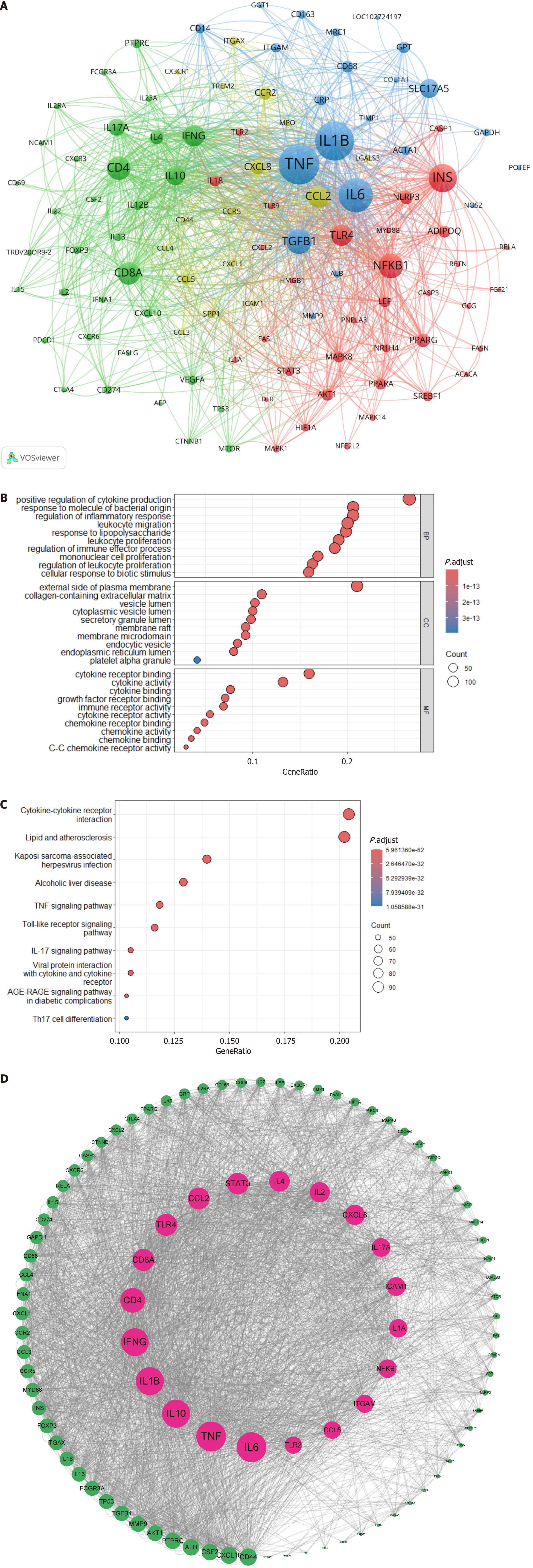
Figure 8 Cluster analysis of associated genes.
A: Gene association cluster analysis map. This map visualizes the co-occurrence of genes related to immune cells and metabolic associated fatty liver disease. Different types of genes were classified by clustering algorithms and represented by four distinct colors: Inflammation-related genes are indicated in blue; chemokine-related genes in yellow; immune-related genes in green; and lipid metabolism-related genes in red; B: Gene Ontology enrichment analysis bubble chart. Bubble size denotes gene count, and color depth reflects enrichment level; C: Kyoto Encyclopedia of Genes and Genomes pathway enrichment analysis bubble chart. The x-axis shows the number of enriched genes, and the y-axis lists pathways; D: Protein-protein interaction network construction analysis map. Nodes represent proteins, and edges indicate interactions.
- Citation: Qi WY, Zheng SH, Li SZ, Wang W, Wang QY, Liu QY, Li XK, Zhang JX, Gan DN, Ye YA, Zao XB. Immune cells in metabolic associated fatty liver disease: Global trends and hotspots (2004-2024). World J Hepatol 2025; 17(3): 103327
- URL: https://www.wjgnet.com/1948-5182/full/v17/i3/103327.htm
- DOI: https://dx.doi.org/10.4254/wjh.v17.i3.103327


