Copyright
©The Author(s) 2022.
World J Gastroenterol. Oct 7, 2022; 28(37): 5469-5482
Published online Oct 7, 2022. doi: 10.3748/wjg.v28.i37.5469
Published online Oct 7, 2022. doi: 10.3748/wjg.v28.i37.5469
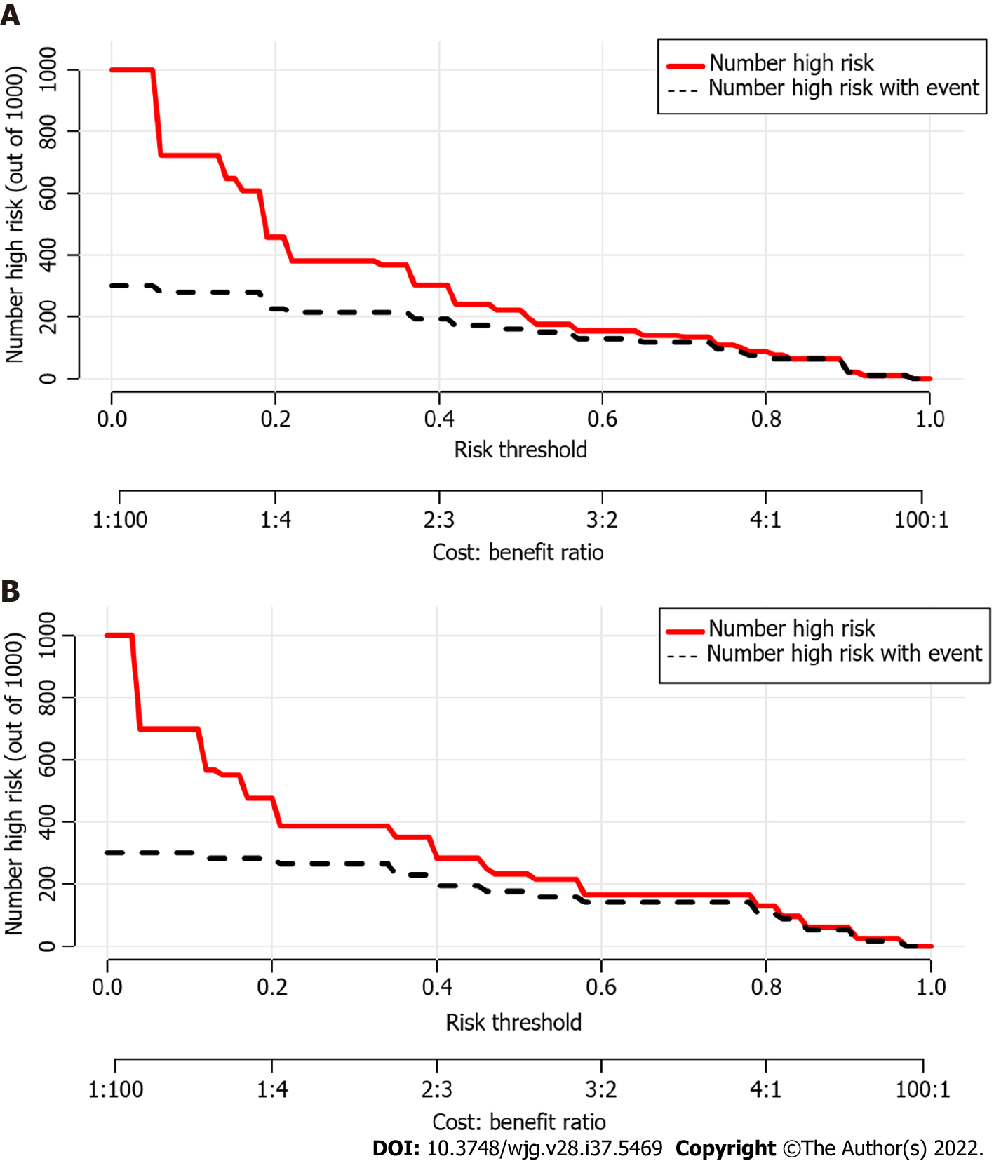
Figure 6 Clinical impact curves of the nomogram.
At different threshold probabilities within a given population, the number of high-risk patients (solid red line) and the number of high-risk patients with the outcome (black dotted line) are shown. In both training and validation cohort, the solid red line and black dotted line show a great fit. A: In the training cohort; B: In the validation cohort.
- Citation: Jiang D, Chen ZX, Ma FX, Gong YY, Pu T, Chen JM, Liu XQ, Zhao YJ, Xie K, Hou H, Wang C, Geng XP, Liu FB. Online calculator for predicting the risk of malignancy in patients with pancreatic cystic neoplasms: A multicenter, retrospective study. World J Gastroenterol 2022; 28(37): 5469-5482
- URL: https://www.wjgnet.com/1007-9327/full/v28/i37/5469.htm
- DOI: https://dx.doi.org/10.3748/wjg.v28.i37.5469


