Copyright
©2011 Baishideng Publishing Group Co.
World J Gastroenterol. Apr 14, 2011; 17(14): 1910-1914
Published online Apr 14, 2011. doi: 10.3748/wjg.v17.i14.1910
Published online Apr 14, 2011. doi: 10.3748/wjg.v17.i14.1910
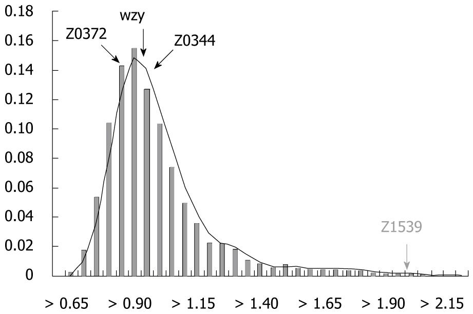
Figure 1 Distance distribution histogram for the barcode k-mer compositions of each gene compared with the average k-mer compositions of the whole genome.
The x-axis is the k-mer genomic barcode distance, and the y-axis is the frequency. The bar indicates the frequency of different ranges of k-mer distance throughout the whole genome. The curve is the fitting curve to the histogram.
- Citation: Wang GQ, Zhou FF, Olman V, Su YY, Xu Y, Li F. Computational prediction and experimental validation of novel markers for detection of STEC O157:H7. World J Gastroenterol 2011; 17(14): 1910-1914
- URL: https://www.wjgnet.com/1007-9327/full/v17/i14/1910.htm
- DOI: https://dx.doi.org/10.3748/wjg.v17.i14.1910


