Copyright
©2009 The WJG Press and Baishideng.
World J Gastroenterol. Nov 21, 2009; 15(43): 5377-5396
Published online Nov 21, 2009. doi: 10.3748/wjg.15.5377
Published online Nov 21, 2009. doi: 10.3748/wjg.15.5377
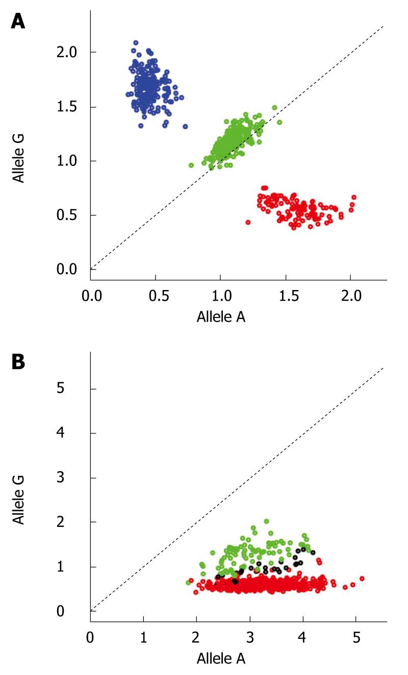
Figure 1 Example of cluster plots for two SNPs.
Plot A shows the plotting of the normalized intensity values for a SNP with good clustering. Each color represents the respective genotype (blue for GG, green for AG and red for AA). Plot B demonstrates the cluster plot for a SNP with bad clustering (same color coding as in A). Disease-associated SNPs demonstrating cluster plots as in B should be discarded as the significant associations at such SNPs are most likely technical artifacts.
- Citation: Melum E, Franke A, Karlsen TH. Genome-wide association studies - A summary for the clinical gastroenterologist. World J Gastroenterol 2009; 15(43): 5377-5396
- URL: https://www.wjgnet.com/1007-9327/full/v15/i43/5377.htm
- DOI: https://dx.doi.org/10.3748/wjg.15.5377


